Jake is printing bellybands on the Vandercook press. Notice the tape registration system he’s got set up – black straps that hold the sheet against cylinder for returning sheet to operator instead of having to collect it from the end of press bed.

Jake is printing bellybands on the Vandercook press. Notice the tape registration system he’s got set up – black straps that hold the sheet against cylinder for returning sheet to operator instead of having to collect it from the end of press bed.
Come check out our Open Studio event this weekend! We’ll be joining over 40 artists and businesses within the Delavan Center and opening our doors this Friday and Saturday. Take a tour of our print shop and shop our latest letterpress goods. Interested in joining us? RSVP on Facebook!

Can’t make it? You can always set up a tour next time you’re in town – just be sure to let us know when you’d like to come by!
Tim the printer discovered a friend looking back at him as he cleaned his press.

This is a dreamy view of a washup tray that is catching dregs of blue-green ink mixed with a bit of opaque white.

When we made an epic shop move a few years ago from one side of the building to the other, this was one of the most astounding sights ever : a gigantic cutter gliding across a sea of freshly epoxied floor. It was beautiful to see this great machine docked at its current post!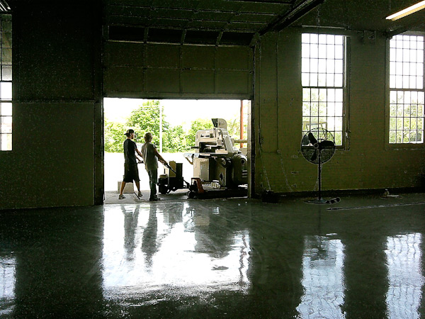
An increasingly common question we are asked, here in the Platemaking Department at Boxcar Press, is “will my reverse type/text/design be readable or look good when I letterpress print it?” Reaching the desired results means exploring what exactly “reverse type/design” is and what to check for to guarantee a great printed piece.
When it comes to printing, reverse type or design refers to white or light text or objects positioned against a solid colored (usually dark) background. This is sometimes also referred to as “knocked out” text.

There are some important aspects to remember when designing for reverse type, especially with regards to using photopolymer plates:


Designs with reverse type can be pretty dramatic, and we hope you’ll consider printing a project like this. With a little planning and forethought about how the design will translate with a larger solid inked area and the detail you want, you can have some very satisfying results. So keep those rollers inked, letterpress lovers, and go reverse!
Situated in the roaming, wild hills of Wyoming, lie not one, but two meticulously kept letterpress print shops of the cheerful and ever-ready James Jareb. From his personal Laramie, Wyoming studio to his printing abode at the Truman State Univerity, master craftsmanship and creative know-how flow effortlessly through both. Taking a short break from his print runs, James sat down with us to give us a tour of his gorgeous collection of presses and printed goodies.


THE PRESSES Ettan etching press (bed size 18 x 36), Fuchs and Lang litho press (bed size 28 x 40), Three copy presses, Daughaday Card press, Improved 3 x 5, Kelsey Model X (6 x 10), C&P old style (8 x 12), and a R. Hoe hand press, bed size (22 x 30).
TYPE OF SHOP The Laramie shop is shared with three artist friends; that space houses the Ettan, the Fuchs and Lang, and the R. Hoe. The other is a small section of the printmaking facility at Truman State University, where I teach courses in all kinds of techniques.
THE LOCATION The shop at Truman State is a converted classroom, on the second floor. Sure hope the presses don’t fall through! My real home is in a shop located in Laramie, Wyoming, and is housed in what used to be the town’s high school, c. 1930. Both areas have good natural lighting, and adequate artificial lights.
SIZE OF PRINT SHOP 16 x 20 feet (for the letterpress action each at both the Truman State University and Laramie locations).
FAVORITE THING ABOUT THE SHOP Probably the C&P. I have had it the longest; she’s my girlfriend. Well, either that press is my favorite piece of equipment, or it is the little paperback dictionary that I keep close by.
FAVORITE INK Because I was first trained in traditional printmaking techniques (and continue to make lithos, woodcuts, etc.) my ink knowledge is somewhat narrow in focus, using oil-based relief inks from Daniel Smith and Graphic Chemical Ink Co.
SOLVENT OF CHOICE For clean up of metal and wood type, I use regular mineral spirits and a red rag (we have a contract with the local linen service — they pick up our dirty rags for recycling). For the press and ink slab and photopolymer plates I use vegetable oil […] followed by 409 to degrease. Stubborn ink or grease? Out comes the Everclear! Wow! That stuff will strip anything.
PLATE AND BASE OF CHOICE When I print with photopolymer plates, I use the Boxcar Deep Relief plate system, first trying them about three years ago. I am still amazed at the great range of elements that can be brought out of the process: Print print print !!!
OIL OF CHOICE I lube the presses with 20w-50 oil, or multipurpose red grease where needed.
WHAT TYPE OF RAG DO YOU CLEAN UP YOUR PRESSES WITH Red rag for metal and wood type. Scott brand Blue Shop towels for the press and ink slab.
FLOORING MATERIAL Concrete
FLOOR PLAN TIPS I have planned and implemented and assisted in the layout of many shops across the U.S. In general, keep spaces tight where you need to do repetitious movement, but also have easy access to some open, clean, “breathing room”. That’s where I hang the motorized mirror ball from the ceiling: you never know when a person might need a spontaneous disco party.
PIED TYPE Oh, I did have, a couple years back, a large amount of pied type in the shop, as I was able to get a good deal on the remnants of type from the Columbia Journal in Missouri. Unfortunately, it had been dumped into black plastic trash bags. It took almost a year and a half to sort the usable from the rest. I finally got that accomplished, and still have some really nice, though a bit worn, selections. The rest — all 672 pounds — went to the foundry of Sky Shipley, before he moved to Arizona.
ORGANIZATION ADVICE A clean shop is a happy shop. Many years ago I read about Henry Ford and the notion of time and motion studies, which I apply to any shop I am asked to have a hand in designing.
PRINTING ADVICE Everything has its place and needs to be put back in its place. Machines, just like the human body, will perform only as well as they are taken care of. Go Print!

Tim is completing makeready on his Heidelberg Windmill.
There’s nothing small about it; sisters-in-law Gina and Katie Vallecorsa of LittleOwl Lettepress are big on keeping their rollers inked. From helping plan each other’s weddings, to acquiring a 3000 lb Heidelberg affectionately named Berkeley, to the thrills of printing their first 3-color invitation set, the labors of their love show in each detailed printed piece. Gina & Katie took a break to let us in on the whirling world of their custom letterpress home.

A CREATIVE TWIST We are sisters by marriage and have a love affair with stationery design, paper, and pretty much all things wedding related! We’ve both lived in Arizona our entire lives, even attending college at rival schools Arizona State and University of Arizona. Since graduating forever ago, Gina has worked in marketing for a home builder and Katie is a teacher.
IN THE BEGINNING Our letterpress start involved our two husbands and a C&P Pilot. We really had no idea what we were getting into, but luckily Mike O’Connor at Letterpress Central was there to help us on our way. We also follow quite a few people on their blogs and social media that we’ve never met. Looking at the work they post is always inspiring.
GREATNESS IN THE GRAND CANYON STATE You know the saying “you’ve put the cart before the horse”? We’ve lived that one! After spending 35+ hours printing a friend’s entire invitation suite using our tabletop press we decided we needed to make a change if we were going to pursue a letterpress business. And this is where the trouble started! At the time we were printing on our tabletop press that resided in the dining room of Gina and Max’s condo. We went ahead and bought Berkeley, our almost 3000 pound Heidelberg Windmill, and realized he would soon be on his way with nowhere to go. Even if there was room in the condo, there was no way to get him through a doorway!

So began the adventure of finding a home for Gina and Max in a great area with a detached garage or shop. After some searching, the stars aligned and we found a house that satisfied all our needs. The original backyard garage with nothing but studs and some outside paneling has turned into a fabulous semi-girly workspace that Berkeley calls home. If you could see our before and after pictures you would be amazed at the transformation! We are so fortunate to be able to walk out the back door and step right into our custom letterpress studio
THE CREATIVE PROCESS Neither of us went to school for design, but all of our current pieces we feature on our website and Etsy shop are our own creations. We’re self-taught in Illustrator (we have the books to prove it!) and we tend to design things that we’d like to buy. We would definitely be broke if we purchased all the different invites we’ve printed since we started!

A LABOR OF LOVE We would love to say that we do this full time, but we’re not there quite yet. Both of us have full time jobs, which means correspondence and proofing happens in the evening and printing usually takes place during the weekends. Sometimes those weekends feel very long, but they don’t call it a labor of love for nothing! Running LittleOwl Letterpress full time is definitely one of our goals.
PRINTING FEATS Our first accomplishment has to be that we’re still at it together! It’s been a long road of trial and error and we are still enamored by the items we letterpress print. We think we’re going to be doing this for a good long time! Another accomplishment was when we printed our first 3-color invitation set for a mock wedding shoot. The invite was designed by Purple Nickel Studio and it was amazing; mostly blind impression with a just a couple items, including the Phoenix skyline, in orange and gray ink colors. When we nailed that third run, it was an amazing feeling!
PRESS HISTORY We got married a year apart and had a great time planning our weddings together. It was at this time that each of us fell in love with all things wedding related, including paper products. Gina’s husband, Max, found a 1910 Chandler and Price hand press and purchased it as a gift. We figured we’d found a new craft and set about learning how to use it. Gina took a 3-weekend workshop in Tempe and then came home to show off her new skills. The two of us started out printing some cards here and there for fun and that transitioned into friends asking us to create their wedding stationery!
BOXCAR’S ROLE Boxcar Press has been amazing to work with! We’ve used Boxcar since the beginning with our Boxcar Bases & for our polymer plates and haven’t looked back! One of our most popular invites gets sent in for a plate often and we always wonder if anyone sees it and thinks, “I’ve done a plate like this before. There’s another one for LittleOwl!”

SHOP TIPS Read, read, and re-read your manual! It will become your friend! Also, when frustration levels are running high, having good tunes coming from the speakers can work wonders!
WHAT’S NEXT Most of our business so far has been wedding related stationery and we’re always working on adding more designs for brides. Currently we’re designing greeting cards for the holidays and general occasions. We’ve recently added a corner rounder from the 1890’s that we’ll refurbish. We’re also working on a concept that we’re calling Pen to Plate that will allow us to partner with graphic designers from all over. No rest for the weary!
Two rounds of applause and big thanks to Gina and Katie for letting us a get the big picture of LittleOwl Letterpress.
Lou is at the light table doing set-up on an envelope.