Let’s see that printed: letterpress posters for Hobofest

Here at Boxcar Press, we look at many, many files every week that are submitted for platemaking. Wedding invitations, greeting cards, text for fine press books and even the occasional unidentifiable piece (translation: large blobs and sketchy lines). More than a few of these files make us wonder what they will look like in their final printed form. So, we decided not to wonder anymore and will be periodically following up with customers to satisfy our inquiring minds and to get the full story on neat projects. For added interest, we will be following the process of the plate through our shop and pick up with the printer on press.

platemaking-img1-2

We saw this letterpress poster file and admired the boldness of the design. It also appealed to us because it was for a musical festival put on by Adirondack Sustainable Communities Inc, an organization whose vision statement is empowering communities to care for the people, the land and the future of the Adirondacks.  The Adirondack Region is a six million acre region of endless lakes and wild mountains in Northern New York. With the assistance of Peter Seward, one of the organizers of this weekend’s event, we were able to get the rest of the story on this letterpress poster

Todd Smith and I, Peter Seward, organize and host a free all-day music festival called Hobofest – now in its sixth year – in the small mountain village of Saranac Lake. Part of our collaboration is designing a new graphic each year, which serves to brand the event, featured as posters, flyers and on T-shirts. From the beginning our primary means of funding the event was through T-shirt sales, and we often marvel at how many of these shirts are out there.

poster-img2

In addition to printing on shirts, the graphic is also printed as a fine art print edition. This year was the first time that we printed the design using a polymer plate. We wanted the precision that this process offered and to take advantage of Bluseed Studios’ Vandercook press. In years past, I actually used the Vandercook as a solid base to silkscreen on!

poster-img3

Bluseed Studios is an inclusive community art center offering studio space for printing, paper making, and ceramics, and a gallery and performance space upstairs. We printed with burlap paper made at Bluseed Studios, donated by Drew Mattot and Maraget Mahan, who travel the world with a portable pulp beater as the Peace Paper Project. Drew and Margaret were the ones who recommended that we use Boxcar Press to create a polymer plate!

poster-img4

We’ve always limited the design as one color and strive for impact and clarity, and an aesthetic informed by earlier printing technologies. We’re very happy with the prints which we’ll vend alongside our other merchandise on event day.

poster-img1

Our thanks to ADKSC.org and Blueseed Studios for letting us see their project!

What to do with excess paper

Letterpress printers get to work with some of the most luxurious, gorgeous paper on earth, but what’s a printer to do with all the extra paper that piles up after a job is finished? We asked letterpress printers from all over the country about the unique ways they’re giving new life to paper scraps, discontinued products, printing goofs and excess inventory, and we’re feeling particularly inspired by the answers!

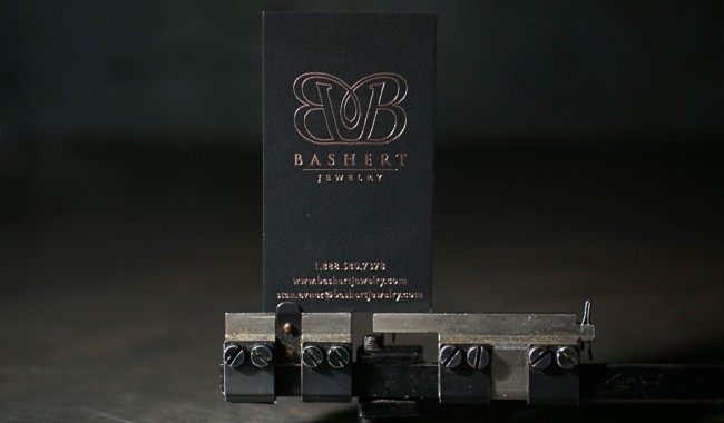
Here at Boxcar Press (also home to Smock and Bella Figura), we move excess paper and product in a variety of ways. Beyond our regular green printing efforts (we have a weekly pickup from the Empire Recycling Company and we reuse paper scraps in the office for notes), we have a few events to move out excess product and sell items that would otherwise just gather dust. We started hosting a Sidewalk Sale to sell slightly imperfect cards, notebooks, gift wrap, boxes, and more at extremely low prices. Partnering with local food trucks has been a great way to boost attendance and make the event really fun! If you’re near the Syracuse area, our 2014 Sidewalk Sale will take place on Wednesday, August 13 and Thursday, August 14 from 11am-5:30pm.

Smock's 2013 Sidewalk SaleSmock's 2013 Sidewalk Sale

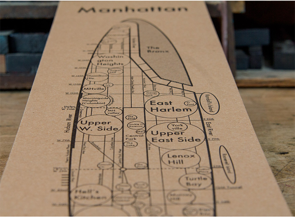
In addition to the Sidewalk Sale, we also invite teachers from the Syracuse City School District to come in and stock up on papers for their classroom projects during our annual paper giveaway in October. We save excess envelope liners, paper scraps, and envelopes throughout the year, and the teachers stock up and put these offcuts to good use.

Teachers_MG_8957Every October, Boxcar Press organizes a paper giveaway for local teachers in the Syracuse City School District

Igloo Letterpress of Worthington, Ohio — We are part of a few neighborhood Facebook “freecycle” groups and every time we have a stack of extra cardboard, paper scraps, or even unused furniture or supplies, we post a picture on Facebook and let people know they can come grab what they like from a shelf on the porch. We are very connected to a few elementary schools and the local preschool in the neighborhood, so we often bundle up boxes of usable scraps and pass them on. There are also some great arts companies, guilds and groups in Columbus that call us every once in a while to see what we might have – we are never short on paper to give away!

With our seconds, we organize them into our bathroom-turned-sample-room and are generous in giving them to future clients. We love being able to send clients home with a stack of beautiful letterpress items to remember us by. For discontinued items and styles, we clearance them in our retail shop, and gift them to lucky customers as a bonus for a sale on other items. It’s always nice being able to use a few extras to smooth over a rough transaction, and fun being able to offer a bonus card for a large online order.

Igloo-Paper-Roundtable-IMG1

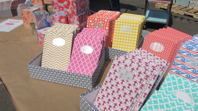
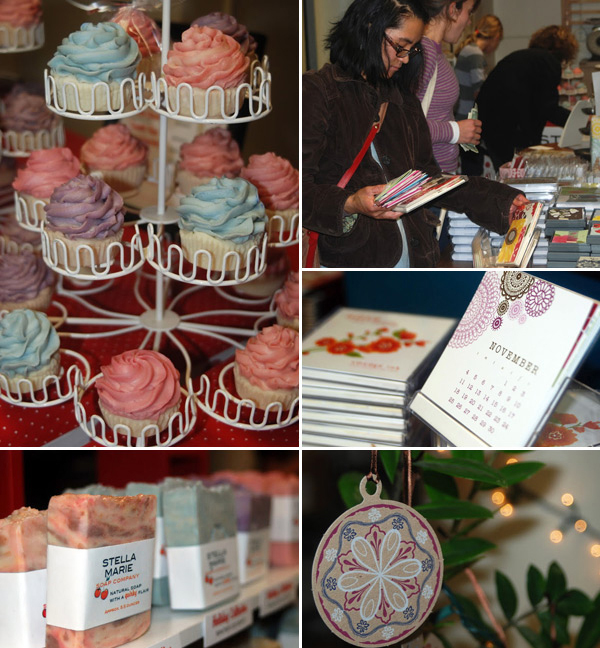
Sugar Paper of Los Angeles, California — At Sugar Paper, we take recycling very seriously. All scraps that result from die cutting or misprints on the letterpress machines are recycled on a weekly basis. We have 2 bins in the pressroom dedicated to recycling. Any extra inventory or discontinued items are all part of our sample sale that occurs in the spring right here at our Los Angeles studio (and they are sold with crazy low discounts!) If we have paper that we haven’t used and will no longer need for any of our products (think extra envelopes or discontinued paper stock), we post the news of extras on our social media channels and give local schools and programs a chance to come pick them up. The photos below are from our sample sale last spring.

Sugar-Paper-Roundtable-IMG1

Jenni Undis of Lunalux in Minneapolis, Minnesota — I am thrifty and resourceful by nature, so we reuse as much as we can at Lunalux. We’re lucky to have a retail boutique and a letterpress studio in the same space – we can re-purpose even the smallest scraps and off-cuts, and sell them directly to the paper-obsessed people who will appreciate them the most. If we end up with extra stock from a custom project, or big-ish scrap, we print whatever suits our fancy and turn it into a little product on the shoppe. The shelves here are full of small-run notecards, notepads, bookmarks, and tags. Odd bits of blank paper are bundled with bakers twine and sold for a dollar (perfect for DIY gift tags, place cards, etc.) Make-ready, mis-print and over-print posters are reincarnated as notebook covers. We’ll even trim the decorative elements off old invitation samples and pair them with tiny envelopes – fancy, limited-edition gift cards! If it ends up in the recycle bin, it’s pretty dirty, small, non-descript, or otherwise useless.

We recently had a “Paper by the Ounce” sale. We pulled out boxes and boxes of discontinued wholesale products and sold them for $1 per ounce. People bought pounds. A nice way for us to send useful, cute stuff out into the world and make room on our shelves.

lunalux-Roundtable-IMG1

Haute Papier in Arlington, Virginia — Scraps take on a whole new life once they become the skinny strips that are left after we cut our papers down for liners.  We use the “bands” as we call them to wrap our boxes of stationery before they ship out to our stores.  And because we have WAY more strips than we could ever use, we also donate them to elementary schools for their art programs.

Since we never make mistakes, we don’t have seconds…. just kidding.  We often use these in house for writing notes to our stores and sending little treats along with our orders.  For discontinued items, we sell by the bundle, give to schools, and try an inventive sale idea.

haute-papier-Roundtable-IMG1

Smudge Ink in Charlestown, Massachusetts — We schedule paper giveaways for local teachers, art instructors and community leaders. They come for a 3 hour period and clear out our excess paper and envelopes. This is usually posted on social media. We also have a yearly holiday Sip and Shop and have a few bargains for people in addition to our new products.  Some of the proceeds from that event go to the Greater Boston Food Bank, so we have the satisfaction of helping, too.

Smudge-Ink-Rountable-IMG1

Matthew McNary of Hammerpress in Kansas City, Missouri — We recycle the majority of our paper scraps on a weekly basis. Occasionally, our folks get creative inspiration and repurpose the scraps for interesting things (like dog jewelry) or personal projects. If the scraps aren’t too small (and are somewhat uniform in size), we’ll store them and reuse them for projects that fit smaller press sheet sizes (like business cards or hang tags) or for our own small printed materials. For example, our last run of business cards were printed from scraps of a postcard project.

Twice a year, we gather all our misprints, make-readies and discontinued product for a big sale. All cards go for $1 and larger sheets sell for $3-$7. It’s proven to be a great way to offer some great deals to our customers while giving us the opportunity to open up some storage space and generate a little revenue from paper that would otherwise be gathering dust or taking up space in a landfill somewhere.

Hammerpress-Roundtable-IMG1

Joey Bordega of Mama’s Sauce in Orlando, Florida — We do lots of recycling. In fact, we’ve got a 4 yard dumpster specifically for recycling that gets picked up weekly.  All of our excess, unusable paper goes in there.  Sometimes, a project will leave a usable amount of paper left behind.  If it’s one of our house stocks, we trim it down to one of our commonly used sheet sizes (maybe 4UP or 16UP business cards) so that it’s ready to go next time we need it.  If there’s something left from a more uncommon paper order, we’ll add it to an internal inventory at a highly discounted rate so our consultants can try to use it on an incoming project that could benefit from that paper.  On occasion, we’ve given leftover paper to a local school teacher to use for art class.  We love paper and try to use every square inch!

mamas-sauce-Roundtable-IMG1

What does your shop do to help move excess paper? Share your tips in the comments section below!

How to Create a Cutting Diagram for Steel-Backed Plates

While steel-backed plates are fun to print with, cutting them down is not so wonderful. If you do not have access to either a heavy guillotine paper cutter or tin snips,  we can (and would be happy to) cut down your steel-backed custom-made plates for you. Simply include a simple, separate cutting diagram file when uploading your file.

We ask that you create a separate file showing your cut mark lines in magenta (Cyan=0, Yellow=0, Magenta=100, and Black=0). The smallest plate size we can trim is 1.5″ x 1.5″ as we use a heavy board shear (heavy guillotine cutter) to make the straight cuts. Please add spacing on either side of each magenta line equal to at least 0.75″ (keep in mind the safety of the tips of our fingers). Only use straight lines and no diagonals, please. Save your cutting diagram file with the words “cutting-diagram” in the file name to alert us that the file is for cutting purposes.

workspace-cuttingdiagram-2

(Notice that the correctly set-up sample has straight lines with enough spacing on either side of the magenta cut lines)

When you have your cutting diagram file and original file ready, upload both to your ticket during the ordering process. Make sure to “decline” all previews for the cutting diagram file as this will ensure accurate plate cost calculations.

Fantastic Prints at Foxhill

Less than five miles away on the sunny and serene campus of Syracuse University in the spacious  Comstock Art Facility, Landon Perkins is layering fine arts printmaking with hand-set type, letterpress, and relief cuts with a touch of mixed-media curiosity. Between ink runs, we caught up with the graduate student on pursuing his MFA, his love for combining a hybrid of old-school printing techniques & the buzz of photopolymer plate technology, and his work at Foxhill press.

Landon_Perkins_IMG1

PRINTING NEIGHBORS My name is Landon M. Perkins and I also go by the press name “Foxhill.” I’m a printmaker and designer currently pursuing an MFA in printmaking at Syracuse University in New York. I’m a native to Tallahassee, Florida, where I attended Florida State University and achieved a BFA in Studio Art in 2014.

LETTERPRESS LOVIN’ I first became aware of letterpress when I visited Denise Bookwalter’s SCAP (Small Craft Advisory Press) in Tallahassee, Florida. I was immediately drawn to letterpress because it seemed to be a hybrid of my favorite mediums of silkscreening and relief printing. I interned at SCAP earlier this summer for a few months and learned how to make photopolymer plates as well as helped assist book artist Jessica Peterson in letterpressing an edition of artist books she was creating.

Landon_Perkins_IMG2

EXCITEMENT IN THE EMPIRE STATE The printshop I currently work in is the Comstock Art Facility at Syracuse University. We have so much great equipment it’s hard to list it all! I think what really stands out about our printmaking facility is just the huge array of presses available. You can literally walk 20 feet and pass various presses ranging in relief, intaglio, litho and letterpress. We also have some of the original Goudy type in our letterpress room!

PRINTING MENTORS I’ve always been a “do-it-yourself” kind of person. I used to think I was only good at design work and was afraid to dive into the fine art field, until one day, I grew bored of simply creating designs on a computer and then printing them out on standard size paper with an ink jet printer. I had no  control over the quality of the paper and ink fed into the printer. I felt like I was doing myself an injustice by not knowing how to really print the designs I was creating at the end of the day. This all changed when I met Denise Bookwalter at Florida State University. She taught and mentored me in the field of printmaking until I graduated from FSU in the Spring of 2014

THE DESIGNER & PRINTER I am currently a printer and a freelance designer. To me, design and print go hand in hand with each other; you can’t successfully do one without the other.

THE CREATIVE PROCESS My process normally begins with some type of light bulb or thought going through my head regarding the general work I am creating at that moment in time. I then try to sketch out what’s in my head and translate that to paper. Sometimes it works out, often times it doesn’t. Once I get past that initial phase and like the direction that my general design is heading, I open up Adobe Illustrator and re-draw my design, which can be eye twitching sometimes, but as the saying goes, “the devil is in the detail.”

Landon_Perkins_IMG4

Once that’s finished I normally drag that design into Adobe Photoshop and tinker away, changing little things I’m not sure anyone else would even notice at the end of the day. The hardest part about design for me is realizing when you’re at a stopping point and when something is finished. I find that simplicity is key when making a good design and that’s often the hardest thing to do as a designer.

Landon_Perkins_IMG8

FULL TIME FUN I am currently printing full-time as a graduate student and couldn’t be happier about it! I’ve been working in the field of printmaking now for three years and feel like I am still learning something new everyday that makes my jaw hit the floor and realize, “you can do that in printmaking!?” My ultimate end goal is to one day become a professor teaching in the field of printmaking.

PRINTING FEATS While I don’t have a lot of accomplishments yet (as I am only beginning to work in the field of printmaking), what I am most proud of right now is just to be given the opportunity to work towards an MFA in printmaking at Syracuse University. My heart sank for a while when I was applying to graduate schools and looking at the statistics of applicants accepted into any given school.
Landon_Perkins_IMG3

The other accomplishment I am very proud of is finishing a three-month long piece for my graduation thesis titled “Metropolis III.” It is the largest piece I have ever worked on, weighing 200 pounds and measuring 5 ft by 8ft. For three months, I layered a giant custom-built piece of wood with relief prints I created, papers of different textures, sizes and colors and miscellaneous items. I was working to mimic the complexity of a city district building on top of itself. I am very much interested in the marks humans and machines are leaving in the world. The destruction of the human environment you find in most cities is just as important as its construction.

Landon_Perkins_IMG5

PRESS WISH LIST I have yet to own my own press, as one is not rolling in money as a graduate student. But I hope to one day buy a Vandercook 219 and if need be, refurbish it on my own as a do-it-yourself project.

BOXCAR’S ROLE  I first learned about Boxcar from Allison Milham who is a printmaking teacher at FSU and, long story short, she told me all about Boxcar Press and their very quick turnaround with photopolymer plates for letterpress. Funny story, I’m actually in the middle of designing and ordering my first plate from Boxcar to letterpress some business cards!

Landon_Perkins_IMG7Landon_Perkins_IMG6-6

SHOP TIPS The only advice I can share this far into my printmaking career is to work hard and don’t be afraid to try new techniques and fail at them. I like to consider myself a good printmaker, but that’s only because I’ve failed a lot learning the practice and I know I am going to continue to fail as I work toward an MFA in printmaking. Hopefully if I fail enough, that one day I’ll become a great printmaker.

WHAT’S NEXT My plans for 2015 are currently to visit and explore Canada and various northeast cities in my free time, get the ball rolling on finding clients for freelance design work. I’m also planning on attending the annual printmaking convention at SGC in Knoxville, Tennessee for the first time!

Huge round of thanks out to Landon of Foxhill for letting us get a sneak peek inside his wonderful printing world!

Rose Gold Foil Stamped Business Cards

We worked with Sarah at the Windmill Paper Boutique in Boca Raton, Florida to create these foil stamped business cards for Bashert Jewelry. We used our Kluge press to foil stamp the cards with rose gold foil on thick, 2-ply black museum board. The end result? Simple, elegant and luxurious.

BC_11A1706BC_11A1705

Client: Bashert Jewelry | Designer: Sarah Gluchacki from the Windmill Paper Boutique | paper: 2-ply Rising Museum Board, black | foil: rose gold shine | press: Kluge | Job #22568

How to Prepare Calligraphy & Hand-drawn Text for Letterpress Printing Plates

One of the more popular questions we get asked here in the Platemaking Department at Boxcar Press is the curious query: “What’s the best way to prep calligraphy and hand-drawn text or artwork for letterpress printing plates?” Understanding how to prepare scanned-in calligraphy and artwork starts first with knowing what file type/format works best for the type of artwork you are scanning in and utilizing the software programs that are accessible to you or your designer.

The most basic formatted file from scanned-in artwork or calligraphy is a TIFF (file extension) in Bitmap color mode. This pixel-based file type is good for keeping tiny details & linework and also produces crisp, solid shapes on the plate. This also means that if you zoom in very closely and examine the edges of shapes, they are slightly jagged, pixelated, and not 100% smooth. If the artwork is scanned in at high-quality resolution (600-1200 DPI), this pixelation is not as visible to the naked eye when you print with the plates.

A great software program that excels in this arena is the pixel-based editing program, Adobe Photoshop. Adobe Photoshop is a powerful editing program that offers a wide range of editing & manipulating options and tools. When scanning in your artwork, hand-drawn text, or calligraphy, make sure that you are using the highest resolution possible (at least 600 DPI) and in a grayscale color mode. This high resolution will ensure that the maximum amount of data will be scanned in and result in a better quality file that you can edit later on. A low-resolution scan (72 DPI-150 DPI) is not recommended as it will not produce the best results. Lower qualities scans and files will show extreme pixelation, illegibility, and “fuzziness” when zoomed in closely on the artwork.

inset-workspace

Above is a example of scanned-in calligraphy file set in grayscale and at 600 DPI. Notice the grayscale and slight pixelation of the edges of the letterforms.

Before converting to TIFF in Bitmap Mode, make sure to edit & fine-tune the artwork by removing blemishes & extra noise as well as fixing breaks in the linework and forms. Once you have your finalized high-resolution grayscale digital file, we recommend the following steps to create a TIFF in Bitmap Mode using Adobe Photoshop:

  • Open your grayscale image in Photoshop.
  • Select Image> Image Size. Change your resolution so that is high (300-600 or more). Make sure all of your artwork is 100% the size you need.
  • Select Image > Mode > Grayscale.
  • Select Yes if a window asks about discarding color.
  • Select Image > Adjustments > Threshold.
  • Move the slider to “preview” what 50% Threshold Bitmap will look like.
  • Move the slider as far to the right to thicken up your objects as much as you can bear. The thicker the object, the better chance it has to hold to your plate type.
  • Click OK (if it prompts you).
  • Then Select Image > Mode > Bitmap. A window will pop up looking for info – use the same output resolution number as the input (e.g. Input: 1200 and Output:1200) and an output method of 50% threshold.
  • Save your file as a TIF (with LZW Compression). Your program may be set to the default of NONE.  LZW compression is the next choice down.

Calligraphy-Bitmap-file-sample

Above is our sample of scanned-in calligraphy that has been treated so that it is a TIFF in Bitmap Mode. Notice the smoothness of the shapes and the minimal pixelation on the letterforms.

When you have your scanned-in artwork file saved as a TIFF in Bitmap mode and want to take the file to the next level, we recommend turning the rasterized artwork into vector-based artwork via a software program such as Adobe Illustrator. Depending on how detailed your artwork or calligraphy is, converting to vector may not be the best option as some of the finer details and smaller objects may be lost. Simple calligraphy or hand-drawn text that has strong forms & shapes may be suitable for vector conversion whereas extremely frail strokes and tiny details may not.

In Adobe Illustrator, you will need to open your TIFF in Bitmap mode file. Then select the artwork using the black arrow (default arrow) tool and select Object>Live Trace. If you have Adobe Illustrator CS5.5 or higher, it will be Object>Image Trace. You can edit and tweak the setting of the Live Trace (or Image Trace in newer versions of Illustrator) to display different vectorized results. Try first the default setting and then experimenting with the “Lettering” setting.

Remember, you can always Edit>Undo if the results are not want you like. Vector conversion with Live Trace / Image Trace may not suit every occasion. We’ll be covering tips and tricks on how to get the best Live Trace results in an upcoming blog post so stay tuned! Additionally, for more amazing information on file formatting, Letterpress Commons has a brilliant section on Raster Vs. Vector: When to Use and Why.

We’d love to hear your thoughts and any tips you’d like share in the comments section below!

Mohawk launches new Strathmore paper for letterpress printers

Mohawk has a new paper for letterpress printers: Strathmore Pure Cotton Letterpress papers. These papers have been designed to emulate the look and feel of handmade papers, with a luxurious surface that allows for a beautiful contrast between the sheet and the printed impression.

New Strathmore Pure Cotton Letterpress paper & envelopes

New Strathmore Pure Cotton Letterpress paper & envelopes

New Strathmore Pure Cotton Letterpress paper & envelopes

Strathmore Pure Cotton Letterpress Paper is available in two shades of white, Ultimate White and Soft White and two rich colors, Smoke Gray and Chino. The paper is available in two calipers: 18 pt for digital printing and 20 pt for letterpress printing. Matching 80 text envelopes are available with square or Euro flaps. Visit Mohawk to learn more.

The Printing Power of Archie’s Press

Sometimes the letterpress journey takes you by surprise. When we spoke to the incredibly talented Archie Archambault of Archie’s Press, he hinted at the curious turns printing has taken him. From humble beginnings of learning the value of patience & process to his travel-bug that combines printing letterpress maps and exploring new cities. We caught up with Archie to spill the beans on the best kept secrets in the cities he’s traversed through and what destinations lay on the horizon.

Archie Archambault prints on his Chandler & Press in Portland, Oregon.

PRINTING IN PORTLAND My name is Archie Archambault. I’m a designer and letterpress printer in Portland, Oregon.

LOVE AT FIRST SIGHT I first learned letterpress during a short session in college. It was a really thorough 2 week course with Barbara Henry who was militant in teaching us the proper and methodical way to print. Being a rather messy person, I resented this at first, but in reality, learned the value of patience and process. I realized it was a passion when I figured out I could grow a business doing something with my hands.

OREGON AUTHENTIC The studio where I print, Em Space, is in a beautiful old factory building with white floors, white walls, more than seven presses, 10 type cabinets, a board sheer, two guillotines and all sorts of fun equipment that I don’t know how to use. It’s in a great location with coffee and food nearby to keep us going when we have late nights printing. We have two Vandercook 219’s, a large C+P, a small treadle-powered C+P, three hand presses, a large sign press and a small sign press.

PRINTING MENTORS My printing mentors are: Rory Sparks (Director of Em Space) and Barbara Henry who taught me all the ins & outs of the process.

Archie Archambault of Archie's Press locks up a Boxcar Base and displays fine letterpress printed maps.

DESIGNED FOR PRINT I design minimalist maps that explain the major gestures and neighborhoods of cities. It has been a great blessing to find something that allows me to travel, design and print for profit.

THE CREATIVE PROCESS My process starts by visiting a city and meeting as many people as possible and exploring the city as thoroughly as possible. With feedback from the locals and hours on the computer, I create a conversation with the city until everything is in the right place for the utmost clarity. Although printing is only one aspect of the business, it can take up entire weeks at a time. I would love to get a Windmill so I can save my back a little. It really takes a toll on the body.

Festive holiday letterpress cards are printed by Archie Archambault of Archie's Press.

PRINTING FEATS I’m very proud to have finished 17 maps with plans to grow much more in the next year. I’m very proud to have built a great network in every city I visit and to have a completely self-sustained business that feeds me and helps me travel even more!

Archie Archambault of Archie's Press prints fine letterpress maps of Manhattan / New York City.

PRESS HISTORY The first press I used was an Asbern of all things. Asberns have this cool clutch thing on that gets the press into trip, and remains my favorite press to use. It also has a variable carriage so it’s super-easy to adjust pressure. I still don’t own a press, but as my business grows, I want to hunt down anything I can find. They’re going so fast!

Archie Archambault of Archie's Press prints beautifully crafted letterpress maps of Los Angeles.

BOXCAR’S ROLE The first time I tried to order a plate from Boxcar, they immediately called me and told me what I was doing wrong. That was invaluable!

Archie Archambault of Archie's Press sets up a printing job on his Chandle & Price press.

The whole process was so painless and the customer service impeccable. That makes my life as a printer much, much easier.

SHOP TIPS My best piece of business advice is to decide early on if you’re interested in doing custom work or starting a product line. When people visit your website, they want to know what you do. Don’t half-ass either of them. A product line can take a lot longer to get going and is much riskier, but can sometimes offer more freedom in the long run.

A fine letterpress card of vintage engravings by Archie Archambault of Archie's Press.

WHAT’S NEXT I’m going on several mapmaking tours over the next several months including: Milwaukee, Chicago, Detroit, Toronto, Philadelphia, Portland (Maine), Montreal, Baltimore, Indianapolis and Columbus.

Big round of thanks and applause out to Archie of Archie’s Press for letting us get the full story!

Taking A Nibble Out of Sharp Teeth Press

David Johnston is not your average printer. As a part-time printer behind the crisp impressions of Sharp Teeth Press, David has deftly intertwined his passion for bookmaking, typecasting and letterpress printing into a solid printing mecca inside his Oakland, California abode. Armed to the teeth with a insatiable craving of perfection and creativity, we sat down with him between press runs to catch a glimpse of the fun.

David Johnston of Sharp Teeth Press in his Oakland printshop.

PRINTING WITH A WILD STREAK  I’m 28 years old and I live in Berkeley California. I grew up in Walla Walla Washington, a town that has an odd mix of intellectual, agricultural and, at the time, punk influences. So I would work on the farm after school and then go downtown to the punk shows. I was into skateboarding and snowboarding and didn’t really think about art till I went to college and met Jessica Spring. After graduating college I spent four years as a typecasting apprentice at M&H Type in San Francisco.

THE ALLURE OF LETTERPRESS I took a design class to fulfill a course requirement at Pacific Lutheran University in Tacoma Washington. The class was in the same room as the letterpress and book arts class, which are both run by Jessica.

I saw all the old stuff (a couple of C&P presses and some cases of type) and knew I had to learn about them. Jessica did an interesting thing with the class — she didn’t even tell any of us about photopolymer printing until the very end of the class, when I was trying to work out this complicated image and she let me in on the big secret. The whole class was handset type, carved blocks for images, and hand bound books. The coursework drew almost completely from an artistic and craft-based past, which I thought was an excellent way to be introduced to the field.

A closer look at the presses of Sharp Teeth Press.

WEST COAST WONDERS My shop is in a large and crazy warehouse in Oakland. The building used to be the American Steel manufacturing plant, so it’s got lots of nice features like a few cranes and lots of power. The building is full of artists and entrepreneurs of all kinds. My equipment includes a Vandercook, Vandercook 1, Thomson Laureate, Challenge paper cutter, Monotype Composition Caster, Hammond Glider saw, Kensol hot stamper, and Potdevin glue machine.

David Johnston of Sharp Teeth Press working in his printshop and views of the printshop.

David Johnston of Sharp Teeth Press shows off his impeccable bookmaking pieces.

DESIGN + PRINT  The majority of my design is book design. Occasionally I do wedding and related stationery design for friends, and I do some large-format metal type and linoleum carving prints. But I do quite a bit of stationery printing for other designers.

THE CREATIVE PROCESS When designing for clients, I usually know them fairly well and can gauge what will please them, and draw from their personalities to direct the design. Designing for books is more fun, and carries a bigger risk because of the larger costs involved and the time it takes to make the things. I start with choosing a paper, typeface (I really only have a few that I can cast in-house), and an artist to accompany the text. Once those things are in motion, I can take a look at the title page and then the cover. It starts with the mundane and then I’m comfortable to work towards the interesting.

A 20,000 POUND HOBBY I do not print full time. I work full time for a construction company. I would love to print full time, but I’m still putting all of the pieces together to run an arts-based business. There are a lot of companies around this area that start off with a lot of capital and a product that may or may not make money. I’m trying to avoid that business model, building a company by first proving that it works as a business, and then trying to run it full time. It seems that when I reach some mystery amount of volume and velocity I’ll be able to take it on full time. ‘Til then it’s a 20,000 pound hobby.

David Johnston of Sharp Teeth Press and a impressive letterpress printed book.

PRINTING FEATS I’m most proud of the autonomy with which I’ve been able to set up a typecasting, printing, and binding shop. I took a small loan to buy my first press, which I had professional help moving into my garage. Since then, I’ve done enough business to buy all of my own machines, and I’ve moved a lot of large equipment. I’ve had a lot of help from friends, but I have a well-equipped shop that’s been set up by twentysomethings, including the plumbing and electricity.

David Johnston of Sharp Teeth Press setting up a print run.

BOXCAR’S ROLE The Boxcar bases are instrumental in nearly every print job that I do, be it books or stationery. I don’t have Boxcar make my plates because I can get it done locally by Logos Graphics. But the gridded bases are so key. I’d be such a mess trying to line up anything without them.

PRESS HISTORY My first press was a Vandercook 32-28. Maximum sheet size is 32 x 28 inches. It’s as long as my car.

SHOP TIPS I usually mix opaque white to match Pantone colors when the swatches call for transparent. I’m not sure how those things are supposed to work exactly, but I get a lot better results with opaque.

Also, to help get those really bright, pale colors, I usually run white on the press and then clean it before putting on a delicate color. It’s an extra round of cleaning but assures that your colors will be as bright as possible.

Beautiful printed pieces from Sharp Teeth Press.

WHAT’S NEXT The biggest plan for this year is to print a first-edition text completely from metal type with new illustrations on handmade paper. The text is by Kirk Lombard and the illustrations are by Martin Machado. The project is daunting and will be expensive, but if I can’t print new books on fancy paper then I don’t want to play any more.

Huge heaps of thanks out to David for letting us take a closer look at Sharp Teeth Press.

Gold Shine Foil Stamped Gala Invitations

We worked with the talented and gracious Katie Barr of Tucked to create invitations and place cards for Reach for the Stars, a fund-raising gala to benefit St. Anne’s – Belfield School, a private school for Kindergarten through 12th grade in Charlottesville, Virginia. The double-sided invitations feature gold shine foil stamping and an exquisite constellation map on sapphire paper. The place cards included an inspirational poem and Katie personalized them by using metallic gold ink and a calligraphy pen to write each guest’s name. The combination of the design elements, gold foil and rich paper color made for quite the dramatic look!
Foil stamped place cards printed by Boxcar Press Gold foil stamped gala invitations printed by Boxcar Press, designed by Katie Barr of Tucked BC_MG_8668Gold foil stamped gala invitations printed by Boxcar Press, designed by Katie Barr of Tucked

foil stamping: gold shine | paper: Colorplan 100# cover in sapphire | size: invitations 5 x 7 when folded; menus 4.12 x 9.12  | job numbers: 22003 + 22392

Place cards photographed by KMS Photography