The way Iowa native Elizabeth Munger of The Paper Nest speaks of letterpress, you find her exhilarated, curious, and earnest. Her voice on the relationship of paper choice and printing is crisp, bright, and even. And for good reason—after exploring the University of Iowa Center for the Book program, serendipity chanced upon her when a good friend teamed up with her to form The Paper Nest (a shop that shows lots of love to quality paper and printing). Elizabeth sat down with us to discuss the new future of letterpress, shop tips, and the heaping mounds of press fun that go with it.
UP CLOSE WITH ELIZABETH MUNGER I am an Iowa native who’s been making art as long as I can remember. It started with my obsession for drawing horses. I am a maker by nature and my hands are usually busy with some form of crafting.I have been printing for about 14 years and running the Paper Nest for three. Printing is definitely one of the things I enjoy most. I am process- oriented and love problem solving on the press.
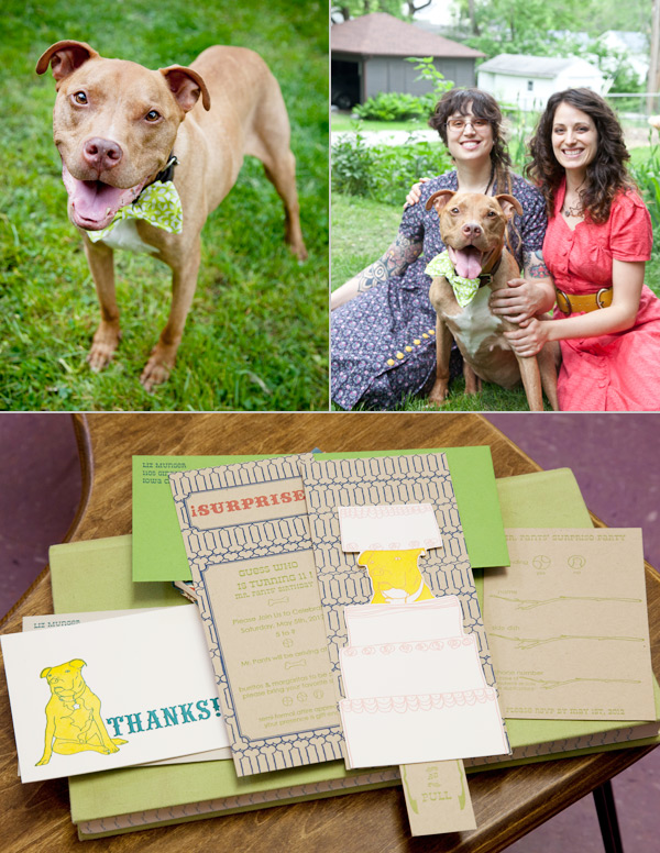 When I’m not on the press, I’m usually sewing, drawing, and doing collage/ assemblage work. If I have access, I love to make paper. When I’m not engaged in some form of art, my favorite thing to do is pal around with my dog, Mr. Pants.
INK IN THE BLOOD My first love was Intaglio. Then, a few years later, I was introduced to letterpress while enrolled in the University of Iowa’s Center for the Book. During my time there, I discovered paper and relief printing which had never made much of an impression on me before. Learning to use a Vandercook was a revelation in printing for me. I went from hand wiping plates to using a self- inking machine. It totally changed the way I thought about printmaking and I felt like I could literally print a million!
My main focus was making artist books. I spent a lot of time thinking about images & materials and how they worked together. Since I was set on editioning, I was constantly ordering paper online. I had a friend who was doing the same thing, and one day, she and I were talking about how convenient & great it would be to buy paper locally. The idea eventually worked its way into the Paper Nest and because paper & printing go so well together, it seemed only natural to make it a paper and letterpress shop.
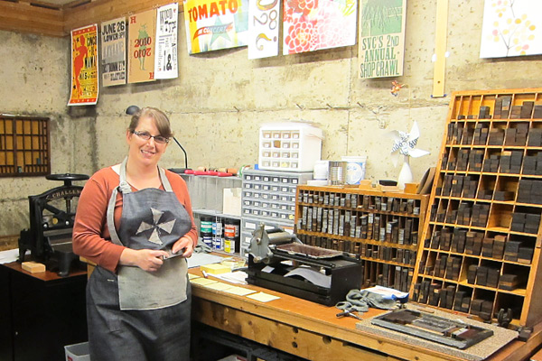
INKING UP IN IOWA The Paper Nest is a combination letterpress and paper store. I sell printing and bookbinding papers and tools and custom letterpress printing. I ran it out of my home the first year. The Vandercook was in my home studio and my paper inventory was on a second floor studio that I rented. My first inventory order was 450 lb. and I pretty much knew then and there that I needed to find a location that was ground level. I sort of lucked out a year later when I ran into a friend of mine, who runs a bead store, Beadology, here in Iowa City. She had a space in the back that she was interested in renting to another small business. This became the home of the Paper Nest.
 Now I have a downtown location that has an alley entrance and is big enough to house me, my dog, Mr. Pants, a C&P craftsman, a huge guillotine, paper cutter and all my paper. We have been here going on 2 years now, and I am constantly humbled with how lucky I’ve been to be surrounded by such a great printing, bookbinding, & crafty community.
PRINTING LEGACIES Virginia Myers was my first printmaking instructor at the University of Iowa, and was a huge influence on my intaglio and foil printing. She is an amazing person, & without her I would have never discovered printmaking.
My other mentors would probably be the ladies I took my first letterpress class with. I had never been part of a group that was constantly doing such great work. This really encouraged me to push myself & make the best work I could.
THE DAILY GRIND As much as possible, I like to collaborate with whomever I’m working with/ for. I try to start by getting as much of an idea of what they want. Sometimes this means we work backwards from what they don’t like to get to what they really like. For example, we might start with something as vague as colors or tone to more concrete ideas such as image.
I really enjoy researching to play on historically correct images, font, and materials. I tend to draw everything by hand and then combine it with text. I try to use the computer as a tool, not as my main substrate.
PRINTER’S PARADISE I am both [a printer and designer], although I feel like I relate more into an artist/ printer category then designer. My goal is to definitely have one job: printing and talking about paper.
 PRINTING FEATS Opening up this business is probably one of my biggest accomplishments. I have to learn all sorts of things that I never thought I would. My latest accomplishment, which I am very excited about, is that I was accepted into the MFA program at the University of Iowa Center for the Book and will be starting this fall.
 BOXCAR’S ROLE Boxcar has been awesome! It is nice not worrying about making plates. It’s so convenient to be able to send out a digital file and get plates back that are so clean. If it weren’t for Boxcar, I would have more steps and be spending more time making them myself.
 It’s such an advantage to be able to call Boxcar and get advice on how to make a file better for plates. I also think their printing videos are great. I feel like they really walked me through a number of printing issues.
PRESS HISTORY Well, I was getting ready to graduate from the University of Iowa’s Center for the Book and was starting to feel anxious about not having access to a press. I started looking around and put the word out. An instructor at the Center mentioned that she had a Vandercook Universal I and I was welcome to come by and give it a look. So I went and checked it out, and that was pretty much it. I had to do some work on it before I moved it (lots of sanding rust, new rollers, etc.)
This was pretty great because it allowed me to really get to know the press and it made it seem more like mine. The other interesting thing is that she bought the press, along with the rest of a print shop, from someone who had been storing it for years, in a garage in Sioux City, Iowa. Coincidentally, I grew up in this city, so we were in the same place at the same time but never met. It took us both moving to Iowa City to meet!


SHOP TIPS My best piece of business advice is to take advantage of your local resources. If you don’t know how to do something there is usually some one in your community who is happy to help and vice a versa. This also helps to build a community. I also think being open to new possibilities and taking action is what ends up making me feel the most successful.
 WHAT’S NEXT Well I’m lucky enough to have my sister, Katie Munger, back in Iowa. She has similar interests and recently decided to come back here and help me with the Paper Nest. I’m also really looking forward to getting a better handle on the business end of things and expanding. I’m hoping to offer more preprinted products as well as custom work and binding workshops. Eventually, I’d like to be able to offer equipment rental and printing workshops.
Big round of thanks to Elizabeth for letting us get the full scoop on The Paper Nest!
 UP CLOSE WITH LAURA BENTLEY When I was young I enjoyed doing artsy things, but in college I went a different direction and got a Computer Science and Accounting degree. By day I’m a computer consultant mostly for a dance studio that teaches social dance—ballroom, salsa, and swing. I run their website, set up their sales system, and do their bookkeeping. So, I’m a hobby letterpress printer, and try to squeeze in time to print when I can. I also volunteer as a teaching assistant for the letterpress classes at SVC (School of Visual Concepts) in Seattle.


 David Black is a fellow teaching assistant and a print artist. I personally consider him a mechanical genius as he can fix almost anything, and has a real gift for explaining how things work. But what inspires me most is that he makes time to print most every day. He once printed a little card that had a tiny ornament of a car and the text said “Tiny car”; only black ink on white paper. It was a great reminder to me that you don’t always have to be printing big extravagant projects, but can print quick fun things, and you’ll learn something with each new thing you print.
 PRESS HISTORY A gentleman named Carl Montford, the self-nicknamed “press matchmaker,” matched me up with an 1863 Gordon Franklin press. It was in the basement of a local artist that wasn’t using it anymore. It’s a great match for me, because it’s a smaller platen press (chase about 7 x 11) and we needed to get it down into my basement. The press would be a little wonky for production work, but it suits a hobby printer like me just fine.


