At lunchtime, Stan brought in his handmade marimbas to hear them in the printshop cavern.
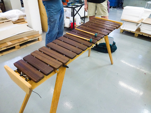
It was a wonderful impromptu concert!

Sounded great!
Tag Archives: letterpress printers
Boxcar Talk With Elizabeth Munger
The way Iowa native Elizabeth Munger of The Paper Nest speaks of letterpress, you find her exhilarated, curious, and earnest. Her voice on the relationship of paper choice and printing is crisp, bright, and even. And for good reason—after exploring the University of Iowa Center for the Book program, serendipity chanced upon her when a good friend teamed up with her to form The Paper Nest (a shop that shows lots of love to quality paper and printing). Elizabeth sat down with us to discuss the new future of letterpress, shop tips, and the heaping mounds of press fun that go with it.
UP CLOSE WITH ELIZABETH MUNGER I am an Iowa native who’s been making art as long as I can remember. It started with my obsession for drawing horses. I am a maker by nature and my hands are usually busy with some form of crafting.I have been printing for about 14 years and running the Paper Nest for three. Printing is definitely one of the things I enjoy most. I am process- oriented and love problem solving on the press.
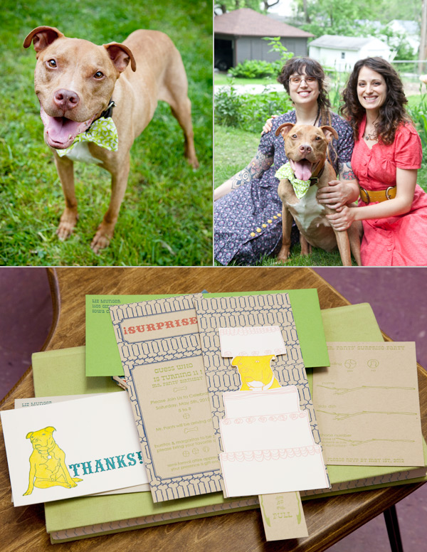 When I’m not on the press, I’m usually sewing, drawing, and doing collage/ assemblage work. If I have access, I love to make paper. When I’m not engaged in some form of art, my favorite thing to do is pal around with my dog, Mr. Pants.
INK IN THE BLOOD My first love was Intaglio. Then, a few years later, I was introduced to letterpress while enrolled in the University of Iowa’s Center for the Book. During my time there, I discovered paper and relief printing which had never made much of an impression on me before. Learning to use a Vandercook was a revelation in printing for me. I went from hand wiping plates to using a self- inking machine. It totally changed the way I thought about printmaking and I felt like I could literally print a million!
My main focus was making artist books. I spent a lot of time thinking about images & materials and how they worked together. Since I was set on editioning, I was constantly ordering paper online. I had a friend who was doing the same thing, and one day, she and I were talking about how convenient & great it would be to buy paper locally. The idea eventually worked its way into the Paper Nest and because paper & printing go so well together, it seemed only natural to make it a paper and letterpress shop.
INKING UP IN IOWA The Paper Nest is a combination letterpress and paper store. I sell printing and bookbinding papers and tools and custom letterpress printing. I ran it out of my home the first year. The Vandercook was in my home studio and my paper inventory was on a second floor studio that I rented. My first inventory order was 450 lb. and I pretty much knew then and there that I needed to find a location that was ground level. I sort of lucked out a year later when I ran into a friend of mine, who runs a bead store, Beadology, here in Iowa City. She had a space in the back that she was interested in renting to another small business. This became the home of the Paper Nest.
 Now I have a downtown location that has an alley entrance and is big enough to house me, my dog, Mr. Pants, a C&P craftsman, a huge guillotine, paper cutter and all my paper. We have been here going on 2 years now, and I am constantly humbled with how lucky I’ve been to be surrounded by such a great printing, bookbinding, & crafty community.
PRINTING LEGACIES Virginia Myers was my first printmaking instructor at the University of Iowa, and was a huge influence on my intaglio and foil printing. She is an amazing person, & without her I would have never discovered printmaking.
My other mentors would probably be the ladies I took my first letterpress class with. I had never been part of a group that was constantly doing such great work. This really encouraged me to push myself & make the best work I could.
THE DAILY GRIND As much as possible, I like to collaborate with whomever I’m working with/ for. I try to start by getting as much of an idea of what they want. Sometimes this means we work backwards from what they don’t like to get to what they really like. For example, we might start with something as vague as colors or tone to more concrete ideas such as image.
I really enjoy researching to play on historically correct images, font, and materials. I tend to draw everything by hand and then combine it with text. I try to use the computer as a tool, not as my main substrate.
PRINTER’S PARADISE I am both [a printer and designer], although I feel like I relate more into an artist/ printer category then designer. My goal is to definitely have one job: printing and talking about paper.
 PRINTING FEATS Opening up this business is probably one of my biggest accomplishments. I have to learn all sorts of things that I never thought I would. My latest accomplishment, which I am very excited about, is that I was accepted into the MFA program at the University of Iowa Center for the Book and will be starting this fall.
 BOXCAR’S ROLE Boxcar has been awesome! It is nice not worrying about making plates. It’s so convenient to be able to send out a digital file and get plates back that are so clean. If it weren’t for Boxcar, I would have more steps and be spending more time making them myself.
 It’s such an advantage to be able to call Boxcar and get advice on how to make a file better for plates. I also think their printing videos are great. I feel like they really walked me through a number of printing issues.
PRESS HISTORY Well, I was getting ready to graduate from the University of Iowa’s Center for the Book and was starting to feel anxious about not having access to a press. I started looking around and put the word out. An instructor at the Center mentioned that she had a Vandercook Universal I and I was welcome to come by and give it a look. So I went and checked it out, and that was pretty much it. I had to do some work on it before I moved it (lots of sanding rust, new rollers, etc.)
This was pretty great because it allowed me to really get to know the press and it made it seem more like mine. The other interesting thing is that she bought the press, along with the rest of a print shop, from someone who had been storing it for years, in a garage in Sioux City, Iowa. Coincidentally, I grew up in this city, so we were in the same place at the same time but never met. It took us both moving to Iowa City to meet!


SHOP TIPS My best piece of business advice is to take advantage of your local resources. If you don’t know how to do something there is usually some one in your community who is happy to help and vice a versa. This also helps to build a community. I also think being open to new possibilities and taking action is what ends up making me feel the most successful.
 WHAT’S NEXT Well I’m lucky enough to have my sister, Katie Munger, back in Iowa. She has similar interests and recently decided to come back here and help me with the Paper Nest. I’m also really looking forward to getting a better handle on the business end of things and expanding. I’m hoping to offer more preprinted products as well as custom work and binding workshops. Eventually, I’d like to be able to offer equipment rental and printing workshops.
Big round of thanks to Elizabeth for letting us get the full scoop on The Paper Nest!
Workspace Spotlight: Slow Print
Nestled next to the hearty Mississippi River, Iowa’s own Slow Print hangs back in the thriving old Warehouse District in Dubuque and houses extraordinary letterpress work, a neatly arranged showcase of letterpresses spanning from a 1900s Chandler & Price to a 1960s 10×15 Heidelberg Windmill, and as many letterpress stories as there are ink cans. Peter Fraterdeus of Slow Print let’s us take a look at what’s inside.

THE PRESSES: 1960s Original Heidelberg “Windmill” 10×15 – Red Ball, main workhorse production press; 1950s Original Heidelberg “Windmill” 10×15 – Black Ball, mostly die-cutting and fail-over; 1940s Vandercook 219 Proofer 19×26; 1930sMiehle Vertical V36 Cylinder 13×19.5, and a 1900s Chandler & Price Gordon Old-Style 10×15.
THE LOCATION: My shop is in Dubuque’s Historic Millwork district, a few blocks from the Mississippi River, and in fact, I’ve been one of the “flagship” tenants. In the past two years, a public-private partnership has upgraded the District, including all the streets & sidewalks and a full-block quadrangle building to the tune of well over $20 million. I just hope I don’t get gentrified out – but the arts are a primary core function of the newly active district.
I’m a block from the Voices Warehouse Gallery and a block from the new Dubuque Community Food Co-op, so it’s an exciting time to be in the area. The building is an early 20th century brick warehouse. The space I’m in was converted to offices many years ago, but it’s surrounded on the 1st floor by raw warehouse, currently inhabited by an ‘architectural salvage’ and antiques dealer.
FAVORITE THING ABOUT THE SHOP: My large blue oriental rug in the coffee/lounge area (about 100 years old, it’s nearly worn out) with the futon couch and 1960s LaPavoni espresso maker.
NUMBER OF PRINTERS IN THE SPACE: One, just me and my new apprentice for the summer, Rachel.
MOST VALUABLE SHOP TOOL: Other than the Heidelberg Red Ball, and my MacBook Pro (without which there would be no business!), the most valuable tool is my loupe.
PLATE AND BASE OF CHOICE: I use KF95 on a locally machined aluminum base. I bought a 24×48 slab of .875 aluminum and had it machined down and cut into numerous smaller sections from 18″x24″ (used on the Vandercook) down to 2″x3″. It’s been in use since about 2007.
FAVORITE INK: Oil-based – either VanSon or others as needed.
SOLVENT OF CHOICE: WM Wash from LithCo. I use Putz Pomade on the rollers after wash-up, which keeps any remaining medium from drying into the surface. The slightly pumice gritty stuff also helps keep the rollers from glazing. I’ve been using rollers from Advance in Los Angeles with very, very good results.
OIL OF CHOICE: 30W non-detergent
FLOORING MATERIAL: Hardwood floors.
PIED TYPE: Plenty. Much of it is wood type, as I purchased a barrel full on ebay some years ago. Couldn’t stand to see it auctioned off a handful at a time. I have one galley full of 24 point Legend, the beautiful Ernst Schneidler calligraphic type, purchased from an eminent printer who was closing up his shop a few years ago.
He shipped the type in the cases, with nothing but a sheet of single-corrugated cardboard on top. When the shipment arrived, the UPS driver set it on its side (although it was marked “keep flat”) and all the type was pied in a mound under the wrapping. I was not at all happy. Took hours just to get it into the galley, and I still haven’t figured out how to read Legend backwards. Major headache.
ORGANIZATION ADVICE: High tables and work surfaces with plenty of storage underneath.
PRINTING ADVICE: These are hardly secrets, but for the auto-didacts who haven’t yet figured it out, these will help a lot.
- Don’t add white to color. Add color to white.
- There’s nothing worse than slimy long ink for sharp printing. But don’t add too much mag, or the ink won’t want to come off the roller!
- There’s no point to adjusting the rollers if there’s too much ink on them.
- How much is “Too Much” ink or “Too Long” ink is entirely dependent on the form being printed.
Deep impression only makes sense with deep paper, otherwise it’s just gauche. (Note to clients: you can’t have deep impression on both sides of the same sheet – unless there’s no overlap from back to front)

Boxcar Talk With Guy Pettit
From expanding the bustling press shop floors to running the community-driven Flying Object gallery/bookstore/community letterpress space, Guy Pettit has been passionate about spreading the word (and a bit of ink here and there) about the wonders of printing. The Massachusetts native hopped on the line with us at Boxcar Press to talk about the richer things in life: inking up the rollers, working with the fabulous community at Flying Object, and of course, his dual love of letterpress & doberge cake.

 UP CLOSE WITH GUY PETTIT I love doberge cake from Gambino’s Bakery in New Orleans, Louisiana. That’s where a lot of my family is from. Doberge has about a thousand layers of dessert pudding alternating with white cake. I’m about to eat a piece. It’s really all that matters.
INK IN THE BLOOD I got started after borrowing a friend of mine’s Kelsey 5×8 while she was abroad for a year. I’m pretty closely connected to small press publishing and poetry, which exposed me to letterpress frequently before I actually knew what it was.
 BRILLIANCE IN THE BAY STATE We’re located in an old volunteer firehouse on a historic common (aka a 17th century palisade – the biggest one of its kind) in Hadley, next to the Connecticut river. I’ve had to do a lot of renovations but the space keeps opening itself up in really exciting ways, almost as though it was the natural next step in this buildings career. There’s a belfry. The concrete floors were perfect for the heavy machinery. Oh, and we have a shower in the studio! And great stone terrace out front. It’s a beautiful space.
PRINTING LEGACIES My mentors are my friends, the volunteers who work at Flying Object, the 501(c)(3) non-profit gallery/bookstore community letterpress I run, all the wonderful people I’ve met working on chapbook presses, Emily B. Goodale of Brave Men Press, and Art Larsen.

THE DAILY GRIND I don’t print full time, but I do spend a lot time managing the non-profit, programming the classes, events, and exhibitions here, and doing design work. I’d like to have more time to spend on my printing projects but I’m not sure if it’s a goal to be a full-time printer. I like the variety that my current jobs affords me.
PRINTER’S PARADISE I’m a designer & printer, and a major influence of mine is the designer Alvin Lustig, many of the artists associated with Fluxus, finding ways to combine new technologies with letterpress, designing intuitively. I’m not trained – I studied creative writing and publishing in college – so my process is always changing. I’m always trying to push myself and break my own rules. But you could probably say my designs tend to blend photographic images with geometric shape. I’m also colorblind, so I’m constantly working with unconventional color combinations. Often people will look at a design of mine and look shocked by the color choices. I sort of enjoy that. I like mistakes. I’m always trying to incorporate them into my designs.

PRINTING FEATS I’m proud that Flying Object is really open to anyone who’d like to get involved and that letterpress is a major reason why people gravitate toward the space.
BOXCAR’S ROLE [Boxcar] has helped make printing with photopolymer plates, which we do a lot of, completely stress-free. I love the professionalism and forward-thinking attitude.

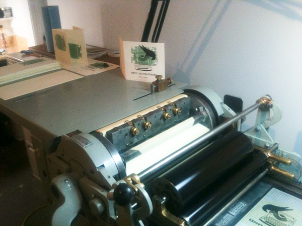 PRESS HISTORY After my year with the borrowed Kelsey, which I’d probably consider my very first press, I bought a Vandercook 4T. It was a big jump but I knew that it was a press I could share with a lot of people and was really the cornerstone behind opening Flying Object.
SHOP TIPS Find out what kind of printing (invitations, cards, books, pamphlets, posters, etc) you like best to do most and do everything you can to make that your focus. I’m a book lover and that’s who I seek out.

WHAT’S NEXT We’re expanding the press-room and converting the unit upstairs in our building into an apartment for a resident creative director, maybe for someone with letterpress experience. It’s going to be a big year!
Many thanks to Guy for letting us take a sneak peak at the wonderful world of the Flying Object shop!
Letterpressing the Issue On Immigration
The visual collaboration groups CultureStrike and Justseeds Artist Cooperative are utilizing the striking beauty of letterpress to display compelling views on the immigration issue. Favianna Rodriguez has been working with Patrick Cruzan – a California-based letterpress printer – to shed light on the issue through an art print portfolio series. This ongoing project is an effort to raise social awareness of immigration laws and their immediate effects. Click here to get the full story.


Photography courtesy of Patrick Cruzan
Rob LoMascolo Featured on Fortnight Journal

Letterpress artist Rob LoMascolo of Upstate New York talks about the traditional craft of letterpress printing in a recent collaborative effort known as Fortnight. Fortnight is an online multi-media and documentary project that’s been put together by a group of 20-somethings to recognize different disciplines that honor the past while defining the path of the future.
LoMascolo is one of Fortnight’s fourteen contributors, and he talks about the traditional craft of printing that has exploded again in the digital age. He is featured with his Challenge Proof Press in this instructional video as he provides a lesson in Letterpress 101.
Fortnight Journal traveled to the Finger Lakes in New York to interview and film Rob in his studio. We are pleased that not only is Rob showcased for his printing prowess but he’s a neighbor of ours and prints right down the highway from Syracuse.
To find out more about this project, visit fortnightjournal.com/about.
Feeding on the Offset Press
The offset press starts feeding, first gulping air then feeding delicious text weight sheets.
Say hi to Dave
Remember Dave from our First Friday Potluck when he played guitar for us? He is caught here on candid camera.

Microscopic View
Here is a part of a very common printer’s tool. Can you identify it? Here’s a hint: rhymes with coin fee.


Boxcar Talk With Ivan Gulkov
Printer and designer Ivan Gulkov first molded his passion for print in the colder climates of Siberia, Russia before turning out clean, modern collections at Pillowface Press that pay homage to the printing roots in the sunny state of California. Now, Gulkov balances the cool with the fun, with a nod to the old while creating the new. And he does it in spades.
Read on to get the full scoop.


SMOTHERED IN INK My name is Ivan Gulkov. I hail originally from the frozen wastes of Siberia, though currently reside in sunny California. PILLOWFACE PRESS is a small printmaking studio I set up to experiment with handset typography and photopolymer. Until recently, ours was one of the most traditional and conservative trades. For five hundred years, the tools and techniques of assembling type have not changed. Fonts were discreet, tangible things, you experienced on a physical level. In every letter, every space and ruler, there was a trace of the creators hand. Computers changed everything.