Printing Heritage at Hamilton Wood Type & Museum

(All photos courtesy of Knorth Studios)

Jim Moran of Hamilton Wood Type & Printing Museum recounts a day in his life at this stunning printing museum. Housing aisles upon aisles of history, craftsmanship, and deep printing roots, the Museum is a testament to the old (and new) ways printing remains such a treasured part of our culture.

I always get to the museum first thing in the morning. Maybe I need to slowly gather my thoughts but there’s something else. 

Turning on the lights, I take a long walk in this place. I’m trying to see everything and what needs to be done. The sander for half-rounds has a coil of wires that I’ve never liked and ought to be cut off. There is a display of patterns that seem to have been cut a hundred years ago and they seem more like sketches in wood. The pencil marks are precise as an architect’s. And why cedar? What an awful wood to cut cross-grain. Who did them? Could it have been a William Page employee that Hamilton brought here?

Among the type displays, I pause in front of Arabesque. The smoky strokes seem sixty-ish and I think of Janis Joplin posters. The row of platen presses are out of order. They should be chronological. Some need rollers, the treadle on the Challenge should be reconnected, there’s no tympan paper on a few and what could I lock up in their chases to explain the process better. 

In the “Central Room”, I dislike the name itself for being non-descript. I want to cover the walls behind the linotypes with newspaper pages from back in the day. Nearby, a Miehle is too gummed up with ink and grease and a Heidelberg serves mostly as a source to rob parts from. When will I get the ruling machine running again? 

Now in the staff pressroom, I’m tempted to put on an apron and run posters of horse races all day long. Maybe all week. The blocks are frozen in action of galloping hooves that will only come to life in printing. They may not have seen ink since the 50s. I wonder about registering their colors and the thrill of the first print that’s never left me since age 10 when I first set and printed my own name. Magic! Random type cases lean in small spaces, hoping to be filled again with Caslon or Engraver’s Text. I think there’s a cabinet in the back they’ll fit into but I resist the urge to check. 

The classroom lights snap on and I read each switches name; House left, House center, House right. The names mean nothing until Wayzgoose, which reminds me I need to create a backdrop for the presenter’s stand. Before I can do that there are boxes of blocks, mostly musician based, that have to be archived but not today. Better to prep for a workshop this weekend and replace those lights in the corner of the room.

Finally, in the gallery, everything is lit and I look over the exhibit again. It’s a good show that I’m lucky to consider for many days. I should look at new emails. Staff will arrive soon and there’s bound to be something I ought to be doing. Maybe printing horses.

For more information and fun about the wonderful Hamilton Wood Type & Printing Museum please visit their Facebook and Instagram pages!


Spot the Differences: Printing Press Edition

Get out your loupes and magnifying glasses for our cool printing press edition of Spot the Differences! There are 20 differences in all. Can you spot them?

And don’t forget, we’re keeping the fun going all week long for Letterpress Appreciation Week.

Spot-the-difference-Control-Group
Spot-the-difference-Variable-Group

Answers and results will be revealed on Friday, September 20th, 2019 so stay tuned!

The Mackenzie Printery and Newspaper Museum – Our Journey So Far

Louise Rowe of the Mackenzie Printery and Newspaper Museum in Queenston, Canada, shares how the Museum stands as a pillar of the printing community. Benefiting from a printing revival in the area, the Museum blends modern techniques with letterpress’ rich history.

I found letterpress in a very roundabout way. I have a vague fine art background; this precedes my twelve-year career in customer service and events. So the only printing I ever did focused on traditional etching techniques. When I was gifted a proofing press by my boyfriend, I quite literally had no clue what it was, let alone how to set it up and use it. However, it was, and is to this day, the best gift I have ever received.

The Mackenzie Printery and Newspaper Musuem img1

For starters, nobody has ever given me anything that romantic. Secondly, it was the motivation I needed to start my own business – Out of Sorts Studio. Finally, my Potter Proof Press is how we ended up becoming members of the Mackenzie Printery. I reached out to them in the hopes that they might be able to shed some light on the one-tonne-beast, which suddenly occupied a space in our basement.

The Mackenzie Printery and Newspaper Museum is a charity founded in 1993 and to this day is run completely by volunteers. They own a vast collection of printing equipment spanning 500 years of history. The collection is housed in the restored home of William Lyon Mackenzie, which is owned by the Niagara Parks Commission and during the summer they open the heritage site to the public as a working museum.

Whilst continuing to maintain a very impressive collection of printing equipment, the charity is now moving forward in efforts to preserve more than the just the physical pieces.

For the most part our members are older and have struggled with finding people in younger generations who are remotely interested in hearing about their experiences, let alone finding ones who actually wish to learn any of the processes. That’s not to say these people don’t exist, just that they are hard to find in our neck of the woods.

The Mackenzie Printery and Newspaper Musuem img1

In recent years, under the Chairmanship of Ron Schroder, the group has been focused on the organization of the entire collection; ensuring it is managed and preserved to the highest museum standards. With such a large collection, that includes a vast selection of type, it has been a long process. With this now well under way the group can turn some of its attention to the presses themselves. It isn’t just about keeping them all shiny and dust-free, we want to make sure that we always have someone who knows how to operate them.

Vice Chairman, Art Ellis, along with our Collections Executive, John Hunt, have been in charge of all things related to the restoration and working order of our printing presses for the majority of the last three decades. As new members, we found it a heartbreaking prospect that their knowledge could just be lost should they no longer be able to participate.

The Mackenzie Printery and Newspaper Musuem img1

Obviously the charity gaining me as a member is great because I’m awesome. However, in reality, Carl (my boyfriend) has proven to be a far more useful asset. He is a mechanic by trade, with a deep appreciation for antiques and a desire to know how things work. His passion for cars is deeply rooted in hot rods and this love took us to the Syracuse Nationals in July, which also provided us with the perfect opportunity to take a tour around Boxcar Press: a place dreams are made of!

Honestly, I don’t think we could have a better first candidate for learning how to set up, maintain and repair the printing presses.

The Mackenzie Printery and Newspaper Musuem img1

He started small, bringing home a rather rusty slug cutter, a mini paper cutter that didn’t cut and a brayer with broken handles. After some research, he took apart each item, carefully cleaned every piece, repaired what he could and fashioned new parts where necessary. Parts were then painted and reassembled, leaving us with three pieces that could either be added into the museum’s collection or sold.

The next logical step was for him to start learning the basics of some of the larger pieces of equipment. John began by showing him how to run our Heidelberg Windmill and has since moved on to showing Carl what he has to do to keep this press in good working order.

The Mackenzie Printery and Newspaper Musuem img1

The printery also has in its collection an 1894 Whitlock press. This press, weighing in around eight tonnes, is too large for Mackenzie House and is instead a permanent feature at the Marshville Heritage site in Wainfleet, Ontario. Every year, this press is used at The Marshville Heritage Festival to print a festival calendar and until this year, Art has been searching for someone to teach how to run it. Buoyed by Carl’s natural aptitude, Art taught Carl everything he needed to know about running and maintaining the Whitlock; she’s got a few quirks, which is understandable given she’s 125 years old.

The Mackenzie Printery and Newspaper Musuem img1

At the same event, after it stopped delivering us our slugs, Carl received a crash course from John on the insides of a Ludlow Type Caster and together they formulated a plan to repair it, which Carl then executed.

While the experts tinker with the big stuff, it falls on the rest of our core work group to continue with sorting through the storage bunker and the many, many, many cabinets of type. Members Marvyn, Dennis, Francis and Tim have the most patience I have ever seen and make type sorting look easy.

With letterpress now considered more of an art or craft, rather than a pillar of society, it is fascinating to see all the modern-day interpretations of an industrial process so rooted in history. As Executive Secretary for the group, I am now looking to the future and how we can continue to sustain our organisation. With much of our surplus stock now sold, it is time to get creative and I couldn’t be more excited to see what we can collectively do.

If you would like more information on the museum, any of the aforementioned members, and how to join or support The Mackenzie Printery and Newspaper Museum, please take a look at our website: https://mackenzieprintery.org/

Or follow our antics on Instagram: @themackenzieprintgroup

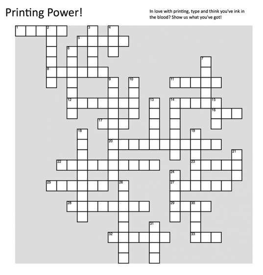
Printing Power! Crossword Puzzle


Time to roll up those sleeves and dust off those printing terminology books! We’ve got a wonderful printing-themed crossword puzzle for all you ink-in-the-blood aficionados!

Our online crossword puzzle can be found here. Come show us what you’ve got!

Answers and results will be revealed on Friday, September 20th, 2019 so stay tuned.

A paper-and-pen lover? Download it here: Printing-Power-crossword-puzzle-Boxcar-Press

Museum of Printing – Boston

Welcome to Part 1 in a series of blogs that celebrate the Print Museum. We are happy to introduce you to places that preserve, collect and offer hands-on opportunities to learn about printing in a way that enjoyably informs and educates. Read on for a quick “visit” to these places that hold our collective printing heritage.

The Museum of Printing is just north of Boston in the old mill city of Haverhill, on the Merrimack River. There are three Vandercooks, two show card presses, a Kelsey table-top, and a large-format Gordon. There are working machines, including Linotype, Ludlow, and Heidelberg Windmill. There is even a Keurig coffee maker and the fridge is always stocked with libations.

The cabinets are filled with paper. The type cabinets hold metal and wood fonts and the 40-drawer cut cabinet has almost one thousand wood and metal engravings The drawings for every font done by Linotype are here.

Craig Busteed is one of the many volunteers at the 41-year old Museum of Printing in Haverhill, Mass. He finds the Museum’s studio a mecca for himself and other members. 

He produced the poster for the Museum’s annual Printing Arts Fair with wood and metal type. Craig also assists at workshops that teach letterpress to novices, young and old. One workshop taught by veteran Ted Leigh covers printing with the hand press using the Museum’s 1888 Acorn press.

The Museum hosts school groups from all over New England. In most cases, the kids set their names and print them. One of them is now in their twenties and shared with us that they still have that print.

Craig also comes in on Wednesdays and helps his team restore vintage Kelseys and C & P’s, many of which are sold at two annual letterpress sales. The Museum Gift Shop sells type and other letterpress items. There are also two annual books sales that offer redundant books on graphic arts.

The Museum of Printing preserves the rich history and working tools of the graphic arts. It archives the largest collection of typographic art and ephemera in the world.

Inquisitive Printers Want To Know: Even More

This week’s Inquisitive Printer focuses on a new chapter for a letterpress printer, the cool printing history of Basel, Switzerland and a creative idea for sketch-booking in the summer.

REBECCA: 

It’s wonderful to see our letterpress friends grow and be on the move. Earlier this month, a cool Chicago-based letterpress printer, A Favorite Design, did just that. After a successful Kickstarter campaign, Amber Favorite & her husband have been able to move into their own brick-and-mortar store in the Albany park area. Way to go and congratulations!

A. Favorite Design letterpress print shop Chicago

(photography courtesy of blockclubchicago.com / afavoritedesign.com )

JAKE:

A significant other’s trip to Europe became an occasion for me to do a little poking into the history of Basel, Switzerland. I couldn’t — and really, still can’t — put my finger on any one reason why Basel feels significant to me, as prominent as it has been in the back of mind. Perhaps it’s some subconscious awareness that many of my cultural heroes are alumni of the old university, like Friedrich Nietzsche, Carl Gustav Jung, and Herman Hesse.

In the Renaissance, it was home to father of pharmacology, the astrologer and alchemist Paracelsus; in the modern era, it was the site of chemist Albert Hoffman’s famous bicycle ride over the course of which he became aware of the effects of the lysergic acid diethylamide he’d just invented. What a cute set of Basel historical bookends marking either end of the modern era of hard science, between magical herblore on one side and psychedelic cybernetics on the other.

At the University of Basel’s Museum of Pharmacy is yet another intriguing and world-changing artifact: the printing press owed by Amerbach & Froben. 

(Source: wikipedia.org and the BEIC digital library)

Amerbach is noted as the first printer to make the switch to Roman typefaces! If that ain’t notable, I couldn’t tell you what is.

MADDIE:

It is summer time, Ya’ll. 

This is the time when I just want to be active and outside. Taking in as much sunlight and warm weather as possible before the next season arrives. I relish these moments, yet have the feeling that I am not focused on my studio work. This little bit of guilt follows me around, but WAIT!!! I have dissolved this worry by combining my two favorite things: drawing and playing outdoors. 

Wherever I go on adventures, I make sure to always have space in my bag for a small notebook and a set for drawing tools. Pens, fine tipped markers and a handmade notebook. 

The sketchbooks are simple to make and can be constructed in a pinch. Yay bookbinding skills!!! Any found and recycled materials such as copy paper, string or staples are used to bind together this booklet. And there you are, ready for summer action and capturing your favorite moments. 

Above are images I have included are from a 2015 sketchbook. These were made while spending the weekend in a remote cabin in central New York. Below are this year’s (2019) sketches of some recent adventures. 

I can captures new experiences and practice my artistic skills all in this small item. I have even asked my friends to contribute to some pages. These become great collection pieces over time. I can look back at these works and enjoy my artistic practice through the summer months.  

Have something that you find intriguing? Let us know in the comments below!

Let’s See That Printed: Carmela Heintzelman of Fiore Press : Architectural Artwork

We were pleased to lend support to Carmela Heinztelman when she was approached with a special print request. After seeing the results, we think more professional design projects like this should come to life in letterpress.

When architect Edward Deegan contacted me about making some letterpress prints of his architectural drawings, I jumped at the chance.  I admire Ed’s work and have seen many of his designs realized in our Illinois community and his work is absolutely impeccable. Below is one of the beautiful houses he designed, and one of the prints I made from his sketch of this house.

Carmela Heintzelman of Fiore Press

(Above: photography credit: Karen Loffing)

Carmela Heintzelman of Fiore Press

I love printing personalized artwork, and this was no different.  To take a talented architect’s sketches and translate it into letterpress printed art that could be framed and hung was such an honor. 

Carmela Heintzelman of Fiore Press

Edward had five sketches that he wanted printed. The challenge was to take these sketches and adjust them in a way that worked best for letterpress and kept the details. 

Carmela Heintzelman of Fiore Press

We needed to apply a screen, which I had never done before. Enter Prepress from Boxcar Press! I called Cathy and explained this project, and she was excited to help. She looked at each of the pieces and told me the best way to prep the artwork. I converted the scans to grayscale, adjusted the contrast, brightness and threshold, then saved it as a TIFF.  It came out perfect – the client was extremely happy!


Carmela Heintzelman of Fiore Press

In addition to the house renderings, I also printed for Edward a tall ships scene and two historical facades.  He framed and hung them all in his office.

Thanks Carmela for sharing the printing of these drawings.  In addition to being a learning experience for you on the file preparation side, it was a nice treat to see something a little out of the norm come to life in letterpress. This is a very limited edition art that will be viewed and enjoyed.

Let’s See That Printed: Dan Narva’s National Parks Letterpress Poster

Dan Narva of Nine Day Weekend teams up with Ted Ollier to have his minimalistic US National Parks poster come to life.

Mark Gibson of Syracuse, New York works on a platemaker at Boxcar Press.

Dan Narva:

I opened my Etsy shop, Nine Day Weekend, a few years ago. My initial focus was on custom illustrations of family photographs. Early projects were all laser cut into wood, as either hangable portraits or magnets. One thing led to another and soon my love of the outdoors inspired me to create illustrations of National Parks.

Dan Narva of Nine Day Weekend

I know it sounds trite, but I woke up early one morning with the random idea that I could draw the Grand Canyon simply by splitting the words in half and spreading them to the far corners of the frame. As I lay in the dark  brainstorming how I could rearrange the letters of my favorite parks into similar designs. I brought my sketchbook and laptop to bed and worked until well after noon, but I had laid the foundation for my new project.

I realized early on that I wanted all of the designs to share a uniform visual language, so it was important to keep the line weights equal, no matter how big or small the letters became. Then, I quickly shifted gears and the parks became the focus of my Etsy shop (conveniently, I had already named my shop Nine Day Weekend, after the length of vacation that you create by taking Monday through Friday off work – I think this name lines up well with my new celebration of America’s natural lands and the joys of visiting them).

Over the course of the following days and weeks (and months), I kept working on the remaining parks, trying to turn each name into a distinct feature of the landscape or wildlife of each park. I allowed myself to rotate, flip, stretch, chop, and generally manipulate each letter, but my one rule was that every letter needed to be recognizably present.

Some of the images came to me very easily (like Arches, Hawaii Volcanoes, and Redwood), and I think their simplicity helps to balance out the more complicated illustrations (like Gates of the Arctic, Guadalupe Mountains, and Petrified Forest), where the letters are truly jumbled and it’s more difficult to “read” the name of the park. It’s fun to present my work at craft fairs and watch customers hover at my table while they try to “solve” all of these puzzles.

Dan Narva of Nine Day Weekend

I first sold these parks as individual laser cut coaster and magnets, so people could create their own combinations of parks to resemble their favorite adventures. But I always imagined the full roster being presented together, so when I finally finished the 59th park (it took over a week to rearrange Theodore Roosevelt into a representation of his North Dakota log cabin and a bison), I needed to find the right medium for the poster.

Dan Narva of Nine Day Weekend

I had met some letterpress printers on the craft fair circuit, and it seemed like my crisp lines would be a good fit for letterpress. One of them was kind enough to point me to Ted Ollier, who advised me on how to translate my digital artwork into letterpress. He also recommended I contact Boxcar Press for the plate. Having many questions, I was very happy with the patience displayed by Boxcar as I was educated on the process of platemaking. Both times that I have ordered plates (I recently created a second edition that includes the 2 new entries to the National Park roster) I was in a self-imposed rush. Why does it seem like all art projects end at the last minute?

Dan Narva of Nine Day Weekend

The quick turnaround by Boxcar allowed me to get my posters printed as soon as possible. And even when their quality control found errors on my end (like using RGB instead of CMYK), I was able to correct the problem immediately without delaying production. I’ll let Ted speak to the printing qualities of these photopolymer plates, but I certainly have no complaints. As a letterpress newbie, Boxcar has been a pleasure to work with.

In addition to the plate I ordered for my new 18″ x 24″ print of all 61 National Parks, I also created a smaller plate that features the 5 National Parks of Utah (with the designs themselves arranged into the shape of Utah).

Dan Narva of Nine Day Weekend

I’m excited to see how outdoor enthusiasts respond to this print. These parks are all very well regarded and highly visited – I’ll actually be visiting them with my family later this month to coincide with National Park Week. I’m incredibly proud of these posters – I love running my fingers along the deboss and I love seeing all of my illustrations lined up in a perfect grid. I looked up the specific Pantone shades of green and brown used by the National Park Service, in order to get as close as possible to the real thing. My hope is that these prints inspire folks to visit, treasure, and protect these amazing lands.

Ted Ollier:

So Dan found me when I was still in a now-defunct letterpress co-op. I ran the original posters on the SP-20 there, but for this run I needed to borrow the SP-20 at the letterpress at Harvard where I teach, the Bow & Arrow Press. I started Reflex Letterpress about this time last year to salvage something out of the demise of the co-op.

The smaller pieces I ran at Reflex on the Vandercook No 4. The presses were feeling good that day, there were no oddities in either run.

Dan Narva of Nine Day Weekend

The smaller pieces I ran at Reflex on the Vandercook No 4. The presses were feeling good that day, there were no oddities in either run.

Want to snag a print of this beautiful poster? Shop here!


Inquisitive Printers: Another Round Of Things That Caught Our Eye

Our focus has been drawn lately to a Goudy typeface, re-invigorating studio visits, and being up-close with dinosaurs. We hope you delight in what has captured our attention in this installment of the Inquisitive Printers!

From Cathy:  

Recently I was running amok on a good search about typefaces. Naturally, Frederic Goudy had his share of references to explore.  One, in particular, caught my eye because it was a video that was linking our Syracuse University here with Goudy.  As Syracuse based printers, we have some hometown pride and to have a tie-in to this very prolific font designer was a neat surprise.  Enjoy this video called Goudy & Syracuse: The Tale of A Typeface found.

From Maddie:

Hello Print Friends! I would like to share with ya’ll my favorite aspect to my artistic practice. Do you have find yourself in your workspace not knowing what to do with your projects? You do? Okay. Great! I suggest you have a studio visit.

This has been extremely valuable to growing as an artist and developing my work since leaving my fine art studies back in 2016. Similarly, I like to receive feedback and miss having a community to work within now that I am done with school.

Have a friend stop by your space. Show them what you are currently working on. Share your artistic process with them. Invite them over while you are working on a print run—more hands make less work. Let your visitor ask questions and get to know what you do as a maker.

Don’t forget the SNACKS! I have some things to eat or drink and enjoy simply hanging out. For instance, I like to invite people over during lunchtime for a 45-minute visit and I also encourage my guest to hang out & draw with me. Sketching and sharing ideas is great!

Think about what you want to get out of a studio visit. Or alternatively, this doesn’t need to have an objective. See where the conversation leads. Discuss everything and nothing. This dialogue may influence your work in return.

Afterward, reflect on what was talked about. do you see your work with a new perspective? I typically feel energized after a studio visit. The feedback allows me to return to working on my projects with fresh ideas. I am delighted that I get to share what I love to do and really appreciate how receptive my visitors are to my work and creative space. I see this as vital to my artistic practice and will continue doing this. FOREVER. Hope you give it a whirl.

Maddie-studio-visit-artist-studio

My dear friends, Shelby and Brian are looking through a box of my small drawings (July 2018).

Here is a great link that offers very honest and helpful suggestions about studio visits and making the most out of them!

From Rebecca:   

Want to get up-close to dinosaur bones without leaving your computer chair? Photographer Christian Voigt does just that as he captured the delicate beauty of the London Natural History Museum’s dinosaur skeleton collection. Come take a look! 

(c) Christian Voigt Tyrannosaurus

(photography credit: Christian Voigt and WIRED.com)

We hope you explore some of our links and perhaps learn a little bit more about what intrigues us here at Boxcar Press.  Email us at info@boxcarpress.com the things that delight you also!

Inquisitive Printers: Even More Things That Caught Our Eye

We remain on the look-out for all things creative, fascinating and colorful. Check out a few of the intriguing items, events, and cool happenings that recently caught our eye.

From Cathy:  

I have always enjoyed the CBS Sunday Morning program as it has introduced me to many fascinating creative people and stories over the years.  On the March 10th broadcast, they focused on fine press books from the printing to the binding.  It is always exciting to see a letterpress print shop on network news.  Enjoy the segment if you haven’t already viewed it.

Larkspur Press Bookmaking Bookbinding Letterpress, Inquisitive Printers

(photo courtesy of cbsnews.com)

From Maddie: 

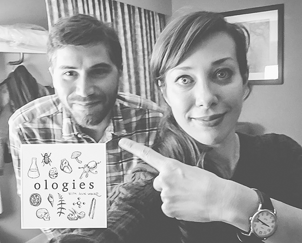
Whew! BOY HOWDY! Anyone in need of a podcast recommendation? Yes!? OKAY. Let me tell you about my favorite podcast OLOGIES, hosted by Alie Ward. This show is all about asking smart people dumb questions.

Alie sits down with a specialist in a different field of study in every episode. For example: Entomology (Insects), Selenology (the Moon), and Tuethology (Squids!!!). This podcast series does not disappoint. You will be giddy with excitement to learn all there is to know about each episode’s topic and an added bonus: delightful side notes of fact checking or defining fancy scientific words. Also worth mentioning, if you listen to the very end of each episode Alie will share a secret with the listeners. 

Inquisitive Printers : Alie Ward Ologies

(photo courtesy of allieward.com)

I listen to this show while printing. Yyou can tell when I am listening to this podcast as I am laughing out loud and smiling. OLOGIES is a delight and I hope you give it a listen…then proceed to tell all your friends about the wondrous information you just learned about Entomophagy Anthropology (eating bugs), Mixology (cocktails), or Somnology (sleep). Enjoy! 

From Rebecca:   

Everyday there are more than 12,000+ planes travelling around the world at any given time. Want to see just how populated the skies are? Check out this nifty website, flightrader24.com, that shows in real-time who could be flying above you!

Inquisitive Printers

(photo courtesy of flightrader.com)

Glass meet metal.  UK-based  Heriot-Watt University has some interesting news for welders, fabricators, and artisans. They’ve been able to weld together certain types of glass and metal using a specialized ultrafast infrared laser systems. The University’s scientists and partnering research labs are still working on perfecting the method. Hopefully, this could lead to some interesting developments in both the manufacturing and art realms.

We hope you explore some of our links and perhaps learn a little bit more about what interests us here at Boxcar Press.  Email us at info@boxcarpress.com the things that delight you also!