For our second letterpress roundtable discussion, we asked some printers we admire to tell us about their favorite press to print on (and don’t spare the details!). The stories are sweet, poetic, and inspiring. Read these responses and then we’d love to hear in the comments about your own love affair with a beloved press.
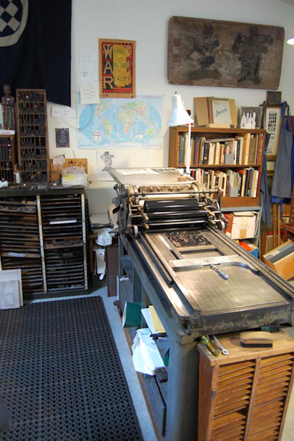
Todd Thyberg of Angel Bomb Design: My most widely used and favorite press at Angel Bomb is a Heidelberg Windmill which I’ve named Kaiser. I purchased it in 2009 from a printer who had advertised it for sale on Craigslist. I wasn’t on the lookout for a particular press, but I had been using a Chandler and Price for all my printing and wanted to be able to produce higher quantities of printing at a faster pace so I was keeping my eyes open for a good production press. Kaiser is a rock solid workhorse and a marvel of German engineering with an almost Rube Goldbergian sense of complexity. Kaiser had been relatively well taken care of but was filthy and several pounds of oil soaked paper needed to be removed from his innards before being used. His serial number is 104012E, placing his build date at 1954. He bears a badge stating “Made in the U.S. Zone of Germany” which reminds me of the Cold War era where spies lurked in dark corners and the world was a very different place. I use Kaiser to print small and large runs as well as die cut and he is always a hit with open studio events; the chug of the air pump powering the suction is like a siren song to passersby who get drawn in and are amazed at this old equipment that is still being used. Considering that this press was designed around the time of World War II and is still working today creates in me a sense of awe of how things used to be built and joy that I get to use him most every day.
Michael Russem of Kat Ran Press: I’ve recently retired from printing, but the best press I ever ran was my Vandercook Universal IV (SN 21497). It took a sheet measuring 32-7/8 wide by 29-1/2 tall—which was just about large enough for the books I was printing. Not only did it seem to be free of the usual problems that often plague power Vandercooks, but the enormous size of the cylinder and bearers cut down makeready time. Whereas I would spend tons of time making complicated tissue makereadies on my SP-20 and Universal I, there was just no need to do so on this big press. In fact, once I installed this Universal IV, I rarely used the two smaller presses as they weren’t worth the bother. And as the Universal IV was a power press, I was able to print twice as many forms per day without being exhausted and in pain when I crawled into bed. Of course, it took much longer to clean up the Universal IV, so I suppose the press wasn’t perfect. It was close, though. Now it’s with Art Larson at Horton Tank Graphics, and I hope Art finds the press to be as life-improving as I did.
Thomas Leech of Palace of the Governors Press: It was a tough call, but out of loyalty I have to say that my favorite press is my own 8×12 Chandler & Price Old Style that I’ve had since 1979. It’s not the best press I’ve ever run, but it is like a member of my family. The serial number is 26099, which according to the APA website puts its year of manufacture as 1890 – old enough to be my grandfather. It is driven by a leather belt and ancient motor that hums like a lullaby. Its comforting hum and rhythmic clanks put my kids to sleep when it lived below their bedroom.
I’ve owned it now for a quarter of its lifetime. I bought it from a guy who bought it from his brother-in-law, who bought it from a deaf man who printed cards with the American Sign Language alphabet. I still have a photoengraving of the manual hand signs, and printed it again only last year.
On November 23, 2008 the automatic counter, which I’ve never set back to zero, and which only counts to 99,999, turned over for the tenth time, which means that it had printed one million hand-fed impressions: business cards, book covers, birth announcements, wedding invitations, change of address notices, broadsides, poems, keepsakes, memorials, graduation announcements, wedding and baby shower invitations, clothing tags, bar mitzvah invitations, tickets, Christmas cards, Rosh Hashanah cards, art show invitations, book plates, keepsakes, and facsimiles.
While in my possession the press has printed under the names of The Fine Mess Press, the San Miguel Paper Workshop, the Smokebrush Press, and most recently, the Press at the Palace of the Governors. When a major building repair was required here at the Palace the press came back to my house, which felt something like having a grown child move back home. I regret I don’t have a photo to share of this press.
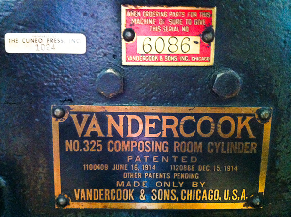
Eileen Madden of Evanston Print and Paper: That’s kind of like asking which of your children you like best. I’d have to say my favorite press to print on is the one I get to print on the least. Our big Vandercook 325 – serial number 6086. It’s my very first press. I bought it in 2007 from Columbia College. That’s where I learned to print, and I never saw anyone use it while it was there. It was mostly used as storage, I’m sorry to say. I guess I’d say it’s my favorite, because it’s the one I do projects of my own on – bigger posters or wood type collages. If I’m on that press it means I’m doing something just because I want to. As nice as it is to print with and for other people, it’s a treat to just play, too. After I acquired the press I found a metal tag on it indicating that it was owned at one time by the Cuneo Press – their press number 1024. The Cuneo Press was one of the large printing companies here in Chicago, and also had a fine book press that created some lovely and amazing work. Bill Anthony, who was a fine bookbinder who came out of the apprentice tradition in Ireland, worked at that press. I love having the connection with that history.
So. That’s my answer. In general I feel luck to be printing on any of our presses. I’m lucky to have this job, but I can say that the 325 is the one I’m the most personally pleased with.
John Barrett of Letterpress Things: The press that’s special to myself and the Barrett’s is B 57516, a new style C & P hand-fed with a Horton variable speed clutch. Manufactured circa 1920, Horace Moses purchased it in 1922 from an envelope company in Springfield, Massachusetts. Mr. Moses, a local philanthropist who founded Junior Achievement, Strathmore Paper Company and numerous other businesses, moved it to a building in Westfield, Massachusetts (formerly owned by the Westfield Whip Co.). There it was installed on the fourth floor as the first printing press owned and operated at Mr. Moses’ newest endeavor: The Old Colony Envelope Company. [The press still carries the original machine tag; a brass plate deep stamped with the number “1”.] It was removed from operations in 1967, about the time my interest in letterpress began to develop. Several years later, for the sum of $50, it was mine. Took it home and therein began my “second” career, Letterpress Services Co. From the beginning my interest was not so much in printing but in perfing, scoring, die cutting and imprinting; a trade service for offset printers, quick copy centers and in-plant printing departments. Old number 1 and me spent many, many hours together cranking out the impressions. Presently, “No. 1’ is semi-retired; eight Heidelberg Windmills carry the work load. But once in a while there’s a job best done by hand. And we step up, wipe the dust off, flip the on switch, coax the hand lever up to engage the clutch. And get goose bumps listening to the clack, clack, clack of the spliced leather belt. B 57516. . . ninety plus years and still pressing the letters.
Mark McMurray of Caliban Press: Well… my favorite press is really my first press, the one I bought with a deep breath, thinking: “in for a penny, in for a pound” after finishing just a week or two of letterpress classes at Red Ozier Press in lower Manhattan in 1985. It’s a 1947 Vandercook model 4T, serial number 10903, which is now tattooed over my heart. It came out of a commercial printer’s shop in New York that I was doing other business with at the time. Although it had been pushed to a corner and was not in use it had been well maintained over the years—which I’ve tried to continue. I remember my horror when suddenly one day one of the inking rollers started to wobble, then shock when I discovered that this was caused by a cracked bushing that was made out of wood (!), then relief to find that I could actually get a replacement (also wood) and fix it myself. (Thank you, Fritz, at NA Graphics).
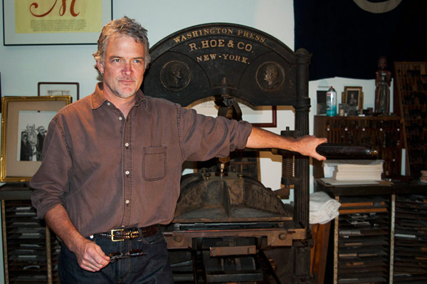
But my other favorite press (come on, life is too short for only one love) is a R. Hoe Washington. As I recall, Hoe began making these in the early 1830’s when he somewhat unscrupulously appropriated the famous “figure 4” toggle joint from another manufacturer. Most of the Washingtons that I’ve come across have had serial numbers cast on them. Mine does not. Therefore I’m assuming it’s early in their production cycle and I date it somewhere around 1835. I suspect press historians may have some views on this matter. I acquired mine from the late wood engraver Frank C. Eckmair who got it not far from his home in Gilbertsville, New York. A local Northern New York printer, Jim Benvenuto, helped me set it up and adjust the platen height and I’m always surprised at how well it prints, given its age and technology. So there… my two favorite presses.
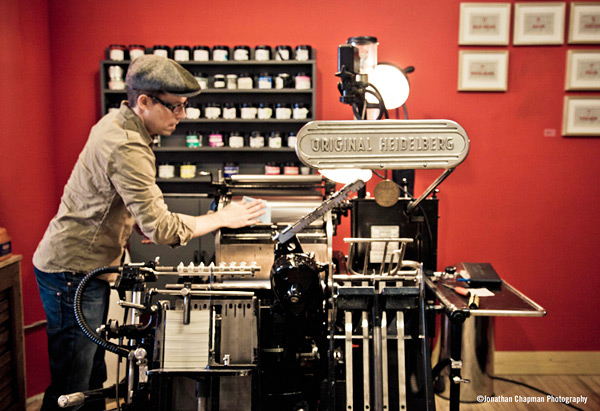
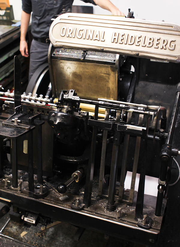
Brooks Chambers of Mamas Sauce: My main squeeze is an Original Heidelberg. Serial # 49582.
We adopted our Windmill from her original owner a couple of years ago. “Heidi,” as we’ve come to call her, was the workhorse of a family-owned basement print shop in Buffalo from the day she rolled off the line. We found her lovingly entombed with a host of tools, spare parts, and other presses that had been with Heidi since day one. The whole gang came with us to Orlando (no toy gets left behind) and Heidi still sits at the heart of this menagerie. Every time we give a tour, people react to her the same way that I did at our first meeting: they stop, stare, and smile. At that point in the tour, I’ve learned to shut up and get out of the way.
She isn’t the first Windmill I’ve had the pleasure of running, but she’s the best. If I had to put words to it, I’d say she’s delightfully invisible. She’s invisible in the way that every good interpreter ought to be. Other presses often interject, leaving the marks of their own idiosyncrasies throughout the run (even if their operator is the only one who knows). Heidi does exactly what I ask her to. Every. Single. Time. That kind of control gives you the freedom to defer to the artwork for inspiration. That kind of control forces you to become a better printer. Before we got Heidi, I could blame a lot my shortcomings on the press. Not anymore. Now the press gets all the blame for my success. She’s teaching me a lot about knowing when to shut up and get out of the way.
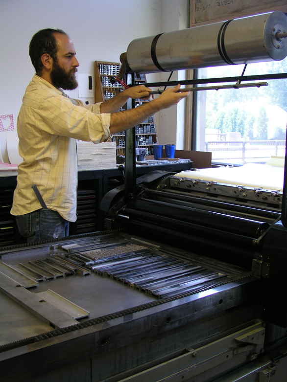
Brad Ewing of Marginal Editions: My favorite press is the Vandercook Uni III. It has an adjustable bed and its rollers are super dialed in!! The serial number is #26318. It’s currently located on 6th avenue and 29th street in Manhattan.
Leslie Miller from Grenfell Press told me that the press came from Middletown, New York about 20-25 years ago. It was large enough that it was taken apart and brought up to the 7th floor by placing the press on top of the elevator.
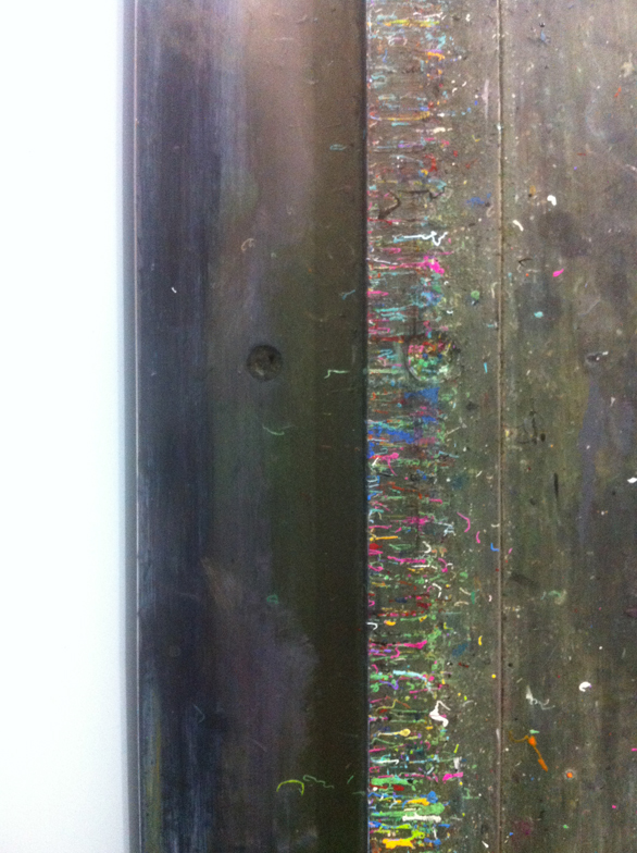
I have been printing lead and polymer plates on the press since 2005. I have also printed laser cut plexi, etched copper plates, leather, and even potatoes on this press. The ink splatters that have built up over the years on my Vandercook serve as a happy reminder of many beautiful print projects accumulated.
Is it any surprise that we love our presses? All of these presses have earned our love and loyalty and even a name or two. Now it’s your turn to tell us about the one that grabbed your heart and makes you a better printer. If you’ve got photos online of your press and you’d like to share them, please include a link to the photos in your comment!


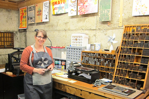 UP CLOSE WITH LAURA BENTLEY When I was young I enjoyed doing artsy things, but in college I went a different direction and got a Computer Science and Accounting degree. By day I’m a computer consultant mostly for a dance studio that teaches social dance—ballroom, salsa, and swing. I run their website, set up their sales system, and do their bookkeeping. So, I’m a hobby letterpress printer, and try to squeeze in time to print when I can. I also volunteer as a teaching assistant for the letterpress classes at SVC (School of Visual Concepts) in Seattle.


 David Black is a fellow teaching assistant and a print artist. I personally consider him a mechanical genius as he can fix almost anything, and has a real gift for explaining how things work. But what inspires me most is that he makes time to print most every day. He once printed a little card that had a tiny ornament of a car and the text said “Tiny car”; only black ink on white paper. It was a great reminder to me that you don’t always have to be printing big extravagant projects, but can print quick fun things, and you’ll learn something with each new thing you print.
 PRESS HISTORY A gentleman named Carl Montford, the self-nicknamed “press matchmaker,” matched me up with an 1863 Gordon Franklin press. It was in the basement of a local artist that wasn’t using it anymore. It’s a great match for me, because it’s a smaller platen press (chase about 7 x 11) and we needed to get it down into my basement. The press would be a little wonky for production work, but it suits a hobby printer like me just fine.


 UP CLOSE WITH GUY PETTIT I love doberge cake from Gambino’s Bakery in New Orleans, Louisiana. That’s where a lot of my family is from. Doberge has about a thousand layers of dessert pudding alternating with white cake. I’m about to eat a piece. It’s really all that matters.
 BRILLIANCE IN THE BAY STATE We’re located in an old volunteer firehouse on a historic common (aka a 17th century palisade – the biggest one of its kind) in Hadley, next to the Connecticut river. I’ve had to do a lot of renovations but the space keeps opening itself up in really exciting ways, almost as though it was the natural next step in this buildings career. There’s a belfry. The concrete floors were perfect for the heavy machinery. Oh, and we have a shower in the studio! And great stone terrace out front. It’s a beautiful space.


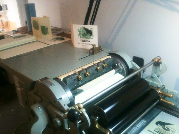 PRESS HISTORY After my year with the borrowed Kelsey, which I’d probably consider my very first press, I bought a Vandercook 4T. It was a big jump but I knew that it was a press I could share with a lot of people and was really the cornerstone behind opening


 THE PRESSES: I am a bit of a freak for late model Vandercooks. I have two SP-15s, two Universal Is and two Universal IIIs. For smaller work there are a couple of C&P Pilots and a Kwikprint 86 foil stamping press. Because I also recondition presses there are often one or two others in some state of restoration at any given time. The equipment has been chosen very carefully to be safe and suitable for a shared work environment.


