The Second Annual Letterpress Broadsides Project

For the second year in a row, we are thrilled to share with you photographs of an incredible collaboration between the folks at the Writers in the Schools program (WITS) and the School of Visual Concepts in Seattle, Washington. For the last two years, WITS has worked with terminally ill patients at Seattle Children’s Hospital to write poetry, out of which artists create beautiful letterpress broadsides. At Boxcar Press, we were privileged to be included yet again, and gladly offered up free photopolymer plates for the project. Below are photos of the process, as well as few shots of the incredibly inspiring poetry written by these kids and young adults.


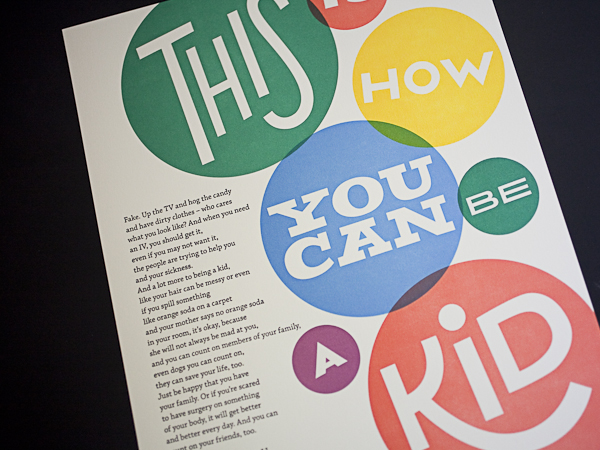
The second annual portfolio includes 16 hand-set artist-made letterpress broadsides. WITS Writers-in-residence  Sierra Nelson and Ann Teplich worked with patients at the Seattle Children’s Hospital to write the poems, then 16 artists from the Seattle area took the poems and translated them into works of art. The poems were printed as letterpress broadsides and included in a striking red portfolio.

At the end of the project, each patient received a portfolio, as well as ten copies of their poem to give to their family and friends. Some patients were given the opportunity to read their poem in front of a live audience.

So many people worked to make this project a success, including letterpress printers volunteering their time, and Mohawk Papers donating paper. It is truly inspiring to see letterpress used in such a positive way!

Do you have any “Doing Good” projects you’ve worked on that you want to share? Let us know! We’d love to hear about them!

Workspace Spotlight: That Sky Blue Press

In the neighboring north of Canada sits a letterpress shop with a self-proclaimed international flavor and big expectations. Litsa Babalis, of That Sky Blue, is the owner and main designer for the company and you can find her work across the North American continent. But it all starts here and she is happy to take a break from designing and printing her environmentally responsible cards to take us on a shop tour.


THE PRESSES We have four presses: three 10×15 windmills and one 12×18 Chandler and Price.

SIZE OF PRINT SHOP 1200 square foot studio.

TYPE OF SHOP We occupy the space completely for our own production, however we often offer classes to students and letterpress enthusiasts after work hours.

THE LOCATION We are based in Montreal, Canada. Our studio is located on the banks of the historic Lachine Canal and minutes away from great coffee shops, markets, and the most adorable & friendly boutiques.

FAVORITE THING ABOUT THE SHOP How can you not feel creative being surrounded by these beautiful machines? Seeing them in action everyday is sure to inspire anyone.

NUMBER OF PRINTERS IN SPACE two pressman, one presswoman (me, whenever I get a chance to get on press… I take it) and one intern.

MOST VALUABLE SHOP TOOL The great people that work here.

FAVORITE INK We use soy based inks. We love the coverage they can handle and the drying time is very quick. My current favorite color has to be 871 gold…I love the way it looks on dark paper as well as the standard white cotton papers we use.

SOLVENT OF CHOICE We use California Wash for our everyday clean ups. It’s great because it’s water miscible, it has a mild odor, and is not harmful for your rollers.

PLATE AND BASE OF CHOICE We use the standard base and the KF95 regular relief plates.

OIL OF CHOICE We prefer to use a heavy weight, non-detergent press oil for our presses.

WHAT TYPE OF RAG DO YOUR CLEAN UP YOUR PRESSES WITH  We use a linen service who comes and picks up our soiled rags once a month and replenishes our stock with clean 100% cotton industrial shop rags.

FLOORING MATERIAL Concrete.

FLOOR PLAN TIPS We have a very small space, so getting the right floor plan is quite important to our work flow. Adding new equipment to our space is always a challenge, so we end up moving everything around once or twice a year. We try to use every square inch as best as possible and that includes wall space. Hanging tools and chases and putting up shelving for inks and other press room supplies saves us on floor space so we can move around a little easier.

PIED TYPE As incredible as it is to have that little bit of printing history in the form of lead type scattered around in drawers and boxes, it just wasn’t getting any use from us so we gave it away a long time ago to a deserving letterpress & typography master.

ORGANIZATION ADVICE I am a neat freak. I like my press shop to be in order, otherwise I feel distracted. The best advice I can give on keeping an organized space is when you use something, put it back in it’s place and clean as you go.

PRINTING ADVICE Get to know your machines really well, take care of them, and most of all be patient with them as they get older and more stubborn…Be good to them and they’ll be good to you!


Boxcar Talk With Johnny Brewton

From mind-boggling multiple color runs to must-have limited editions, from vinyl to Hunter S. Thompson, the elusive (and quite captivating) Johnny Brewton of X-Ray Book and Novelty Co. has a great story — read on to find out how he got started in letterpress printing and where his business is heading.

Johnny Brewton of X-Ray Book and Novelty Co. wows with letterpress magic.


LETTERPRESSED FOR DETAILS I’m a letterpress printer, graphic designer & small press publisher with a focus on limited edition projects. I publish the assemblage magazines X-Ray & Bagazine plus assorted chapbooks, broadsides, artist books and miscellaneous odd print projects.

PRINTING AS A NECESSITY I was living in the San Francisco Mission district in early 1993 and began work on the first issue of X-Ray. It was to be a limited edition assemblage journal of sorts, non-disposable with original art and hand printing similar to a copy of Wallace Berman’s Semina.

Letterpress was the perfect tactile medium. So I began designing the inserts for letterpress, and paid printers like Artnoose and The Toxic Coyote to run them for me. Eventually – and out of necessity – I acquired my own press and began doing the printing myself.

WEST COAST WONDERS We go back and forth between our house in Grass Valley California and our apartment in San Francisco (lower Haight). My studio is located in the basement of the house my Dad built (in Grass Valley). We’re on 5 acres surrounded by Cedar, Black Oak and Sugar Pine trees. It’s a nice place to work & call home.

PRINTING MENTORS Jon and Louise Webb who published Outsider (Loujon Press), Wallace Berman (Semina), Graham Mackintosh (White Rabbit Press) and of course H.N. Werkman.


THE DAILY GRIND Step 1. Wrap my head around the obvious big idea and make a rough first draft – just to get it out of the way and grasp the concept.

Step 2. Take an abstract sideways approach, which is usually too wacky and avant-garde for a client. It’s always good to try something that’s the opposite of whatever seems obvious.
Step 3. I combine steps 1 and 2 and make a mutant third version. That process can change depending on who I’m working with. I’ll usually go with the one that’s the most appropriate for the integrity of the project.

DESIGNS THAT STAY TRUE TO THE CRAFT Sometimes I’m asked to design to look like letterpress when the piece is to be mass produced and offset printed. I avoid the exaggerated and over distressed look. It’s become overused and cheapens the craft. Once you see this used in a T.G.I. Friday’s commercial the jig is up!

FULL TIME FUN Not running the press full time yet but I print as much as possible and hope to be running it full time by the end of the year. Working out some details, website and getting ready to launch X-Ray Letterpress Service.

PRESS HISTORY Around 1994 while visiting my Dad I came a cross a little Kelsey 5 x 8 at a junk shop. I didn’t buy it but I told my Dad about it. He went down, purchased it and gave it to me for my birthday. I still have it.

Press List: Vandercook Universal No.1, Poco Proof Press, C&P 8×10, Kelsey 5×8.

PRINTING FEATS
Seeds on Hard Ground – Tom Waits
The Sudden Fart of Billy Childish – Billy Childish
Mistah Leary, He Dead by Hunter S. Thompson
Hunter S. Thompson – X-mas in Woody Creek
Richard Brautigan chapbook: Desire in a Bowl of Potatoes
POOP! – Charles Bukowski/Michael Montfort Box of Photos & Broadside
Bern Porter FOUNDS 1- 9
True Confessions – Tom Waits
The assemblage magazines X-Ray and Bagazine
Broadside of the Month Club. B.O.T.M.C.
Tom Waits Orphans LP and CD set
Neil Hamburger Heckle Cards 1 & 3
Neil Hamburger & Pleaseeasaur Souvenir Record
Instructions for Redemption – Mark Faigenbaum
Tanka-Toys – August Kleinzahler
The American Scene – F.N. Wright
Outrun the Blast – John Brewton Sr.
City Lights Bookstore 1969 – Michael Horowitz
In Search of Yage A William S. Burroughs Pictorial
13 Jazz Poems – A.D. Winans
The Ferlinghetti Arcane – Jack Hirschman
(to name a few)

BOXCAR’S ROLE I still use wood and lead type, but the Boxcar base and polymer plates have expanded the possibilities. It allows me to liberate the type and experiment in ways that I thought weren’t possible with multi color projects.

SHOP TIPS I’m probably not the best guy to be giving anyone business advice so here goes nothing: Don’t print anything you don’t want to look at for more than 15 impressions. Always be sure the project (at least) pays for itself.

If you’re not getting the desired result (no matter what you try and everything seems to be correct), clean off the ink, redo the tympan (packing) and start over. Always keep a keep roller gauge handy. Share your knowledge. Make the world a more interesting place with what you produce. Take your time. Have fun!

WHAT’S NEXT In addition to X-Ray Letterpress Service, we also have a few interesting projects in the works: Bagazine 5 which includes work by Mark Mothersbaugh of Devo, Richard Hell, Tom Waits and more. We have a few chapbooks and artists books lined up and are discussing additional projects with Richard Hell, Dan Melchior, Billy Childish, and maybe even a booklet + vinyl record of the Tim Leary, John Lennon, Yoko Ono conversation from the 1969 Bed-In. We’ll see…

Big round of thanks to Johnny for letting us get a sneak peek on X-Ray Book & Novelty Co.!

Heidelberg Alert – Printing Press At Work On Screen

Though the popular USA Network series “White Collar” is now in it’s 4th season, a nostalgic look back at the series pilot shows a Heidelberg windmill going full tilt in the final minutes of action.  The press is supposedly printing counterfeit, multi-color Spanish Victory Bonds.

( image credit: USA Networks © 2009 )

The bad guys are trying to finish printing and box up the bonds before the FBI breaks down the doors.  It’s often a game of “Spot the Mistakes” when a printing press is used in a movie or television.  However,  it’s also a source of pride to see and say “hey, it’s a (fill in the blank) press” when you come across one.  You’ll probably admit that, when possible, you back up the action to take a second and even third look at the press (it’s okay, so do we). Just remember — this Heidelberg windmill was forced to do these illegal deeds.

Also spotted recently (with some very careful sleuthing) is a cameo appearance of another Heidelberg Windmill tucked away in the corner of print shop in the Academy Award-nominated 2002 film, “Catch Me If You Can”, starring Leonardo DiCaprio and Tom Hanks.


( image credit: Dreamworks Pictures © 2002 )

The scene in question opens up with Tom Hanks’ character, Carl Hanratty, doing some of his own detective work with a few ink-in-the-blood printers while trying to locate where the crafty con-man, Frank William Abignale, might be next. In the far right, a sneaky Heidelberg graces the scene for a few seconds, but steals our heart for the rest of the film.


Boxcar Talk With Eric Woods

A year-long celebration commemorating the 10 year anniversary at The Firecracker Press in St. Louis, Missouri is in full swing. The beginnings were humble in a dirty old warehouse with a questionable freight elevator, but two moves later, they are thriving & pushing the limits at their present space. Owner Eric Woods and Print Shop Manager Matty Kleinberg confess they eat, drink, and sleep letterpress, and it’s a diet that has served them well.


HOMETOWN ROOTS I’m originally from the small town of Piedmont, Missouri. My close family is from that region and I still have close ties to the area. One of my grandfathers owned a lumber and hardware business, the other was a retired Missouri State Park Superintendent. I grew up with one foot in town and the other deep in the country.

THINK INK I had known about letterpress since art school in the 1990s but didn’t get involved until well after. I’d worked in New York designing book covers, had come home to work at the local newspaper, and then got recruited to St. Louis by a large ad firm. The idea of starting a letterpress studio had been percolating for 5-6 years and after feeling unfulfilled with my design career I came home to tell my wife I was quitting my job. At the time we called it “going off the grid” but I had a feeling it was the right thing to do. Within days of quitting, I had signed up for a letterpress class through a local printer and rented a studio space with a few mates.

Letterpress quickly proved the perfect combination of graphic design and hands-on craftsmanship. It was everything I’d been searching for and offered complete control from concept to production. In an odd way I’d been practicing for a career in letterpress my whole life. I bought a C+P 10×15 in 2002 and The Firecracker Press was born!


SPLENDOR IN THE SHOW-ME STATE We own a 2500 sq. ft. building in the Cherokee neighborhood in St. Louis, Missouri. The front of the shop is a mix of retail and studio space. We sell posters, books, cards, and stationery… all of it made in the back of the studio. If you stop by you’ll see printmaking in action and we’re happy to show visitors around. We have two C+P platen presses, a Golding Pearl, two Vandercooks (#4, SP20), a large sign press, and a variety of smaller desktop platens. I guess I’d call our decorating style functional chaos but we try to run a clean shop.

A WEALTH OF KNOWLEDGE Dick Niehaus introduced me to the St. Louis Letterpress Society and helped me find our first press. We’ve learned a lot from Dick and others in the Society and they’ve been a great resource over the years. We’re lucky to have such a thriving group and a rich history of letterpress printing in St. Louis.

THE DAILY GRIND We work with a wide range of clients but most jobs start out the same way… with a conversation. We research the project, draw out ideas, and then build designs on the computer.

Once we’ve got a tight mockup we’ll go through a round of changes with the client and work toward final approval. We use the approved mockup as a road map to construct hand-carved woodblocks, lead or woodtype, and/or photopolymer on press. There is real magic that happens from the digital realm to the tangible, printed form and that’s what keeps us hooked. After 10 years I’m still surprised at the moment of creation.

FULL TIME FUN We’re open 6 days a week and print full time. From the beginning it was important that we jump in with both feet. We eat, drink, and sleep letterpress.

LOVE AT FIRST SIGHT Technically our first press was a Nolan Proof Press that my father helped me dig out of an old school. But the press that launched The Firecracker Press was a C+P 10×15 that we rescued from an old printshop. The owner was retiring and had sold off all his other equipment. The only thing left was the C+P . My friends and I moved it across the state and onto the second floor of our first studio. It fit through the front door and into the elevator but was larger than the door to my studio by about 6 inches (a rookie mistake). We tore the wall down and put up new drywall before morning. My landlord never suspected a thing.

INSPIRED BY THE PAST We love rescuing old equipment and giving it new life. We have studio tours for all ages that pass on the knowledge we’ve gained. We’ve got a robust internship program and have hired several interns as part-time and full-time employees. Our connection to history through the methods/techniques we use inspires us. It’s always a pleasure to meet people that have old stories or are somehow drawn to printing. We’re
proud and feel lucky that we’ve been able to do what we love for so long! Our clients have been generous and amazing.

BOXCAR’S ROLE You guys used to make photopolymer plates for us on a regular basis. We now make our own but do use your services for plates that are over-sized. We’re inspired by Boxcar’s size and reach.

SHOP TIPS The question we hear most from young artists and printers is: “How much do I charge for my work?”, and our answer is this: letterpress rarely comes easy and is often accompanied by hard work that our clients never see. As a result, we continually educate our clients and communicate with them throughout the making process. We set expectations early and work hard to deliver quality work. We developed a cost schedule in the early days after researching new and old methods of structuring prices. We’ve updated it over the years but it’s a system that’s served us well.

WHAT’S NEXT We hope to expand the studio and are working on plans to build onto our current location. If all goes well, we’ll more than double in size, with a venue for performances, a larger retail shop, a garden, and of course, more studio space.

Lots of thanks out to Eric for letting us get the full scoop on Firecracker Press!

Boxcar Talk With Katie Daniels of Concrete Lace

Armed with sharpies, inks, and a dazzling inspiration, Katie Daniels of Concrete Lace is a phenomenal front to shaping the way letterpress has been deftly handling those warm wishes and special greetings to friend and family alike, be it a an eye-popping invitation or a special run edition card. A Georgia native, Katie’s been imbibing the wonderfully sweet fruits of the creative process.

If you’re in the Asheville, North Carolina area between August 2nd-5th, you should pop in to the Ladies of Letterpress Conference and say a big hello to Katie, as she’ll be rousing up some fun at the printer’s fair!

IT’S ALL IN THE CARDS I am originally from Foley, Alabama, on the Gulf Coast of Alabama (a sleepy town that didn’t know what to do with a rebellious punk vegan in the early 90’s). My mother is very creative, always had art supplies around and is no doubt the reason why I am an artist today. As a four-year-old, she encouraged me to start selling my handmade cards annually at the Foley “Art In The Park”event. 30 years later, after moving to Atlanta, the card making tradition continues under the name my awesome sister, Carla Kaiser, came up with: Concrete Lace. I also love history, collecting, cooking, exploring, gardening, animals and being a nerd.

LETTERPRESS FOR LIFE I had dabbled in printmaking in the past, but when I got engaged in 2008, I really wanted to print my own invitations. A friend of mine told me about a local company, Praxium Press, who let you rent their press. The owner, Berwyn, was an awesome guy who introduced me to the Vandercook world. I loved it and immediately started designing & printing letterpress greeting cards and Atlanta neighborhood postcards, and was printing there so often that he convinced me it was time to get my own press. My awesome husband, Paul, then decided to set me up with a Vandercook studio in our home where Concrete Lace is thriving today.

GIFTED IN GEORGIA My studio is in my home, with the Vandercook & Kelsey upstairs in the small 7×10″ studio, and the Kluge, C&P and large format Challenge cutter down in the one-car garage. My upstairs studio is an inspirational eclectic mess, and the garage is more industrial feeling. I love to crank up local tunes super loud when I am printing, and I like to let the music set the tone for my productivity.

LIFE LESSONS + PRINTING MENTORS I had a fortunate job at one of the best health food stores, Brighter Day in Savannah, Georgia, while in college. I worked there for many years, and befriended a dear woman who also worked there, the late Joan Cobitz. Joan was among the first female MFA printmaking graduates of her time. She served as a major inspiration to me, as we traded house cleaning expeditions for printmaking classes in her home studio (printmaking was not offered at SCAD at the time). She was a great story teller and mentor for me and I think of her daily, not only in the press room, but also when I use her culinary advice or her prized Sabatier kitchen knife.

After graduating, I moved to Atlanta, and was fortunate enough to buy a house next door to a fourth generation letterpress printer, David Brough. He was a kind and generous man who loved his presses and loved to share information. Through David’s passing, I met another printer, Kevin O’Neil, who serves as my primary letterpress mentor today. Kevin very generously donated a beautiful C&P and Kluge to my pressroom, along with his invaluable information, which I will cherish forever.

DAILY GRIND For illustrations and hand lettering, I start out either with sharpies or pen and ink, then scan them in and convert them to vector graphics in Illustrator. Some illustrations are done directly on the computer in Illustrator (sometimes Photoshop then Illustrator), but I do all of my layouts, typesetting and separations in InDesign. My designing system is different for each line of cards as I like to switch things up so that I am always exploring new things. For example, I did a great deal of research on tapestries, pottery, wall paintings and other historic references when coming up with designs for my Greek and Hebrew lines, but did more hand lettering and illustration for my pet sitter cards, and illustration & typesetting for my French and German series.

THE DESIGNER IN THE PRINTER I am a professionally trained graphic designer, as well as a printer.

FULL TIME FUN I am a full time designer and a “part time” printer (but more like a 2nd full time job). I will never stop designing, so it is not my goal to give that up. I love it too much!

A LUCKY FIND I looked a year for a Vandercook SP15 or #4 (the only two sizes that would fit in my tiny upstairs studio), but no luck until I got Steve Robinson involved. He found me a #4 from an ink testing studio, and the press was in beautiful condition, with minimal miles logged and only one owner!

A VARIETY OF ACCOMPLISHMENTS I have won the Redbull Flugtag competition twice, thousands of dollars in numerous halloween costume contests, fostered and placed over 30 dogs, donated eggs twice, taught myself how to proficiently speak German in three years, forgot how to speak German in three months, taught myself how to play the accordion, started piano lessons at age 23, started tap lessons at age 31, won several design awards for work done for Emmy awards packaging and work created for television networks TNT, TBS and Turner Classic Movies, and most importantly, started Concrete Lace.

BOXCAR’S ROLE Boxcar sold me my base for my Vandercook and my Kelsey press, and I have been ordering my plates from Boxcar ever since. I really do find value in the relationships I have established with Boxcar, and feel that they have set a high industry standard, and high expectations, for customer service and plate making. They are fast and their site is user-friendly — key reasons for why I use them.

SHOP TIPS Don’t be discouraged. 1) This industry is all about exploring and learning, so I feel like even the biggest mistakes are the best teachers. 2) These machines were around WAY before any of us, and WAY before computers. We sometimes need to back off and not put pressure on ourselves to meet today’s standards of timing. These machines are much more powerful than we are, so it’s so important to think clearly and work at a pace that is comfortable for each of us individually.

WHAT’S NEXT I am working on an Italian line, and have two more lines in the works that will have to be a surprise… They probably won’t be ready until 2013, at this rate!

Big round of thanks out to Katie for letting us take a peek around the shop at Concrete Lace! Don’t forget to say “Hi!” to her at the Ladies of Letterpress Conference on August 2nd-5th, 2012!