This mesmerizing stack is what was left over after diecutting square coasters. What a splendid pattern leading into a dark infinite middle!
Endless Diecutting
Reply
This mesmerizing stack is what was left over after diecutting square coasters. What a splendid pattern leading into a dark infinite middle!


With letterpress love in the air, we’ve put together a list of 14 of our favorite gifts for this upcoming Valentine’s Day—we found some amazing letterpress gifts online, alongside some great books and sweet supplies that your printer will gush about!

1. Boxcar Base: Protective Base Sleeve from Boxcar Press | 2. Typewriter Key Bracelets by Joy Sparks Design | 3. We Just Click card by Waterknot | 4. To the Letterpress Magnet Set from Modcloth.com | 5. 2013 Color of the Year Mug – Emerald by Pantone | 6. Alphabet Coaster Set by 1Canoe2 | 7. 100 Postcards by Pantone | 8. Scale Printing Press Wooden Model Kit by Revell | 9. Chandler & Price Wall Clock from Zazzle | 10. Boxcar Press Printing Apron | 11. LetterPressed Type-Style Cookie Cutters by Fred and Friends | 12. Love Letterpress Necklace by belrossa | 13. New Kraft Letterpress Valentine tags from Word Letterpress | 14. Gutenberg’s Gift pop-up book by Nancy Willard
Fall in love with our cheery vector set to lighten the mood for Valentine’s Day! This (free!) heartwarming set includes a Celtic heart border, a dazzling flower art deco pattern, a bubbly mini-card, and a plethora of fun graphics to share for the fabulous Valentine’s Day season. All are free for use and in both EPS and PDF format . Cheers!


In the pressroom, Bridget Elmer of Flatbed Splendor is creative heat, cool logic, a constant of undeterred printing desire. She is the definition of adroit; passing from typesetting, to teaching classes in both the academic & community settings, and comes back around as a deft, keen machine of printing prowess bent on devouring type, ink, paper, and bindery. Bridget peered in through the letterpress looking glass in the early 2000s and became immediately enamored with the letterpress community. She started up Flatbed Splendor in 2007, and stays on her toes at Black Mountain College Museum + Arts Center. Her style presses the printing frontiers (e.g. multiple colors on one run, dubbed the “Rainbow Roll”) while getting the job done and then some—drawing from a library of book art knowledge to specialized printing techniques. An American splendor, Bridget let us in on the wonderful workings of Flatbed and how the ink rolls these days.
SPREADING THE LETTERPRESS LOVE I am an artist, book maker and letterpress printer currently working in Asheville, North Carolina, and soon relocating to St. Petersburg, Florida. I am the proprietor of Flatbed Splendor, an independent press that I founded in 2007. Through Flatbed Splendor, I produce artists’ books, prints, broadsides, and ephemera. Flatbed Splendor is a member of the 7 Ton Letterpress, a collective devoted to letterpress printing, graphic design, calligraphy, paper goods, invitations and shenanigans.

My fellow 7 Ton members include Beth Schaible of Quill and Arrow Press, Kelly Kelbel of Tiny Story Factory, and Eleanor Annand of Two Step Press. I am also the co-operator of Impractical Labor in Service of the Speculative Arts (ILSSA), a membership organization for those who make experimental or conceptual work with obsolete technology, which I co-founded with Emily Larned in 2008. I am thrilled to report that I recently joined Jessica Peterson as co-owner of The Southern Letterpress, providing letterpress artwork, products and printing to the Southeastern United States. Jessica currently runs The Southern Letterpress print shop in Northport, Alabama. Upon my arrival in Florida this September, The Southern’s St. Petersburg location will soon be up and running!
I received my MFA in the Book Arts (2010) and Masters in Library and Information Studies (2011) from the University of Alabama. In addition, I teach book arts in a variety of educational settings. I have taught as an Adjunct Professor at Florida State University, a Visiting Art Professor at Colorado College, a Resident Artist at The Catherine Cook School, and an Instructor at Asheville Book Works and Ox-Bow. As a member of the College Art Association, College Book Arts Association, the Southeast Guild of Book Workers, and Ladies of Letterpress, I have also presented and published my work and my intersecting fields of interest.
BEAUTIFUL BEGINNINGS Ten years ago I arrived in New York City from Portland, Oregon, where I had been working in the non-profit sector for several years, advocating for affordable housing, transportation alternatives and police accountability. All of this advocacy work, as well as my interest in creative writing and poetry, led me to discover a continuing education class at Cooper Union entitled Self-Publication. The course was taught by Christopher Wilde, a book and collage artist who was a student of Walter Hamady’s and a co-founder of Booklyn, Inc., an artist-run, non-profit artist and bookmakers organization headquartered in Greenpoint, Brooklyn. Christopher introduced us to the history of the book and the artist’s book as a contemporary art form. One of our field trips for the class was a visit to MoMA to see the exhibition, The Russian Avant-Garde Book 1910-1934. I was hooked, and letterpress is what hooked me! Particularly the work of Olga Rosanova and Vasilii Kamenskii, which integrated collage, wallpaper, monoprints, and linocuts with letterpress printed, handset type and simple book forms.
Soon I was spending my every extra moment in Greenpoint, absorbing all that I could from the amazing alliance of artists that Booklyn convened. I started taking classes at the Center for Book Arts as well and bought my first press soon after.

OPULENCE IN THE OLD NORTH STATE It’s a crazy time for me, as I am smack dab in the middle of moving from Asheville to St. Pete. Currently, I print at 7 Ton Letterpress Collective in West Asheville. I’m going to be moving from this space on Labor Day weekend, which I must admit, totally breaks my heart. 7 Ton is an amazing, affordable studio in a mixed-use building, located in a primarily residential area of Asheville. We have a storefront with huge windows and a glass door, where we prominently display our logo, which my collaborators designed and I love so much! Behind the storefront is a large studio space, which houses two Vandercooks, one Chandler & Price motorized platen press, and two table top platen presses, as well as an extensive collection of handset type, a monster guillotine, a bunch of flat files and a collection of book binding equipment.

West Asheville is one of my favorite places, so I love our location. We’re just a few short blocks from Harvest Records, the best record store on the planet; Ship to Shore Shop, the studio of artist, designer, dressmaker, and one of my favorite collaborators R. Brooke Priddy; Asheville BookWorks, a community resource for book artists and printmakers; and The Dry Goods Shop, a studio, community center and store for locally made goods. We’re also a hop, skip and a jump away from the River Arts District, a hopping, ever-expanding neighborhood that is home to over 165 working artists, including Ladies of Letterpress founder Jessica White’s Heroes & Criminals Press, as well as Mark Olson’s Innerer Klang Letterpress. Asheville is located on the Blue Ridge Parkway, nestled in the Appalachian mountains, surrounded by natural beauty and grounded in a strong tradition of craft and creativity.
PRINTING MENTORS The Booklyn crew, including Christopher Wilde, Mark Wagner, Emily Larned and Sara Parkel. My Bama crew, professor Steve Miller and my fellow MFA graduates Jessica Peterson, Emily Tipps, Sarah Bryant, Frank Brannon and Ellen Knudson. The Asheville crew, Brandon Mise, Laurie Corral, Jessica White, Beth Schaible, Eleanor Annand and Kelly Kelbel.

THE CREATIVE PROCESS When I design, I try to start with the idea, intention or overall feel of the project. As such, I usually start from a draft text and any available source imagery. From here, I draw up a variety of possibilities in my sketchbook. I usually move from my sketchbook to my laptop, mapping out potential layouts, trying out different typefaces and color schemes, and making my way toward a rough draft of the project. At this point, I often make mock ups if the project requires complicated imposition and finishing. If I’m planning to print from photopolymer, I continue working digitally until the design is finalized. If I plan to work with handset type, then I work from a fairly rough digital draft. As I set type and proof, the finalized design emerges. If I’m working for a client, I arrange for a proof check, either at our shop or via a digital scan, before I commit 100% and start cranking!
PRINTER’S PARADISE After ten years of letterpress printing and over five years of owning my own press, I feel that I’ve evolved from a printer to a designer / printer. I’ve been trained primarily as a letterpress printer and book designer, but as my interests have expanded into experimental printmaking, custom letterpress work and the foundation of a full-fledge print shop and storefront, my design interests have also grown. I find myself doing a lot of research and self-educating with regard to the history of design and contemporary design practices. I strive to constantly be learning more in that realm.

Currently, I do not print full time. I work three days a week at the Black Mountain College Museum + Arts Center, and I will soon transition to a more flexible schedule as a consultant at the museum, working the equivalent of two days a week from home. In addition to my work at the museum, I also have a sporadic teaching schedule, which can range anywhere from a two-day workshop to a semester or year as an Adjunct Professor. I would say that I currently spend about two days a week in the print shop on average. Once my move to St. Petersburg is complete, I’m hoping to spend at least three days each week printing, with the eventual goal of The Southern Letterpress being my primary bread and butter. I want to continue teaching and making my own work, so I intend to always make time for those pursuits. In my dreams, the print shop becomes a community center where I can do it all (printing, teaching, making art) in a one-stop shop!
PRESS HISTORY I took Letterpress I with Richard Meneely at the Center for Book Arts, and learned how to print handset type on a small, table top platen press. When the class ended, I asked Richard if he had any suggestions for how I could find a similar press. He led me to a previous student of his, who was living in Brooklyn. She had purchased a Craftsman Superior years before after completing Richard’s class, but it was languishing on the floor in the corner of her apartment, collecting dust and cat hair. I made her an offer she couldn’t refuse and, thanks to a generous gift of type, ink and leading from Mark Wagner, I was able to set up the first incarnation of Flatbed Splendor in my apartment.


PRINTING FEATS I am most proud of the collaborations and communities that I have helped to found and build through letterpress, including ILSSA, 7 Ton and The Southern. I’m also very proud of the artists’ books that I have published, each of which gives me the opportunity to learn more about designing, printing and binding. I feel a sense of pride when the back-and-forth of custom letterpress work comes to fruition in ways that please both me and my clients. Finally, I’m super-proud of my students and always excited to watch them fall in love with letterpress.
BOXCAR’S ROLE Boxcar Press has been an invaluable ally in my both my letterpress printing business and my work as an artist. In addition to enthusiastic service and a consistent, reliable product, Boxcar offers a community of support that I am constantly tapping into, both with my own work and with my students. Boxcar also provides a successful, sustainable model for all of us hoping to move forward with a career in letterpress.

SHOP TIPS I think the best advice I’ve been given as a letterpress printer regards the importance of clear communication and the constant need to educate our clients and the public in general. Clear policies and accessible descriptions of the letterpress printing process translate to good business and ever-increasing interest in our field.
WHAT’S NEXT Funny that you’re asking right at this moment! I’m getting ready to make some big changes in the coming weeks–moving from Asheville, North Carolina to St. Petersburg, Florida, finding a new space for my shop, refurbishing a new-to-me Vandercook #4, giving my Chandler & Price motorized platen press some long-deserved attention, and hopefully, by the beginning of 2013, spending the majority of my time building clientele and making things happen at The Southern Letterpress! I’m also excited to report that I’ll be teaching a two-month concentration at Penland School of Crafts in the spring of 2013, entitled Book Structures: Innovative Forms. I’m super-psyched that Micah Currier from the Dale Guild Type Foundry will be teaching a class in Type Founding during the very same session. I can’t wait to check out their pivotal casters and get a rare peek into the type founding process!
Big round of applause and a tip of the hat out to Bridget for sharing the details on Flatbed Splendor!
Printer Jim pauses for a moment of contemplation before pulling the die he needs from the storage shelf.


For the fifth installment of our letterpress roundtable discussions, we asked some of the printing and designing world’s die-hard denizens to show off their love of all things printing via their tattoo work as well as the stories behind the ink. And trust us, there’s always a good story to be told. As always, we’d love to hear of your own stories embodied in tattoo-form in the comments section!
 I decided to get a Fuchs and Lang litho press tattooed on my back as a kind of homage to what is no longer made, and had plans to compliment it with an old style C&P 10X15 eventually; obviously not two at a time. These were by no means my first tattoos, and so I knew what I was getting into and knew what I wanted out of the artist. I found the appropriate engravings and took them to a few tattoo shops and talked to some folks/had consultations, and eventually settled on a fellow named Josh Egnew at 3 Kings who I had worked with before. Firstly, he did such a great job with the Fuchs and Lang that I was excited to bring him the drawing of this C&P; he kinda balked at it at first, as it was even more of a p.i.t.a. than the litho press, but after taking the time to trace it out for a transfer – he seemed happy enough, but a little bit reluctant. It took 2 sessions: one to outline and handle some of the shading, and the other to finish up the shading. By comparison, the litho press took him one session. I’m sure I squirmed a lot more for the C&P.
In the end I know he was very happy with the results, and the work is slightly out of character for him, but it was first rate work and the whip shading he used was top-notch. I can honestly say I will not be very likely to get anything as ornate or difficult to work with as this press, but I feel it is a commitment to what I love to do – and a fitting illustration as homage to this lovely breed of art that, if you are reading this blog, you undoubtably know and love yourself.
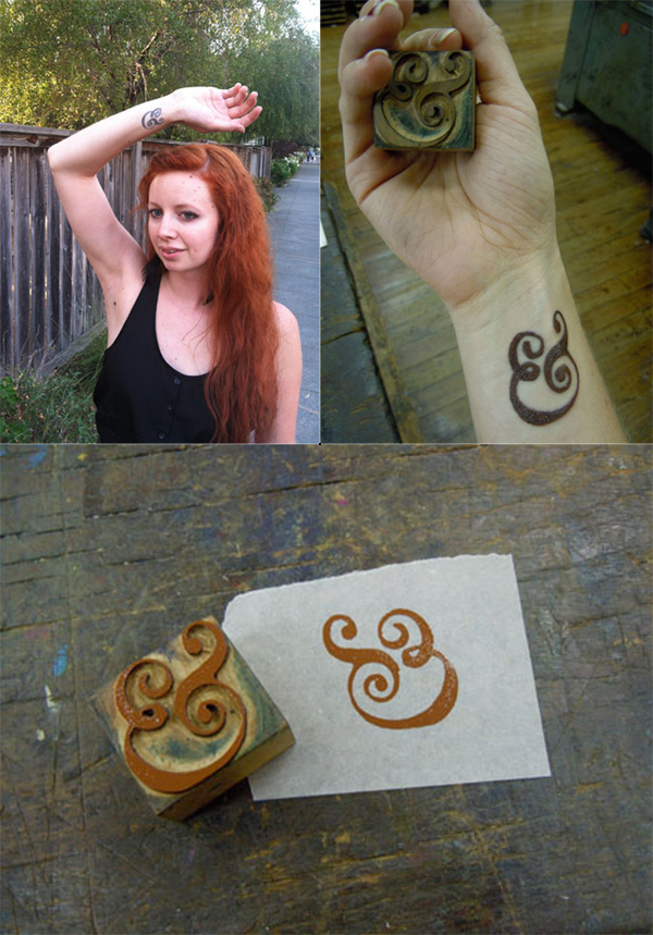 When I was about to graduate from CCA (California College of the Arts) with a degree in Graphic Design, I knew I wanted a bit more of a hands-on approach to design in my life than most of my classes had emphasized (I took a lot of letterpress and bookmaking on the side to make up for it). On a whim I applied to the Hatch Show Print internship program for the month after graduation, and I got accepted! Thus, my boyfriend and I relocated to Nashville, Tennessee for 6 weeks.
While at Hatch I got some AMAZING experience playing with type, designing and printing, and learning about the history of letterpress. I knew I had found my calling, and I felt that it was such a milestone experience that I wanted to get a tattoo to commemorate it. I have always loved the Caslon ampersand, and ampersands in general (my cat is even named Ampersand), so when I saw a Caslon ampersand woodblock at Hatch I knew it was the tattoo I wanted. My other tattoos are kind of hidden, so I also knew I wanted it in a place I would see (and others would see) all the time, which is why it’s on my wrist.
I pulled a print of the woodblock, and took that to the tattoo artist to copy. I specifically wanted it to have some woodgrain texture so it would look more like woodtype, and less like digital type. Overall, though getting the tattoo hurt a lot, I absolutely LOVE my tattoo. It is a constant reminder of my passion for history, letterpress, and things that are well crafted and handmade.
 While I was at the Ladies of Letterpress conference this year, I decided to get a type related tattoo as a souvenir. It’s a less obvious version of mind your p’s and q’s. When I look at it, it is a p and q within curly brackets and from the perspective of someone else, it is a b & d.
My part time employee at the shop Bill also has a p’s and q’s themed tattoo. His is much more obvious with the actual moveable type forms tattooed with the wording of “mind your” I’m not entirely sure why he got his, beyond a love for letterpress.
 I had the tattoo done just a few months after dropping out of college here in Mexico City. My job back then required me to do a whole lot of print work for the company I used to work. However, being so inexperienced and contact-less after dropping out, I had to try quite a lot of print shops, most of which produced less-than-stellar results.
One thing I never got to learn while in school was color matching and the whole printing process, since most of my education was focused around digital output. It took me a really long time to get the hang of these concepts, trying out an endless list of shops and ruining, I’m sorry to admit, quite a bit of paper in the process. At the time, I chose to have the tattoo done since it was very useful to have this comparison point readily available, almost at my finger tips. Now a days, it’s more of a welcome reminder that learning about anything is more akin to a practicing a craft than carrying out a job.

It was only natural when planning for a tattoo to use a ligature as my trade symbol. After a bit of research and exploration, I found this italic ampersand an allegory of my life: … always looking to what comes next... Over the years I’ve see a few other ampersand tattoos, but something about the way this one’s shaded and the subtle wrap of the terminals around my forearm have kept it distinctive.
I have many tattoos large and small, some of them pertain to printing and the rest are Victorian Luddite sentiments. The first and second printing tattoos I got at the same time: an ink brayer and a copy of a “poison” skull from ludlow specimen book. The third is the now famous “apathetic ink knife” of which is a bit cathartic now since some how it proliferated the web a bit after I got it. A friend of a friend drew it (lithoshop) and one of my tattooing friends convinced me to get it. The next one will be a little guy of a windmill……

Do you or someone you know have ink in the blood? Let us know in the comments section below! We’d love to hear from you!
A common downfall of new printers using light colored inks is thinking the print will be the same color as how the ink looks in the can. Here is a can of nice deep rust orange ink but it is actually meant to be a light apricot color. When applying an unfamiliar ink to your press, use a small amount and work your way up to color. That is much easier than having to wipe ink off and possibly put lintballs from a rag on the ink drum or disc. If you do have way too much ink on, it’s less trouble to simply wash up and start over. There is never an end to learning more press tricks!


Wandering the displays at the Printers Fair at the recent 2012 Ladies of Letterpress Conference reminded me of a nifty pocket book written a few years ago filled with one liners about productively living our lives. This great instructional guide gave little gems of wisdom and witty truisms such as “be courteous to everyone” or “remember people’s names”. All good, sound advice.
Lo and behold, I started to notice a few good suggestions and observations at the printers Fair that we can probably all smile over, agree with or be improved by. So here in a nutshell are interesting life reminders for all of us from our fellow letterpress printers, in beautiful form.

(photo credits: clockwise from top left – Chris Charles – Fly Rabbit Press; Amos Kennedy – Kennedy Prints; Rachel Hetzel – Pistachio Press)

(photo credits: clockwise from top left – Chris Charles – Fly Rabbit Press; Kathryn Hunter – Blackbird Press; Margot Ecke – Smokey Road Press; Jessica Peterson – Paper Souvenir.com)

(photo credit: above – Margot Ecke – Smokey Road Press)