2016 Seattle Children’s Hospital Broadsides: Part 1

In its sixth year of running, we’ve teamed up with amazing young poets, and inspired printers to share with you 2016’s Seattle Children’s Hospital Broadside project in a two-part blog feature. The collaboration of 22 artists and pediatric patients is helmed by poets Sierra Nelson and Ann Teplick of the Writers in the Schools program and the School of Visual Concepts in Seattle. WITS works with long term patients at Seattle Children’s Hospital to write poetry, out of which printers & artists create beautiful letterpress broadside prints. Boxcar Press supports this project with photopolymer plates for the limited run of broadsides. Participating printers share their experiences bringing each poet’s words to life in this year’s edition.

This first installment features six printers who share their printing process and experiences with the youth writers of the program.

2016 Seattle Children's Hospital letterpress broadsides project
Letterpress broadside posters from the 2016 Seattle Children's Hospital letterpress broadsides project

Bonnie Thompson Norman Every year, I feel a strong connection to the young person whose poem I print. I know each person who works on these broadsides feels the same way. We don’t always have (or choose to have) the opportunity and/or privilege of meeting our poets, but the bond is a strong one. As the project comes to an end, we all gather for a potluck dinner. All of the completed broadsides for that year’s project are displayed. Each of us reads “our” poem and talks about the process of creating the image, designing the text, printing, etc. The sharing that takes place as we read and talk about our connection to the young person who wrote the poem and our experience in interpreting it for others to see, is a meaningful bond for all of us and each of us…to the writers, the poets who work with them, and one another. It is what keeps us looking forward to coming back year after year. It isn’t just a legacy for the poets and their families. It is our legacy, too.

Here is a video of the creative process for a few of us:

(video courtesy of www.seattlechannel.org

One last comment on the bond between printer and poet… last year, I wrote a blog post about my young poet who I was able to meet on his 17th birthday. He teared up when he saw how I had interpreted his writing. We met at the Children’s Hospital where he was (again) a patient when I gave him his copy of his poem that I designed and printed. We were both emotional when he saw how I had interpreted his writing. It was so gratifying to see how he appreciated what I felt was our collaboration though we had not met before.

Chris Copley 2016 was my second experience with the Seattle Children’s Hospital poetry broadside project. My 2015 project was both artistically challenging (still a rookie to letterpress, I carved three 10-inch-by-13-inch linoleum blocks to illustrate the poem’s text and images) and emotionally poignant (the poet I worked with, 13-year-old Ahmie Njie, died about a month after I printed her poem). Exchanging a few Facebook IMs with her before she passed away remains one of the highlights of my life.

I liked the idea of incorporating the text of the poem itself in the illustration of the poem, so I planned to do that again in 2016. I worked with a poem by 12-year-old Kayli Jones, a Chinese-born adoptee living with her American parents and three brothers in Idaho. I exchanged a few email questions with the poet’s mom to learn a little more about the poet.

Chris Copley creates beautiful broadsides for the 2016 SVC Children's Broadsides project.

The primary design concept for me revolved around Kayli’s Chinese origins. So I decided to use the poem’s text to represent branches of a Chinese-style cherry tree in bloom. Cherry blossoms are considered a symbol of good luck in Asia, and Kayli’s poem ends on a note of hope and determination to beat her cancer.

I hand-drew the letters of the poem, then ordered a polymer plate from Boxcar. This was my first polymer plate print run, and it worked SO WELL. I couldn’t have been happier. All of my text was printed in black. I then hand-set a tall, thin column of text for the colophon; the form was intended to evoke the look of a column of characters on a Chinese-style painting.

I decided to print the second color, red, using a different technique — pressure printing. I used a print from the first color run to cut out the cherry blossoms, and then glued them onto another print to create the pressure-print “plate.” I used the print with the blossom “holes” as a frisket to mask the speckling you get with pressure printing. Printing the blossoms also went pretty smoothly, although I had to recut the frisket twice to try to get the blossoms the way I wanted.

(An added disaster-turned-blessing: I forgot to bring a linoleum block as required for pressure printing, so I used the backside of a Boxcar base, and the swirly pattern on the base’s bottom side left an absolutely beautiful effect on the cherry blossoms.)

Finally, I added another element, at least to some of the prints: several hand-drawn Chinese-style chops, also in red ink. Two of the chops spelled Kayli’s name in characters reminiscent of ancient Chinese text. I printed them freehand on only a few prints, using an ink-stamp pad because I worried they would distract from Kayli’s poem.

I was really happy with the broadside design and printing, and I felt it represented Kayli well. As much as I enjoy the artistic and technical challenges of portraying a poem, it’s important to me to represent the person whose work I’m illustrating.

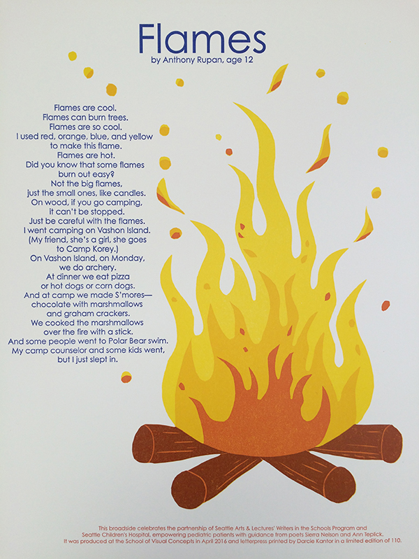
Darcie Kantor It was an honor to be part of the Children’s Hospital Broadside project. This was my second year participating.

Darcie Kantor creates beautiful broadsides for the 2016 SVC Children's Broadsides project.

For my process I combined Boxcar plates for the poem and did a linoleum block reduction for the fire/flames. It was a fun project to work on.

Darcie Kantor creates beautiful broadsides for the 2016 SVC Children's Broadsides project.

Juliet Shen The boy who wrote this poem was a registered member of the Swinomish tribe whose lands are north of Seattle on Puget Sound. I had designed a font for the Lushootseed language (indigenous to this area) and asked my contacts in the Tulalip Lushootseed Department to have his poem translated so it could be typeset in both languages.

Juliet Chen's beautiful broadside as featured in the 2016 Seattle Children's Broadsides.

When it comes to making art work, I am against the appropriation of traditional Native American art styles by outsiders because my research for making the Lushootseed font revealed that the iconic imagery used by Northwest tribes has deep cultural significance. I decided to design to my particular strengths, which are typographic, not illustrative, so I typeset the poem in a shape that I hope looks like an elk to readers. I rely on polymer plates because my primary focus is on typographic design and I need the control that using polymer affords me.

Heidi Hespelt I do want to say that our printing community is amazing!  I had a terrible back injury at the end of last year and was pretty much out of printing commission. Amy Redmond offered to do the actual printing for me if I wanted to be involved in the design. She made it possible for me to participate by giving of her time and printing expertise.

Heidi Hespelt creates beautiful broadsides for the 2016 SVC Children's Broadsides project.

Project supervisor, Jenny Wilkson, selected a younger poet for me, not knowing that she chose what was secretly the one I wanted. Serendipity.  My poet was Alex Enderle, and the poem was “I Am Me”.  Alex was 7 when he wrote the poem.

Heidi Hespelt creates beautiful broadsides for the 2016 SVC Children's Broadsides project.

I think of it as the cupcake poem.  I wanted a younger poet because I have a now 5 year old grandson that is a big part of my life and felt like I could probably tune in to what a little guy might find interesting. Bright colors and yumminess that you can see seemed important and I loved what I was able to accomplish with Boxcar plates.

Annabelle Larner I’ve participated as a printer in the Seattle Children’s Hospital Broadside project since its inception about 6 years ago.

Most of my work is all hand done. This year’s project, from April 2016, was printed using a hand-cut wood block as the printing base, with a lightning bolt used as a pressure print. It was printed with a split fountain ink in dark blue, then the final polymer type was printed in red.

Annabelle Larner creates beautiful broadsides for the 2016 SVC Children's Broadsides project.

Working on this project is extremely rewarding, and also hard. I want to really get into the words of the printer and try to convey their feelings in a way that is not too literal or childish, as I know kids can appreciate darkness, and what they are going through is pretty dark. Sometimes I get to meet the kids and it’s always special. Their parents are often very grateful, and seeing the kids talk about their poems is amazing.

Stay tuned & read on about this amazing Broadside project in the upcoming Part 2. The creativity and intensity of both poets and printers and the dazzling results are why Boxcar is proud to have a part in this project every year.

Let’s See That Printed: Dead On Paper’s Extraordinary Tarot Card Prints

As soon as Chris Ovdiyenko’s masterfully intricate and eerily beautifully illustrated Arcana tarot card designs passed through our platemaking department, we were eager to learn more about the project and how it was to be printed. Chris from Dead on Paper filled us in on the gorgeous work (and let us know where we could snag a print or two)!

Photopolymer plates being made for Chris Ovidiyenko of Dead on Paper. This letterpress Arcana tarot card poster series features eerily beautiful detailing.

All prints are 11×14” on Stonehenge Natural White, printed with Van Son Universal Black. I’m printing them on a 1907 Peerless platen press. As you can see from the images, I’m using a Boxcar Base (love it!!), and gauge pins from Boxcar Press also.

Chris Ovidiyenko of Dead on Paper brilliantly prints eerily beautiful detail in his letterpress Arcana tarot card poster series.

In order to get good coverage, I’ve cranked up the pressure a fair amount and hand turn the fly wheel. Although my press is motorized, with the increased pressure the motor and belt assembly isn’t able to make it through a full cycle as it takes a fair amount of effort to get it through to the point where the platen touches paper.

Chris Ovidiyenko of Dead on Paper brilliantly prints eerily beautiful detail in his letterpress Arcana tarot card poster series.

There are 45 different designs with a total run of 3000 prints. At this point, I’ve completed about 1800 of them. The most difficult part, as you would imagine, are the ones with large areas of flat black. Luckily I have the technique down to where there’s only a minimum of “salting” which actually adds some nice character to the prints. 

Chris Ovidiyenko of Dead on Paper brilliantly prints eerily beautiful detail in his letterpress Arcana tarot card poster series.

Just a quick word about the plates – they are amazing! I started out relief printing with laser etched wooden plates, and what a world of difference photopolymer plates have made for me! I outfitted my press from Boxcar and love the high-quality plates, excellent service, and speedy turnaround!

Huge round of thanks out to Chris at Dead on Paper for letting us get a closer look at these brilliant poster designs! And be sure to snag a print here!

2015 Seattle Children’s Hospital Broadsides

Boxcar Press has a heart for projects that combine letterpress printing with children, and none is more dear to us than the Seattle Children’s Hospital Broadside project. This collaboration with 22 artists and pediatric patients always yields beautiful art and prose. The children’s ages range from 5 to 20, and through the Writers in the Schools program (WITS – a poetry program spearheaded by Sierra Nelson and Ann Teplick) the children create amazing imagery with words. The printers at the School of Visual Concepts then give their interpretation of the words. Each year we support this project by donating photopolymer plates for the limited run of 106 broadsides. We reached out to some of the printers involved this year to hear more about their experiences and how they created artwork to showcase each poem – take a look.

Seattle Children's Hospital letterpress broadsidesSeattle Children's Hospital letterpress broadsidesSeattle Children's Hospital letterpress broadsides

Ana Sofia Mariz I was fortunate to find a perfect fit in terms of the poem. My little poet was five and I also have a son of the same age. So I immediately felt engaged and connected as I felt I could hear the boy’s voice in my head. I decided to involve my own son in the project. I told him about this boy who was sick and had written this poem and that we’ll make him a beautiful “drawing” so he’ll be happy and recover faster. My poet wrote about Spiderman, so I brought that idea into the layout within a kid’s visual repertory:  drawing, coloring, and crayons.

AnaSofia-IMG1AnaSofia-IMG2

As the boy would be the Spiderman, I decided to trace my son’s hands and color them as within a Spiderman suit. They are climbing the text wall and the title would be hand drawn like a web between the hands. All the elements would reflect the imperfections of a hand drawing.

I never got to meet the boy. I guess I didn’t realize that was possible at that time, but I wish to meet him and his family some day. I can easily say that this was one of the top five most enjoyable projects I’ve ever done.

AnaSofia-IMG3

Sarah Kulfan This year was my third participating on the Seattle Children’s broadside project. I chose to print my poem using Boxcar plates because of a tight schedule and I have produced great prints with Boxcar plates previously. The poem I printed is called ‘May I’ and was written by eleven year old Kira Hoffman. I was very excited to work on this poem because the first stanza immediately made me think of my brother’s dog Roofus, who passed away this year.

Sarah Kulfan's dog Rufus was the inspiration for her Seattle Hospital Children's Broadsides project print.Sarah Kulfan's dog Rufus was the inspiration for her Seattle Hospital Children's Broadsides project print.

Initially, I was planning on asking Kira about her dog but I realized my interpretation of Kira’s poetry was part of the collaborative process that makes this project so rich. I helped raise Roofus as a pup and over the years, have created various Roofus inspired drawings and artwork. I dug up some old photos of Roofus and developed a sketch. Through Kira’s words, this would be an opportunity to commemorate the pup that I helped raise.

Sarah Kulfan's dog Rufus was the inspiration for her Seattle Hospital Children's Broadsides project print.

Jenny Wilkson who heads up the SVC letterpress shop and leads the Seattle Children’s broadside project once said that this project is one of the most sustainable efforts she’s experienced.  It’s easy to see this as many of the same printers return to donate their time and energy each year, which is one reason why I love this project. I am so honored to have printed Kira’s poem and create a keepsake for her and her family to share; and my brother got a nice birthday present this year, a last memento of his best pal, the yellow dog, Roofus.

Heidi Hespelt This was my second year participating in the Childrens’ Hospital Broadside project.  It is such a joy to be part of it. My poet is a 16 year old girl who, I hear, is now doing well and living in Portland. Her poem was strong and happy, so I chose bright colors and the Gerbera daisy image to illustrate that. I used polymer plates for the text and did a lino block reduction for the flowers.

Heidi-Hespelt-IMG6Heidi Hespelt carves out a lineoleum block for the first ink pass for her contribution to the 2015 Seattle Hospital Childrens Broadsides Project.Beautiful reduction cuts for Heidi Hespelt for the Seattle Hospital Childrens Broadsides project.

I am a bit smitten with the reduction process (to me it can be a brain twister!) where the block is carved between each pass and the parts that are carved away stay the color you just printed. Sound easy? Yep! Easy to get confused! It was a very satisfying project for me this year to master this. ​

Beautiful second color run on the Vandercook for Heidi Hespelt for the Seattle Hospital Childrens Broadsides project.Heidi-Hespelt-IMG5

Darcie Kantor Printed in black and what she calls “Darcie Yellow” because her 15 year old poet specifically titled her poem “Black and Yellow”.

Boxcar letterpress plates in action for Darcie Kantor's Seattle Hospital Children's Broadsides project print.

Many thanks to all of the printers who donated their time and efforts to this amazing project!

2014 Seattle Children’s Hospital Letterpress Broadsides

For the past few years, we’ve collaborated with the Writers in the Schools program (WITS) and the School of Visual Concepts in Seattle, Washington, to create an inspiring collection of letterpress broadsides. Poets Sierra Nelson and Ann Teplick from the WITS program worked with long term pediatric patients at the Seattle Children’s Hospital to write poetry, and the artists use the poetry to create beautiful letterpress broadsides. This year, 20 artists worked on the project to create 20 prints for the Seattle Children’s Hospital Broadsides project. We supported the project by donating photopolymer plates to help offset the product costs involved with creating this limited run (only 110 were created!) of broadsides. Here are a few photos from this year’s beautiful collaboration – as well as photos of the artists who letterpress printed the broadsides!

2014 Seattle Children's Hospital Broadsides project2014 Seattle Children's Hospital Letterpress Broadsides

2014 Seattle Children's Hospital Broadsides - letterpress artists 2014 Seattle Children's Hospital Broadsides - letterpress artists 2014 Seattle Children's Hospital Broadsides - letterpress artists

2014 Children's Hospital Letterpress Broadsides

2014 Children's Hospital Letterpress Broadsides2014 Children's Hospital Letterpress Broadsides

Artist photos courtesy of the School of Visual Concepts