For the fifth installment of our letterpress roundtable discussions, we asked some of the printing and designing world’s die-hard denizens to show off their love of all things printing via their tattoo work as well as the stories behind the ink. And trust us, there’s always a good story to be told. As always, we’d love to hear of your own stories embodied in tattoo-form in the comments section!
 I decided to get a Fuchs and Lang litho press tattooed on my back as a kind of homage to what is no longer made, and had plans to compliment it with an old style C&P 10X15 eventually; obviously not two at a time. These were by no means my first tattoos, and so I knew what I was getting into and knew what I wanted out of the artist. I found the appropriate engravings and took them to a few tattoo shops and talked to some folks/had consultations, and eventually settled on a fellow named Josh Egnew at 3 Kings who I had worked with before. Firstly, he did such a great job with the Fuchs and Lang that I was excited to bring him the drawing of this C&P; he kinda balked at it at first, as it was even more of a p.i.t.a. than the litho press, but after taking the time to trace it out for a transfer – he seemed happy enough, but a little bit reluctant. It took 2 sessions: one to outline and handle some of the shading, and the other to finish up the shading. By comparison, the litho press took him one session. I’m sure I squirmed a lot more for the C&P.
In the end I know he was very happy with the results, and the work is slightly out of character for him, but it was first rate work and the whip shading he used was top-notch. I can honestly say I will not be very likely to get anything as ornate or difficult to work with as this press, but I feel it is a commitment to what I love to do – and a fitting illustration as homage to this lovely breed of art that, if you are reading this blog, you undoubtably know and love yourself.
 When I was about to graduate from CCA (California College of the Arts) with a degree in Graphic Design, I knew I wanted a bit more of a hands-on approach to design in my life than most of my classes had emphasized (I took a lot of letterpress and bookmaking on the side to make up for it). On a whim I applied to the Hatch Show Print internship program for the month after graduation, and I got accepted! Thus, my boyfriend and I relocated to Nashville, Tennessee for 6 weeks.
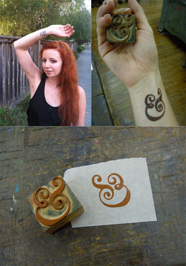
While at Hatch I got some AMAZING experience playing with type, designing and printing, and learning about the history of letterpress. I knew I had found my calling, and I felt that it was such a milestone experience that I wanted to get a tattoo to commemorate it. I have always loved the Caslon ampersand, and ampersands in general (my cat is even named Ampersand), so when I saw a Caslon ampersand woodblock at Hatch I knew it was the tattoo I wanted. My other tattoos are kind of hidden, so I also knew I wanted it in a place I would see (and others would see) all the time, which is why it’s on my wrist.
I pulled a print of the woodblock, and took that to the tattoo artist to copy. I specifically wanted it to have some woodgrain texture so it would look more like woodtype, and less like digital type. Overall, though getting the tattoo hurt a lot, I absolutely LOVE my tattoo. It is a constant reminder of my passion for history, letterpress, and things that are well crafted and handmade.
 While I was at the Ladies of Letterpress conference this year, I decided to get a type related tattoo as a souvenir. It’s a less obvious version of mind your p’s and q’s. When I look at it, it is a p and q within curly brackets and from the perspective of someone else, it is a b & d.
My part time employee at the shop Bill also has a p’s and q’s themed tattoo. His is much more obvious with the actual moveable type forms tattooed with the wording of “mind your” I’m not entirely sure why he got his, beyond a love for letterpress.
 I had the tattoo done just a few months after dropping out of college here in Mexico City. My job back then required me to do a whole lot of print work for the company I used to work. However, being so inexperienced and contact-less after dropping out, I had to try quite a lot of print shops, most of which produced less-than-stellar results.
One thing I never got to learn while in school was color matching and the whole printing process, since most of my education was focused around digital output. It took me a really long time to get the hang of these concepts, trying out an endless list of shops and ruining, I’m sorry to admit, quite a bit of paper in the process. At the time, I chose to have the tattoo done since it was very useful to have this comparison point readily available, almost at my finger tips. Now a days, it’s more of a welcome reminder that learning about anything is more akin to a practicing a craft than carrying out a job.

I’ve always been a fan of type. The obsession started early, practicing the “Metallica” lettering style over my folders in 5th grade. The natural gravitation from music and art eventually led me (narrowly dodging guitars altogether) to a career in graphic design.
It was only natural when planning for a tattoo to use a ligature as my trade symbol. After a bit of research and exploration, I found this italic ampersand an allegory of my life: … always looking to what comes next... Over the years I’ve see a few other ampersand tattoos, but something about the way this one’s shaded and the subtle wrap of the terminals around my forearm have kept it distinctive.
I have many tattoos large and small, some of them pertain to printing and the rest are Victorian Luddite sentiments. The first and second printing tattoos I got at the same time: an ink brayer and a copy of a “poison” skull from ludlow specimen book. The third is the now famous “apathetic ink knife” of which is a bit cathartic now since some how it proliferated the web a bit after I got it. A friend of a friend drew it (lithoshop) and one of my tattooing friends convinced me to get it. The next one will be a little guy of a windmill……

Do you or someone you know have ink in the blood? Let us know in the comments section below! We’d love to hear from you!


