Here is a simple and classy way to let gold foil shine on a traditional wedding invitation. This is jewelry on paper!

Here is a simple and classy way to let gold foil shine on a traditional wedding invitation. This is jewelry on paper!
No one knows Murphy’s Law better than a printer. Rarely does a day in the print shop or studio go by without some hiccup or problem to be solved. And while most problems are a speed bump, there are those doozies that hit us, challenge us, and make us wonder why we ever thought printing should be our career choice. For this next discussion, we asked a handful of printers for their ultimate letterpress disaster stories. The one that can now be looked back on with some humor and possibly even a good lesson learned. So read on, enjoy, and please share your own “oops” moment with all of us. You’ll feel better for sharing.

My worst letterpress disaster occurred in September 2004. I had just moved my shop from Charlestown, Massachusetts to Asheville, North Carolina in August. The move itself was traumatic enough, but it got done. I had just finished painting the shop, getting everything moved into place, and was ready to go when, on September 7, the remnants of Hurricane Francis moved up from the Gulf and it began to rain, and then it rained some more, and then it continued to rain. My shop is about 100 yards from The French Broad River. The water rose on its banks, and continued to rise until the water made it over the banks and flooded the entire area. The next day I tried to drive to my shop but the road was blocked about 2 miles away. No one was allowed in. The entire area was under water. A week later I could finally make it to my shop. Opening the door there was about 6 inches of muck and water on the floor. Looking at the wall you could see the water line at about 4 feet. Everything in the shop below that line had been submerged in water. The fun was about to begin…
I have a few pictures after the flood and a broadside that I eventually printed titled Flood to “commemorate” the event. The broadside was a poem by Robert Gibbons (a friend from my years in Boston). He sent me the poem shortly after the flood in my shop.
The photo of my office chair shows some of the muck that was left everywhere. The photo of the chipboard is the one redeeming piece of art from the flood. I had stapled chipboard over each typecase to keep the type in place during my recent move. After the flood I pulled this piece of chipboard off one of the cases and found this impression of the case transfered to the chipboard. The chipboard is framed and hangs on my shop wall.

In late 2010, I was excited to see a Facebook posting for a show by Carlene Carter at the home of the Buffalo Philharmonic Orchestra. Carlene Carter is the step daughter of Johnny Cash (daughter of June Carter Cash) and ex-wife of Nick Lowe. Kleinhans Music Hall is a modernist/deco building desiged by Eliel and Eero Saarinen. Being a fan of them all, I thought it might be great opportunity to do a poster. The Western New York Book Arts Center had been doing outreach to other cultural organizations to create posters (at no charge) for events as a way of getting our name out in the community and showing off our work, and as a good will gesture to help
other cash strapped cultural organizations who could not budget for a letterpress poster. I had emailed the marketing department at Kleinhans Music Hall but hadn’t heard back. We always try to get permission for
gratis posters (or even better, get hired to do actual paying jobs) but rarely would do a poster without some nod of approval from a promoter or artist. Since I had a very clear idea of what I wanted to do yet did not hear back, I figured I would just print it, go over and show them one, they would love it and say “yes, we would love for you to print us a poster.”
The main idea was to use an assortment of oversized wood type that was particularly distressed as overlapping shapes in combination with a stylized guitar fretboard made from the backs of wood type blocks. The fret markers were made by drilling a shallow hole with a cordless drill into the back of a few blocks. The holes would not affect the the printing of the other side, and wood type often has some sorts where an industrious printer needed a letter so the back is hand carved; dilemma averted.
The combination of the homage to Hatch Show Print posters a la Johnny Cash and the Art Deco caption text evoking the Kleinhans Music Hall seemed to be a good fit. I confirmed the info from the Facebook posting and
then went to work to set up the poster in the bed of our Vandercook SP-20. To render the guitar strings, various width of printers rule was set to have a full bleed and printed in metallic silver/blue. After getting about halfway through the first color (chocolate brown), something made me double check the show date. Instead of Facebook, I went to the actual venue website. Sure enough, the Facebook date was wrong. Oh well, glad I checked before the second color went on. So in changing from Saturday to Friday, I discovered there were not enough letters to spell everything out that was needed. In fact there were not enough ‘A’s for the Saturday setting so there is a V in BUFFALO. Friday had to be set in the other color – again, not a major problem, just one that needed a solution. On day two, when the second color was underway, some old acquaintances came by the printshop. They loved the poster but rather shyly pointed out that Kleinhans was spelled wrong. At that point I figured this poster was not meant to be since I never heard back and I decided it would all be put away and never discussed again.
Within a couple of days, I heard back from the people at Kleinhans and they loved the idea of the poster and were looking forward to it. I somewhat reluctantly reset the type, fretboards and the strings and tried to mix the colors…and make sure everything was spelled correctly. In the end, we gave the venue and Carlene Carter copies of the poster and she signed one and sent it to us with a nice note. Lesson hammered home once again — proofreading: not overrated.
This is a story about a press move. These are always stressful, especially when it is a DIY operation. It starts when a woman named Virginia Sheard agrees to give me her C&P 8×12 NS for free. I convince three friends to help me, and we show up on a Sunday afternoon with some tools and box truck.
We were, of course, grossly under-prepared. I don’t recall how exactly we did it, but somehow we picked the press up onto blocks and placed it onto a dolly. After removing the doors from their hinges, and just barely squeezing it past the door frame, Virginia mentioned that “Ah yes, I remember now, it came in in TWO pieces.” Once out the ground-level basement door, it had to go up the hill to street level. We opted for the long way around the house, an uneven hill rather than up the steps.
With two sheets of plywood to roll on, and a lot of unorganized pushing, we finally made it to the truck. Here’s where the story gets interesting. The press was strapped to a very large dolly, upon which it moves quite smoothly. On level ground, one person can move it with little effort. And so logic would then dictate that TWO people could easily keep it steady as the lift gate lifts it up. We all agree and push it onto the lift. I head up to the cab to turn on the engine of the truck (and the lift hydraulics).
In the amount of time it takes to walk back from the cab, the following has happened: The lift gate has lifted and slanted under the weight. The press shifted, and 2 wheels slid back onto the ground. Top heavy, and past its center of gravity, the press smoothly tipped off of the lift to land squarely on its back on the pavement.
We dropped the press.
One friend (wisely) let go, and the other (stubbornly) held on and was thrown 5′ from the lift. Miraculously he landed in a somersault and somehow jumped to his feet completely unscathed. The only fault of the third friend is that he didn’t take a photo.
Since I’m not insured for any of this, I’m not paying anyone, and I asked them all to help me, I can’t be upset. I calmly unstrap the dolly, winch the press back to vertical on the lift, and into the truck she goes. A handful of broken pieces came off with the fall, none of which are critical to printing mechanics. We move the press “temporarily” to the school where I work “for a few weeks”. It remained there for 3 1/2 years.
Finally this fall, 4 years after dropping her, this press is finally being put back together and into service at Baltimore Print Studios.
Here’s the press, just before she fell:

I was working on a new book edition with a tight deadline of 6 weeks. The images were of maps so I wanted to use an antique map color like orange, rust or ochre. I mixed up an orange and printed the entire press run of all 12 pages, edition of 50, only to decide that the color just wasn’t right and I had to start over. I had to buy the paper twice. The orange pages still sit in a box– I just can’t bear to throw them out!!
Three years ago, when I was looking for a house to buy, I knew that I needed a place that could accommodate my letterpress shop. I found a sweet little mid-century brick house in the sleepy town of Winterville, just outside of Athens, Georgia. It had a lovely little L- shaped yard and a decent sized workshop, which had been used as a tinkering station for the mechanic who had previously lived in the house. Two birds, one stone. I was excited.
I closed on the house and moved my presses into the backyard shop. I knew immediately that I had shown a lack of judgement when it came to the studio. Wind whistled through the cracks in the walls, which were
made of pallets and plywood. The cement floor was at such a severe slope (an 11″ discrepancy from wall to wall) that every press had to be shimmed, and the ceiling was too low to stand up completely. There were termites in the walls and the place was never clean. Plus, the previous owner had used the small patch of earth behind the shop as a compost and trash heap and so the ground was soft and full of building debris.
The building clearly had to be torn down and a new one would have to be built. However, with the recent move and the financial strain of starting a new business, I couldn’t afford much. I lured friends and past students over with the promise of beer and pizza and in one afternoon, we tore down the original structure. One wall was so termite ridden and water damaged, that it simply peeled right off.
I was lucky to find a carpenter who would to do the work for about $1500 and a trade (for business cards). Next, I hired an electrician who was willing to do the electrical work in exchange for a lasagna-a-week for six months. That trade also appealed to the guy who painted the workshop’s exterior. (Tip: the lure of lasagna even works for non-home-improvement trading: a haircut for a lasagna and hair coloring for an apple pie! I will add that it definitely helps when the person you are trading with is way too used to eating Ramen Noodles for dinner.)
I purchased windows and doors at Habitat and Southern Surplus (the guy gave me a discount when he turned down my offer of the lasagna trade). Lights were purchased from IKEA. And, of course, I did lots of the work myself: from the design, to the removal of debris, to helping the carpenter and pouring concrete. Pressroom patience paid off when it came time for me to operate the bull float…that floor is super smooth! The compost/trash heap was cleaned up and leveled and I brought in a bunch of white gravel and created raised beds. Enclosed within a tall white picket fence and shaded by the branches of a Chinaberry tree, that space is now one of the loveliest spots in the yard.
The total cost of the project came to about $5,000 and was well worth the price. The irony of this story is that I had only worked in the space for about a year before realizing that it was too small! Smokey Road Press will be moving to a new space in downtown Athens, Georgia in January of 2013.

Way back in the Czar early days…one of my first decent sized projects was to print about 40 new greeting card designs. Each card was two colors, with a one color envelope. This was way back when I first started (and we weren’t cool enough to be using photopolymer plates : ) …we were using wood mounted magnesium. These were new designs that were launching at the National Stationery Show. As any typical important job goes…we were not given enough time by my customer to reasonably complete the job. We had about 10 days to print the approximate 120 different plates, which consisted of at least 30-40 different ink colors…so we had a lot of set up on our hands.
As the plates arrived, I quickly got started, and then noticed that just about every other plate was ruined. Turns out…and as luck would have it…that the company we were using at the time for plates switched to a new washout solution, but didn’t have it quite dialed in. So the plates were basically being washed out too much and much of the copy was being washed away. The real killer was, I could not tell if each particular plate was good until I had it on press. I’m pretty sure I had an overnite shipment arriving every day with replacement plates to replace the bad ones. So now we were having to do all new set ups for the replacement plates and reprint about half of the colors….so the job turned into more like 200 plates and 60 colors…in less then 2 weeks. Kinda of a big deal, considering at the time, the company consisted of just me! Lots of coffee ensued…
I finished everything, barely. I like to think that I pretty much learn something new everyday that I’m printing…but I learned a lot on the fly from this disaster.
 A while back, a printer friend of mine referred a friend of his customer to me. This was in the difficult first 2 years of being on my own and in business for myself. This customer – let’s call them “Customer B” from here forward – had designed a stationery/identity set for a writer.
While several “red flags” went off at the start of the courting, such as the designer being out of the country, as well as the actual end consumer of the production being in the country, but out of state, and the job was an ultra rush (2-3 days to turn around a 4 piece, 1000 piece per style, 2 color suite? Oh, not to mention multiple paper-stocks+envelope runs? Hand cranked on a Vandercook? And I couldn’t gang them up, because the designer sent pre-cut paper?!?!) WHAT was I thinking.
And even though I hadn’t been sent the paper yet….. I somehow decided that this would be a profitable endeavor and thought it would be okay to do the job. I honestly don’t know why I didn’t just turn it down, but I took the job because I like working under pressure, enjoy a challenge, and thought what the heck – it’s good money. When something is that difficult, but I still know I can accomplish it… I can’t say no! It’s a weakness, this can-do-attitude….
Unfortunately, while I did lay out rush terms and made sure the contracting party did tell me about her vision and collected proper direction/art/supplies, I didn’t have the foresight to request any kind of down-payment; I also failed to ask the designer who would be settling the tab at the end, and didn’t really lay out terms that were clear. It was a rush job! There simply wasn’t time for me to turn around and ask all these things of them. Or so I thought. I guess at this point I was green enough not to really thoroughly vet the ‘business side’ of things, and hadn’t really been taken to the cleaners by a customer yet. Live and learn!
I completed the job to the best of my ability, which is to say it looked and felt great! I was quite satisfied with the results, and hand delivered this boxed set of brand spanking new stationery to the actual end customer – who happened to be in New York City, where I’m based, for a conference. This is why it needed to be rushed! She needed to pass out calling cards and write notes during her stay. She pronounced it to be of a quality that satisfied her expectations and then some, and even complimented me on the work. She went through the sets, fanned the printed matter on a table at her hotel, and I went over the parameters and pointed out all the details, and made sure that she was not only happy with the printing quality, but I went a step further- I spent some time educating her about letterpress printing, ink spread, impression, pointed out the back of the sheets and taught her about the qualities associated with “good” printing versus fine printing, and what she was receiving for her payment. When I left, she was a happy customer and had praised my efforts and seemed very appreciative.
….. But I had still not been paid, and verbal appreciation is NOT currency.
This is where the lesson should be learned folks: Always get paid a deposit worth at least your materials and labor; the other half or portion should be the profit, the fat you are storing for the winter, so that in the case you’re put into trouble you at least retain your investment…..
In this case, I contacted the designer and was given a run around for about a week, at the end of which she informed me that I had turned over “poor quality work” and that her customer was dissatisfied with the results. How would this customer have actually been given the opportunity to look at the results and be as excited as they were, and then turncoat in this way? I was not sure how it worked, and after a lengthy email chain back and forth during which the designer failed to take any responsibility, I realized that SHE had not been paid up front by the customer either, and that we were probably BOTH being taken for a walk – no matter how sweet and appreciative this person was at the time! What a PEST!
Moral of the story is, lay out your terms carefully in a contract looking official invoice format. Do not fudge this or leave wiggle room. Be clear about pricing and commitments/requirements, and ALWAY ALWAYS ALWAYS require a downpayment or a validated form of payment on file, because you never know how it will go at the end of the transaction – even with referrals and friends of friends. Never turn work over, especially hard work – rush work – unless you know you’ll be paid and have been paid a portion up front. It also really helps to know when you’re maybe out-gunned, or when too many red-flags actually do pop up – if you don’t recognize these things, it’ll maybe come back to bite you, referral or not!
We know you must have a disaster story or two that you can share, so tell yours in the comments section below!
Here stands a beautiful stack of foil edged cards, so brilliant and distinctive. Truly these are a treasure made to be shared as each piece is passed on to the lucky receiver.

At lunchtime, Stan brought in his handmade marimbas to hear them in the printshop cavern.
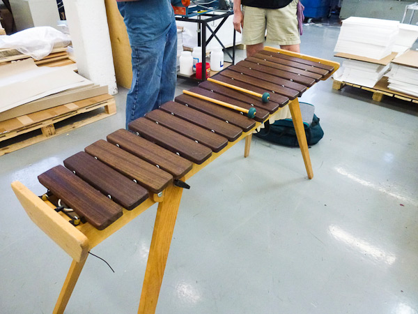
It was a wonderful impromptu concert!

Sounded great!
To keep colors uniform between pieces in a set, we like to look at multiple pieces at the same time while running. Sometimes the arrangement begs to be slightly embellished.

As summer is starting to sizzle up, letterpress lovers, we thought you’d enjoy a free summer themed vector set! This sunny set includes a sensational seashell, a bountiful flower pattern (notecards anyone?), a sweet trio of sheep, and a sandy beach starfish. All are free for use and in both EPS and PDF format. Cheers!


While in New York City recently for the National Stationery Show, we found that not everything inspiring was happening just inside the Javits Center. With a sharp eye, there was some appealing typography in signage that was spotted during our travels. We all can appreciate a well turned font and a clever capital that gets the message across. Shown here are just four images we snapped, but we also recommend checking out the artful NYC Type, a site that reveals some of the classic lettering hidden high and low along the streets of New Y0rk City. Click on each picture on the NYC Type website for the location of each photo.

Clockwise from the top: Harrington’s Bar & Grill on 7th Avenue | Classic serifs on 42nd Street with Madame Tussauds | Houndstooth Pub on 8th Avenue | More serifs grace the Regal Theatre marquee.
Guess who’s got lots of fun new cards to print up! We’ll make plenty for you all! Check them out and keep checking back for new designs coming soooon! Visit Smock.

Florescent Pink Pantone 806 makes a surreal mini inkscape inside the ink can with it’s particular crusting properties.

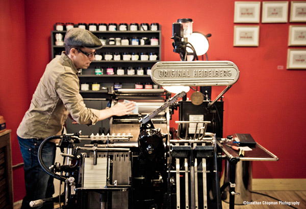
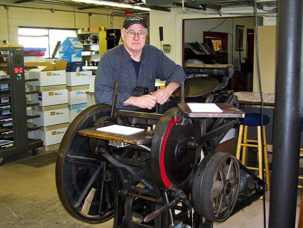
Todd Thyberg of Angel Bomb Design: My most widely used and favorite press at Angel Bomb is a Heidelberg Windmill which I’ve named Kaiser. I purchased it in 2009 from a printer who had advertised it for sale on Craigslist. I wasn’t on the lookout for a particular press, but I had been using a Chandler and Price for all my printing and wanted to be able to produce higher quantities of printing at a faster pace so I was keeping my eyes open for a good production press. Kaiser is a rock solid workhorse and a marvel of German engineering with an almost Rube Goldbergian sense of complexity. Kaiser had been relatively well taken care of but was filthy and several pounds of oil soaked paper needed to be removed from his innards before being used. His serial number is 104012E, placing his build date at 1954. He bears a badge stating “Made in the U.S. Zone of Germany” which reminds me of the Cold War era where spies lurked in dark corners and the world was a very different place. I use Kaiser to print small and large runs as well as die cut and he is always a hit with open studio events; the chug of the air pump powering the suction is like a siren song to passersby who get drawn in and are amazed at this old equipment that is still being used. Considering that this press was designed around the time of World War II and is still working today creates in me a sense of awe of how things used to be built and joy that I get to use him most every day.
Michael Russem of Kat Ran Press: I’ve recently retired from printing, but the best press I ever ran was my Vandercook Universal IV (SN 21497). It took a sheet measuring 32-7/8 wide by 29-1/2 tall—which was just about large enough for the books I was printing. Not only did it seem to be free of the usual problems that often plague power Vandercooks, but the enormous size of the cylinder and bearers cut down makeready time. Whereas I would spend tons of time making complicated tissue makereadies on my SP-20 and Universal I, there was just no need to do so on this big press. In fact, once I installed this Universal IV, I rarely used the two smaller presses as they weren’t worth the bother. And as the Universal IV was a power press, I was able to print twice as many forms per day without being exhausted and in pain when I crawled into bed. Of course, it took much longer to clean up the Universal IV, so I suppose the press wasn’t perfect. It was close, though. Now it’s with Art Larson at Horton Tank Graphics, and I hope Art finds the press to be as life-improving as I did.
Thomas Leech of Palace of the Governors Press: It was a tough call, but out of loyalty I have to say that my favorite press is my own 8×12 Chandler & Price Old Style that I’ve had since 1979. It’s not the best press I’ve ever run, but it is like a member of my family. The serial number is 26099, which according to the APA website puts its year of manufacture as 1890 – old enough to be my grandfather. It is driven by a leather belt and ancient motor that hums like a lullaby. Its comforting hum and rhythmic clanks put my kids to sleep when it lived below their bedroom.
I’ve owned it now for a quarter of its lifetime. I bought it from a guy who bought it from his brother-in-law, who bought it from a deaf man who printed cards with the American Sign Language alphabet. I still have a photoengraving of the manual hand signs, and printed it again only last year.
On November 23, 2008 the automatic counter, which I’ve never set back to zero, and which only counts to 99,999, turned over for the tenth time, which means that it had printed one million hand-fed impressions: business cards, book covers, birth announcements, wedding invitations, change of address notices, broadsides, poems, keepsakes, memorials, graduation announcements, wedding and baby shower invitations, clothing tags, bar mitzvah invitations, tickets, Christmas cards, Rosh Hashanah cards, art show invitations, book plates, keepsakes, and facsimiles.
While in my possession the press has printed under the names of The Fine Mess Press, the San Miguel Paper Workshop, the Smokebrush Press, and most recently, the Press at the Palace of the Governors. When a major building repair was required here at the Palace the press came back to my house, which felt something like having a grown child move back home. I regret I don’t have a photo to share of this press.
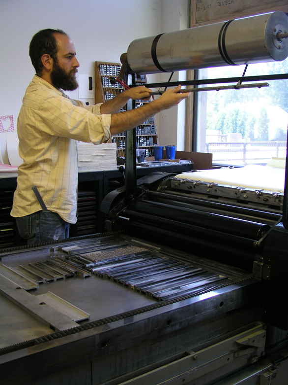
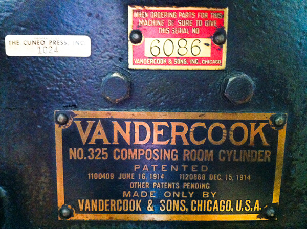
Eileen Madden of Evanston Print and Paper: That’s kind of like asking which of your children you like best. I’d have to say my favorite press to print on is the one I get to print on the least. Our big Vandercook 325 – serial number 6086. It’s my very first press. I bought it in 2007 from Columbia College. That’s where I learned to print, and I never saw anyone use it while it was there. It was mostly used as storage, I’m sorry to say. I guess I’d say it’s my favorite, because it’s the one I do projects of my own on – bigger posters or wood type collages. If I’m on that press it means I’m doing something just because I want to. As nice as it is to print with and for other people, it’s a treat to just play, too. After I acquired the press I found a metal tag on it indicating that it was owned at one time by the Cuneo Press – their press number 1024. The Cuneo Press was one of the large printing companies here in Chicago, and also had a fine book press that created some lovely and amazing work. Bill Anthony, who was a fine bookbinder who came out of the apprentice tradition in Ireland, worked at that press. I love having the connection with that history.
So. That’s my answer. In general I feel luck to be printing on any of our presses. I’m lucky to have this job, but I can say that the 325 is the one I’m the most personally pleased with.
John Barrett of Letterpress Things: The press that’s special to myself and the Barrett’s is B 57516, a new style C & P hand-fed with a Horton variable speed clutch. Manufactured circa 1920, Horace Moses purchased it in 1922 from an envelope company in Springfield, Massachusetts. Mr. Moses, a local philanthropist who founded Junior Achievement, Strathmore Paper Company and numerous other businesses, moved it to a building in Westfield, Massachusetts (formerly owned by the Westfield Whip Co.). There it was installed on the fourth floor as the first printing press owned and operated at Mr. Moses’ newest endeavor: The Old Colony Envelope Company. [The press still carries the original machine tag; a brass plate deep stamped with the number “1”.] It was removed from operations in 1967, about the time my interest in letterpress began to develop. Several years later, for the sum of $50, it was mine. Took it home and therein began my “second” career, Letterpress Services Co. From the beginning my interest was not so much in printing but in perfing, scoring, die cutting and imprinting; a trade service for offset printers, quick copy centers and in-plant printing departments. Old number 1 and me spent many, many hours together cranking out the impressions. Presently, “No. 1’ is semi-retired; eight Heidelberg Windmills carry the work load. But once in a while there’s a job best done by hand. And we step up, wipe the dust off, flip the on switch, coax the hand lever up to engage the clutch. And get goose bumps listening to the clack, clack, clack of the spliced leather belt. B 57516. . . ninety plus years and still pressing the letters.
Mark McMurray of Caliban Press: Well… my favorite press is really my first press, the one I bought with a deep breath, thinking: “in for a penny, in for a pound” after finishing just a week or two of letterpress classes at Red Ozier Press in lower Manhattan in 1985. It’s a 1947 Vandercook model 4T, serial number 10903, which is now tattooed over my heart. It came out of a commercial printer’s shop in New York that I was doing other business with at the time. Although it had been pushed to a corner and was not in use it had been well maintained over the years—which I’ve tried to continue. I remember my horror when suddenly one day one of the inking rollers started to wobble, then shock when I discovered that this was caused by a cracked bushing that was made out of wood (!), then relief to find that I could actually get a replacement (also wood) and fix it myself. (Thank you, Fritz, at NA Graphics).
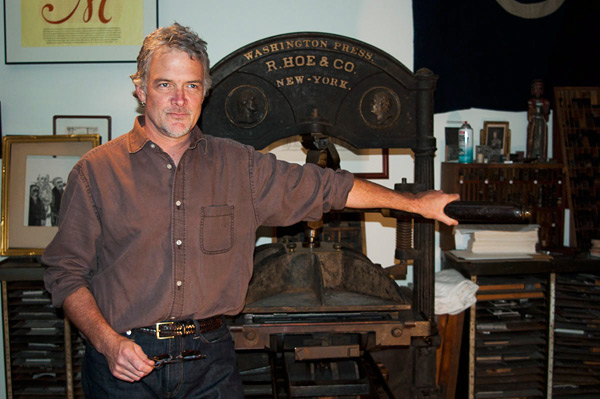
But my other favorite press (come on, life is too short for only one love) is a R. Hoe Washington. As I recall, Hoe began making these in the early 1830’s when he somewhat unscrupulously appropriated the famous “figure 4” toggle joint from another manufacturer. Most of the Washingtons that I’ve come across have had serial numbers cast on them. Mine does not. Therefore I’m assuming it’s early in their production cycle and I date it somewhere around 1835. I suspect press historians may have some views on this matter. I acquired mine from the late wood engraver Frank C. Eckmair who got it not far from his home in Gilbertsville, New York. A local Northern New York printer, Jim Benvenuto, helped me set it up and adjust the platen height and I’m always surprised at how well it prints, given its age and technology. So there… my two favorite presses.
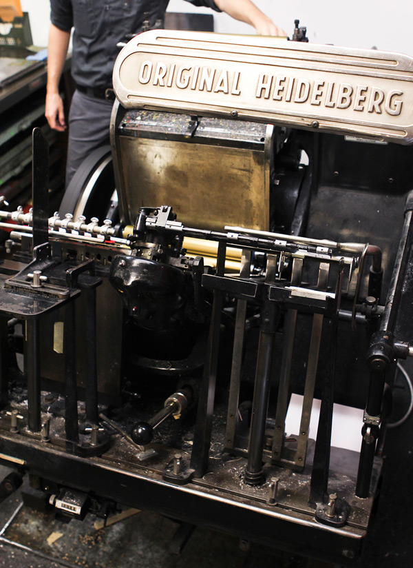
Brooks Chambers of Mamas Sauce: My main squeeze is an Original Heidelberg. Serial # 49582.
We adopted our Windmill from her original owner a couple of years ago. “Heidi,” as we’ve come to call her, was the workhorse of a family-owned basement print shop in Buffalo from the day she rolled off the line. We found her lovingly entombed with a host of tools, spare parts, and other presses that had been with Heidi since day one. The whole gang came with us to Orlando (no toy gets left behind) and Heidi still sits at the heart of this menagerie. Every time we give a tour, people react to her the same way that I did at our first meeting: they stop, stare, and smile. At that point in the tour, I’ve learned to shut up and get out of the way.
She isn’t the first Windmill I’ve had the pleasure of running, but she’s the best. If I had to put words to it, I’d say she’s delightfully invisible. She’s invisible in the way that every good interpreter ought to be. Other presses often interject, leaving the marks of their own idiosyncrasies throughout the run (even if their operator is the only one who knows). Heidi does exactly what I ask her to. Every. Single. Time. That kind of control gives you the freedom to defer to the artwork for inspiration. That kind of control forces you to become a better printer. Before we got Heidi, I could blame a lot my shortcomings on the press. Not anymore. Now the press gets all the blame for my success. She’s teaching me a lot about knowing when to shut up and get out of the way.
Brad Ewing of Marginal Editions: My favorite press is the Vandercook Uni III. It has an adjustable bed and its rollers are super dialed in!! The serial number is #26318. It’s currently located on 6th avenue and 29th street in Manhattan.
Leslie Miller from Grenfell Press told me that the press came from Middletown, New York about 20-25 years ago. It was large enough that it was taken apart and brought up to the 7th floor by placing the press on top of the elevator.
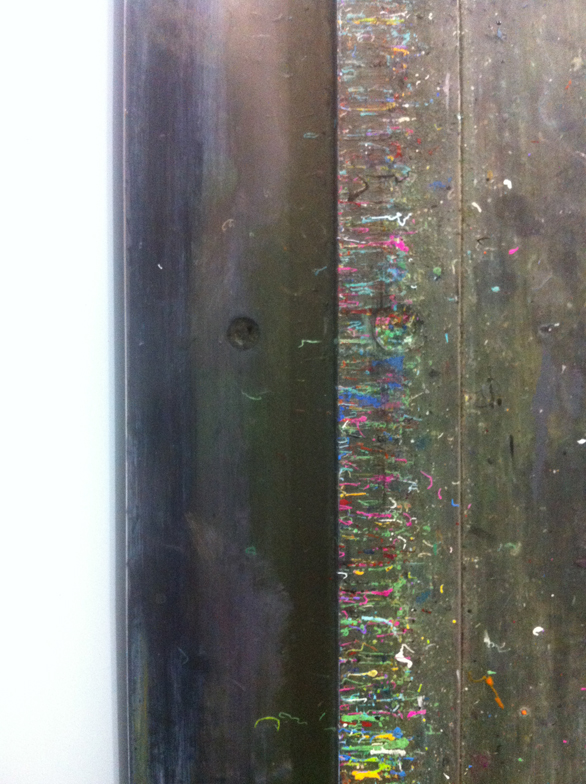
I have been printing lead and polymer plates on the press since 2005. I have also printed laser cut plexi, etched copper plates, leather, and even potatoes on this press. The ink splatters that have built up over the years on my Vandercook serve as a happy reminder of many beautiful print projects accumulated.
Is it any surprise that we love our presses? All of these presses have earned our love and loyalty and even a name or two. Now it’s your turn to tell us about the one that grabbed your heart and makes you a better printer. If you’ve got photos online of your press and you’d like to share them, please include a link to the photos in your comment!