Tell us about your printing mentors: a Valentine for the people who taught us how to print.

A few months ago, we sent out a survey to a whole lot of letterpress friends asking them a whole lot of printing things. One of our favorite questions was “Who are your letterpress mentors”? The list of responses was a gushing love fest to the famous, infamous, and unknown printers alike, the people who taught us, inspired us, and stay with us. You can read the list below. So in honor of red hearts and Valentine’s, share your stories with us — who taught you a love of letterpress — and what did they teach you?

Harold Kyle of Boxcar Press talks about his first letterpress printing mentor

Barry Moser a designer, typographer, illustrator and teacher from Pennyroyal Press, shared his mentor story with us:

I got started in printing in 1968. It was a late umber November afternoon in 1969. I wish I knew the exact date, because it was a day that changed my life. When I opened the door of Leonard Baskin’s Gehenna Press I heard a din of sweet noise and smelled the essence of viscera of a sort known to me in some distant and obscure way. The din was the chitty-chitty-bang-bang of the big press running. The essence was the smell of oil and grease and ink and solvents. There was an antique trestle table with stacks of books on it and a model of Gutenberg’s printing press. The books were of a kind I had never seen. Hand made paper. Fine bindings. Impeccable printing. I stood there, a little uncomfortable, and feeling like I had just stepped into another world. Continue reading

A Sweet Surprise: February Vector Set!

With Valentine’s Day coming up soon, letterpress lovers, we thought you’d enjoy a free Valentine’s Day vector set! The sweet set includes clever Scrabble messages for you and yours, as well as pair of lovebirds for all you nesting couples out there. All are free for use and in both EPS AND PDF format. Cheers!

Free February vectors from Boxcar Press

Did You Know That … Checking Line and Dot Thicknesses Is a Cinch?

One of the most common issues we face here in the Platemaking Department at Boxcar Press is determining a sufficient line thickness. Making that ruling means explaining to customers two things – how do you go about checking to see if lines or text are thick enough to hold on your particular plate? What’s the thinnest line that can hold on the plate?

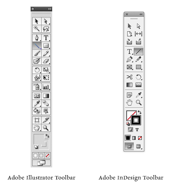
Surprisingly, there’s just one tool you need to utilize in either Adobe Illustrator or InDesign: The Line Tool. If you are using Adobe Photoshop, the Line Tool unfortunately reverts to a minimum line thickness of 1pt. If you are only using Adobe Photoshop to create your file, we highly recommend placing your final file in InDesign and using the Line Tool to check your work.

LINETHICKNESS_IMG1-1

What do we mean when we talk about our line thickness guarantee? Simply put, if your lines meet or exceed the line thickness as outlined below, we will guarantee they will hold on your plate. If they are under that thickness, it’s hit or miss. Some days you are lucky and other days, you might lose details.

The first thing you need to determine is your line thickness based on your plate type:

– If your plate type is the KF 95, Jet 94FL, or 94SB, you have a line thickness guarantee of 0.25pt or thicker.

– If your plate type is the KF152, 152SB, or 145SHSB, you have a line thickness guarantee of 0.35pt or thicker.

– For all plate types, your dots (like the ones above the letter “i”, periods, or dotted lines) must be 1pt to 1.25 pt or thicker.

THINK FAST! Quick quiz here – what is usually the most common culprit of too thin lines? Crop Marks! More on that later.

Here’s how to use the handy Line Tool to check to see if your lines are thick enough (and plate friendly, too):

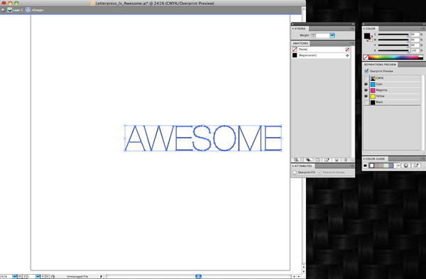
You need to first open your file in either Adobe Illustrator or InDesign. We’ll be using a small type sample in Adobe Illustrator to check to see if our lines are plate-friendly for a KF152 plate type. The KF152 plate type has a line thickness minimum of 0.35pt for lines and 1pt to 1.25 pt for dots. We can see that it looks like there are some thin lines in the serif of the Didot typeface… but will they hold?

First, click the Line Tool icon in the tool palette on the lefthand side of the screen in Adobe Illustrator to activate it. If you cannot find it, hover your mouse over the icon that looks like a line to see “Line Segment Tool ()” pop up in a yellow box .

Next, in the control panel up at the top, we’ll select the words “1 pt.” in the dropdown area next to the word “STROKE” with our mouse. You’ll be substituting the “1 pt” and replace it with “0.35pt”.

letterpress file prep tips from Boxcar Press

We’ll select the Zoom tool (Z) and move in because we’ll be doing some close up viewing in the area you are inspecting. Select the line segment with your mouse and move it so it is right next to the bottom part of the “L” in “Letter”. Draw a short line so it is parallel with the thin line you are checking on your art board. It doesn’t have to be very long but this little line segment will be our “ruler” to compare thicknesses.

letterpress file prep tips from Boxcar Press

At this close magnification, we see that our line segment set at 0.35pt is much thicker in comparison to the thinnest line in of the serif on the letter “L”. We will need to add a hairline stroke to boost our text’s thickness to correct this.

letterpress file prep tips from Boxcar Press

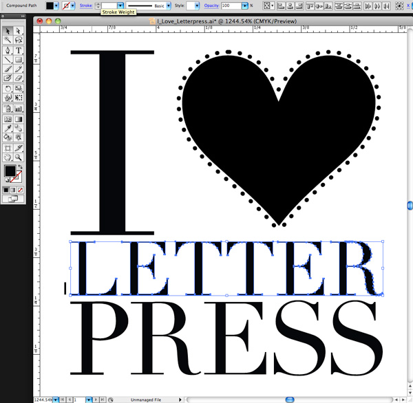
To add a stroke, using the selection black arrow tool (V), select all the characters in the word “LETTER.” In our Control panel at the top our screen we should see that the letters only have a fill and that we’d like to add a hairline stroke (about 0.15pt). Click the white area next to “STROKE” to activate the area so we can type in “0.15pt”. Immediately single-click the white area anywhere on the board. This will deactivate your selected text and add the hairline (0.15pt) stroke.

letterpress file prep tips from Boxcar Press

Zoom in again using the Zoom Tool around the line segment we created with the Line Tool and the letter “L”. We can now visually see that the serif on the “L” is as thick as the 0.35pt line. Success!

Delete your line segment and zoom back out. Continue around your artboard to visually check to see if other areas look “safe” as well.

For dots, such as the ones around the heart shape, we’ll need to set our Line Tool weight to “1pt” just to be on the safe side. We’ll repeat the same steps mentioned above to create the line, to zoom in, and visually compare the dots’ diameter against the 1pt line segment we just drew on our art board. Like the thinner lines on the “L”, we’ll need to correct this by adding a much thicker stroke of 0.3 pt to boost our dots’ diameter up to 1pt.

Using the Line Tool to check your work should be a “Must Do” test before submitting your files to your platemaking ticket. If anything appears too thin, you will need to correct it.

A few final instructions to help you be aware of potential trouble spots:

-When creating crop marks in your files – the program default setting is often 0.2 pt or 0.25 pt. Keep this in mind so you can make the necessary changes to your crop mark thickness when you place them.

-Thin lines that curve, particularly in wispy script or calligraphic fonts, are always suspect for being too thin. Give them the support they need to hold on the plate with hairline stroke (if needed).

Stay tuned, letterpress lovers — next we’ll solve the mystery of how to create multiple color files!

Related Blog Posts

Learn to Love Color Separations – A Boxcar Press Checklist
Did You Know That … 100% CMYK Black Is a Breeze?

Did You Know That … 100% CMYK Black Is a Breeze?

One of the more common questions we receive here in the Platemaking Department at Boxcar Press is: how do you check to see if your file is set up properly for color separations? Or in 100% CMYK Black (100%K where CMY are at 0%)?

One of the easiest ways is utilizing the Separations Preview palette that Adobe InDesign and Illustrator programs offer. To view the palette, simply select the following:

-In Illustrator (CS4 or above) WINDOW>SEPARATIONS PREVIEW
-In Indesign (all versions of CS) WINDOW>OUTPUT>SEPARATIONS PREVIEW

If you are using a version of CS3 or earlier, you will need to save your files, then place them into InDesign to check your color separations. In Adobe Illustrator CS3 or earlier, the separations preview window feature is not available.

separations-preview-palette-illustrator-indesign

Let’s examine how a file separates out using Adobe Illustrator.

If you are in CMYK mode, then you should see in the Separations Preview palette CMYK, Cyan, Magenta, Yellow, and Black. If you do not see all these colors, you are most likely in RGB or a different color mode and need to switch to CMYK mode. You can easily do this by clicking on FILE>DOCUMENT COLOR MODE>CMYK. Once you are in CMYK mode, click the box next to “Overprint Preview”, which will allow you to see what objects in your file do or do not have a certain color applied to it.

Let’s start with this nifty type sample in Helvetica Neue Ultra Light of “Letterpress Is Awesome”. We can see that it looks like all of the text is in black. Let’s take a look using the Separations Preview to see what colors we truly have here.

CMYK Separation instructions from Boxcar Press

If we click the eye graphic next to “black”, all objects containing ONLY black will disappear, as we’ve turned off that particular color channel. What we have left is the word AWESOME but it’s now a funny shade of black. This indicates it is not in 100% black, but rather is made up of parts of cyan, yellow and magenta in addition to black. We don’t want this as it will cause errors in your film output. Easy fix, though. But first we need to access another window in our toolbox. If it isn’t already open, you will need your Color Window.
(WINDOW>COLOR)

Select the remaining text by clicking on it. In your Color window you will clearly see it is made up of parts of CMYK.

CMYK Separation instructions from Boxcar Press

Move your cursor to the bottom far right of the color window to where there is a white rectangle over a black rectangle. When you are over the black color, the cursor should change to an ink dropper. Select the black and it will change your text to 100% black. See, the sliders moved to 0 for CMY. This text should disappear. Don’t worry! It’s good. Go back to your Separations Preview and click on the eye next to black. Everything reappears. Click off the eye and all items in 100% black only will disappear. That should be your test before submitting your files. If anything is remaining, it needs to be corrected.

If you are printing in another color and need a second plate for that color, your file should be set up to have those objects assigned to a spot or Pantone swatch color for multiple color printing. Stay tuned for our next blog post where we demystify multiple color files!

The Boxcar Press Holiday Gift Guide: 22 Gifts for a Letterpress Printer

(looking for our favorite letterpress cards for valentine’s day? Check that out here!)

Need holiday gift ideas for the letterpress fanatic in your life? We’ve put together a list of our favorite gifts for this holiday season—we found some amazing letterpress pieces online, along with some great books and handy supplies that any printer would love to receive.

A holiday gift shopping guide for letterpress lovers, created by Boxcar Press

1. Boxcar Press apron: A heavy duty printing apron with deep roomy pockets, made right here in Syracuse, New York. $16

2. 9SpotMonk letterpress placemats: 10 by 15 inch placemats, letterpress printed on 100% Recycled Kraft Paper, and packaged in a sealed, clear cello bag with 3 non-toxic crayons. $14 for a set of 24.

3. Studio on Fire calendar: Positive Apocalypse Edition. $30

4. Gutenberg Printing Press: A miniature Gutenberg Printing Press. $37.39

5. Wood type: The bold Preissig design is offered as a woodtype font – prices range from $22 – $470.25

6. Johann Gutenberg and the Amazing Printing Press: This book focuses on Johann Gutenberg as an innovator who developed a way of casting metal type, a linseed-based ink, and a press to allow the transfer of inked letters to paper. Great for ages 5 & up. $16

7. Pantone iPhone case: Available in 9 colors. $36

8. Rubber based ink: Rubber-based inks are our ink of choice for general letterpress printing. Choose from a variety of colors (prices vary). Oil-based inks, acrylic inks, metallic inks and other supplies also available. $31.20

9. Glow in the dark posters: Goodmorning, goodnight glow in the dark prints by Dolce Press. $45

10. Vandercook Press book: A new, essential Vandercook reference book by Paul Moxon based on his “Vandercook Maintenance” workshop with notes on significant models and competing presses. $55

11. The Cloudy Collection: Monster Parade:A four-color, 8″x10″ letterpress print created exclusively for the Cloudy Collection. The print comes in a custom folder that features metallic silver printing on black paper. $75

12. Boxcar Press t-shirts: Choose from the Vandercook Universal III; the Chandler & Price Craftsman 12 x 18; the Heidelberg Platen 13 x 18; and the baby Sigwalt 5 x 8. Made in the USA! View them all here. $16

13. Letterpress Woodland Creature clocks: This bird clock was letterpress printed by the Sesame Letterpress Shop. $30

14. LetterMPress App: Experience the craft of letterpress on your iPad or Mac. $9.99

15. Roller setting gauge: This handy tool will help you accurately measure the height of your rollers so your press can produce the crispest printing. $22

16. Mark Twain’s Book of Animals: Twenty-five impressions of each of the thirty-one prints Barry Moser designed, drew, and engraved for Mark Twain’s Book of Animals have been printed on an archival sheet from the Zerkall Paper Mill in Hurtgenwald-Zerkall, Germany. $3,500

17. Letterpress holiday coasters: Printed by Paisley Tree Press. $10 for a set of 8

18. The History of Printmaking: A highly interactive tour of the history of printmaking covers Sumerian cuneiform, the innovations of typographer Frederic Goudy, the works of Rembrandt and Henri de Toulouse-Latrec, and comic books. $13.77

19. Dead Feminists Broadside: On a Mission: A 10×18 broadside, printed by hand on an antique Vandercook Universal One press. Each piece is printed on archival, 100% rag (cotton) paper, and individually signed and numbered by both artists. $35

20. Gutenberg Printing Press pencil sharpener: A detailed, cast metal miniature model of the Gutenberg Printing Press, complete with moving parts, is also a pencil sharpener! $6.95

21. Letter from Santa: We love great type and letterpress, but man, seeing real live amazing gorgeous calligraphy gives us the chills. This is a hand-calligraphed, personalized letter from Santa (if Santa was a really talented calligrapher) $15

22. Hamilton Wood Type: A History in Headlines: A 65 page book outlining the history of the Hamilton Wood Type Company and the importance of wood type to the growth of printing world-wide. $20

Buy local: Holiday Letterpress Event at Smudge Ink to Benefit Boston Food Bank

We’re excited to share an event that Smudge Ink (one of our long time letterpress friends) is putting on next week. They’re teaming up with local vendors to put on a holiday sale, and will be donating a portion of the proceeds to the Greater Boston Food Bank! The Holiday Sip + Shop event will take place on Thursday, November 3rd (that’s a week from today!) from 4-8pm at their shop in historic Charlestown, Massachusetts. Because we think it’s so cool that Smudge Ink is supporting their local food bank with their event, we donated the plate for their letterpress posters, and we’ve gotta say — they came out pretty awesome, don’t ya think?

If you’re in the Boston area, be sure to stop by! There will be a drawing for a gift basket filled with awesome prizes like a calendar, gift wrap, boxed notes, holiday cards and coasters from Smudge Ink; a 2-box subscription from Boston Organics for home-delivery of organic produce; a soy candle from Crash, plus soap goodies from Stella Marie, a few bottles of craft brews from Pretty Things Beer + Ale , and a special gift from 2-Fresh-Threads!

Smudge will also be giving away a 4-pack of these amazing letterpress coasters to their first 50 customers, so be sure to stop by and support these local businesses!

Having a cool letterpress holiday event at your print shop? Let us know and we’d love to help promote it!

Boxcar Press: Letterpress Tips on Youtube

We may be into letterpress printing & doing things the old-fashioned way around here, but we’re into modern technology, too — did you know we’re on Youtube?? We’re sharing some of the printing tips and techniques we’ve learned along the way. We’re always looking to share new ideas, too, so get in touch if you have some tips to share! The video below gives tips on how to use 1 plate to print multiple colors, but that’s just a sampling of what’s in store (so be sure to visit)! And don’t forget, we’re on Facebook & Twitter, too!

Boxcar Press Mentions

You may have guessed that we really love (letterpress) printing around here. We also love seeing our name in print, so we were honored when the Wall Street Journal contacted us a few months back to talk letterpress.

Felt & Wire also interviewed Harold, one of Boxcar’s owners, about the revival of letterpress — it’s pretty neat, check it out!!

We’re psyched when we see some of our customers in the news, too — in August, Norman’s Printery was featured in a really nice post on the Gutenblog. The post also links to their Flickr photostream, which is pretty incredible…take a look!