The Letterpress Roundtable, Part III: Shop Tool Star

Thomas Carlyle, a satirical Scottish writer, is quoted as saying that Man is a tool-using animal. And what self-respecting print shop or studio isn’t filled with many necessary and important tools? We asked a handful of talented letterpress printers to tell us about the most valuable tool in their print shop, and we got some great answers to share with you (including tips and secrets for geting the most out of these handy tools). As always, we hope to hear about the tool you can’t live without in your shop, so be sure to add your advice in the comments section below!


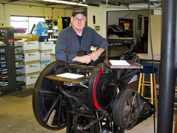
Mary Mashburn and Steve St. Angelo (Shop Boy) – Typecast Press 

There are so many terrific tools that we’ve been given or purchased while building our business — and letterpress knowledge — that we had to think pretty hard about which is the most useful. Then it hit us at the same instant: Alignmate! (If you don’t have one yet, it’s a thin, see-through, gridded, somewhat-expensive-for-what-it-is and easy-to-lose-in-stacks-of-paper piece of plastic that makes checking the straightness of image to paper so simple, aligning addresses on envelopes such a snap, that you won’t be able to function without it).

But we figured everybody would say that, right? Not that they or we would be wrong. But it got us to thinking about tools at our printshop that have made the almighty Alignmate even better. Mary and Steve — alias Shop Boy — have very different roles at Typecast Press (she the registration, he the repetition) so it should be no surprise that we have a strong difference of opinion here.

Mary went with the loupe. A photographer friend bequeathed to Typecast Press not just any loupe but an adjustable black metal Fuji 4x job that the company had once given away as a promo. It’s overkill. Any loupe will do for magnifying the precision of the Alignmate. By pressing the loupe directly against the Alignmate, Mary can see all the way to straightness heaven. Side to side, centered. Top to bottom, ditto. Stray dots cannot hide. Of course, even without the Alignmate, the loupe is a wonder for looking at ink density (“Get me 30ccs of mag carb, STAT!”) and consistency across the printing area, or for evidence that the rollers are too high or low. And checking those things again. And again. And again.

Steve’s running joke is that Mary looks for reasons to stop the presses; he looks for reasons to keep them going. She insists her tweakiness is the real time saver. Fair enough.

But as his most important tool, Steve votes for those little double-stick foam scrapbooker squares — Uhu is our brand. These dumb little things let you print funky-sized envelopes or pre-cut coasters on the C&P in a hurry, using a Boxcar base and a polymer plate, without the fear of a nicked base and smashed metal gauge pins. Say Mary’s letterpress class from the Maryland Institute College of Art has stopped by for a tutorial on the C&P. They work exclusively on Vandercooks at MICA. About 15 students. Each has a polymer plate the size of a 4-inch round coaster. And we’ve got 90 minutes or so in which to get each kid the experience of creating 25 samples of his or her printed design. No sweat. Pick a dependable spot on the platen. Peel one side of two little squares (it’d be three squares set like gauge pins for a rectangle) and stick them to the tympan, an inch or two apart and angled in just a hair. Tape the impression side of the polymer plate to the coaster and set the coaster between the squares. Press together. Bang. You should be pretty darn close to registered. (“Alignmate!”) The squares pull up and then re-stick for micro-adjustments if necessary. Done. And … next!


Ray Nichols – Lead Graffiti

I didn’t want to go with the obvious, such as one of our two micrometer composing sticks, but I wanted to get outside of the normal a bit. Hmmm. A roller height gauge is critical. Our electronic micrometer for measuring paper thicknesses and wood type height. Our killer old Boston pencil sharpener which puts a seriously long, tapering point to pencils. But overall I would pick Scotch tape. We use it to build up type (and once you get it right you can just leave it on) or woodcuts. We also use it a lot on the mylar on our Vandercooks to build up specific area a bit such as the names on a wedding invitation to give it a bit of extra punch. One small trick that is good if you have enough room around it is to double back one end (not under an area you are printing) so that you can easily grab it to pull it up after printing. We’ll often print right on the mylar, stick a piece of tape to the printed image we want to add impression and then pull it back up so we can see the exact printing area, and then cut the tape out in the right shape. This way you have a nice image to align against. Also we will often use an Xacto knife blade barely stuck to one or both sides to help us get it into position.


Mike Dacey – Repeat Press

After much thought I’d have to say the most valuable tool in my shop right now is my cutter, a Challenge 305 with power back and digital readout. It allows me to order and cut large parent sheets in bulk, which saves a huge amount of time and money. After printing, I can trim down orders with the precision and consistency that my clients demand. The cutter cost more than I paid for any of my presses but I’d buy it again in a heartbeat – I really can’t imagine running my shop without it. I don’t have many secrets for this one, it’s a pretty straightforward piece of equipment. Get some extra knives, keep them sharp, and you’re good to go!


Gerald Lange – Bieler Press

What I have to proffer is not the most valuable tool (in terms of expense) but it is one I rely upon and trust daily, and it has a personal history that I value. It is the lowly roller height setting gauge. I had always admired the long handled gauges used on production platen presses and when a friend of mine offered to make a dead on accurate gauge for me at Jet Propulsion Laboratories, what could I say but yes. They had made a bed plate for me a while before and it was dead on (I think they thought it was going to Mars or something).

Well, he tested the other gauges I had, historic and present, and said that they were not, um, in anyway .918 (he was a bit of a stickler) so off we went, hand-polished to .91800+/-. Somehow we ended up with about four or five dozen of these before he got sick and tired of the hand-polishing thing. I kept a couple and we sold the rest.

At any rate, I like to call it my magic gauge. Everything seems just so right when I use it. And that is just so, so reassuring on press.

Specifications on it are: Gauge is 15-3/8 inches long. Shaft is 5/16 of an inch in diameter. Mirror-polished head is precisely ground to .91800+/-. Head is beveled and measures 3/4 of an inch wide. Weight is 7-1/4 ounces. Knurled tail. Made of 303 high-grade stainless steel. Highly resistant to corrosion. Non magnetic.


Ben Levitz – Studio on Fire

Here are a couple things we use every project, every press:

Digital Thickness Gauge – Don’t guess at your packing. These are critical for knowing what you are placing in the press for packing to quickly and accurately achieve the desired impression. Ours cost about $70 from Amazon.

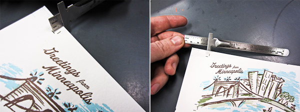
Depth Ruler – These little $2 rulers have a little sliding clip perfect for comparing the distance from crop to edge of sheet. Perfect for quick comparison side to side and head to tail of sheet to squaring things ups. Crooked printing sucks to correct later on the cutter.


Graham Moss – Incline Press

Back in the day there was a printing supply company in the UK called Cornerstone, and by the 1960s they were the bee’s knees when it came to ordering sundries for serious letterpress work.

They pretty much supplied all the goods you might need, excluding presses and type. They made sets of three narrow rollers with a uniform handle so you could pull two colour proofs with a single line of 10pt type in a second colour; type cabinets with cases that were made of ultra lightweight metal with plastic liners, that ran on nylon rollers and had a safety mechanism so it was impossible to pull the case too far out and drop it; their aluminium furniture was widely used, top quality page cord the like of which we won’t see again, and the make-up galley with a spring lever that told you how many points under or over your page was, another item still in use around here.

But of all their sundries the one I prize most is the type high measuring gauge. The 10 inch square steel base is engineered flat, and connected to one side is a five inch curving arm bringing a dial gauge to a spot over the centre. This has a spring loaded contact point so that a block, be it polymer, zinc, mag, or wood engraving, placed beneath it, gives the exact height, the dial showing .918 centred at zero, and one thou increments up to twenty five thou above or below type high each side of it.

I rely on it, and every block I prepare for printing passes under the gauge before going in the chase. Old blocks, purchased with all sorts of paper packing on the back, can be cleaned and rebuilt, checked and made ready for use with little trouble. Likewise wood type, notoriously various, saving a lot of effort by checking each letter for wear before setting and pulling a first proof. Eventually every piece in the shop will have been corrected through using the gauge, but that will take a while!

My biggest saving was with a book illustrated with ten original wood engravings – all were supposed to be machined to type high by a reputable supplier. One though was twelve thou over, and considering how much work goes into creating one wood engraving, I was delighted not to crush it!


Fred Hagstrom – Carleton College

I recently asked a student how large something was and the reply was “seven and three lines.” So my most essential tool is the ruler, and I am dismayed by the growing number of people–smart, well educated people–that don’t know how to read a ruler. When I do bookbinding with groups I ask them to measure 3/8 of an inch for the spine gap. I have to quickly look around the room. Some will have 3/16, some even 3/4 but they will have 3 somethings. It is not that they are dumb, it is just that they have never made anything before, so there is a huge gap in the physical and mental skills of how things are made. For instance, body mechanics. I can show someone how to cut something, or how to print something, but I can no longer assume a basic physical understanding of how to complete a task. I end up talking about how to stand, how to push down on something etc. That is something I did not have to do years ago. I have found my print tools spread around the building, mangled when used to do something inappropriate like opening a paint can. There is little reverence or appreciation for tools because they are not understood.

Learning these skills is not just a mundane thing. There is an intellectual dimension to knowing how to do things. Too many folks in education see this as devoid of intellectual content. Some highly intelligent people lack the basic ability to complete a task. They would be liberated in an intellectual sense if they had a better understanding of work. And the digital world has only increased this problem. I hope to increase people’s enjoyment of the process, and decrease their fascination with the results-only approach. I had a poor academic preparation, but I had a huge advantage in life experience from doing manual labor. I knew how to learn because I knew how to work.


So tell us – what’s the handiest tool in your print shop? Add your comments below!


Typography spotted in the Big Apple

While in New York City recently for the National Stationery Show, we found that not everything inspiring was happening just inside the Javits Center.  With a sharp eye, there was some appealing typography in signage that was spotted during our travels.  We all can appreciate a well turned font and a clever capital that gets the message across.  Shown here are just four images we snapped, but we also recommend checking out the artful NYC Type, a site that reveals some of the classic lettering hidden high and low along the streets of New Y0rk City.  Click on each picture on the NYC Type website for the location of each photo.

Clockwise from the top: Harrington’s Bar & Grill on 7th Avenue | Classic serifs on 42nd Street with Madame Tussauds | Houndstooth Pub on 8th Avenue | More serifs grace the Regal Theatre marquee.

Workspace Spotlight: Slow Print

Nestled next to the hearty Mississippi River, Iowa’s own Slow Print hangs back in the thriving old Warehouse District in Dubuque and houses extraordinary letterpress work, a neatly arranged showcase of letterpresses spanning from a 1900s Chandler & Price to a 1960s 10×15 Heidelberg Windmill, and as many letterpress stories as there are ink cans. Peter Fraterdeus of Slow Print let’s us take a look at what’s inside.

Workspace Spotlight at the Slow Print letterpress shop in Dubuque

THE PRESSES: 1960s Original Heidelberg “Windmill” 10×15 – Red Ball, main workhorse production press; 1950s Original Heidelberg “Windmill” 10×15 – Black Ball, mostly die-cutting and fail-over; 1940s Vandercook 219 Proofer 19×26; 1930sMiehle Vertical V36 Cylinder 13×19.5, and a 1900s Chandler & Price Gordon Old-Style 10×15.

THE LOCATION: My shop is in Dubuque’s Historic Millwork district, a few blocks from the Mississippi River, and in fact, I’ve been one of the “flagship” tenants. In the past two years, a public-private partnership has upgraded the District, including all the streets & sidewalks and a full-block quadrangle building to the tune of well over $20 million. I just hope I don’t get gentrified out – but the arts are a primary core function of the newly active district.

I’m a block from the Voices Warehouse Gallery and a block from the new Dubuque Community Food Co-op, so it’s an exciting time to be in the area. The building is an early 20th century brick warehouse. The space I’m in was converted to offices many years ago, but it’s surrounded on the 1st floor by raw warehouse, currently inhabited by an ‘architectural salvage’ and antiques dealer.

FAVORITE THING ABOUT THE SHOP: My large blue oriental rug in the coffee/lounge area (about 100 years old, it’s nearly worn out) with the futon couch and 1960s LaPavoni espresso maker.

NUMBER OF PRINTERS IN THE SPACE: One, just me and my new apprentice for the summer, Rachel.

MOST VALUABLE SHOP TOOL: Other than the Heidelberg Red Ball, and my MacBook Pro (without which there would be no business!), the most valuable tool is my loupe.

PLATE AND BASE OF CHOICE: I use KF95 on a locally machined aluminum base. I bought a 24×48 slab of .875 aluminum and had it machined down and cut into numerous smaller sections from 18″x24″ (used on the Vandercook) down to 2″x3″. It’s been in use since about 2007.

FAVORITE INK:  Oil-based – either VanSon or others as needed.

SOLVENT OF CHOICE: WM Wash from LithCo. I use Putz Pomade on the rollers after wash-up, which keeps any remaining medium from drying into the surface. The slightly pumice gritty stuff also helps keep the rollers from glazing. I’ve been using rollers from Advance in Los Angeles with very, very good results.

OIL OF CHOICE: 30W non-detergent

FLOORING MATERIAL: Hardwood floors.

PIED TYPE: Plenty. Much of it is wood type, as I purchased a barrel full on ebay some years ago. Couldn’t stand to see it auctioned off a handful at a time. I have one galley full of 24 point Legend, the beautiful Ernst Schneidler calligraphic type, purchased from an eminent printer who was closing up his shop a few years ago.

He shipped the type in the cases, with nothing but a sheet of single-corrugated cardboard on top. When the shipment arrived, the UPS driver set it on its side (although it was marked “keep flat”) and all the type was pied in a mound under the wrapping. I was not at all happy. Took hours just to get it into the galley, and I still haven’t figured out how to read Legend backwards. Major headache.

ORGANIZATION ADVICE: High tables and work surfaces with plenty of storage underneath.

PRINTING ADVICE: These are hardly secrets, but for the auto-didacts who haven’t yet figured it out, these will help a lot.

  • Don’t add white to color. Add color to white.
  • There’s nothing worse than slimy long ink for sharp printing. But don’t add too much mag, or the ink won’t want to come off the roller!
  • There’s no point to adjusting the rollers if there’s too much ink on them.
  • How much is “Too Much” ink or “Too Long” ink is entirely dependent on the form being printed.

Deep impression only makes sense with deep paper, otherwise it’s just gauche. (Note to clients: you can’t have deep impression on both sides of the same sheet – unless there’s no overlap from back to front)

Slow Print Workspace spotlight

The Letterpress Roundtable, Part II: Letterpress love affairs

For our second letterpress roundtable discussion, we asked some printers we admire to tell us about their favorite press to print on (and don’t spare the details!). The stories are sweet, poetic, and inspiring. Read these responses and then we’d love to hear in the comments about your own love affair with a beloved press.

Todd Thyberg of Angel Bomb Design: My most widely used and favorite press at Angel Bomb is a Heidelberg Windmill which I’ve named Kaiser. I purchased it in 2009 from a printer who had advertised it for sale on Craigslist. I wasn’t on the lookout for a particular press, but I had been using a Chandler and Price for all my printing and wanted to be able to produce higher quantities of printing at a faster pace so I was keeping my eyes open for a good production press. Kaiser is a rock solid workhorse and a marvel of German engineering with an almost Rube Goldbergian sense of complexity. Kaiser had been relatively well taken care of but was filthy and several pounds of oil soaked paper needed to be removed from his innards before being used. His serial number is 104012E, placing his build date at 1954. He bears a badge stating “Made in the U.S. Zone of Germany” which reminds me of the Cold War era where spies lurked in dark corners and the world was a very different place. I use Kaiser to print small and large runs as well as die cut and he is always a hit with open studio events; the chug of the air pump powering the suction is like a siren song to passersby who get drawn in and are amazed at this old equipment that is still being used. Considering that this press was designed around the time of World War II and is still working today creates in me a sense of awe of how things used to be built and joy that I get to use him most every day.


Michael Russem of Kat Ran Press: I’ve recently retired from printing, but the best press I ever ran was my Vandercook Universal IV (SN 21497). It took a sheet measuring 32-7/8 wide by 29-1/2 tall—which was just about large enough for the books I was printing. Not only did it seem to be free of the usual problems that often plague power Vandercooks, but the enormous size of the cylinder and bearers cut down makeready time. Whereas I would spend tons of time making complicated tissue makereadies on my SP-20 and Universal I, there was just no need to do so on this big press. In fact, once I installed this Universal IV, I rarely used the two smaller presses as they weren’t worth the bother. And as the Universal IV was a power press, I was able to print twice as many forms per day without being exhausted and in pain when I crawled into bed. Of course, it took much longer to clean up the Universal IV, so I suppose the press wasn’t perfect. It was close, though. Now it’s with Art Larson at Horton Tank Graphics, and I hope Art finds the press to be as life-improving as I did.


Thomas Leech of Palace of the Governors Press: It was a tough call, but out of loyalty I have to say that my favorite press is my own 8×12 Chandler & Price Old Style that I’ve had since 1979. It’s not the best press I’ve ever run, but it is like a member of my family. The serial number is 26099, which according to the APA website puts its year of manufacture as 1890 – old enough to be my grandfather. It is driven by a leather belt and ancient motor that hums like a lullaby. Its comforting hum and rhythmic clanks put my kids to sleep when it lived below their bedroom.

I’ve owned it now for a quarter of its lifetime. I bought it from a guy who bought it from his brother-in-law, who bought it from a deaf man who printed cards with the American Sign Language alphabet. I still have a photoengraving of the manual hand signs, and printed it again only last year.

On November 23, 2008 the automatic counter, which I’ve never set back to zero, and which only counts to 99,999, turned over for the tenth time, which means that it had printed one million hand-fed impressions: business cards, book covers, birth announcements, wedding invitations, change of address notices, broadsides, poems, keepsakes, memorials, graduation announcements, wedding and baby shower invitations, clothing tags, bar mitzvah invitations, tickets, Christmas cards, Rosh Hashanah cards, art show invitations, book plates, keepsakes, and facsimiles.

While in my possession the press has printed under the names of The Fine Mess Press, the San Miguel Paper Workshop, the Smokebrush Press, and most recently, the Press at the Palace of the Governors. When a major building repair was required here at the Palace the press came back to my house, which felt something like having a grown child move back home. I regret I don’t have a photo to share of this press.


Eileen Madden of Evanston Print and Paper: That’s kind of like asking which of your children you like best. I’d have to say my favorite press to print on is the one I get to print on the least. Our big Vandercook 325 – serial number 6086. It’s my very first press. I bought it in 2007 from Columbia College. That’s where I learned to print, and I never saw anyone use it while it was there. It was mostly used as storage, I’m sorry to say. I guess I’d say it’s my favorite, because it’s the one I do projects of my own on – bigger posters or wood type collages. If I’m on that press it means I’m doing something just because I want to. As nice as it is to print with and for other people, it’s a treat to just play, too. After I acquired the press I found a metal tag on it indicating that it was owned at one time by the Cuneo Press – their press number 1024. The Cuneo Press was one of the large printing companies here in Chicago, and also had a fine book press that created some lovely and amazing work. Bill Anthony, who was a fine bookbinder who came out of the apprentice tradition in Ireland, worked at that press. I love having the connection with that history.

So. That’s my answer. In general I feel luck to be printing on any of our presses. I’m lucky to have this job, but I can say that the 325 is the one I’m the most personally pleased with.


John Barrett of Letterpress Things: The press that’s special to myself and the Barrett’s is B 57516, a new style C & P hand-fed with a Horton variable speed clutch. Manufactured circa 1920, Horace Moses purchased it in 1922 from an envelope company in Springfield, Massachusetts. Mr. Moses, a local philanthropist who founded Junior Achievement, Strathmore Paper Company and numerous other businesses, moved it to a building in Westfield, Massachusetts (formerly owned by the Westfield Whip Co.). There it was installed on the fourth floor as the first printing press owned and operated at Mr. Moses’ newest endeavor: The Old Colony Envelope Company. [The press still carries the original machine tag; a brass plate deep stamped with the number “1”.] It was removed from operations in 1967, about the time my interest in letterpress began to develop. Several years later, for the sum of $50, it was mine. Took it home and therein began my “second” career, Letterpress Services Co. From the beginning my interest was not so much in printing but in perfing, scoring, die cutting and imprinting; a trade service for offset printers, quick copy centers and in-plant printing departments. Old number 1 and me spent many, many hours together cranking out the impressions. Presently, “No. 1’ is semi-retired; eight Heidelberg Windmills carry the work load. But once in a while there’s a job best done by hand. And we step up, wipe the dust off, flip the on switch, coax the hand lever up to engage the clutch. And get goose bumps listening to the clack, clack, clack of the spliced leather belt. B 57516. . . ninety plus years and still pressing the letters.


Mark McMurray of Caliban Press: Well… my favorite press is really my first press, the one I bought with a deep breath, thinking: “in for a penny, in for a pound” after finishing just a week or two of letterpress classes at Red Ozier Press in lower Manhattan in 1985. It’s a 1947 Vandercook model 4T, serial number 10903, which is now tattooed over my heart. It came out of a commercial printer’s shop in New York that I was doing other business with at the time. Although it had been pushed to a corner and was not in use it had been well maintained over the years—which I’ve tried to continue. I remember my horror when suddenly one day one of the inking rollers started to wobble, then shock when I discovered that this was caused by a cracked bushing that was made out of wood (!), then relief to find that I could actually get a replacement (also wood) and fix it myself. (Thank you, Fritz, at NA Graphics).

But my other favorite press (come on, life is too short for only one love) is a R. Hoe Washington. As I recall, Hoe began making these in the early 1830’s when he somewhat unscrupulously appropriated the famous “figure 4” toggle joint from another manufacturer. Most of the Washingtons that I’ve come across have had serial numbers cast on them. Mine does not. Therefore I’m assuming it’s early in their production cycle and I date it somewhere around 1835. I suspect press historians may have some views on this matter. I acquired mine from the late wood engraver Frank C. Eckmair who got it not far from his home in Gilbertsville, New York. A local Northern New York printer, Jim Benvenuto, helped me set it up and adjust the platen height and I’m always surprised at how well it prints, given its age and technology. So there… my two favorite presses.


Brooks Chambers of Mamas Sauce: My main squeeze is an Original Heidelberg. Serial # 49582.
We adopted our Windmill from her original owner a couple of years ago. “Heidi,” as we’ve come to call her, was the workhorse of a family-owned basement print shop in Buffalo from the day she rolled off the line. We found her lovingly entombed with a host of tools, spare parts, and other presses that had been with Heidi since day one. The whole gang came with us to Orlando (no toy gets left behind) and Heidi still sits at the heart of this menagerie. Every time we give a tour, people react to her the same way that I did at our first meeting: they stop, stare, and smile. At that point in the tour, I’ve learned to shut up and get out of the way.

She isn’t the first Windmill I’ve had the pleasure of running, but she’s the best. If I had to put words to it, I’d say she’s delightfully invisible. She’s invisible in the way that every good interpreter ought to be. Other presses often interject, leaving the marks of their own idiosyncrasies throughout the run (even if their operator is the only one who knows). Heidi does exactly what I ask her to. Every. Single. Time. That kind of control gives you the freedom to defer to the artwork for inspiration. That kind of control forces you to become a better printer. Before we got Heidi, I could blame a lot my shortcomings on the press. Not anymore. Now the press gets all the blame for my success. She’s teaching me a lot about knowing when to shut up and get out of the way.


Brad Ewing of Marginal EditionsMy favorite press is the  Vandercook Uni III.  It has an adjustable bed and its rollers are super dialed in!! The serial number is #26318.  It’s currently located on 6th avenue and 29th street in Manhattan.

Leslie Miller from Grenfell Press told me that the press came from Middletown, New York about 20-25 years ago. It was large enough that it was taken apart and brought up to the 7th floor by placing the press on top of the elevator.

I have been printing lead and polymer plates on the press since 2005. I have also printed laser cut plexi, etched copper plates, leather, and even potatoes on this press. The ink splatters that have built up over the years on my Vandercook serve as a happy reminder of many beautiful print projects accumulated.


Is it any surprise that we love our presses? All of these presses have earned our love and loyalty and even a name or two. Now it’s your turn to tell us about the one that grabbed your heart and makes you a better printer. If you’ve got photos online of your press and you’d like to share them, please include a link to the photos in your comment!

Workspace Spotlight: The Arm

As studios go, The Arm in New York might be one of the best hidden secrets.  If you go before it opens, you might wander up and down this Brooklyn street wondering if you are in the correct location.  There is no sign, just some apartments, empty-looking warehouses with metal rolling doors, and a small corner store. The street number is right but still nothing to say “here it is”.  But minutes before the 11 am hour, a couple of people wander up.  They carry paper and what could be a plastic printing plate.

This looks promising. And on the hour, a skateboarder arrives, unlocks the door, rolls up the metal rolling cover to show a big picture window and its welcome to The Arm.  Here there are the presses, the notices on the window. The activity begins as many more printers arrive in succession.

Daniel Morris of The Arm describes what’s inside.

THE PRESSES: I am a bit of a freak for late model Vandercooks. I have two SP-15s, two Universal Is and two Universal IIIs. For smaller work there are a couple of C&P Pilots and a Kwikprint 86 foil stamping press. Because I also recondition presses there are often one or two others in some state of restoration at any given time. The equipment has been chosen very carefully to be safe and suitable for a shared work environment.

SIZE OF PRINTSHOP: 1500 square feet

THE LOCATION:  The Arm is on the ground floor of a renovated nineteenth century stables building in Williamsburg, Brooklyn. The studio takes up the bulk of the ground floor. I built the glass shopfront so that it opens 8 feet wide — getting equipment in and out is a breeze.

FAVORITE THING ABOUT THE SHOP: The way I have laid out the space, the press room is visible from the street, but the type room is tucked away. This was to make sure that passers-by could see what was going on from the street, but also to make sure that people weren’t too distracted when composing type forms.

TYPE OF SHOP: Community + educational. I set it up specifically to be able to share it, my presses and my knowledge of printing. I teach classes from the space almost every week and make the presses available for people to use for their own projects. We’ve got quite a community of printers here in NYC. It is far more fun in the space when there are a few people in working.

MOST VALUABLE SHOP TOOL: The trusty .918 roller setting gauge.

FAVORITE INK: We use the Van Son Rubber Base Plus system and maintain an inventory of all the base colors for the Pantone mixing system. With these inks, a Pantone book and a scale you can’t go wrong.

SOLVENT OF CHOICE: I use Gamsol for washup. It is an artist’s grade mineral spirits. We keep it in Justrite plunger cans and make sure all waste rags end up in our sealed Justrite waste cans. I’m a bit militant about shop safety protocol, MSDS sheets, etc.

PLATES AND BASE OF CHOICE: I am very fond of the standard base and the KF95 plates. I don’t like the deep relief plates, but do have a couple of small deep relief bases for people that bring them in. There must be nearly a dozen Boxcar bases here at The Arm.

FLOOR PLAN TIPS: Make sure your press is situated where you feel comfortable and have good light. Get yourself a good anti-fatigue mat (I love the 2×6 Uline Cadillac mats for Vandercooks) and your feet, legs and back will thank you.

PIED TYPE:  I am proud to say my shop has no pied type. As one of the owners of The Dale Guild Type Foundry, I love to work with metal type, but my policy is to sort the good stuff and melt the bad. May as well turn it back into something useful- we can smelt old foundry type to make new type and Linotype metal, Monotype, etc. we give to our machinist to melt down to make fishing sinkers. You’ve got to keep your machinist happy.

ORGANIZATION ADVICE: Down time is critical. Sometimes you just need to take everything apart, clean like crazy, and put it all back together.

PRINTING ADVICE: Coffee and good records are key [to making the space feel creative and comfortable]. But it is important that the music isn’t too loud that you can’t hear when the press is trying to tell you something.

Big round of thanks to Dan Morris for letting us get the grand tour of The Arm!

Letterpress Art Sales to Benefit Baby’s Medical Procedures

Today we’ve got details about a worthy event that will help a young boy’s medical expenses and provide you with a chance to obtain some limited edition fine art prints for your walls! Prints for Platelets is helping raise funds for Nico Bond, the 17-month-old son of Arizona Master Printer Brent Bond of Santo Press and artist Veronica Villanueva.

Since November of 2011, Nico has undergone 2 bone marrow biopsies, over a dozen transfusions and is still undiagnosed with a blood disorder that leaves him with very low platelet counts.  Prints for Platelets will give you a 20% discount off all Santo Press Prints with 100% of the proceeds going to Nico’s medical expenses through the month of May.

Santo Press Prints offers high quality relief prints, monoprints and monotypes from 16 regionally and nationally recognized artists. Shown above is a photopolymer and reduction linocut from Veronica called Nicolas’ Odyssey.  Veronica tells us this about the creation of this print.

Getting pregnant wasn’t easy and the pregnancy was a high risk one.  I made this print when I was pregnant with Nicolás.  It seemed that even before birth Nico has gone through a whole odyssey.  And it seems that his odyssey continues… The key image was created digitally and relief printed from a Boxcar polymer plate, colors were developed via a reduction linocut.  The print was from an edition of 50 which was donated to Mesa Contemporary Arts at Mesa Arts Center for their annual fine art print calender fund raiser.

Click here to go to the Santo Press website and choose one or more signed, numbered, and titled prints from the artists and receive the 20% discount through the month of May.   The prices are very competitive and with an additional 20% off, it’s an easy but meaningful way to help this little boy and his parents while supporting fine art printmaking.

Rob LoMascolo Featured on Fortnight Journal

Letterpress artist Rob LoMascolo of Upstate New York talks about the traditional craft of letterpress printing in a recent collaborative effort known as Fortnight. Fortnight is an online multi-media and documentary project that’s been put together by a group of 20-somethings to recognize different disciplines that honor the past while defining the path of the future.

LoMascolo is one of Fortnight’s fourteen contributors, and he talks about the traditional craft of printing that has exploded again in the digital age.  He is featured with his Challenge Proof Press in this instructional video as he provides a lesson in Letterpress 101.

Fortnight Journal traveled to the Finger Lakes in New York to interview and film Rob in his studio.  We are pleased that not only is Rob showcased for his printing prowess but he’s a neighbor of ours and prints right down the highway from Syracuse.

To find out more about this project, visit fortnightjournal.com/about.

Essential Q&A – Rebecca Miller

It’s been a while since we’ve done an Essential Q&A on the Boxcar blog, so we’re bringing it back! Today we’ve got some questions for Rebecca Miller, prepress extraordinaire — read on to find out more about her!

Boxcar Press Rebecca Miller

Job title: Pre-Press

Describe what you do at Boxcar Press in 10 words: Prepare press-friendly layouts and illuminate design, technical, and printing solutions.

My super power is: Making people feel at ease.

Hometown: Sault Ste. Marie, Michigan (pronounced “SOO”)

My favorite printing equipment: Heidelbergs!

What three places do you want out-of-towners to visit in Central New York?
1. Boxcar Press of course!
2. The Oncenter Arena to catch a Syracuse Crunch game
3. Fillmore Glen in Moravia, NY

Music that inspires me: MIDI music from old video games

The greenest thing I do: Recycle old clothes into nifty pillows and throws

Besides letterpress, I am passionate about: Typography, illustration, and hockey!

PM 368 U swatch

My favorite Pantone: 368: A green you can count on.

Most memorable meal: Bear jerky and deep fried smelt. Delicious!

What book do you think everyone should read? The Jungle by Upton Sinclair

What’s on your nightstand right now? The Prince by Machiavelli, ink pens, and a digital clock in 24-hour time.

Something about the Boxcar Press crew our customers don’t know: How extraordinary and cheerful we are… even under pressure or the weather. Such gifted talent in this group!


Boxcar Talk With Nancy Hill

Boxcar Press goes one-on-one with colorful Nancy Hill, one-half of the dynamic letterpress duo of Hazel & Violet Press, (the other printing power is Beverly Wolfe) to talk shop, slip in a few amazing printing stories, and show how letterpress has shaped quite an adventure the two will never forget. Read on to get the full interview.

PERFECT PRINTING PARTNERS We are two long time friends who share a love of typography, paper, and letterpress printing. Although we both have full time jobs, we love printing every chance we get.

LETTERPRESS LUCK We had been watching, looking, hoping… for just a table top hobby press – when an opportunity came along to buy a complete letterpress shop. We learned to print by taking classes, personal instruction, and good old fashioned trial and error.

AWESOME ARIZONA Our shop is in a completely renovated garage – complete with cabinets, sink, insulation and flooring. Not sure if you can call it ‘decor’ – but, we definitely have a turn of the century industrial feel. Since there are no curtains on the windows,  we would have to call it a shop, not a studio. We have a new style Chandler & Price 10×15 named Beauty and a Windmill named Baby. We also have a Potter #2 named Beatrix at our gallery in downtown Phoenix. Our favorite thing about our shop is that we get to print there.

PRINTING LEGACIES Ladies of Letterpress has been a great mentor for us. The team at our first NSS was just great and has led to many new friends. Many of our mentors we haven’t even met. They are the guys on Letpress.

PRINTER’S PARADISE We do not print full time – but that is really our goal!

PRINTING FEATS That our first job was a 3 color wedding invitation and we didn’t kill each other. Also being selected Best Letterpress of Phoenix 2011 by New Times.

BOXCAR’S ROLE Great patience and so much help from Cathy when we first started ordering plates. Even now Boxcar is so helpful when we call with stupid questions.

PRESS HISTORY Well…we saw an ad on Craig’s List for an entire shop for sale and we just jumped in. It took every friend we have and a horse trailer to get it to our shop.

SHOP TIPS  Our favorite business advice – don’t break out the wine until you finished cutting the job.

WHAT’S NEXT While we are still printing our retail stationery, we are well on our way to growing our commercial letterpress business. We are really enjoying working with designers on their projects, and we are starting letterpress classes later this summer.

Big round of thanks to Nancy Hill for letting us get the full story on Hazel & Violet Press!