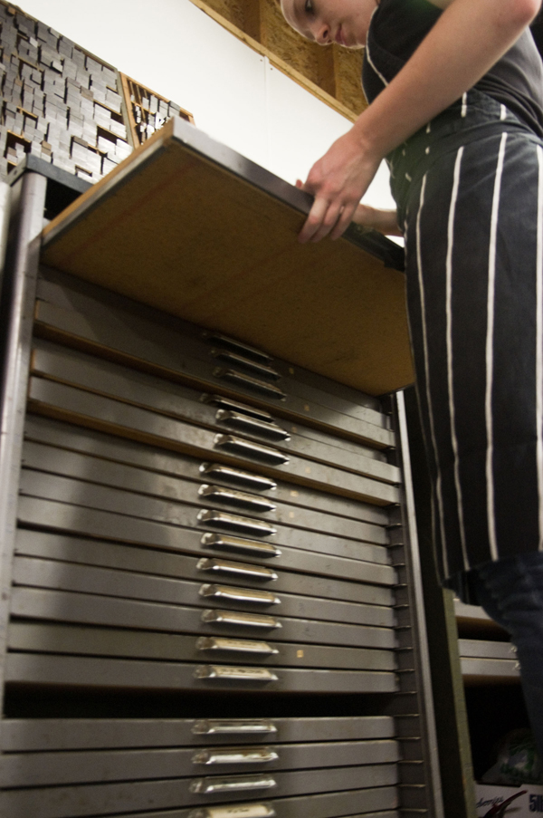
Tim the printer discovered a friend looking back at him as he cleaned his press.

Tim the printer discovered a friend looking back at him as he cleaned his press.
This is a dreamy view of a washup tray that is catching dregs of blue-green ink mixed with a bit of opaque white.

Found this fella gazing out from the left side of a Heidelberg windmill 10 x 15. This creature seems to be part machine, part giraffe, part rhinoceros, a serious but friendly cuddler. 

With letterpress love in the air, we’ve put together a list of 14 of our favorite gifts for this upcoming Valentine’s Day—we found some amazing letterpress gifts online, alongside some great books and sweet supplies that your printer will gush about!

1. Boxcar Base: Protective Base Sleeve from Boxcar Press | 2. Typewriter Key Bracelets by Joy Sparks Design | 3. We Just Click card by Waterknot | 4. To the Letterpress Magnet Set from Modcloth.com | 5. 2013 Color of the Year Mug – Emerald by Pantone | 6. Alphabet Coaster Set by 1Canoe2 | 7. 100 Postcards by Pantone | 8. Scale Printing Press Wooden Model Kit by Revell | 9. Chandler & Price Wall Clock from Zazzle | 10. Boxcar Press Printing Apron | 11. LetterPressed Type-Style Cookie Cutters by Fred and Friends | 12. Love Letterpress Necklace by belrossa | 13. New Kraft Letterpress Valentine tags from Word Letterpress | 14. Gutenberg’s Gift pop-up book by Nancy Willard
Leaves crunching under your feet, the glittering twinkle of a first snowfall, and the yummy smell of homemade cooking lets us know winter is on its way, dear letterpress lovers! So to kick off the cozy holiday season, we’re spreading the joy with a free winter themed vector set! This set includes joyful winter wishes, a determined hockey player, a festive Thanksgiving tom, and a delicious cup of cocoa to warm up your letterpress designs! All are free for use and in both EPS and PDF format. Cheers!


Michigan is a swirling eddy of vibrant creativity and a full force of passionate people. From the endless cherry farms in Traverse City, the delightful scents of pasties cooking in the breathtaking U.P, and of course, the energetic letterpress work of Anna Tomlonson of Ginger Tree Press from Kalamazoo. Working with a keen know-how of typography and a fiery passion for detail & craftsmanship, Anna stops for a minute between runs to let us in on the loves and labors of letterpress.

1-2-3 TYPOGRAPHY I have a BFA in Graphic Design from Western Michigan University. I thought I wanted to go into Interior Design, but a freshman foundation design class and a lecture on typography by visiting designer Wolfgang Weingart prompted me to apply for the Graphic Design program instead. It was the idea of typography that is what first drew me to graphic design and, later, to letterpress.
GIVING SOME LOVE TO LETTERPRESS A few weeks before picking up the press, I took a letterpress workshop at the Kalamazoo Book Arts Center, which is located just down the hall from my current studio space and has been a great resource. In the workshop we learned the basics of setting type, locking up a form, and proofing a design. My Chandler and Price was quite different than the presses we worked with in the workshop and when I started printing on my own, I only had a vague idea of how my press ran, which I gathered from taking the press apart to move it.


It was a combination of Elementary Platen Presswork by Ralph W. Polk, Boxcar Press’ videos, and a good deal of trial and error that helped me amass what printing knowledge I have.
As I became more comfortable with printing, it felt more and more natural. I have always been very detail oriented and I have fallen in love with the problem solving that printing on a hundred year old press requires. In my design work I have also always been most interested with the substrate, in fact, it was the basis of my bachelor’s thesis. Having such a close relationship to paper choice and printing technique is one of the things I find most exciting about letterpress.

MUCH ADO IN THE MITTEN My studio is in a building called the Park Trades Center, it is an old warehouse that was converted to artist studios in the early 80’s. It is right downtown and participates in Kalamazoo’s Art Hops, a monthly event where downtown businesses host area art work and artists open their doors to the public. It has proven to be a great marketing tool.

INSPIRED BY CRAFTSMANSHIP While I don’t have any one particular printing mentor, I am always inspired by printers whose focus is craftsmanship.
CREATIVE GEARS IN MOTION I always start a design on paper, creating a word list before I even start sketching. If I am working for a client, I am trying to find a direction that is appropriate for their particular project. If I am working on a project for myself it helps to narrow down my focus and create guidelines for the project. I have found there is nothing more challenging than a project with no restrictions – it is hard to do anything when you can do anything.
DESIGN + PRINT Since my background is in design, I often think of myself as a designer first and printer second. My work falls into three categories: non-letterpress design work, letterpress for fellow designers, and most often, seeing the job from ideation and design through printing.


FULL TIME FUN? I don’t print full time, yet. I also do the food ordering for a local gourmet food and wine shop. Half of the week is pure studio time, and the other half I like to print after work with a chunk of cheese and a glass of wine.
LADY LUCK I found my first press very much by chance. A friend of my dad’s was trying to sell his parents’ house, which had a complete print shop in the basement. They were struggling to find someone willing to buy everything and, preferring not to turn it into scrap, they were looking to give it away. At that point owning a press was more of a long-term fantasy than short-term goal, but it was an opportunity I couldn’t pass up. To say moving the press was a struggle is putting it lightly. Thankfully, I have some dedicated friends who spent a 17 hour day with me, in mid-August, hauling as much as we could out of that basement and back across the state.


SHOP TIPS Find mentors and ask for help, both in business and in printing. While there is something to be said for figuring things out for yourself, building a network and learning from other people’s experience is an invaluable asset.
WHAT’S NEXT Next on the list of skill sets to teach myself is die cutting. An old blueberry box full of dies was one of the treasures that came with the press, and I’m excited to put them to use. I am also planning my first workshop for this fall and starting on designs for a full holiday collection.
Huge thanks to Anna for letting us getting a sneak peek at Ginger Tree Press!
For the fifth installment of our letterpress roundtable discussions, we asked some of the printing and designing world’s die-hard denizens to show off their love of all things printing via their tattoo work as well as the stories behind the ink. And trust us, there’s always a good story to be told. As always, we’d love to hear of your own stories embodied in tattoo-form in the comments section!
 I decided to get a Fuchs and Lang litho press tattooed on my back as a kind of homage to what is no longer made, and had plans to compliment it with an old style C&P 10X15 eventually; obviously not two at a time. These were by no means my first tattoos, and so I knew what I was getting into and knew what I wanted out of the artist. I found the appropriate engravings and took them to a few tattoo shops and talked to some folks/had consultations, and eventually settled on a fellow named Josh Egnew at 3 Kings who I had worked with before. Firstly, he did such a great job with the Fuchs and Lang that I was excited to bring him the drawing of this C&P; he kinda balked at it at first, as it was even more of a p.i.t.a. than the litho press, but after taking the time to trace it out for a transfer – he seemed happy enough, but a little bit reluctant. It took 2 sessions: one to outline and handle some of the shading, and the other to finish up the shading. By comparison, the litho press took him one session. I’m sure I squirmed a lot more for the C&P.
In the end I know he was very happy with the results, and the work is slightly out of character for him, but it was first rate work and the whip shading he used was top-notch. I can honestly say I will not be very likely to get anything as ornate or difficult to work with as this press, but I feel it is a commitment to what I love to do – and a fitting illustration as homage to this lovely breed of art that, if you are reading this blog, you undoubtably know and love yourself.
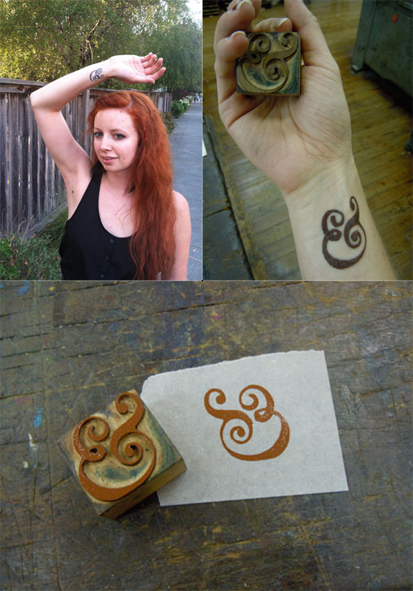 When I was about to graduate from CCA (California College of the Arts) with a degree in Graphic Design, I knew I wanted a bit more of a hands-on approach to design in my life than most of my classes had emphasized (I took a lot of letterpress and bookmaking on the side to make up for it). On a whim I applied to the Hatch Show Print internship program for the month after graduation, and I got accepted! Thus, my boyfriend and I relocated to Nashville, Tennessee for 6 weeks.
While at Hatch I got some AMAZING experience playing with type, designing and printing, and learning about the history of letterpress. I knew I had found my calling, and I felt that it was such a milestone experience that I wanted to get a tattoo to commemorate it. I have always loved the Caslon ampersand, and ampersands in general (my cat is even named Ampersand), so when I saw a Caslon ampersand woodblock at Hatch I knew it was the tattoo I wanted. My other tattoos are kind of hidden, so I also knew I wanted it in a place I would see (and others would see) all the time, which is why it’s on my wrist.
I pulled a print of the woodblock, and took that to the tattoo artist to copy. I specifically wanted it to have some woodgrain texture so it would look more like woodtype, and less like digital type. Overall, though getting the tattoo hurt a lot, I absolutely LOVE my tattoo. It is a constant reminder of my passion for history, letterpress, and things that are well crafted and handmade.
 While I was at the Ladies of Letterpress conference this year, I decided to get a type related tattoo as a souvenir. It’s a less obvious version of mind your p’s and q’s. When I look at it, it is a p and q within curly brackets and from the perspective of someone else, it is a b & d.
My part time employee at the shop Bill also has a p’s and q’s themed tattoo. His is much more obvious with the actual moveable type forms tattooed with the wording of “mind your” I’m not entirely sure why he got his, beyond a love for letterpress.
 I had the tattoo done just a few months after dropping out of college here in Mexico City. My job back then required me to do a whole lot of print work for the company I used to work. However, being so inexperienced and contact-less after dropping out, I had to try quite a lot of print shops, most of which produced less-than-stellar results.
One thing I never got to learn while in school was color matching and the whole printing process, since most of my education was focused around digital output. It took me a really long time to get the hang of these concepts, trying out an endless list of shops and ruining, I’m sorry to admit, quite a bit of paper in the process. At the time, I chose to have the tattoo done since it was very useful to have this comparison point readily available, almost at my finger tips. Now a days, it’s more of a welcome reminder that learning about anything is more akin to a practicing a craft than carrying out a job.

It was only natural when planning for a tattoo to use a ligature as my trade symbol. After a bit of research and exploration, I found this italic ampersand an allegory of my life: … always looking to what comes next... Over the years I’ve see a few other ampersand tattoos, but something about the way this one’s shaded and the subtle wrap of the terminals around my forearm have kept it distinctive.
I have many tattoos large and small, some of them pertain to printing and the rest are Victorian Luddite sentiments. The first and second printing tattoos I got at the same time: an ink brayer and a copy of a “poison” skull from ludlow specimen book. The third is the now famous “apathetic ink knife” of which is a bit cathartic now since some how it proliferated the web a bit after I got it. A friend of a friend drew it (lithoshop) and one of my tattooing friends convinced me to get it. The next one will be a little guy of a windmill……

Do you or someone you know have ink in the blood? Let us know in the comments section below! We’d love to hear from you!
Wandering the displays at the Printers Fair at the recent 2012 Ladies of Letterpress Conference reminded me of a nifty pocket book written a few years ago filled with one liners about productively living our lives. This great instructional guide gave little gems of wisdom and witty truisms such as “be courteous to everyone” or “remember people’s names”. All good, sound advice.
Lo and behold, I started to notice a few good suggestions and observations at the printers Fair that we can probably all smile over, agree with or be improved by. So here in a nutshell are interesting life reminders for all of us from our fellow letterpress printers, in beautiful form.

(photo credits: clockwise from top left – Chris Charles – Fly Rabbit Press; Amos Kennedy – Kennedy Prints; Rachel Hetzel – Pistachio Press)

(photo credits: clockwise from top left – Chris Charles – Fly Rabbit Press; Kathryn Hunter – Blackbird Press; Margot Ecke – Smokey Road Press; Jessica Peterson – Paper Souvenir.com)

(photo credit: above – Margot Ecke – Smokey Road Press)
For the second year in a row, we are thrilled to share with you photographs of an incredible collaboration between the folks at the Writers in the Schools program (WITS) and the School of Visual Concepts in Seattle, Washington. For the last two years, WITS has worked with terminally ill patients at Seattle Children’s Hospital to write poetry, out of which artists create beautiful letterpress broadsides. At Boxcar Press, we were privileged to be included yet again, and gladly offered up free photopolymer plates for the project. Below are photos of the process, as well as few shots of the incredibly inspiring poetry written by these kids and young adults.


 The second annual portfolio includes 16 hand-set artist-made letterpress broadsides. WITS Writers-in-residence Sierra Nelson and Ann Teplich worked with patients at the Seattle Children’s Hospital to write the poems, then 16 artists from the Seattle area took the poems and translated them into works of art. The poems were printed as letterpress broadsides and included in a striking red portfolio.

At the end of the project, each patient received a portfolio, as well as ten copies of their poem to give to their family and friends. Some patients were given the opportunity to read their poem in front of a live audience.

So many people worked to make this project a success, including letterpress printers volunteering their time, and Mohawk Papers donating paper. It is truly inspiring to see letterpress used in such a positive way!
Do you have any “Doing Good” projects you’ve worked on that you want to share? Let us know! We’d love to hear about them!
Here is a particularly lovely version of Bella Figura‘s design Simple Frame printed in Watermelon and Pale Gray inks with matching envelope liner in the Simple Lace Pattern. Together these pieces are Simply Stunning!
