Letterpress That Changes the World

With tidings of good cheer and peace on earth to all men in full swing, we thought it’d be fitting to celebrate the holiday season with a tribute to the remarkable letterpress pieces of truly talented & dedicated printers giving back to their communities. We gathered some of letterpress’s finest for this installment of our  roundtable series. Check out the uplifting responses this immensely talented group has to offer and find out how they’re changing the world, one card at a time. Be sure to tell us about your own charitable projects in the comments section below!

Kathryn Hunter – Blackbird Press

The notebooks: Madeline Ellis of Mimosa by m.e., a local jewelry maker, in town (Baton Rouge, LA) and I started a conversation about collaborating on a project together. So after conversations we decided to do something focusing on our US states, a handmade notebook and necklace. We started right before Hurricane Sandy, but we also knew from living in many hurricane seasons in Louisiana (and felt the impact) that the “state” sets had potential to help with relief whenever the people of a state are affected by some sort of hardship. We started with the states Louisiana and New York (because I was going to exhibit at an Indie craft market in Rochester). As soon as Hurricane Sandy made landfall we agreed to make a New Jersey set as well. At that point when the New York & New Jersey sets were ready to sell we decided to give 50% of the sales to Hurricane Sandy relief. So far we’ve donated to the Red Cross and to the Humane Society to help with recovery (we are both big animal lovers too).

The community reaction so far has been good. Most people are amazed that we are giving anything to charity which is so strange to me. But I think it makes people feel good when they spend money on things that help in some way.

We’ve also had a month long sale in the past to help Tsunami relief in Japan, where we gave 50% of sales. We’ve also given a percentage to the Natures Conservatory or other groups that help restore the Louisiana coast from the sale of our last three limited edition calendars.

Basically, it’s my intention to always give back. And letterpress is such an amazing way to do that. With the history of manifestos to Constitutions, letterpress printing has spread the word of progress and restoration. Honestly, I haven’t had the time to do more projects like this (hustling to keep this small business growing keeps me busier than ever) but we try wherever we can. I’m excited about the “state” notebook/necklace sets because I think they will be able to help when places need it.

Jennifer Parsons – Tiny Pine Press

I got involved with the Joyful Heart Foundation in 2008 when I designed their first Gala invitation. I had worked with Mariska Hargitay (founder and president) in the past on her custom stationery orders, so they reached out to me to see if I would be involved. It was a very simple invitation which was printed digitally because of the quantity and scope, but I was honored to help such an amazing group get the annual fundraising started. It was obvious from the get go that the Tiny Pine Press aesthetic really meshed perfectly with JHF. I quickly became friends with everyone who worked at the foundation. I went to the first Gala and was incredibly touched by their message and vision for helping heal, educate, and empower.

Jen Parsons Joyful Heart

Joyful Heart particularly spoke to me and my own personal healing as a survivor of abuse. One of the things that JHF focuses on in its programming is art therapy: working with your hands to express yourself. They put a lot of emphasis on the healing effects of being creative and putting things on paper. Journalling and collage help the mind relax and in a way focus on self healing. When I learned about this, I realized that printing and graphic design does this for me. Once I am focused on the press, I am able to feel free–which is the ultimate goal.

As I got more and more involved with Joyful Heart, I noticed they focused very much on gratitude. And what way to express gratitude but through the old fashioned mail. So as a gift for the 3rd annual gala, I designed the gratitude cards (it’s my handwriting!) and printed them up on my Chandler & Price 10×15 press. Loving every one. Then I glued rhinestones, as a nod to the sparkle of life in each of us and the element of fun and silliness. After the response from the gala, I decided to produce them in bulk and donate all of the proceeds to Joyful Heart. It was the least I could do after they helped me so much in my healing.

In life it is important that even though things are tough and overwhelming sometimes, we have to keep breathing. This is another message that Joyful Heart has given me that I wanted to give to everyone else. So a couple of years later, I decided to create the “inhale peace, exhale joy” cards, and we put them on Etsy with all the proceeds benefiting the foundation as well.

Overall, the response to the Joyful Heart cards has been great. Sometimes people buy them for themselves and some give them as gifts. Either way, I am happiest when lots are selling so I can keep making more. It makes me feel really great to give back in a way that comes easy to me.

Another special project that I’ve worked on was creating one-of-a-kind pieces for a Japanese letterpress project to benefit orphans of the tsunami n Japan last year called Letterpress of Pray by Bluemoon Letterpress. For this one, I was in a stamp store and so inspired by beautiful vintage Japanese postage stamps that I created a letterpress piece around that. I wrote in my handwriting my prayer for the japanese orphans, and I put a Japanese stamp and an American vintage stamp in “to:” and “from:” boxes. I made twenty of these and shipped them off to Japan with hopes that someone would value this little piece of art enough to help a worthy cause.

Maggie Cambell – Campbell Raw Press

I’ve wanted to build giving back into our business for at least the last year. When I heard Harold talk about the way Boxcar & Smock have made this into part of their business, I felt like I had found a model and wanted to do the same, sooner rather than later. I think making beautiful stationery is as noble as any other pursuit you love, but I also wanted to give something to folks who were doing the hard work in the world, making life better for whoever they could.

Maggie Campbell Autograph

There are a couple of areas that appealed to me right off the bat. I knew I wanted to do something with women and children who needed more than they had or were in bad situations. I found Safe Horizon through Charity Navigator and we support them now with 5% of the sales from our Autograph Cards. They assist victims of domestic violence and child abuse and have offices in many of the NYC courthouses, so they’re very present and accessible.

Maggie Cambell Over Through Woods
Maggie Campbell Joy

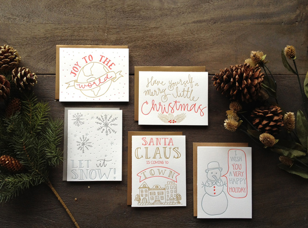
We also had a dear friend from high school, Josh Casteel, who died this past August of stage 4 adenocarcinoma lung cancer almost certainly because of his military service in Afghanistan, tending burn pits, after he became a conscientious objector. 5% of the sales from our new holiday cards (Over the River & Joy to the World) go to Iraq Veterans Against the War in his honor.

Maggie Campbell Calendar

Finally this year, my mother in-law was diagnosed with early onset Alzheimer’s Disease, which has been a pretty terrible way to put all of our priorities front and center. $15 from the sale of each 2013 cyanotype + letterpress calendar and $5 from the sale of each Book of Days perpetual calendar go to the Cure Alzheimer’s Fund, which funds research to prevent and cure Alzheimer’s.

We’ve gotten incredible feedback about all of these donation initiatives. My mother in-law is extremely proud of our contribution to the Cure Alzheimer’s Fund and that organization actually interviewed me recently and will feature our calendars in their upcoming newsletter! Also, customers who come up to my table at craft fairs and who buy my cards online are excited to find out that they’re doing a little something extra good with their purchase. It’s incredibly rewarding, and I’m excited to write some substantial checks to all 3 of these organizations at the end of this year!

 Shauna Rue – Purple Ink Press

Shauna Rue Purple Ink Press

I had the Boston card available for sale in my etsy shop, so when I heard about Owen Carrignan, I knew the card was a perfect fit. Owen was a 6-year-old boy from my town who passed away from complications related to a sudden E. coli infection. The Owen E. Carrignan Sports Scholarship Fund was established to keep alive his love & spirit, and to celebrate his love of Boston sports; 100% of the proceeds from the Boston card are donated to the fund in his memory. To hear that a young boy died so suddenly was heartbreaking, but I was shocked to learn that he was actually my cousin’s wife’s nephew–although I had never met him.  Selling a card in his honor was the very least I could do.

Shauna Rue

The card has been very popular, despite only being available on Etsy.  I look forward to selling it at next year’s fundraisers, which will certainly generate more sales.

In terms of other projects: just last week I sold an assortment of letterpress cards at Kai’s Holiday Village, a fundraiser that was held in memory of a local 2-year-old boy who recently lost his battle with an inoperable brain tumor. 100% of the sales went to support Kai’s Village, a newly founded, (truly!) grassroots group that provides support to families affected by a serious illness.  Kai’s mother, Kerri, expressed an interest in creating a line of stationery that can help support some of the organizations that were invaluable to her son during his fight, so I look forward to making that a reality for her in 2013.

Additionally, I will be adding a donations section to my wedding suite offerings (sometime in early 2013): when couples give a designated amount to a registered charity, I will print coordinating reception cards, coasters, etc. for free.

I love what I do.  And when I can help others in the process, it makes my amazing job even better.  Sometimes I feel like one card sale isn’t going to help much, but then I remind myself that following is worth remembering: “Never doubt that a small group of thoughtful people can change the world. Indeed, it is the only thing that ever has.” (Margret Mead)

Tess Darrow & Kara Yanagawa – Egg Press

We have donated to organizations large and small, all to organizations that we believe in. We teach an elective class on letterpress and screen-printing to one of our local schools, the Metropolitan Learning Center. The class had fun learning about business, technique, and art while having fun with hands-on training and talks of the printing industry. Cards sold at a sale in March, 2012 went to benefit the MLC.

Egg Press Mercy Corps
We have proudly printed pieces for American Foundation for Equal Rights, Tie The Knot, Mercy Corps, Operation Hope and Rock and Roll Camp for Girls. Last December, Egg Press was able to donate their time and printing expertise while partnering with Mercy Corps on their holiday card. A piece that supported the Mercy Corps vision of worldwide education, providing communities with emergency response, conflict management, micro lending, and more.

Egg Press Breast Cancer

In addition we have donated countless gift baskets for fundraisers to benefit public schools and local organizations. Last year, Tess designed a “good luck with your boobs” card to send to friends with upcoming mammograms or those dealing with breast cancer. A percentage of each card sold is donated to the Breast Cancer Research Foundation.

Tia Blassingame – Primrose Press

Tia Blassingame Blues Print

I approached musician and composer Dave Eggar of Deoro, whom I had met during an artist residency at MacDowell Colony, about collaborating on a project. I really wanted to work on a piece about blues music, which I adore and constantly have playing in the studio. He was amenable to such a piece. He was on tour and I was in graduate school at the time, so we tried to conceive of a collaboration that would work despite our schedules and distance. I felt it would be interesting for people to hear a musician verbalize the significance of blues music, particularly a musician that is not specifically a blues musician.  The idea that this music would affect musicians across genre seemed intriguing to me. I particularly liked this idea of an artist expressing themselves in a manner outside their discipline. In this case, we have a musician writing a poetic piece about blues music.

From its inception, Primrose Press has had a charitable aspect to it. A portion of all sales are donated. Over the years, Primrose has donated to local organizations like the Connecticut Food Bank, as well as international charities like HelpAge. Dave and I talked about donating the sales proceeds to a music-related non-profit organization. He provided invaluable input regarding organizations that were not only reputable, but whose mission we might wish to support. The Blues Foundation with their Hart Fund (Handy Artists Relief Trust) just seemed like the perfect organization for the project. As a lover of blues music, it always bothered me that those talented blues men and women are too often forgotten as they age. In the scheme of things and in relation to the joy that their music has given me, it is a tiny thing to print these cards and donate the proceeds.

This piece [, the Blues Letterpress Note Card,] involved an extended print day of playing around with metal typefaces, ink, and sending probably too many photos and text messages to my collaborator. The text that Dave wrote was so beautiful. I always enjoy setting type for poetry. Usually it is my own poems that I am setting, editing, and obsessively re-editing, so it was a pleasure to pick a subtle typeface and set his writing.

I mixed up a blue ink, printed a background layer, and then realized that I wanted to build up the background with multiple colors before printing the text. Knowing that I had a limited time on the press, but not wanting to short change the piece. I figured the best way to do this without losing time cleaning the press, and re-inking was to add and mix colors on the press. Obvious for most seasoned printers, but at that time I was a bit of a purist wanting a clean press between color changes. So the piece started from one blue, and then builds into several that are all within the same family with just the addition of blues and blacks. During the print run as I was texting photos of lock-ups and pieces in the drying rack, Dave announced that he had just been nominated for the Grammy. So after my “Shut up!” text had been sent to him, I nervously locked up the final layer of the piece: his text.

People have reacted amazingly to the piece. It was a limited edition piece, and is almost sold out. I printed some additional small postcard size prints on variety of blue-colored Crane’s papers, and those are still available at the Print Center in Philadelphia.

I recently discovered Black & Missing Foundation, Inc. This is an organization run by two woman in D.C. that helps publicize the plight of missing African American children and adults. Basically, they give a voice to invisible people whose stories are not featured in the media. A percentage of purchases made during the month of December from Primrose Press’ Etsy shop is donated to Black & Missing. I look forward to offering additional collaborative limited edition prints that will benefit ailing musicians.

Tia Blassingame Al Mutanabbi

Other charitable projects: [I am a part of] the Al-Mutanabbi project. It has several parts, and the first was letterpress broadsides. The current one features artists’ books. It involves letterpress printers/bookmakers from across the globe. I created a print (handset letterpress & etching) for the broadside portion; and am finishing up my artists’ book (letterpress). The project was inspired by the bombing of the bookselling street in Baghdad. The broadsides have been exhibited internationally, and soon the artists’ books will be, too. The artists’ books will also become part of the permanent collection at the National Library of Bagdad.

Jennifer Larkin – The Paper Peony

Jen Larkin

I’ve been designing and printing wedding stationery and invitations since 2002.  In 2006 I began taking letterpress classes in the evening at Columbia College here in Chicago.  I, like many, became smitten.  I enjoyed the time intensive task of pulling each card, by color, off the Vandercook. Inspecting every lovely unique print. For over a year I rented time through the college printing custom cards and stationery. In 2007 I opened The Paper Peony on Etsy.

Excitingly in late 2007, with the help of Briar Press, I acquired a sturdy well kept Chandler & Price Pilot press from Milwaukee. For $1,000 I considered it a gift, and luckily my supportive husband Shaun agreed.  It came with ink, cotton paper, 2 drawers of metal type, tympan and more…we were able to carry the 250 pound press to the basement to the sweet little studio my husband built for me. In 2009 we began searching for a larger press. By October ‘Gretchen’ was delivered in the rain to our garage from KY at 7am.  An 1,100 pound Vandercook #4 that needed tons of care.

A few years later I released the lettersass™ card line including sassy sayings, petit cards and simplicity with rounded corners and stripes.  The cards bring some humor to life milestones like marriage, having a baby, birthdays, graduations and more.

In 2011, I found out my lovely college roommate Jenny was diagnosed with breast cancer. She had no risk factors, she did everything right. Her cancer had been forming for a while, and was only going to get worse. It was an easy and an instant decision to create a lettersass card that would spotlight breast cancer.  Most importantly, because I could donate a part of the profits to help find a cure. I’ve had amazing feedback locally – especially from sisters of cancer survivors and the ones still fighting. One of the things Jenny most wants women to know is how ESSENTIAL it is to have mammograms, as SOON as possible. Her cancer would never have been felt. A mammogram is the only way she would ever have found out.

If you’ve got photos online of your letterpress work that is for a great cause and you’d like to share them, please include a link in your comment!

Boxcar Talk With Annika Buxman

There’s a vibrancy when Annika Buxman of De Milo Design Studio & Letterpress speaks about braiding her foci of letterpress,  responsible printing, faraway homelands, and her support of Fair Trade paper. Deftly she passes from one story to another, entrancing us, while her C&P mirrors her movements. Paper to ink. Printed piece to hand. Annika paused the press so we could ease in a few curious questions into the extraordinary printing tapestry around us.

THE CREATIVE CASE OF ANNIKA BUXMAN Machinery is in my blood. I mostly grew up in Bakersfield, California in the 1970’s. At that time the landscape, even in town, was covered with functioning oil wells. The “head” on a long “neck” was constantly moving up and down like a gargantuan horse leaning down to drink. I named dozens of them and felt a special kinship with these “creatures”. The oil wells combined with the farm equipment in my grandparents’ barn made me feel at home with wrought iron and rust. I didn’t learn how to use a computer until college in 1988, so mechanical rather than digital functionality is imprinted in my brain.  A completely different childhood experience from Bakersfield was being born in Africa (Kinchasa, Zaire) and having those images and stories around the house. My family also lived in Manila, The Philippines, right after the revolution in 1987 and traveled around that part of the world for a year. Those experiences gave me a strong sense of poverty in developing countries. But it seemed like too big of a problem to solve. When I learned about how small businesses can make a difference through the practice of fair trade it was the perfect fit for De Milo Design.

Locally, I enjoy teaching the art of letterpress to people in my studio and working on custom invitations, business cards and personal stationery. Globally, I’m committed to promoting cross cultural business relationships with women in developing countries through the development and sale of their handmade paper via my fair trade and eco paper line “Sustain & Heal.”

LOVE AT FIRST SIGHT I first saw letterpress printing in the gallery at Art Center College of Design where I was a student in 1993 and was fascinated. I took their Archetype Press class. I thought it was just a fun elective. I never thought I would do it for a living so I didn’t pay very close attention. When I started up my shop I had to go back and take the class again.

STAYING COOL IN CALIFORNIA South Pasadena, California is a small town about 10 miles northeast of downtown LA. The entertainment industry does a lot of filming here when they need the “quaint-cute-midwestern-small-town” look. The front of my street level studio has huge windows that look out onto the main boutique shopping and gallery section of town. The Goldline light rail station and weekly farmers market is just down the street and the chamber of commerce organizes art walks 4 times a year so there’s a lot of foot traffic. I treadle my C&P in front of the windows every chance I get. Working the press with the backdrop of lovely marbled fair trade papers always attracts attention.

PRINTING MENTORS My first printing mentor was Regis Graden. I met him just in time because he died a few years later. But in those few years my skills improved by leaps and bounds largely due to his input. When I called him with a question often he would say “I could tell you but it would be easier to show you. I’ll be there in 20 minutes.” Here is a bit more about him on my blog. Today my mentors are other printers like me who are each doing their own thing with letterpress. Close to my studio there are at least a dozen printers — Maude Press, Lala Press, Anenome Press, Fugu Fugu Press, and Papermum Press, just to name a few. And we all rely on local printing legend Gerald Lange. The International Printing Museum puts on an annual printers fair and it’s fun getting together with other local printers to talk shop and exchange advice. The Ladies of Letterpress conference this past August provided me with a host of contacts and I love their discussion board.

THE CREATIVE PROCESS The unexpected juxtaposition of materials is the most fun way for me to design. At Art Center I learned the basics of a good layout (first, second, third read, and dynamic “white” space) and picked up an appreciation for meticulous typography. Applying those skills to combining different materials is my favorite way to design. Most of my work ends up being a collage of some sort. I could get a PhD in adhesives!

FULL TIME FUN I am both a designer and printer, and I’ve been printing full time since 1998.

PRESS HISTORY I bought a 8×12 C&P Old Style Treadle Press from the International Printing Museum in Carson and drove it to Pasadena on Los Angeles freeways on a little trailer that was only rated to carry 500 pounds. Dumb.

PRINTING FEATS In 2007 I designed and launched a line of fair trade and eco friendly papers called “Sustain & Heal.” It primarily features handmade & handmarbled papers and a specially made for letterpress Jute sheet. Later I traveled to Bangladesh to meet with many of the artisans who make the paper and see what a huge difference it makes in people’s lives when we buy fair trade. Taking “Sustain & Heal” to the National Stationery Show and bringing the message of fair trade to people there for the last six years has been a huge undertaking. I’m terrible at marketing and showing my work. I dread public speaking and talking to strangers, especially when they stare at me blankly after my passionate little speech about fair trade. Doing this show has been an area of personal growth and I’m proud that I rise to the challenge year after year.

BOXCAR’S ROLE When I first launched my website in 1999 there were not many other letterpress websites out there. Boxcar made me feel like I wasn’t alone, or crazy, to be doing what I was doing. They also gave me a laugh with the “What is Harold wearing” section. They continue to be ahead of the curve and leaders in this industry. Their habit of eco-friendly practices inspire me to do the same.

PRINTING ADVICE Regis [Graden], my first letterpress mentor, used to say “You know the only sure way to not make a mistake? Don’t ever do anything!” He also once consoled me when I called him with my latest printing woe, “You made a mistake? I can’t believe it. The last time I made a mistake was…let me think…ten o’clock this morning.”

WHAT’S NEXT So many “high on talent, low on bank account” folks walk into my studio each week with their wonderful designs that they want printed. Often they leave disappointed because they had no idea letterpress requires so much effort and is on the higher end of the price scale. So I’ve set up a “letterpress lab” program for people to come into the studio and print their own designs for a small equipment rental fee. So far it’s worked well with the few people who have tried it. I’m looking forward to expanding this program next year.

Again, a big round of thanks out to Annika for letting us catch a glimpse of the spectacular work of De Milo Design Studio & Letterpress!

Who is that?!

This hungry little face is found on the delivery side of a Heidelberg KSBA cylinder press. While it has lurked there unknown, it has eaten many wandering scoring matrices – those are the blue strips inside – plus other mysterious dainties. If your scoring matrix or lunch is missing, ask this fella if he has seen it.

One of the Boxcar Press cylinder presses


Workspace Spotlight: Alissa Bell

In the sunny spacious hills of California, Alissa Bell can be found enjoying her new printing space. She let us take a well-timed tour of the new digs, and offered up some great advice, heaps of laughter and curious answers as we meandered around her brightly lit space.

THE PRESSES I have a Chandler & Price 12×18 press from 1919.

SIZE OF PRINT SHOP 500 sq. ft.

THE LOCATION My workspace, located in the hills just outside of Salinas, California, is in a “casita” with views of old oak trees and Steinbeck country.

FAVORITE THING ABOUT THE SHOP I moved into this new space just 2 weeks ago and already I am feeling more inspired and refreshed.  I love the high ceilings and big windows…they bring in lots of natural light.  My dogs keep me company while I am printing. Barley likes relaxing by my feet, but Blue is scared of the press while its running so he sits outside. I also have a cow-skin rug… just in case I forget that I’m in the countryside.

NUMBER OF PRINTERS IN SPACE This is a one girl commercial print shop!

MOST VALUABLE SHOP TOOL My iPod. I nerd out to Ira Glass and other podcasts while printing. I love learning and printing at the same time.

FAVORITE INK Van Son rubber based inks. However, I’ve been playing around with the Van Son oil based metallics. I am enjoying gold 871… I printed 2013 calendars in gold on black paper stock. It looks and feels so glamorous.

SOLVENT OF CHOICE I use California Wash. Fellow printer, Robert from The Paper Crane in Half Moon Bay, recently shared a tip that has shaved a few minutes off my cleaning process. He suggested after the initial cleaning of the ink disk, reapply cal wash to the disk. Run the press and allow the rollers to run over the cal wash… removing extra ink and also breaking up the ink on the rollers further before taking a rag to them. I find this little tip very helpful!

PLATE AND BASE OF CHOICE I have a Boxcar deep relief base and use Boxcar KF152 plates.  My studio has only been in business for 1 year and I’ve been using this system since day one.

OIL OF CHOICE Motor Oil from the hardware store

WHAT TYPE OF RAG DO YOU CLEAN UP YOUR PRESSES WITH I am often making trips to ACE hardware to purchase this handy square box of old t-shirts.  They are perfect for clean-up.

FLOORING MATERIAL Stained concrete

FLOOR PLAN TIPS Since this space is 2 weeks new, I am still working out the equipment arrangement.  One new item being added to the floor plan is a platform/stool.  For this move, we (and by we I mean strong men and a forklift) got the press on a pallet and I think I will keep the press on it permanently just in case of a future move.  I’m going to build a platform for me to stand on so I am at a safe height to work.

PIED TYPE First born. Type A. I love to clean… I can’t help it!

ORGANIZATION ADVICE I have a filing system for my clients’ polymer plates.  I use the plastic sleeve from Boxcar to help separate different projects and clients so I don’t loose my marbles (or the plates) during a reorder.

PRINTING ADVICE The word “no”… I am so excited about what I do and want to share with each person who shows interest. Sometimes, though, being able to say “no” due to time constraints, comfort level, or the intangible bad feeling about a project would save me a few headaches.

Free Cozy Winter Vector Set

Leaves crunching under your feet, the glittering twinkle of a first snowfall, and the yummy smell of homemade cooking lets us know winter is on its way, dear letterpress lovers! So to kick off the cozy holiday season, we’re spreading the joy with a free winter themed vector set! This set includes joyful winter wishes, a determined hockey player, a festive Thanksgiving tom, and a delicious cup of cocoa to warm up your letterpress designs!  All are free for use and in both EPS and PDF  format. Cheers!

Boxcar Talk With Bridget Elmer

In the pressroom, Bridget Elmer of Flatbed Splendor is creative heat, cool logic, a constant of undeterred printing desire. She is the definition of adroit; passing from typesetting, to teaching classes in both the academic & community settings, and comes back around as a deft, keen machine of printing prowess bent on devouring type, ink, paper, and bindery. Bridget peered in through the letterpress looking glass in the early 2000s and became immediately enamored with the letterpress community. She started up Flatbed Splendor in 2007, and stays on her toes at Black Mountain College Museum + Arts Center. Her style presses the printing frontiers (e.g. multiple colors on one run, dubbed the “Rainbow Roll”) while getting the job done and then some—drawing from a library of book art knowledge to specialized printing techniques. An American splendor, Bridget let us in on the wonderful workings of Flatbed and how the ink rolls these days.

SPREADING THE LETTERPRESS LOVE I am an artist, book maker and letterpress printer currently working in Asheville, North Carolina, and soon relocating to St. Petersburg, Florida. I am the proprietor of Flatbed Splendor, an independent press that I founded in 2007. Through Flatbed Splendor, I produce artists’ books, prints, broadsides, and ephemera. Flatbed Splendor is a member of the 7 Ton Letterpress, a collective devoted to letterpress printing, graphic design, calligraphy, paper goods, invitations and shenanigans.

My fellow 7 Ton members include Beth Schaible of Quill and Arrow Press, Kelly Kelbel of Tiny Story Factory, and Eleanor Annand of Two Step Press. I am also the co-operator of Impractical Labor in Service of the Speculative Arts (ILSSA), a membership organization for those who make experimental or conceptual work with obsolete technology, which I co-founded with Emily Larned in 2008. I am thrilled to report that I recently joined Jessica Peterson as co-owner of The Southern Letterpress, providing letterpress artwork, products and printing to the Southeastern United States. Jessica currently runs The Southern Letterpress print shop in Northport, Alabama. Upon my arrival in Florida this September, The Southern’s St. Petersburg location will soon be up and running!

I received my MFA in the Book Arts (2010) and Masters in Library and Information Studies (2011) from the University of Alabama. In addition, I teach book arts in a variety of educational settings. I have taught as an Adjunct Professor at Florida State University, a Visiting Art Professor at Colorado College, a Resident Artist at The Catherine Cook School, and an Instructor at Asheville Book Works and Ox-Bow. As a member of the College Art Association, College Book Arts Association, the Southeast Guild of Book Workers, and Ladies of Letterpress, I have also presented and published my work and my intersecting fields of interest.

BEAUTIFUL BEGINNINGS Ten years ago I arrived in New York City from Portland, Oregon, where I had been working in the non-profit sector for several years, advocating for affordable housing, transportation alternatives and police accountability. All of this advocacy work, as well as my interest in creative writing and poetry, led me to discover a continuing education class at Cooper Union entitled Self-Publication. The course was taught by Christopher Wilde, a book and collage artist who was a student of Walter Hamady’s and a co-founder of Booklyn, Inc., an artist-run, non-profit artist and bookmakers organization headquartered in Greenpoint, Brooklyn. Christopher introduced us to the history of the book and the artist’s book as a contemporary art form. One of our field trips for the class was a visit to MoMA to see the exhibition, The Russian Avant-Garde Book 1910-1934. I was hooked, and letterpress is what hooked me! Particularly the work of Olga Rosanova and Vasilii Kamenskii, which integrated collage, wallpaper, monoprints, and linocuts with letterpress printed, handset type and simple book forms.

Soon I was spending my every extra moment in Greenpoint, absorbing all that I could from the amazing alliance of artists that Booklyn convened. I started taking classes at the Center for Book Arts as well and bought my first press soon after.

OPULENCE IN THE OLD NORTH STATE It’s a crazy time for me, as I am smack dab in the middle of moving from Asheville to St. Pete. Currently, I print at 7 Ton Letterpress Collective in West Asheville. I’m going to be moving from this space on Labor Day weekend, which I must admit, totally breaks my heart. 7 Ton is an amazing, affordable studio in a mixed-use building, located in a primarily residential area of Asheville. We have a storefront with huge windows and a glass door, where we prominently display our logo, which my collaborators designed and I love so much! Behind the storefront is a large studio space, which houses two Vandercooks, one Chandler & Price motorized platen press, and two table top platen presses, as well as an extensive collection of handset type, a monster guillotine, a bunch of flat files and a collection of book binding equipment.

West Asheville is one of my favorite places, so I love our location. We’re just a few short blocks from Harvest Records, the best record store on the planet; Ship to Shore Shop, the studio of artist, designer, dressmaker, and one of my favorite collaborators R. Brooke Priddy; Asheville BookWorks, a community resource for book artists and printmakers; and The Dry Goods Shop, a studio, community center and store for locally made goods. We’re also a hop, skip and a jump away from the River Arts District, a hopping, ever-expanding neighborhood that is home to over 165 working artists, including Ladies of Letterpress founder Jessica White’s Heroes & Criminals Press, as well as Mark Olson’s Innerer Klang Letterpress. Asheville is located on the Blue Ridge Parkway, nestled in the Appalachian mountains, surrounded by natural beauty and grounded in a strong tradition of craft and creativity.

PRINTING MENTORS The Booklyn crew, including Christopher Wilde, Mark Wagner, Emily Larned and Sara Parkel. My Bama crew, professor Steve Miller and my fellow MFA graduates Jessica Peterson, Emily Tipps, Sarah Bryant, Frank Brannon and Ellen Knudson. The Asheville crew, Brandon Mise, Laurie Corral, Jessica White, Beth Schaible, Eleanor Annand and Kelly Kelbel.

THE CREATIVE PROCESS When I design, I try to start with the idea, intention or overall feel of the project. As such, I usually start from a draft text and any available source imagery. From here, I draw up a variety of possibilities in my sketchbook. I usually move from my sketchbook to my laptop, mapping out potential layouts, trying out different typefaces and color schemes, and making my way toward a rough draft of the project. At this point, I often make mock ups if the project requires complicated imposition and finishing. If I’m planning to print from photopolymer, I continue working digitally until the design is finalized. If I plan to work with handset type, then I work from a fairly rough digital draft. As I set type and proof, the finalized design emerges. If I’m working for a client, I arrange for a proof check, either at our shop or via a digital scan, before I commit 100% and start cranking!

PRINTER’S PARADISE After ten years of letterpress printing and over five years of owning my own press, I feel that I’ve evolved from a printer to a designer / printer. I’ve been trained primarily as a letterpress printer and book designer, but as my interests have expanded into experimental printmaking, custom letterpress work and the foundation of a full-fledge print shop and storefront, my design interests have also grown. I find myself doing a lot of research and self-educating with regard to the history of design and contemporary design practices. I strive to constantly be learning more in that realm.

Currently, I do not print full time. I work three days a week at the Black Mountain College Museum + Arts Center, and I will soon transition to a more flexible schedule as a consultant at the museum, working the equivalent of two days a week from home. In addition to my work at the museum, I also have a sporadic teaching schedule, which can range anywhere from a two-day workshop to a semester or year as an Adjunct Professor. I would say that I currently spend about two days a week in the print shop on average. Once my move to St. Petersburg is complete, I’m hoping to spend at least three days each week printing, with the eventual goal of The Southern Letterpress being my primary bread and butter. I want to continue teaching and making my own work, so I intend to always make time for those pursuits. In my dreams, the print shop becomes a community center where I can do it all (printing, teaching, making art) in a one-stop shop!

PRESS HISTORY I took Letterpress I with Richard Meneely at the Center for Book Arts, and learned how to print handset type on a small, table top platen press. When the class ended, I asked Richard if he had any suggestions for how I could find a similar press. He led me to a previous student of his, who was living in Brooklyn. She had purchased a Craftsman Superior years before after completing Richard’s class, but it was languishing on the floor in the corner of her apartment, collecting dust and cat hair. I made her an offer she couldn’t refuse and, thanks to a generous gift of type, ink and leading from Mark Wagner, I was able to set up the first incarnation of Flatbed Splendor in my apartment.

PRINTING FEATS I am most proud of the collaborations and communities that I have helped to found and build through letterpress, including ILSSA, 7 Ton and The Southern. I’m also very proud of the artists’ books that I have published, each of which gives me the opportunity to learn more about designing, printing and binding. I feel a sense of pride when the back-and-forth of custom letterpress work comes to fruition in ways that please both me and my clients. Finally, I’m super-proud of my students and always excited to watch them fall in love with letterpress.

BOXCAR’S ROLE Boxcar Press has been an invaluable ally in my both my letterpress printing business and my work as an artist. In addition to enthusiastic service and a consistent, reliable product, Boxcar offers a community of support that I am constantly tapping into, both with my own work and with my students. Boxcar also provides a successful, sustainable model for all of us hoping to move forward with a career in letterpress.

SHOP TIPS I think the best advice I’ve been given as a letterpress printer regards the importance of clear communication and the constant need to educate our clients and the public in general. Clear policies and accessible descriptions of the letterpress printing process translate to good business and ever-increasing interest in our field.

WHAT’S NEXT Funny that you’re asking right at this moment! I’m getting ready to make some big changes in the coming weeks–moving from Asheville, North Carolina to St. Petersburg, Florida, finding a new space for my shop, refurbishing a new-to-me Vandercook #4, giving my Chandler & Price motorized platen press some long-deserved attention, and hopefully, by the beginning of 2013, spending the majority of my time building clientele and making things happen at The Southern Letterpress! I’m also excited to report that I’ll be teaching a two-month concentration at Penland School of Crafts in the spring of 2013, entitled Book Structures: Innovative Forms. I’m super-psyched that Micah Currier from the Dale Guild Type Foundry will be teaching a class in Type Founding during the very same session. I can’t wait to check out their pivotal casters and get a rare peek into the type founding process!

Big round of applause and a tip of the hat out to Bridget for sharing the details on Flatbed Splendor!

Boxcar Talk With Amy Rau

Amy Rau, of Green Girl Press, has a candid smile and jingle of a laughter that steps in time with the rhythmic clicking of her presses and fantastically-detailed letterpress designs. She’s one of those printers that can be spreading ink on the rollers while gushing about her last memorable jaunt to the most recent Ladies of Letterpress Conference down in North Carolina (and, oh the stories she tells!). For Amy, printing weaves together a love of detail, history, and passion. This fellow Central New Yorker printing powerhouse talked with us about how she plays with her designs just as much as she does with her printing resume – read on for the full story.

Amy Rau of Green Girl Press - letterpress printer profile by Boxcar Press

WOMAN ON A MISSION I’m super detailed. I ascribe to the “more is more” philosophy, even though I admire clean minimal design. I have 2 dogs & 2 cats. Vacuuming is my favorite “chore” (I can’t resist the lines it makes on the floor!). Last year I endeavored on a quest to find the perfect vegetarian marshmallow recipe (haven’t found it yet).

LETTERPRESS LOVIN’ Totally by accident. I thought I wanted to take up calligraphy. By a stroke of luck, the calligraphy class I wanted to take at the GCAE wasn’t being offered for the next session so I signed up for “Type 1” now, “Lovin’ Letterpress 1” instead. I had no idea what Type 1 even was. But, within 5 minutes of my first class, I had fallen head over heels. By the second class, I knew that I was going to quit my day job and start my own press. I later took that calligraphy class and it turns out I don’t have even half the patience required to work with nibs anyway.

Letterpress printed calendar made by Amy Rau of Green Girl Press, as seen on the Boxcar Press blog

EXCELLENCE IN THE EMPIRE STATE I have 2 table top presses that reside in my garage and I also rent space from a community print shop in Rochester, New York. There is always something new coming into the community space.

A LETTERPRESS FAIRY GODMOTHER After listening to her keynote speech at the 2011 Ladies of Letterpress Conference, Judith Berliner of Full Circle Press became my unofficial “Letterpress Fairy Godmother”. Whenever I come across a sticky situation in the print shop, I conjure up a vision of her waving a magic wand and erasing my problems. It’s not really very helpful for problem solving but it does make me smile.

THE PROCESS The majority of my design process occurs in my head. I use sketchbooks to make endless lists. And I spend a lot of time procrastinating. That’s probably the biggest portion of my design process. Days and days of thinking. After that, I work in Illustrator playing with different typefaces and layouts. My designs usually come together pretty quickly once I move onto the computer. I’ll play around with 3 or 4 versions of the same project and those usually evolve into a dozen or so more complex but similar designs, one of which I find successful enough to print.

FULL TIME FUN I am both a designer and a printer, but I love to print other people’s designs as well. It allows me focus on printing everything perfectly without the distraction of wishing I could modify the design.  I do, I do, I do print full time! I’ve been printing full time for the past year and a half, and loving every minute of it!

LOVE AT FIRST SIGHT The story behind my first press is relatively unremarkable. The story behind my second press, a 3×5 craftsman, goes like this: A lovely woman by the name of Shirley began emailing me telling me that her husband, Milton, had seen a newspaper article about me and wanted to sell me his guillotine paper cutter. We exchanged a few emails and then, after a brief telephone conversation, they invited me to their home. Milton had set up a personalized garage sale in his basement for me! Everything I mentioned liking was displayed on folding tables. I didn’t end up buying the cutter (that day) but I did go home with some beautiful Cheltenham wood type and my little Craftsman. It was hard not to buy up everything!

PRINTING FEATS I’m pretty sure I died from excitement the first time I saw my work on Pinterest.

BOXCAR’S ROLE Without Boxcar, I wouldn’t exist! As much as I love typesetting, my real passion is in printing designs that I have created digitally. Boxcar’s platemaking is top-notch.

Cathy, Rebecca and Anthony in plate making have all been SUPER wonderful whenever I have dared to spread my design wings and not known how to manipulate the files in order to print well. I also find the video tutorials really helpful.

SHOP TIPS Raise your prices.

Big round of thanks out to Amy for letting us get a glimpse into the wonderful world of Green Girl Press!

The Letterpress Roundtable VI: Letterpressing the Issue

With the 2012 election just a week away, we thought it’d be fitting to poll some of the printers we admire to see how they’re using letterpress to inspire political change. The results are in, and they’re poignant, humorous, intelligent and – above all – stimulating. We gathered some of letterpress’s best for the sixth installment of our letterpress roundtable discussion in an effort to light the way for what is yet to come. Read the stirring responses this group has to offer and be sure to tell us about your own projects in the comments section below!

Boxcar Talk With Isabel Ibanez

Boxcar Press sat down with Florida native and letterpress maven, Isabel Ibanez of 9th Letter Press, to talk about her first jobs, how it took one business card to change her life, and why she won’t back down from a good printing press find. 9th Letter Press plans to open up shop with a little shindig on October 27th, so if you’re in the Orlando area be sure to stop by!

THE NINE LEVELS OF ISABEL I’m a Floridian/Bolivian hybrid who graduated from the University of Central Florida with degrees in English + History. I like giant cups of pumpkin flavored coffee, tall stacks of books, and heading to the cinema on an all the time basis.

Many people have been asking the significance regarding the name of my company. Well, here it is: the 9th letter in the alphabet is the letter “i”. My first and last name both start with this letter and I was also born on April 9th. Nine has always been my number. Since I’m essentially starting a printing press business, I added “press” to the name as a play on what my company is and what my company uses to print. Voila!

BEAUTIFUL BEGINNINGS I was working for a magazine as an editorial assistant where I would often get to observe the design process. It seemed like modern day art to me. I left my writing gig in order to go back to school to study graphic design so I can learn a little more about “modern day art”. In my very first class, my teacher handed out business card samples and one of them happened to be letterpress.

The effect was instantaneous. I absolutely loved it. From there, I was very proactive with my education and got an internship and a mentor. Both helped me pave a way to starting my own printing shop.

SERENDIPITY IN THE SUNSHINE STATE Oh, man. I have something of a nostalgic personality and I knew I wanted my studio to reflect that. When it came down to searching for the perfect place, my heart was set on the Winter Park area. It’s quite charming and old school. Lots of brick roads, quaint houses built in the early 1900s and the like. Our studio is decorated in a turn of the century feel. I wanted to mix the aesthetics of old New York style + the industrial revolution, creating a space where Edith Wharton would feel like she could step in for tea. On top of that, I knew I wanted to make the printing process accessible to the public. Not many people get to see a letterpress in action. The layout in our studio has our press out in the open juxtaposing our retail section. A client could come in and see their project getting printed while drinking coffee and checking out our newest paper products.

PRINTING MENTORS I interned at Mama’s Sauce, and afterward was mentored by Gary Johanson. Both have been valuable experiences.

THE DREAM JOB I am the designer + printer. 9th Letter Press is my full time job, thank goodness.

PRESS HISTORY I first started out with a tabletop but quickly moved to getting a 10 x 15 Chandler & Price. I searched long and hard for the right press and finally found a C&P in Seattle. Of course, I wasn’t a huge fan of the zip code that press lived in. A C&P weighs 1800 pounds or some such, which made my stomach turn whenever I thought about how on earth I was going to move the C&P across the continental United States. But then by some miracle, Sheli (my partner in crime) and I found a C&P 15 minutes down the street from my house. The owner had been printing as a hobby and was looking to downsize from living on a paved street to living on a boat. The rest is something of a blur but within a week I was the owner of a C&P, the very press I had my heart set on!

PRINTING FEATS Honestly, I think my proudest moments have been recognizing that what I was doing wasn’t crazy. We all face a moment when we’re about to commit to something seemingly scary and we wonder for a minute if we’ve lost our minds. Was I really about to start a business in this economy? I never thought “working” could be so much fun. With each new thing that gets printed + designed and is well received by friends, blogs, retailers, etc., it further confirms that I’ve found my niche. I can’t believe I get to do what I do. I guess I wasn’t as crazy as I thought.

BOXCAR’S ROLE Boxcar is chock full of the nicest and most helpful people I’ve ever met. I can’t tell you how daunting it seemed to me to find a place where I could outsource my plates, buy ink, and receive excellent customer service. Boxcar has all that plus the added bonus of being super encouraging. Who doesn’t need a little pep talk here and there?

SHOP TIPS That timeless anecdote about no man being an island is completely true. Having a major role in so many areas in your business will take its toll, particularly if you’re wanting to go at it alone. There are resources everywhere, especially if you’re brave enough to ask for help. You’ll be surprised and moved by how much people are willing to give — whether it be proof reading an important email, hanging shelves, or packaging greeting cards, help looks like a lot of things and can come from anywhere. Just ask.

WHAT’S NEXT Growing up, I loved perusing the aisles of Barnes + Noble to see the newest journals, calendars, planners, and wrapping paper. 2013 will have me designing + printing some of my favorites things, and I couldn’t be happier to explore other paper products.

Extra heap of thanks to Isabel for letting us get a sneak peek over at the wonderful workings of 9th Letter Press!