Inking up with Shauna Rue of Purple Ink Press

From a bizarre love affair with metal plates while crafting tailored social stationery to the dream of running a small business, Shauna Rue of Purple Ink Press exemplifies the drive and playfulness of letterpress printing. We sat down with Shauna to catch a glimpse of how all of the pieces came together to capture the happy-go-lucky heart of letterpress.

Shauna_Rue_IMG1_1


BEAUTY IN THE BAY STATE My name is Shauna Rue and I am the owner of Purple Ink Press, which I created in 2010. I design and print customized letterpress invitations, baby announcements, business cards, and all types of social stationery. I live and work in the Worcester area of Massachusetts. I have been married to my husband, Mark, for 7 years, and we have two beautiful children together: Wyatt, 2, and Emerson, 8 months.


FOR THE LOVE OF LETTERPRESS Like many new printers, I first discovered letterpress when I was looking for my own wedding invitations back in 2005.  Two years later, I was still OBSESSED with letterpress, and I found John Barrett with Letterpress Things out in western Massachusetts.  I took a few classes and I was hooked―John wouldn’t sell me a floor press until I put my time in on a tabletop, so I came home with my Kelsey 6 x 10, a cabinet, and drawers of type. I printed incessantly on nights and weekends and during vacation time from my corporate job, practicing the craft and familiarizing myself with different papers and plates.

In 2009, the timing was right so I left my full-time job and found a Chandler & Price 10 x 15 floor press in need of a good home.  I have been printing happily since then.

Shauna_Rue_IMG2_2


PARADISE IN THE PRINT SHOP My print shop is in the basement of my home, which luckily has great light and space.  I actually love having the presses at the house, since I am a night owl and like to print at all hours.  With that being the case, I still love using rubber based inks that I can keep open on the press.  There is always a dog at my feet and I have drawers and drawers of type that I need to organize. I tell myself it’s all part of the creative process!

THE CREATIVE PROCESS The majority of my work is custom wedding invitations and accompaniments, so I like to talk to the couple about their wedding―when we can’t meet in person, we’ll talk on the phone or through email.  I like to gather the details before I draft an idea for the invitations. To me, seeing a picture of the dress is often the most useful visual for creating an invitation suite that best reflects the event. From there, I put my ideas on paper―I still use a sketchbook and pencil to flush out my ideas before putting them on the computer. I always keep in mind to design to the letterpress’ strengths―i.e., I’ve only made the mistake of printing light ink on dark paper once!

FULL TIME FUN  I design and print [and] yes, I’ve been printing full time since 2010.  I can’t believe Purple Ink will be celebrating its third birthday in February!  This year, however, I took an extended maternity leave, so I only printed a handful of select projects.

Back in April, I finished printing a job and went into labor 5 hours later, so I knew I needed to slow down a bit after the birth of my daughter.

Shauna_Rue_IMG3_2

PRINTING FEATS My biggest accomplishment was deciding to start and run a letterpress business full-time – that was very scary for me, but I am so happy that I took the plunge! Everything else is an extension of that decision and I feel lucky every single day I am working. Running a small business has been a dream come true, and I have the luxury of making every job unique and customized to each customer. To me, it is a huge accomplishment to see genuinely ecstatic reactions to my work or hear from a couple that I captured the true essence of their style, love story, and wedding through my art. I love being able to be creative and constantly work at my craft and try to improve. And being interviewed for a blog such as this one or speaking at a local college as a guest art professor definitely makes me proud!

BOXCAR’S ROLE The deep relief base and photopolymer plates, baby! At the beginning of December, I just started the process of transferring my entire shop over to polymer: I love that the plates can be recycled at the end of each job and the fact that the platemaking process is less taxing on the environment.  I had dabbled with photopolymer in the past, but I held onto a bizarre love affair with metal plates. Happy to have finally seen the light! My favorite shop tool―hands down―is the Boxcar roller gauge.

Shauna_Rue_IMG4_1


SHOP TIPS When I first started my stationery line, I tried to come up with cards that I thought people would like and it was a disaster. I quickly learned that if I print what I like, someone out there will find it. One of my most popular baby shower prints is the dog pushing the baby carriage, which I originally designed for my own shower invitations because I wanted to incorporate my current ‘kids’―my yellow lab and my French bulldog―into the celebration. Sure enough, I’m not the only crazy dog lover out there, and I have since printed bulldogs, dachshunds, cocker spaniels, and countless Labradors pushing baby carriages.


WHAT’S NEXT I am very excited for 2013. I re-launched my website in January, which is perfect timing after my extended maternity leave. Recently, I have been designing invitation suites using a combination of paper textures, finishes, thickness, colors, fonts, and materials. I’m also doing more with ready-to-order letterpress cards and add-ons to invitation suites, such as letterpress coasters, table signs, and place cards for weddings. I can’t wait to show them off! I have definitely evolved over the years and in 2013 I really want to encourage my customers (and brides everywhere!) to be unique, creative, and fun. I love how all of the pieces of a suite eventually come together beautifully and can truly capture the personality and heart of a wedding or event. A goal for my bridal customers is to create wedding invitations that will make guests excited about their wedding!

Some other plans for 2013 include continuing to work with some charities that I partnered with in 2012. Giving back to my community and organizations that are close to my heart is an important aspect of my life and my business. In an effort to extend this sentiment to my customers, I am going to offer couples the opportunity to donate to registered charities in exchange for letterpress cards, coasters, and other specialty items. I’m trying to make 2013 the year of giving back!

Huge round of thanks out to Shauna for letting us catch a colorful glimpse of Purple Ink Press!

Let the Show Begin: A Look at Sideshow Press

The warmth of the South Carolina sun follows us in as we enter Virginia Gregg’s brightly lit printing space, Sideshow Press, located just a stone’s throw away from historic Charleston. Virginia greets us with a smile that lasts from the moment we start the fabulous tour on through the curious conversation threading from her Great Dane, Lulu, organization advice, and of course her gorgeous letterpress work!

THE PRESSES We have 3 presses total:  a 12 x 18” C&P, Vandercook No. 4, and a 10 x 15” Heidelberg Windmill

SIZE OF PRINT SHOP 700 square feet

THE LOCATION Located in historic downtown Charleston, our small shop is just around the corner from King Street. You can find us nestled in a small alley off Cannon Street. You can’t miss our bright yellow doors. Our space is crisp and clean, with great natural light…and paper everywhere!

FAVORITE THING ABOUT THE SHOP The sound of presses running [is out favorite thing]. Besides the presses, we have lots of found objects we’ve gathered from our grandmother’s attics, antique stores and travels abroad.  They serve as inspiration for designs, techniques or texture. Our ceilings are about 14 ft. high so we never feel cramped or crowded. It’s nice to have that extra air around us filled with natural light. It’s pretty calming and inspiring!

NUMBER OF PRINTERS IN SPACE Just the three of us! And sometimes Lulu, a 130lb Great Dane that comes to hang out every now and then.

MOST VALUABLE SHOP TOOL The line board we use to measure straightness. Can’t live without it!

FAVORITE INK We use VanSon rubber-based inks mostly. Currently we are using a lot of grays since they go with everything. That way the little pops of color really stand out!

SOLVENT OF CHOICE We use odorless mineral spirits for wash ups. On the Vandercook, we’ll run make ready sheets between the roller system to extract as much ink as possible before wash up.  And we let the press do some of the work for us by adding wash while its still rolling.  When the rollers stop rolling, you can start to clean.

BASE AND PLATE OF CHOICE We switched to the Boxcar base format and photopolymer plating about 3 years ago and haven’t looked back. We found it to be much more accurate, provides better impression quality and the polymer plates are so easy to store, reuse and cut and rearrange as needed.  One time we had a funny typo, with the phrase “to the mooon and back”, we’ll that’s an easy fix with a little poly-type surgery and we were back in business.

OIL OF CHOICE  Durofilm R&O 150

WHAT TYPE OF RAGS DO YOU CLEAN UP YOUR PRESSES WITH We use the boxed Scott Shop Rags for press wash ups.

FLOORING MATERIAL Our floors are concrete, painted gray. Of course!

FLOOR PLAN TIPS Keep it organized!

PIED TYPE We don’t really have/use much in the way of pied type.  We have a little hanging around.

ORGANIZATION ADVICE We use lots of storage boxes and shelves to maximize our small space. Since our ceilings are so tall, we just keep going up instead of out.

PRINTING ADVICE When setting up, make one adjustment at a time.  When having a problem, mechanical or while printing, start by looking at the simplest thing first and move up from there.

Big round of thanks to Sideshow Press for giving us a tour of their space today!

The Boxcar Press Valentine’s Day Gift Guide: 14 Gifts for Your Letterpress Sweetie

With letterpress love in the air, we’ve put together a list of 14 of our favorite gifts for this upcoming Valentine’s Day—we found some amazing letterpress gifts online, alongside some great books and sweet supplies that your printer will gush about!

V-DayGuide_IMG3

1. Boxcar Base: Protective Base Sleeve from Boxcar Press | 2. Typewriter Key Bracelets by Joy Sparks Design | 3. We Just Click card by Waterknot | 4. To the Letterpress Magnet Set from Modcloth.com | 5. 2013 Color of the Year Mug – Emerald by Pantone | 6. Alphabet Coaster Set by 1Canoe2 | 7. 100 Postcards by Pantone | 8. Scale Printing Press Wooden Model Kit by Revell | 9. Chandler & Price Wall Clock from Zazzle | 10. Boxcar Press Printing Apron | 11. LetterPressed Type-Style Cookie Cutters by Fred and Friends | 12. Love Letterpress Necklace by belrossa | 13. New Kraft Letterpress Valentine tags from Word Letterpress | 14. Gutenberg’s Gift pop-up book by Nancy Willard

Letterpress Love Free Vector Set

Fall in love with our cheery vector set to lighten the mood for Valentine’s Day! This (free!) heartwarming set includes a Celtic heart border, a dazzling flower art deco pattern, a bubbly mini-card, and a plethora of fun graphics to share for the fabulous Valentine’s Day season. All are free for use and in both EPS and PDF format . Cheers!

Jan_2013_FreeGraphics
Jan_2013_example

Counting the Many Brilliant Ways of Studio Three Four

Matt Robinson, the Georgia-based printer behind Studio Four Three, finds inspiration in the life-cycle of design, the kinetics behind architecture, turning out custom-based letterpress work, and accessing solace in his C&P’s. While sitting down with Matt, we found out that his love for letterpress flows strong as he mused about his newlywed bliss, his blossoming studio, and the mentors he’s been proud to work alongside.

Matt_IMG1

LOVE & LETTERPRESS Studio Four Three was officially launched on April 3rd a while back when my wife and I exchanged vows and said ‘I do’. Specializing in custom letterpress invitations and stationery, we named our business Studio Four Three, which was chosen by the day we got married.

We initially met when I was asked by Lauren to design a logo for her blossoming photography upstart, and as they say, the rest is history. It wasn’t but 9 months later that I proposed to my former client and future bride. We are now expecting parents, currently live and work in Alpharetta, Georgia with our two dogs, Elvis and Libby, and they are eagerly preparing for the arrival of our baby boy (who is sure to be creative).

BEAUTIFUL BEGINNINGS As far back as I remember, I always loved art and architecture and thought that one day I would be an architect. After entering college to study architecture, what I found I loved most was designing something and watching it come to life. Whether it was drawing something on paper and building a scale model of the design, I loved that ideas had a life-cycle of their own. I left school and worked for a print shop for a while and learned how to take my designs on the computer and turn them into a final printed product. The same thing I loved about school [was what] I ultimately loved about print media as well.

Matt_IMG2

It was only a matter of time before I encountered my first letterpress machine and immediately became enamored with the antiquity and complexity of the large moveable cast iron gears and parts. I knew without a doubt in my mind that letterpress was exactly what I wanted to do.  That was several years ago and my love for letterpress grows stronger each day.

PERFECTION IN THE PEACH STATE We are blessed to operate out of our house; our garage hasn’t seen a car in a long time because it’s packed with all sorts of letterpress goodies.  Everything from presses, shelves full of ink cans, drafting and composing tables, paper cutters, etc. This space is fully dedicated to our love and passion for letterpress. We are located just north of Atlanta, Georgia and conveniently a few miles from both my parents, sisters, and my in-laws. With a little one on the way, being close to family was our biggest decision in relocating to the suburbs. As it stands, we have a 1923 10×15 C&P, a 1910 No. 2 Potter Proof Press, a 6.5×10 C&P Pilot and a old style Gordon Press on its way down from New Jersey.

Matt_IMG4

PRINTING MENTORS While I have had an opportunity to meet some of the best printers in my area, I have one person I could call a mentor. Chris from Farmwood Press has helped me beyond what words can express. I have worked alongside him and he patiently helped teach me the basics of letterpress and allowed me to use his machines before I bought my own. I also spend a substantial amount of time researching other letterpress printers, watching videos, and reading blogs. A lot of what I know has come from self-educating and asking many people a lot of questions, but nothing compares to what Chris has helped teach me.

My wife is from Orlando, Florida and has stayed in touch with her childhood friends- one of whom recently got married.  My wife asked me if we could go to the wedding and I immediately said “yes, but only if we can go visit Mama’s Sauce while we’re there!”  She laughed and said “yes dear, we can go see their shop.”  While the wedding was a lot of fun, the highlight of my long road trip was visiting the shop that produces so much incredible work that I admire and meeting the guys who have built the business from the ground up. These guys have been probably my biggest inspiration!

THE CREATIVE PROCESS I do design for my clients, which is one of the things I really love about my job.  While there are lots of printers that print other people’s designs, I enjoy seeing what I work on come to life in the form of a final product. Our business works with a lot of brides and grooms (mostly brides though) so we focus a lot of our time on developing custom design solutions for their upcoming wedding. Everything begins with a very organic approach to their project: we listen to the client tell us about themselves and what they have envisioned for their wedding. Based on the discussion, we begin working on their design. Once everything has been approved, we get the files ready to send off to Boxcar Press and when the plates arrive, we go to print. Everything we work on is custom, from concept to completion, as it’s all centered around their wants, their vision, and their budget.

DESIGNED FOR PRINT I went to a large art school and have been fortunate enough to cultivate friendships with some incredibly talented artists, architects, photographers, etc. and am constantly impressed with how talented they are! I have kept in touch with many of them over the years and am blown away by some of the work they’re currently producing. While I design for my clients (and they often love what we are able to produce), I think comparatively I have a lot of growing as a graphic artist left to do. I believe that if I ever stop learning, I will become stagnant and that won’t be a good thing. I print what I design, but I’m always inspired by what other people are producing.

FULL TIME FUN Thinking about what I want the future of the business to look like, I get a huge grin on my face because it brings joy to my heart to think about doing something I love so much for the rest of my life. I currently design and print full time; however, a majority of my mornings are spent writing and responding to emails, balancing books, and placing orders.

I do want to continue to grow the business and be at a point where we have a few people working alongside us designing, printing, and working on business development. I love all three aspects of the business but its difficult to print all the time if I am not generating projects and designing for clients, so my time right now is spread between the three areas.

Matt_IMG3

PRESS HISTORY I guess in retrospect it’s a funny story: I had a client who wanted her invitations letterpressed and her deadline was to design and print her project in less than a week (needless to say, she waited a little too late in the game to work on letterpress invitations!) and I couldn’t find any company that could letterpress her project as quickly as I needed to have it back to her. This led me to think about buying a press so that I wouldn’t have to rely on someone else to do something I needed done for my design business.

I bought a small Kelsey 3×5 on eBay and when it arrived, it was a nightmare!  It looked like it had been sitting outside for a few decades so I painstakingly restored it and brought it back to its original glory but realized that it was far too small to use for an invitation suite so I decided to sell it on eBay. I made quite a profit on that sale and I bought my second press, a 10×15 Chandler and Price new style platen press, and still had half of my profit left over! Like I said, I made quite a bit of profit. Since getting the C&P, we have been able to buy a few more presses.

Matt_IMG5

PRINTING FEATS I’m really proud of my wife, Lauren, for sticking by me and encouraging me to do something I love.  There’s nothing easy about working 70 to 80 hours a week, but its worth it if the job is something you love, and letterpress is definitely something I completely love.  Needless to say, I married my best friend and that’s probably the accomplishment I am most proud of.

Matt_IMG7

BOXCAR’S ROLE There is hardly a day that goes by that I don’t visit Boxcarpress.com to either place an order for plates, or to tinker around and do a little research.

SHOP TIPS Learn how to use your press and what its capabilities and limitations are.  I have met a lot of people who look at the business of letterpress as a source of a making a quick buck, but profits often fall by the wayside if the printer doesn’t understand what their press can and cannot do.  Develop and build your business organically; it takes time, effort and intentionality to grow so don’t expect your venture to be profitable immediately. Our personal relationships with our clients are our most valuable commodity and their recommendation to their friends and family is the best form of advertising that money can’t (and never will) buy.

Matt_IMG6

WHAT’S NEXT Well, now that 2013 is officially here, we are looking forward to the arrival of our son (Judah Woods), who is due in a matter of weeks!  We’re incredibly excited to welcome this little guy into our hearts and will be devoting a lot of time to him. If there is anything else I could add, I think I would like to say that I hope he will follow in his father’s footsteps (that’s me!) and letterpress as well….or at least find something he loves and pursue it with passion. I have been looking online for an old 3×5 Kelsey to restore for him. (Who knows, maybe I will restore it, sell it, and buy him a Heidelberg Windmill with the profits, right?!). In regards to business, it is our hope and prayer that we have another great year and work with some incredible clients.

Big round of applause and congratulations out to Matt for letting us catch the beat on Studio Three Four!

Think Ink

For this roundtable discussion, we invited a handful of talented letterpress printers to let us in on their best (and some quite startling) inking techniques to share with you. As always, we hope to hear you dish about the inking secrets that make your press runs smooth, so be sure to add your advice in the comments section below!

Sarah Almond – Shed Letterpress

As a largely commercial shop, a lot of our printing caters to the whims of whichever talented, awesome designer we’re currently working with. I’d be remiss if I said I hadn’t noticed some trends in design, though, that are very specifically related to proper inking and getting the most out of the press.

SarahAlmond_IMG1SarahAlmond_IMG2

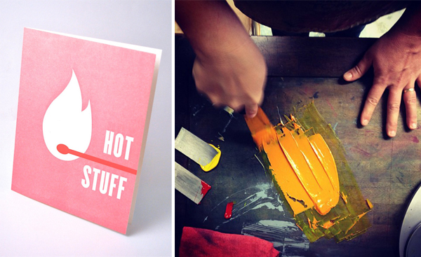
As requests for floods and knockouts have become more popular, I’ve had to adjust the way that I think about the inking process. In my work as an apprentice, I spent the majority of my time printing wedding invitations and focusing on type clarity and sharpness. Knockouts and floods present a different sort of challenge, however, since one is simultaneously trying to get great coverage and pull a clear, tight print.

The first step for me is to add the rider roller to my Heidelberg 10×15. Though the roller is traditionally used to prevent ghosting (and is spectacularly good at doing so), I’ve tinkered with it enough to discover that it’s also a great way to get a little more ink on the rollers. What is key with the rider roller is to adjust its pressure against the other two—you really want it to just lay against them. Once I’ve tightened down the screws, I run the press, uninked, a couple of times through to make sure that it’s spinning freely but not too loose.

Another step I’ve stumbled upon is to add a little bit of tack reducer to the ink to make sure it is being distributed evenly and smoothly (I use Van Son 2162). Once I’ve mixed my Pantone, I add just a bit so that the ink is slightly less tacky than usual (side note: this isn’t always the best idea for darker colors, but I frequently warn clients that a dark flood will more than likely not be even). I then ink the distributor roller towards the back of the press with tiny dots of color, building up slowly until I feel that I’ve reached the maximum amount that the rollers will hold. Visually, I can usually tell when I’ve gone too far; the rollers will take on a “glazed” appearance, and then it’s time to wash the press down and start over.

It’s rare to get a great flood from one impression alone. Frequently I have to skip feed the press to get the consistency that I like. This can present a problem, however, as double feeding darkens the Pantone. When I know that I’m going to need to run something through the press twice, I will add a bit of transparent white to the mixed ink in an effort to maintain the color. I’ve also found that, when skip feeding, it’s better to err on the side of underinking and then build up very, very slowly.

Last but not least, I’ve found that the lighter Pantones with large amounts of transparent white can take on an almost mealy effect. The color tends to tighten up towards the end of a short run, but it can be frustrating to wait it out. A great way to prevent this, which I learned from Tim Chapman at Press New York, is to add a small percentage of plain white ink in the place of the transparent white. I never use more than, say, 20% of the total amount (for example, if the mix is five parts transparent white to one part black, I’ll use one part white, four parts transparent white, and one part black), and I haven’t noticed that it affects the appearance of the Pantone.SarahAlmond_IMG3

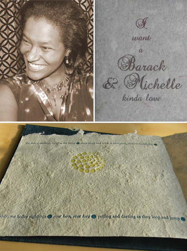
All this being said, however, the real key is to just play around with your press until you find a way that works best for you, and communicate the limitations of the press to your clients. I always like to let designers know that a letterpress flood isn’t going to look like an offset flood, and it’s helpful to have some examples around the shop so that they know what to expect. I’ve attached a couple of my own here.

Ben Sargent

Of the elements of making ready for a letterpress job–gauge, impression, inking–that pesky inking is generally the only one that requires the printer’s attention all through the press run. While gauge and impression can ideally be adjusted, set and then left alone, the ink is being used up a little bit with every impression, so the pressman needs to keep a bright lookout to make sure the ink appears on the page with proper and consistent density and color.

Sargent_IMG1_3

The right ink is a good place to start, and in our shop we have always depended on good old rubber-based ink, which is easy to work with, consistent in color and consistency, and comes in Pantone colors which make custom color mixing a relative breeze.
To ink up the press (and we’re talking here about a 108-year-old C&P job press; certainly many people have presses with more sophisticated inking systems), always start light and work up to the right amount of ink (even though it might wind up being a lot!) . A good smear the width of your ink knife across the ink table is a good start. And if you go too far, of course, there are high-tech ways of taking ink off the table, such as carefully letting the rollers run over a sheet of newsprint draped across the ink table (followed by five or six impressions to even up the remaining ink.)

As in just about every element of the printer’s work, patience can be your best friend, and ink management is no exception. As you run the job, check the ink impression frequently, and have the patience  to add ink as often as necessary, even if it’s after only a few impressions. Occasionally, as well, the inking characteristics of a job may demand “skip-feeding,” or taking an impression only on every other rotation of the press. This may be required particularly with a form that has both broad areas of heavy inking and other elements that are more delicate, or it may be necessary with a form that has a bleed onto the tympan sheet, where you will want both hands to remove the printed piece without smearing. Again, sometimes patient printing takes time.

Adding ink initially, of course, is best done without the form in the press, but in mid-run it is certainly possible to add ink without stopping the press (removing the chase can potentially make  minuscule changes in the gauge), if done carefully. Put just a small dab on the top right corner of the ink table (being alert, of course, to keeping the ink knife away from the rollers), and smear it leftward around the edge in as thin a film as possible. Let the ink even out for seven or eight impressions, and you’re ready to continue feeding.

The other essential element in inking, of course, is the proper care and feeding of rollers. Good composition rollers should give you a long life of reliable service, but they do need replacing every once in a while (see what your supplier or fellow printers think in terms of how often). Never leave rollers on the ink table, of course, and if they’re off the press, they should ideally be stored vertically, somewhere where they won’t be unduly affected by temperature extremes or ultraviolet light.

Many inking problems may be traced to roller height on the press, up to and including those dramatic moments when part of a form just disappears, even though the type or plates are still clearly making an impression. Different presses have different systems for adjusting roller height, but a type-high roller gauge is an excellent investment for being sure the rollers are properly just kissing the form, and for making adjustments if they’re not.

Keeping consistent inking through a job can sometimes be a time-consuming exercise, but having the impression look just right in strength and color is well worth it! Hope these ideas help!

Matt Robinson – Studio Four Three

While I believe ink (both mixing and application) is  incredibly important when it comes to letterpress (or any print media for that matter), I think the discussion of ink should begin with a discussion of color.

As I am sure a majority of the Boxcar Press community is aware, color is very important, but depending on who you ask, the individual’s perception of color can vary from one person to the next, which makes mixing “green” or “red” ink a sort of an arbitrary guessing game if you don’t have a good reference to go off of.  There are several factors that determine our perception of color: gender, the cones and rods in our eyes, ambient/natural, or artificial light, a person’s age, surrounding objects, and even the time of day can all change the way we see colors. Knowing there are so many variables that can and will change the way we perceive color, it becomes imperative to have a standardized way of calibrating the correct color.

One of the biggest issues I run into with clients (and in the grand scheme of life, it’s by no means is it truly an issue) is trying to explain how the color they are viewing on their desktop printer or their computer monitor might not be the same color I’m using in the design and seeing on my computer.  All of those previously-mentioned variables now come into play in a practical way, and it helps streamline my job if I ask the client to mail me a fabric swatch, a paint chip, or pick out their color using on of my ever-so-trusty Pantone swatch books.

I rely on my Pantone books to help myself and our client pick out the correct color, which essentially removes the ambiguity of what they see and perceive on their computer monitor.  Once the color swatches have been picked out, the designs have been approved, and Boxcar has produced the photopolymer plates we use to press, the next step is to mix the inks.

Mixing inks was initially an intimidating task but is made fairly easy by my trusty scale, Pantone formula guide, and a few different putty knives.  While most printers I know have their “proprietary secrets” that they won’t divulge to anyone, a little trick that was taught to me by a friend (a fellow printer) is to mix inks on a piece of glass that’s elevated by some rubber sticky pads.  Underneath the glass, simply slide a piece of the paper you will be printing on and use that paper to help gauge the color as you’re mixing.  My favorite ink is Van Son Rubber, which is generally transparent so the color of the paper changes the perception of the color of ink when its applied.

Learning the hard way, when applying ink to the ink plate, start with a little and work your way up…its easier to add ink than it is to clean the press and start over.  If there is heavy inking on the plate, its always possible to adjust the rail height by adding rail tape or painter’s tape (I use a combination of both of them) to elevate the trucks, which move the rollers off of the artwork just enough to reduce the amount of ink that’s applied each pass.

Bridget Elmer – The Southern Letterpress

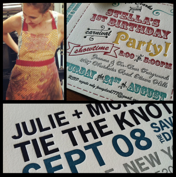
At The Southern Letterpress, we are big fans of the rainbow roll. Printing a multi-color gradient can be particularly challenging when you’re aiming for a consistent edition and printing on a press with an oscillating roller. My first rainbow roll edition was for my own wedding invitations, which my husband and I co-designed in the spirit of vintage, handset Lucha Libre posters.

Flatbed_IMG2_2

Once our complicated lock-up was ready to be printed, we quickly discovered that it was difficult to maintain consistency with the rainbow roll and that the colors quickly began to blend and become increasingly muddy at the center of the rollers as we printed. Hmmm…

Flatbed_IMG3

Let the troubleshooting begin!

We did some research on Briar Press and the Ladies of Letterpress forum, both of which offer incredibly helpful resources and advice from fellow printers. At the time, my studio was located at 7 Ton Letterpress Collective in Asheville, NC, so I picked the brains of my incredibly capable 7 Ton colleagues as well! With all of this shared knowledge in hand, we cleaned the press and started over, following a few simple rules for a more successful and consistent rainbow roll. At Blogxcar’s request, we’re happy to share them with you!

1) Turn off the motor as soon as your ink is sufficiently distributed on the rollers. This minimizes oscillation and blending, which will occur only as you travel down the bed of the press and back. Of course, you’ll need to turn the motor back on when adding ink, but again, switch that motor off as soon as initial distribution is complete.

2) When adding ink, add more of the lighter color in your gradient. Keep adding consistent amounts of ink along the inking roller, but extend the coverage of the lighter color further along the roller.

3) If you’re planning to print with more than two colors, we suggest placing your lightest color in the center of the rollers. If you’re printing three colors, you can easily add only that lightest color to the center of your rollers when re-inking.

4) Don’t be afraid to clean the press in the middle of your edition and begin again with fresh ink. Once the ink begins to get muddy, there is only so much you can do to bring it back to it’s original rainbow glory! It may seem like a pain, but it can save you a lot of frustration in the end.

Flatbed_IMG4Flatbed_IMG1

After the wedding invitations were in the mail, we just couldn’t get enough of the beautiful gradients that the rainbow roll creates. The experiments continue at my studio in St Petersburg, FL, and at our storefront shop in Northport, AL! Many thanks to Boxcar Press for the invitation to share what we’ve learned at The Southern Letterpress.

Eric Woods – The Firecracker Press

Some inking tips [are]: VanSon Dutch Fireball (PMS 185), straight out of the can, always looks pink unless mixed with another, darker tone. We usually mix in a little black… we call it Firecracker Red. Opaque white, when printed on chipboard, will change color while drying. We print a proof, let it sit for a minute or two, then pull a fresh proof and compare the two. The difference in tone is sometimes very dramatic. We’re still looking for a good white.

When we first started out we had trouble with ink offset as we stacked finished prints. We thought the ink was too wet and devised elaborate drying systems (I think we even tried microwaving each print) with clothes lines all over the studio. It was time consuming. An old-timer pointed out that we were over-inking everything. Ink was getting onto the shoulder of our type or woodcut, collecting as a microscopic halo around everything, and transferring onto the printed sheet. When we stacked the prints, after running them through the press, the ink halo was offsetting on the back of the previous print. Messy and unprofessional and not the fault of the ink after all!

Ke Francis – Hoopsnake Press & Flying Horse Press

One of the interesting things about Boxcar Press is the variety of artists and printers who use their services. I would assume that each of these clients has a different perception of the “correct application of ink to matrix” depending on their demands. Generally speaking, the aim of most printers is to consistently duplicate an image in multiple. If a machine, even a simple machine, is used in the process then cleanliness, neatness, and attention to detail are part of the successful mindset. There are printing and inking benchmarks for the industry and a conservative approach to inking is a must with sophisticated presses. We probably all agree on this point and maybe we will agree on the following characteristics of ink:

The first thing to remember about ink is that it does not respect your shop’s “Immigration Policy”. It will migrate at will. The minute you pull the tape from the top of the can it is on it’s mischievous way. If you enter the print shop with a nice sports jacket, stand in the middle of the room, and don’t touch anything, in about four minutes it will be on your jacket.

If you place the correct amount of ink (you think it is the correct amount) on your platen or distribution rollers and let it run for a while to “even-out” and then pull a proof you will often discover there is too much ink on your rollers. How did the extra ink get there? The same way it got on your sports jacket.

Ink, if left to it’s own devices, will turn a civil gathering of the medium into a riotous mob that will “black the eyes of your Es’ and turn your pristine type into “sloppy rag-a-muffins”. Over-inking a complex press means that the machine has to be shut down and ink cleaned off to get a fresh start. This is the case even with Vandercooks and platen presses and especially true of vacuum fed machines like the Klugy and the Red Ball. So the lesson to be learned about inking these presses is to apply the ink to the distribution system very slowly until the correct amount is reached.

Do everything you can to thwart ink’s natural inclination to gather, preach revolution, and cause problems. If you do not have anal retentive tendencies (lots of printers do and that is of great benefit) then you need to button the top button on your shirt,.put on your cleanest apron, put a clean rag in your back pocket, and get out your loupe. If Nurse Rachet from “One Flew Over the Cuckoo’s Nest” is in the alley taking a break and a smoke then invite her in, give her some of those head-banded magnifiers and sit her down next to you to help keep the ink under control. Promise her anything (booze, counseling, cigarettes, snuff, Red Bull, etc.) to look carefully at the proofs while you slowly add ink until the type is crisp and black. Then print away until the type starts to lighten and then add a little ink. If there are artists in the room (including your alter ego) then this is a good time to chide and cajole them and point out how little they really know or understand. This will help your attitude immensely. Quote Michel Focault or some other contemporary French critic…One little quote will do…or better yet quote a few stanzas of Emily Dickinson to show them that you are REALLY sensitive, but also capable of doing the REAL work while they must live their little desperate lives with only their concepts for support…I promise this will help keep the ink under control [laughs].


We know you must have a really good inking tip or two that you can share, so tell yours in the comments section below! We’d love to hear how you get your print runs to go smoothly!

The Fresh Prints of Alice-Louise Press

We sat down with vibrant Amy Lesniewicz-Arndt — the printing powerhouse behind Ohio-based Alice-Louise Press — to talk shop about her first jobs, how her father (and printing mentors) influenced her, and why she won’t give up her cowboy boots without a fight.

Amy-Lesniewicz-Arndt_IMG2_1

MIDWESTERN MAGIC I grew up in a very artistic family who owns a graphic design agency and I worked there for 12 years or so, but fell in love with letterpress and left the family business to start something of my own. Lived in Bay Area, Chicago, but my heart has always been in the Midwest, especially Northern Lower Michigan. I religiously wear my cowboy boots until the bottoms are completely worn through and I won’t often be seen without my chai tea or dogs.

Amy-Lesniewicz-Arndt_IMG1_1

LOVE AT FIRST SIGHT Alice-Louise Press is named after my Grandmother, who ran a small offset print shop in the 1940s and ‘50s from the basement of her home in Toledo. She was one of the few woman printers back in her day and a super hard working woman. I’d say my mentor for letterpress is Alan Runfeldt from Excelsior Press in Frenchtown, New Jersey. He’s always been there to help me along the way and he’s really the first person that helped me get started.

BEAUTY IN THE BUCKEYE STATE Years ago I put my first real press in the basement of my house, and it sits there still. Maneuvering it down there was such a bear that I didn’t bother bringing it back up when I moved my shop downtown, and I swore I would never again move a press up and down stairs.  The space I had in downtown Toledo was cool, but quite isolated, so a year ago I moved my business back into my house, in a quiet neighborhood with lots of trees and squirrels and a big back yard where our dogs Ben and Emma can run around.

My presses are set up in the garage, which we plan on expanding to twice its size in Spring 2013. My husband Todd has been very understanding as the business takes over more and more of the house. My friend/employee Jeff Nelson (Dischord Records/Minor Threat) has been a great asset this past year. Along with printing on all the presses, he’s crucial to the daily operations in getting orders out the door.

PRINTING MENTORS Aside from receiving some very helpful early tips from Alan Runfeldt, I’ve had to learn to operate my presses myself. It would help if Alan didn’t live in NJ, but the next best thing to being a phone call away from help is my Heidelberg Windmill Manual. I’ve read it cover to cover so many times. I never knew I could know so much about a hunk of metal!

Amy-Lesniewicz-Arndt_IMG3_1

THE CREATIVE PROCESS It has taken 6 years to build up Alice-Louise Press into a full-time job.  As recently as last year I worked as a designer at my father’s ad agency, Lesniewicz Associates, but it got to be too much, and now I can focus all my energies on coming up with new designs, building relationships with stationers across the country, and helping them satisfy the last-minute and often irrational demands of frantic brides.

PRESS HISTORY I started out with a tabletop Kelsey that I drove out to New Jersey to pick up, and I ended up spending the day with Alan at Excelsior Press who taught me the ins and outs of letterpress. I don’t think he realized how motivated I was or how hard I planned on working. It only took about 2 weeks for me to realize that the Kelsey was more suited for people doing it as a hobby. I then purchased a larger 8×12 C&P New Style in Kalamazoo and it finally felt like I was getting the outcome I was looking for. Since then, I have added a 10×15 C&P and 10×15 Heidelberg Windmill, and am looking to eventually add a couple more Windmills.

PRINTING FEATS When I was still working at the ad agency, I earned my share of design awards which was certainly fulfilling, but I’m proudest of having created a small, successful business where I’m able to do what I love.

Amy-Lesniewicz-Arndt_IMG4_1

PRINTING ADVICE Phase out at least one bad working relationship that you have with a store every year. That energy you end up spending with a business that hardly yields anything is worth getting rid of and focusing your energies on the people you love to work with.

WHAT’S NEXT Coming out with a new album to replace all of our existing albums and doubling our space this spring!

Big round of thanks out to Amy for letting us get the full scoop on Alice-Louise Press!

A fun slide

If you are running lightweight stock on your windmill, a slide can be very helpful. This is a plastic sleeve that fits over the sucker bar reducing air flow that can cause too much fluffing into top of feed pile and subsequent misfeeds. There are several colors of slides with differing sizes of air holes for the particular kind of stock being run. Make sure when running thin stock that as little air as necessary is being used, that your Thin Stock Knob is pulled out and speed of press is reduced to allow more control.boxcar press letterpress printshop boxcar press letterpress printshop

Weaving history with letterpress: the story behind Primrose Press

Tia Blassingame has navigated a printing career with a historical passion and kinetic love for the design process. As the wise woman behind Primrose Press, she threads a dozen different creative experiences into one singular life—a life of letterpress and artists’ books. Tia sat down with us to discuss everything from the powerful draw of history to the genius of typesetting.

Tia_Blassingame_IMG1_2

TALKING SHOP WITH TIA My training is in architectural design and history. My focus has been on the intersection of architecture, African American history, and perception.

BEAUTIFUL BEGINNINGS During an artist residency, a visual artist and I visited the resident letterpress printer. He was generous enough to open his studio to us, show us how to set type, use his press, everything. It was a perfect day. I still have the broadside that I made that day. Many years later I thought back to that perfect day, when I was thinking about what might make me happy creatively. Up until that point, my creative focus had been upon writing about architecture, African American architectural history, and art. I signed up for letterpress classes at the Center for Book Arts, and almost immediately knew that letterpress printing was for me.

Tia_Blassingame_IMG3_1

I like the precision of it, the feel of lead type, the rhythm of setting type, and the freedom that comes with wood type, [as well as] how it shows its age. Overall I love how the type, the machines, and the process connects you to another time. You can almost see someone fifty, one hundred years ago doing the exact thing you are doing, in the same way. For someone interested in history, this was a very powerful draw for me. Particularly in considering how slave and freedmen apprenticed or owned by early American printers might have set sentences character by character, but would not have had the freedom to choose their words or sentiments.

LOVE AT FIRST SIGHT Primrose is the name of the first metal ornament that I purchased. It is a decorative border, and I use it as a symbol of the press, but also in many pieces. Also Primrose was the name of part of a mistrel duo that worked in blackface – Primrose & West. My press work deals with beauty, but also presenting issues of racism in a visually appealing way that might disarm the viewers initial instinct to flee or avoid the topic. Primrose, with this duel meaning, seemed an appropriate name.

THE CREATIVE PROCESS I currently have two veins of activity: letterpress papergoods and artists’ books. For me, the stationery and prints inform my books. I use the notecards to experiment or perfect a technique. For example, I have long been interested in overlay. This is something that I work with a lot. Not all attempts are successful, but over time I get better and more knowledgeable about what works for me. Other times, I want to gain a better understanding about how a material or paper prints or folds or takes ink. I am fortunate in that my customers do not seem to mind the experiments. And I have a group of customers that have been supportive since my first day and have seen my progress.

I am constantly sketching, doodling, thinking/obsessing about projects or sentiments for cards. Some pieces are thoroughly planned out before I get to the press, but I also enjoy figuring it out on the press.

FULL TIME FUN I print as often as possible. I would love to be a full-time printer. My goal is to better marry my stationery pursuits with my artists’ books and prints. I consider myself a book artist and printmaker. I am very hands-on and prefer to be perform all duties: writing the text, designing, creating illustrations, printing, bind, etc.

Tia_Blassingame_IMG2_1

PRINTING FEATS “Past Present: DC”, my set of artists’ books on segregation in historic and contemporary Washington, D.C., was recently acquired by the State Library of Queensland. I spent over a year researching, made the paper from my own clothing, created the etchings, created the polymer plates, set the type, but at some point you find yourself in a vacuum. You hope the work has meaning to others. At some point you get so close to the project, it is hard to know. The fact that the library felt the piece would resonate with their patrons was very humbling.

BOXCAR’S ROLE Though handset letterpress has my heart, increasingly my projects require the use of typefaces that are not available in metal or wood. I find myself spending more time at my computer before getting to the press. Boxcar Press allows me to bring my designs from sketch to life.

PRESS HISTORY My first press is a very adorable 1906 Sigwalt.

HOME IS WHERE THE PRESS IS My home studio is crammed with paper and artists’ book projects – both finished and in process.

Tia_Blassingame_IMG4_1

SHOP TIPS If you are in a rush or cocky, it is more than likely that the print gods will not be on your side. The print gods will humble you and remind you how little you know.

WHAT’S NEXT I am big on collaboration, and have had the good fortune to have met some talented artists over the years. In 2013, you can expect more limited edition collaborations. A few years ago, I started a valentine swap with a group of artists (writers, composers, printmakers, book artists, poets). 2013 will bring the 3rd annual Artists’ Valentine Swap. Photos of valentines in process and finished and details on how you can be part of the swap will be posted on the Primrose Press Facebook page.

A big round of thanks out to Tia for letting catch a glimpse at the wonderful world of Primrose Press!

An inside look at Woodside Press

Davin Kuntze of Woodside Press let us in to his Brooklyn Navy Yard shop, which is nestled safely between artisans shops and within World War I enemy fire resistant walls. More now a refuge for the creative thought than for protecting, Davin muses on the need for more letterpress in the world and bad typography (a crime against humanity) as he shows us through the space. THE PRESSES In general use we have seven presses. There is the C&P treadle press that came from the American Typefounders Company; two C&P Craftsman presses (one for printing and one for scoring and perfing); a Windmill for longer jobs; a Heidlberg KSB; and finally two Vandercooks, a Universal III for poster work, when we get it, and an SP20 that we use almost exclusively for proofing type. In addition to that we have a number of random presses in various states of repair, mostly small format platen presses that no one seems to want these days.

SIZE OF PRINT SHOP 5,000 square feet I think. It’s really too much space for one shop, but we’ve managed to fill it up with plenty of objects that inspire. But seriously, I think you should call “Hoarders.”

THE LOCATION We’re located in the Brooklyn Navy Yard, which is home to its own strange assemblage of artists, craftsmen, furniture makers, malcontents, mad scientists, old school Brooklyn hangers-on, young upstart urban farmers … the usual crowd that is attracted to affordable industrial space. We are in a high-floor corner of a massive 11-story building that was built for World War I, and actually carries a fire-rating of “able to withstand enemy attack,” although the enemy envisioned is most likely the Red Baron. Lomography has a distribution facility across the hall from us, and the Yard also has the largest manufacturer of military-grade body armor in the country.

FAVORITE THING ABOUT THE SHOP The view is one of a kind. We look out over the East River onto Manhattan from the southern tip of the island, up past the Williamsburg Bridge, to the United Nations. A lot of the time it feels miles away from the frantic pace of the city. That and the radio, be it NPR or some music at a volume that will drown out the phone if it starts to ring.

NUMBER OF PRINTERS IN SPACE It’s just us at the moment. We have a working relationship with a few other artists who occasionally come in to do collaborative projects. And we’re always happy to give a tour complete with our own (possibly skewed) history of printing and typecasting.

MOST VALUABLE SHOP TOOL I can’t think of any one machine we’d really suffer without, but the Linotype comes in really handy for book projects. There are a number of chapbooks we’ve done over the years that would easily have taken three or four times as long without this incredibly frightening contraption.

FAVORITE INK We use Van Son rubber-based for the most part. My favorite colors tend to be very rich. Far too many designers waste countless hours deliberating between four slightly different shades of light brown which all look like, well, baby crap. Type should be black (for the most part) and you should pick an accent color that makes a statement.

SOLVENT OF CHOICE We use Power Klene VC for the presses and Blanket Wash #4 for type, both from Prisco.

BASE AND PLATE OF CHOICE We’ve used KF152 for a number of years. People want “letterpress quality,” which means we have to smack the paper too hard.

OIL OF CHOICE You got me. We have a giant barrel of some sort of oil that I’ve been using for years, seems to be 30-weight motor oil.

WHAT TYPE OF RAG DO YOU CLEAN UP YOUR PRESSES WITH We get our rags from an industrial rag supplier. Every month or so they show up with a barrel of clean rags and take away our dirty ones. Not very exciting.

FLOORING MATERIAL Concrete. This is the Navy Yard and our building was built to warehouse aircraft-carrier components. It can stand up to a few tons of printing equipment.

FLOOR PLAN TIPS Smaller is actually better. It keeps things simple and all your tools are close at hand. A place for everything and everything in its place. Unfortunately we don’t follow our own advice. This place is a constant battle against entropy, and I love it. But losing all six pairs of scissors for a month at a time can be frustrating.

PIED TYPE We have a couple barrels of it. An associate of the press who cuts mats and makes brand new foundry type occasionally takes a big bucket away to cast a new face. In exchange we sometimes get brand new type for the shop. Works out for both of us.

ORGANIZATION ADVICE Did you read my answer about floor plan tips? [I recommend that.]

PRINTING ADVICE When I first got into printing, I was given a book by DB Updike called “In The Day’s Work” which I recommend to anyone in any creative field, although this book is more for the practical printer. Basically it says take pride in your work, keep your shop clean and organized, and don’t let your clients make decisions because you, as the printer, are the expert. I should have read that more closely and taken it to heart. I think the three books I’d recommend for a printer starting out are “In The Day’s Work” for self discipline and self confidence; “The Elements of Typographic Style” by Robert Bringhurst, because bad typography is a crime against humanity; and “The Elements of Color” by Johannes Itten, because there IS a science to why some colors work together and others don’t.