We are all thankful and proud that letterpress is enjoying such a notable degree of success at so many levels. From one print-person studios to large community print workshops, it’s exciting to think about all the presses that have come back to life for our artisan craft. Before this surge in the early 2000’s, letterpress was mostly a small part of university and college printmaking courses. Higher education was where letterpress was happening, quietly and without huge fanfare. Now, it’s a whole new story and we checked in with some colleges and universities around the country to find out the status of letterpress instruction today.
Miami University in Oxford, Ohio — Erin Beckloff of “Pressing On – The Letterpress Film,” also wears a hat at Miami University’s Department of Art, where letterpress is part of the graphic design program.
The press shop at Miami University is called Curmudgeon Press. They operate a Vandercook SP-20, C&P Pilot, and Vandercook no. 1 proof press. They also have around nine cabinets of metal type and a large flat file of wood type fonts. The class has been traditional handset combined with some lasercut experiments and lots of linoleum carving for illustrations. Their brand new photopolymer platemaker is going to open up even more opportunities!
Undergrad and graduate students who use the studio will take Art450, Alternative Design Media: Letterpress. They usually major in Graphic Design, Interior Design, Architecture, Art & Architecture History, Journalism, and Printmaking. Some like Katherine Fries of the University of Indianapolis even went on to create and teach letterpress at other universities. It is hoped it continues to be a diverse mix because the combination of areas of study and approaches to the process produce the most interesting collaborations and work.

There is a community education part of the letterpress program for non-students. Letterpress has been taught for three summers as a part of CraftSummer, which is open to anyone. It has brought in students from Nashville, Chicago, and all over Ohio — many are K-12 art teachers.

Over the past few years Miami University has hosted several Visiting Artists introducing the letterpress community to Miami students and faculty. Kyle Durrie made a stop in Oxford with the Moveable Type Truck; Brad Vetter was a visiting artist, and taught workshops and gave critiques; Scott Moore of Moore Wood Type brings his pantograph for students to learn the history and get to cut wood type themselves; and Chris Fritton The Itinerant Printer will be visiting later this school year.
Community exposure to finished letterpress projects include works that have been selected for the annual Best of Class Graphic Design show and less formally, the posters have been used for their original purpose, to promote events around Miami and the broader Cincinnati community.

Florida State University – Tallahassee, Florida— Letterpress is a new class within the FSU Printmaking curriculum, and started in the Spring of 2015 under the direction of Denise Bookwalter (Director of the FSU printmaking program) and Allison Milham (former FSU adjunct professor). Allison Milham designed and executed the entire letterpress studio, and taught the inaugural class last spring. The class is built around learning traditional letterpress printing techniques (hand-set metal type, etc.) in combination with more experimental techniques (pressure printing, laser etched printing plates, etc.). Students are taught the fundamentals of how the press works, so they can take that knowledge into any studio and find success on any press they come across. The pressroom has two Vandercook 219s (one is an Adjustable Bed), and one Chandler and Price Pilot Press.

Denise Bookwalter created the letterpress class so that it is open to both printmaking students, and students outside of the printmaking program. Ashley Gorham is teaching a Printed Book class in the studio in which the advanced printmaking students are using the Vandercooks to make artist’s books. For many of her students, this is their first experience with letterpress printing (and look how much fun they’re having!). The programs are still very new but possibly in the future there will be a community education program to broaden the interest and knowledge in letterpress.


University of Arizona – Tucson, Arizona — Karen Zimmerman says ASU has a course called Letterpress and the Multiple for graduates and undergraduates. It is an elective in the School of Art. Students can use the facilities for their own projects after they have taken the class or have experience. They have a lot of type, cuts, a photopolymer platemaker and digital output for “negatives”. The University of Arizona School of Art has BFA, BA and MFA students.

The Letterpress Lab is a couple of blocks north of the campus. The building used to be a restaurant, so the layout and style is a bit challenging, but it does have lots of windows, natural light, and a patio. There are five Vandercooks of varying sizes, three Chandler and Price, one Baltimorean and one Midget Reliance iron hand press (circa 1890).

There are 30 students on average and they can continue to use the facilities for projects after their class. Most are School of Art students, MFA Creative Writing students and Book Art Collective members. In addition, there are community workshops that typically take place during school breaks.
The letterpress lab at the college is about 10 years old. At first the equipment was used just for projects in a typography course, but the curriculum has grown in scope over the years. Now letterpress is a stand alone course. School of Art has poster shows in their student gallery showcasing the work from these classes or around visiting artists like Amos Kennedy, Paul Moxon or others.

Donations of equipment have led Zimmerman to learn how to move heavy equipment, rent machinery, and fix presses, all due to necessity. Organization has been a huge undertaking and it is still evolving. Social media is also a huge effort to get the word out about the lab and projects. The letterpress studio is slightly off campus in its own building, so it is hard to get people to it and parking can be an issue but it’s an exciting place to print and worth the trouble.
Madison College Center For Printing Arts – Madison Wisconsin — Beth Ketter is an Instructor of Graphic Design at The Madison College Center for Printing Arts. The Center also houses wonderful instructors such as Deb Vogt and Dave Stuber and a lab manager, Nick Loveland. They are in their fourth year of offering two sessions each of a 3-credit Principles of Letterpress course and a 2-credit Advanced Letterpress course as electives in their Graphic Design & Illustration Program. The 16-week classes are also open to anyone in the community and capped at 12 students. Typically there are 2–3 instructors present for each class and classes meet for 6 hours per week with 12 to 16 hours of open lab time each week.

Topics covered include designing for letterpress printing; hand setting metal and wood type; generating photopolymer plates using artwork created using computer graphics software programs; creating linocuts and pressure prints; press maintenance and press set-up. Students also learn how to mix inks by eye and using a scale. Students run projects on a variety of papers and inks and learn how to select the best paper for a project. There are guest-led workshops on special printing topics as well as guest speakers. Classes also go on tours/field-trips to tour small and large letterpress businesses and they are fortunate to be close enough to visit the Hamilton Wood Type and Printing Museum.

Madison College owns ten presses made up of three Vandercooks; a Heidelberg Windmill; three Chandler & Price platens; a Kelsey Excelsior 5×8; a Washington Hand Press; and a Showcard. In addition, they own a Ludlow, and the lab has finishing and binding equipment, plus two offset presses and screen printing capabilities.

Persons of all ages and backgrounds take the classes. The courses are offered as electives to Graphic Design & Illustration Associate Degree students, enhancing their portfolios.
They also serve the Madison area where many take the course because of an interest in handmade books, printmaking, and commercial letterpress printing and entrepreneurship. For some students, this may be their first foray into making art. They are just getting into having short term workshops. Over the summer, workshops were held for high school students interested in printmaking and there are many requests for more of this in the future.

Every semester the Center for Printing Arts has 2–3 pop-up sales where student work is packaged, displayed, and sold. The proceeds help cover the cost of materials. Products include cards, calendars, prints, notebooks, ornaments, hang-tags and other paper goods. They use an iPad for sales and keep track of inventory. This experience also gives students a chance to see how to market their work at craft fairs and other such events. In addition, there is an art gallery which exhibits student-produced prints and they’ve also had shows at local galleries showcasing the students’ work.
The Book Arts Program and Red Butte Press at the University of Utah – Salt Lake City, Utah — In 1996, Gene Valentine, who now teaches at Arizona State University and runs Almond Tree Press and Papermill, began teaching summer letterpress intensives to community members. And In 1999, the first academic letterpress class was taught by Chris McAfee. Beginning in 2000, Marnie Powers-Torrey began teaching academic and community letterpress classes. She was joined by David Wolske in 2009. Currently, Crane Giamo and Marnie Powers-Torrey run the letterpress programming.

The shop has many, many presses: eight cylinder proofing presses including Challenge, Asbern, and various Vandercook presses; three Chandler and Price platen presses; two iron hand presses – a Columbian and an Albion; four bench-top platen presses, and 15 table-top presses.

U of U has 2 academic letterpress courses—Letterpress I and Book Arts II, each of which are requirements for students pursuing a Certificate or Minor in Book Arts. Letterpress I also fulfills the general education Fine Arts requirement.
A diverse swath of students take the classes. Graphic Design, English/Creative Writing, and Art students are mainstays of their printing economy. They have 25 students for each letterpress course, 50% of which arrive from the Art and Art History Department. They also attract many independent studio users —community members and former students — who have access to the print shop.
For community members, a multi-session letterpress class is taught for 8 weeks over the summer. As part of this, they reserve two slots of the academic letterpress courses for community members through lifelong learning/continuing education partnerships, and teach several single day and weekend workshops throughout the year.
To bring letterpress courses to the school, the idea has been “If you build it, they will come“ — marketing strategy a la Field of Dreams. Also, the school has generated a variety of digital marketing campaigns and community outreach programs. The underlying idea is that CONTENT=PROMOTION, so they curate 2-6 exhibitions per year, all of which feature some aspect of letterpress printing. Currently there are two exhibitions on display, one showcasing work from the Women’s Studio Workshop, the other featuring work from the 14 instructors who will be teaching community workshops throughout the 2016 calendar year.
There is much printing in the halls of academia and we applaud all of the colleges and universities that are keeping our art alive for their students and their communities. Does your college offer a letterpress program or print shop? Tell us about other programs in the comments below! terpress on campus


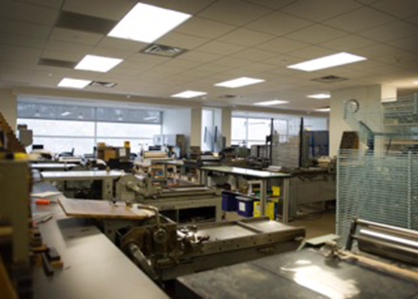
 (photography courtesy of Linzee McCray)
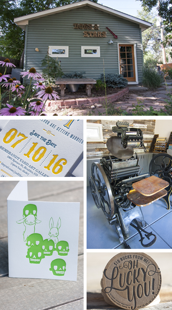
 MEET THE PRESSES I have two presses: a Vandercook Universal I (her name is Phyllis) and a C&P Oldstyle 10×15 (his name is Bill). I love them both and feel so lucky to have met them.