A handful of delicious Smock bar mitzvah cards makes the eye wobble with delight.

A handful of delicious Smock bar mitzvah cards makes the eye wobble with delight.
Jake is printing bellybands on the Vandercook press. Notice the tape registration system he’s got set up – black straps that hold the sheet against cylinder for returning sheet to operator instead of having to collect it from the end of press bed.

Come check out our Open Studio event this weekend! We’ll be joining over 40 artists and businesses within the Delavan Center and opening our doors this Friday and Saturday. Take a tour of our print shop and shop our latest letterpress goods. Interested in joining us? RSVP on Facebook!

Can’t make it? You can always set up a tour next time you’re in town – just be sure to let us know when you’d like to come by!
Tim the printer discovered a friend looking back at him as he cleaned his press.

This is a dreamy view of a washup tray that is catching dregs of blue-green ink mixed with a bit of opaque white.

When we made an epic shop move a few years ago from one side of the building to the other, this was one of the most astounding sights ever : a gigantic cutter gliding across a sea of freshly epoxied floor. It was beautiful to see this great machine docked at its current post!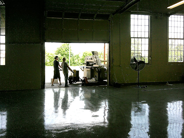
Tim is completing makeready on his Heidelberg Windmill.
Lou is at the light table doing set-up on an envelope.
A window into the soul of a Heidelberg offset press.
There are few things more fascinating than watching letterpress printing in person, but videos can be a close second. We picked out some of our favorite letterpress printing videos, so feast your eyes on the presses, the ink, the paper and the people. There are stories to be heard and techniques to be learned. We bet you’ll be itching to get to your own press to make a little letterpress magic after watching just a few of these! Tell us which ones you liked best in the comments below, and by all means, share some of the jewels you’ve discovered.
We admit, we think these instructional letterpress videos on makeready, mixing ink, and locking up your base are packed with good information for all types of printers. Harold and the Boxcar Presses can help improve your printing, so be sure to check out the rest of our training videos. Here are some unique tips for the Heidelberg Windmill.
Can’t make it to Syracuse for a tour? This video will give you a little taste of Boxcar Press.
This is a great film that pays homage to a machine that transformed printing. It’s a wonderful blend of new and old footage, and the stories are fascinating. Here’s an introduction.
In this fun video, Mike Dacey of Repeat Press creates coasters from beginning to end. He combines polymer plates (on a Boxcar Base) with a little metal type and throws in corner rounding, cutting, packaging, and even tests the coasters out.
This black and white video is fun to watch and makes you feel nostalgic about the glory days of letterpress printing — there’s great footage of pressman, hand typesetting, linotypes and more.
A video about Studio on Fire that also includes information on designing for letterpress and a simplified version of the polymer platemaking process. Highlights include the printing (and reading) of Studio on Fire’s “Pressman’s Creed”.
http://www.beastpieces.com/2010/11/letterpress-video-at-studio-on-fire/
A look into the workings of Hatch Show Print Shop. The visuals of all the posters, the people working, and their long history blends into a nice video experience.
A short film about letterpress and one of the few remaining, movable-type printing workshops in the United Kingdom, which is situated at Plymouth University. The credits are a fun surprise, too.
This video eloquently explains the craftsmanship involved with the hands-on process of letterpress, including creating and using metal type.
This is a short film on UK printer Brian Donaghey. It covers his background and it’s like a spending a pleasant afternoon with a master. Brian pulls prints on a Hopkinson, Finsbury & Cope Iron handpress.
Good information and a demonstration on locking up type from Tim Butler at Quality Letterpress.
Shayna Norwood from Steel Petal Press does a masterful job explaining letterpress for a new customer. You can watch each part of her studio process, from inking all the way through to cleanup.
A brief but well done video of printing with wood type. There are no words, but the videographer added some great descriptions and artsy touches.
Many have tried this supersized printing method. This video combines a fun, musical look at the artistic efforts of the University of Montana students in their annual event. All of the artwork had a “Day of the Dead” theme, so it’s very bold, and at the end of the day they held a parade to show off the art. Check out the sketching, carving, inking and yes, the unveiling.
From the toe-tapping banjo music to the long shots of the Yee-Haw studio, this video is very appealing on so many levels. Yee-Haw worked on 10 letterpress posters for Jack Daniels, and this video shows the creation of just one of them (and it’s a beauty). It’s also nice to see because Yee-Haw closed their doors in April 2012 and they did masterful work.
This trailer gives a peek at Typeface, an hour long immersion into the history of the Hamilton Type factory (now known as the Hamilton Wood Type Museum). The film has inspired many visits to Two Rivers Wisconsin for the real thing, but is also available for purchase on DVD.