Monster Parade with Ed Emberley for Cloudy Collection

Printing for the Cloudy Collection is, hands down, one of the coolest things we get to do around here. Recently we had the sincere privilege of printing this cool art print, Monster Parade, created by Ed Emberley exclusively for the Cloudy Collection. Printed in green, red, dark blue, and black the print comes in a custom folder, with metallic silver printing on black paper. Each of the prints and folders in the edition of 250 is hand-numbered on the back and is available now to ship anywhere around the globe. A portion of the sales of these prints will go to Heifer International, providing reliable sources of food to women and families in developing nations, and to the Central Asia Institute, which provides books and literacy and educational opportunities to girls and women in Pakistan and Afghanistan.

halloween-letterpress-print

letterpress-flood

letterpress-cloudy-collection

2011 Earth Day Clean Up

This past weekend we held our traditional Earth Day Clean-Up, rounding up the troops to spend a bit of time cleaning up the area around our building in downtown Syracuse and the local neighborhood. Armed with sunny skies, brooms and trash bags, the crew was off and cleaning! Nothing says spring like a little spring cleaning. Big thanks to our youngest helpers, Francesa and Max, for spending the day with us and making this year’s Earth Day Clean-Up so much fun.

earth-day-activities

occra-earth-day-cleanup

earth-day-clean-up

Funky Fresh Orange + Blue Save the Dates

We printed these crazy cool letterpress save the date for our friend Rebecca at The Pink Orange. They feature an ornate 3-color letterpress design on the front and an all over blind deboss pattern on the reverse. Paired with a great 2-color envelope, they’re a little bit funky, a little bit sophisticated and a whole lot awesome.

letterpress-save-the-dates

unique-save-the-dates

blind-deboss-letterpress

orange-letterpress-save-the-dates

Blackletter Business Cards

We’ve been printing a lot of cool letterpress business cards of late, not the least of which is these sweet cards we printed for Blackletter. They feature a great letterpress flood printed in black, offering sharp contrast to the bright white paper and perfectly setting off Blackletter’s simple, typography-loving branding.

modern-business-cards

unique-business-cards

Designerly Cool Letterpress Business Cards

We printed these cool letterpress business cards for designer Christina Clugston. The logo is designed with a series of super fine lines, overprinted to give a three-color look to a two-color job. Paired with simple typogprahy, these cards are some of the coolest we’ve seen in a while.

letterpress-business-cards

business-cards

Boxcar Goes Bowling

Last Friday night we packed up and headed out for a night of bowling. There were color-coordinated shirts, lots of trash talk, fake mustaches and ample fun to be had for all. With catchy team names like Gutter Down and Split Happens, we brought our finest bowling skills to show up the local competition.

fake-mustaches

bowling-shirts

bowling

The rumors are true. Carrie – the most senior member of our printing team – can often be found sporting a cape after hours. Perhaps not coincidentally, she can also be spotted hanging out with Cathy, our esteemed platemaking account manager, on a regular basis. Cool people tend to hang out together, we’re told. (Cool people? Super heroes? You be the judge.)

letterpress-bowlers

super-carrie

bowler

Two newer members of our team, graphic designer Racheal and client coordinator Erica, survive their first Boxcar Press outing! Turns out, Racheal is a rockstar bowler. (Former varsity bowling team rockstar. For real.)

boxcar-bowling

All in all, we enjoyed a rather cheerful night of innocent debauchery complete with one failed Orangemen attempt at beating UConn in OT in the Big East and a darts showdown to end all showdowns. Bowl on!

Boxcar Talk with Sweet Letter Press

Elizabeth and Matthew were professional dancers in New York when good ol’ letterpress twirled into their lives. These days, after numerous hours in their Boulder, Colorado studio Sweet Letter Press, they do find time to dance together in their kitchen. We’ve got a lot of love for husband and wife teams. A lot of love surrounds this duo – to each other and to their work.

How did you two first get into letterpress?
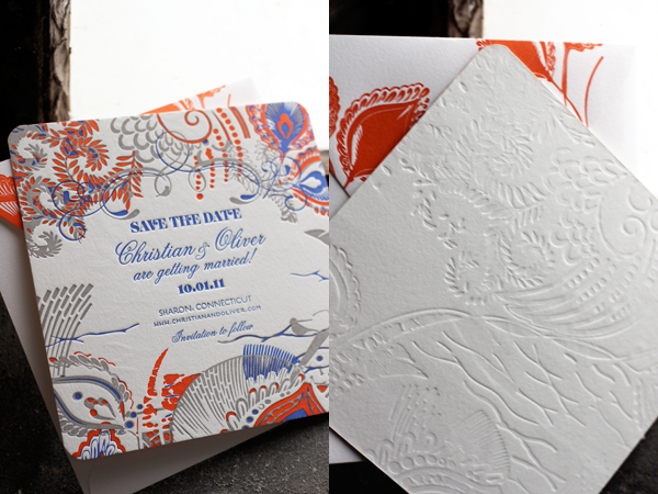
Matthew and I got into the stationery business when we decided to make our own invitations for our wedding in October 2006. Since I was a designer and he was an illustrator, we figured we could do a good job ourselves. When it came time to decide how the invitations should be printed, we fell in love with letterpress printing while looking at samples at Village Invites in Midtown NYC. It was a little out of our budget, but we remained very attracted to this form of printing long after the wedding. When we moved to Colorado, we decided to learn about letterpress and found a couple of generous older printers who offered to share their knowledge. On one of their presses, we printed our first professional wedding job for a very satisfied client in February 2008, and then we acquired our own studio and press in the summer of 2008.

What was your very first press?
Our very first press was a table top Craftsman. It only took 1 or 2 uses before we decided it was by no means enough and we promptly got it on Briarpress. Our first “real” press, which is still our current workhorse, is a C&P Old Style, 10×15.

What medium do you usually print (lead/wood type, photopolymer, lino, etc.)?
Photopolymer with the Boxcar base system.

What’s your process from sketch to press?
Usually new ideas come to us over morning coffee. We discuss a concept and then Matthew gets to work drawing ideas. Once we have all the original pieces we need, I scan his pencil drawings, convert them to vector art and put together the completed design in Illustrator. We then send the files off to Boxcar where they are magically converted into plates.

What other print shops do you admire?
We admire the work of Bella Figura* for their beautifully classic designs and impeccable printing. On the more whimsical side, we love Old School Stationers and Maginating Letterpress and Design. And of course, Studio on Fire for always pushing the envelope with printing techniques and styles. Their blog is always a great source of inspiration.

Who or what inspires you the most?
We find a lot of inspiration in nature – Colorado is full of amazing wild flowers, trees, mountains etc. Also vintage poster art, textiles and photography. Fabulous design in any medium.

What are your favorite things/items from Boxcar Press?
Love that they recycle plates!

Any neat tricks you can share?
Using the Boxcar system, many a typo can be fixed with a scalpel and a loop.

What are you looking forward to?
We are working to premiere a new line this May which should be fun. Also, we’ve taken on our biggest project yet that has us pretty ecstatic – a baby due this summer! Can’t wait to design the birth announcements!

What was the experience like for you at NSS last year?
NSS is a lot of work. 2010 was no exception, but we met a lot of great people and picked up some new stores.

For more from Sweet Letter Press, visit their etsy shop and check out more photos on flickr. Congratulations on the little one, Elizabeth and Matthew! No doubt the baby announcements will be fantastic.

{Photos by Sullivan Studios.}

*Bella Figura is a part of Boxcar Press.

Amos Kennedy Prints!

Last week, we were honored to have famed letterpress printer Amos Kennedy pay us a visit. In town for Amos Kennedy Prints, a special exhibition at the Community Folk Art Center at Syracuse University, Amos shared with us his love for old wood type and snapped lots of photos of our newly expanded print shop. (Also, it should be noted that Amos is one of the funniest guys we’ve ever met and had us cracking up the whole time he was here.)

amos-kennedy-harold-kyle

letterpress

amos-kennedy

letterpress-demonstration

(Umm…we may or may not have been really excited to have Amos drop by for a while.)

Of course, it was only fitting for a Boxcar contingency to go visit Amos in action on the opening day of the exhibit where his passion for wood type, bold color and political innuendo took center stage. As a sponsor of the exhibition, one of our old Vandercooks stands proud and at the ready now through April 4. More details can be found at the Community Folk Art Center’s website. If you’re in the Syracuse area, don’t miss the chance to take part in this special event. Thanks for stopping by, Amos!

wood-type

letterpress-art-prints

letterpress-printing

amos-kennedy-art-prints