Boxcar Talk With Johnny Brewton

From mind-boggling multiple color runs to must-have limited editions, from vinyl to Hunter S. Thompson, the elusive (and quite captivating) Johnny Brewton of X-Ray Book and Novelty Co. has a great story — read on to find out how he got started in letterpress printing and where his business is heading.

Johnny Brewton of X-Ray Book and Novelty Co. wows with letterpress magic.


LETTERPRESSED FOR DETAILS I’m a letterpress printer, graphic designer & small press publisher with a focus on limited edition projects. I publish the assemblage magazines X-Ray & Bagazine plus assorted chapbooks, broadsides, artist books and miscellaneous odd print projects.

PRINTING AS A NECESSITY I was living in the San Francisco Mission district in early 1993 and began work on the first issue of X-Ray. It was to be a limited edition assemblage journal of sorts, non-disposable with original art and hand printing similar to a copy of Wallace Berman’s Semina.

Letterpress was the perfect tactile medium. So I began designing the inserts for letterpress, and paid printers like Artnoose and The Toxic Coyote to run them for me. Eventually – and out of necessity – I acquired my own press and began doing the printing myself.

WEST COAST WONDERS We go back and forth between our house in Grass Valley California and our apartment in San Francisco (lower Haight). My studio is located in the basement of the house my Dad built (in Grass Valley). We’re on 5 acres surrounded by Cedar, Black Oak and Sugar Pine trees. It’s a nice place to work & call home.

PRINTING MENTORS Jon and Louise Webb who published Outsider (Loujon Press), Wallace Berman (Semina), Graham Mackintosh (White Rabbit Press) and of course H.N. Werkman.


THE DAILY GRIND Step 1. Wrap my head around the obvious big idea and make a rough first draft – just to get it out of the way and grasp the concept.

Step 2. Take an abstract sideways approach, which is usually too wacky and avant-garde for a client. It’s always good to try something that’s the opposite of whatever seems obvious.
Step 3. I combine steps 1 and 2 and make a mutant third version. That process can change depending on who I’m working with. I’ll usually go with the one that’s the most appropriate for the integrity of the project.

DESIGNS THAT STAY TRUE TO THE CRAFT Sometimes I’m asked to design to look like letterpress when the piece is to be mass produced and offset printed. I avoid the exaggerated and over distressed look. It’s become overused and cheapens the craft. Once you see this used in a T.G.I. Friday’s commercial the jig is up!

FULL TIME FUN Not running the press full time yet but I print as much as possible and hope to be running it full time by the end of the year. Working out some details, website and getting ready to launch X-Ray Letterpress Service.

PRESS HISTORY Around 1994 while visiting my Dad I came a cross a little Kelsey 5 x 8 at a junk shop. I didn’t buy it but I told my Dad about it. He went down, purchased it and gave it to me for my birthday. I still have it.

Press List: Vandercook Universal No.1, Poco Proof Press, C&P 8×10, Kelsey 5×8.

PRINTING FEATS
Seeds on Hard Ground – Tom Waits
The Sudden Fart of Billy Childish – Billy Childish
Mistah Leary, He Dead by Hunter S. Thompson
Hunter S. Thompson – X-mas in Woody Creek
Richard Brautigan chapbook: Desire in a Bowl of Potatoes
POOP! – Charles Bukowski/Michael Montfort Box of Photos & Broadside
Bern Porter FOUNDS 1- 9
True Confessions – Tom Waits
The assemblage magazines X-Ray and Bagazine
Broadside of the Month Club. B.O.T.M.C.
Tom Waits Orphans LP and CD set
Neil Hamburger Heckle Cards 1 & 3
Neil Hamburger & Pleaseeasaur Souvenir Record
Instructions for Redemption – Mark Faigenbaum
Tanka-Toys – August Kleinzahler
The American Scene – F.N. Wright
Outrun the Blast – John Brewton Sr.
City Lights Bookstore 1969 – Michael Horowitz
In Search of Yage A William S. Burroughs Pictorial
13 Jazz Poems – A.D. Winans
The Ferlinghetti Arcane – Jack Hirschman
(to name a few)

BOXCAR’S ROLE I still use wood and lead type, but the Boxcar base and polymer plates have expanded the possibilities. It allows me to liberate the type and experiment in ways that I thought weren’t possible with multi color projects.

SHOP TIPS I’m probably not the best guy to be giving anyone business advice so here goes nothing: Don’t print anything you don’t want to look at for more than 15 impressions. Always be sure the project (at least) pays for itself.

If you’re not getting the desired result (no matter what you try and everything seems to be correct), clean off the ink, redo the tympan (packing) and start over. Always keep a keep roller gauge handy. Share your knowledge. Make the world a more interesting place with what you produce. Take your time. Have fun!

WHAT’S NEXT In addition to X-Ray Letterpress Service, we also have a few interesting projects in the works: Bagazine 5 which includes work by Mark Mothersbaugh of Devo, Richard Hell, Tom Waits and more. We have a few chapbooks and artists books lined up and are discussing additional projects with Richard Hell, Dan Melchior, Billy Childish, and maybe even a booklet + vinyl record of the Tim Leary, John Lennon, Yoko Ono conversation from the 1969 Bed-In. We’ll see…

Big round of thanks to Johnny for letting us get a sneak peek on X-Ray Book & Novelty Co.!

The Letterpress Roundtable, Part IV: Printing Dilemmas

No one knows Murphy’s Law better than a printer. Rarely does a day in the print shop or studio go by without some hiccup or problem to be solved. And while most problems are a speed bump, there are those doozies that hit us, challenge us, and make us wonder why we ever thought printing should be our career choice. For this next discussion, we asked a handful of printers for their ultimate letterpress disaster stories. The one that can now be looked back on with some humor and possibly even a good lesson learned. So read on, enjoy, and please share your own “oops” moment with all of us. You’ll feel better for sharing.


Mark Olson – Innerer Klang 

My worst letterpress disaster occurred in September 2004. I had just moved my shop from Charlestown, Massachusetts to Asheville, North Carolina in August. The move itself was traumatic enough, but it got done. I had just finished painting the shop, getting everything moved into place, and was ready to go when, on September 7, the remnants of Hurricane Francis moved up from the Gulf and it began to rain, and then it rained some more, and then it continued to rain. My shop is about 100 yards from The French Broad River. The water rose on its banks, and continued to rise until the water made it over the banks and flooded the entire area. The next day I tried to drive to my shop but the road was blocked about 2 miles away. No one was allowed in. The entire area was under water. A week later I could finally make it to my shop. Opening the door there was about 6 inches of muck and water on the floor. Looking at the wall you could see the water line at about 4 feet. Everything in the shop below that line had been submerged in water. The fun was about to begin…

I have a few pictures after the flood and a broadside that I eventually printed titled Flood to “commemorate” the event.  The broadside was a poem by Robert Gibbons (a friend from my years in Boston). He sent me the poem shortly after the flood in my shop.

The photo of my office chair shows some of the muck that was left everywhere. The photo of the chipboard is the one redeeming piece of art from the flood. I had stapled chipboard over each typecase to keep the type in place during my recent move. After the flood I pulled this piece of chipboard off one of the cases and found this impression of the case transfered to the chipboard. The chipboard is framed and hangs on my shop wall.

Richard Kegler – WNY Books Arts Center

In late 2010, I was excited to see a Facebook posting for a show by Carlene Carter at the home of the Buffalo Philharmonic Orchestra. Carlene Carter is the step daughter of Johnny Cash (daughter of June Carter Cash) and ex-wife of Nick Lowe. Kleinhans Music Hall is a modernist/deco building desiged by Eliel and Eero Saarinen. Being a fan of them all, I thought it might be great opportunity to do a poster. The Western New York Book Arts Center had been doing outreach to other cultural organizations to create posters (at no charge) for events as a way of getting our name out in the community and showing off our work, and as a good will gesture to help
other cash strapped cultural organizations who could not budget for a letterpress poster. I had emailed the marketing department at Kleinhans Music Hall but hadn’t heard back. We always try to get permission for
gratis posters (or even better, get hired to do actual paying jobs) but rarely would do a poster without some nod of approval from a promoter or artist. Since I had a very clear idea of what I wanted to do yet did not hear back, I figured I would just print it, go over and show them one, they would love it and say “yes, we would love for you to print us a poster.”

The main idea was to use an assortment of oversized wood type that was particularly distressed as overlapping shapes in combination with a stylized guitar fretboard made from the backs of wood type blocks. The fret markers were made by drilling a shallow hole with a cordless drill into the back of a few blocks. The holes would not affect the the printing of the other side, and wood type often has some sorts where an industrious printer needed a letter so the back is hand carved; dilemma averted.

The combination of the homage to Hatch Show Print posters a la Johnny Cash and the Art Deco caption text evoking the Kleinhans Music Hall seemed to be a good fit. I confirmed the info from the Facebook posting and
then went to work to set up the poster in the bed of our Vandercook SP-20. To render the guitar strings, various width of printers rule was set to have a full bleed and printed in metallic silver/blue. After getting about halfway through the first color (chocolate brown), something made me double check the show date. Instead of Facebook, I went to the actual venue website. Sure enough, the Facebook date was wrong. Oh well, glad I checked before the second color went on. So in changing from Saturday to Friday, I discovered there were not enough letters to spell everything out that was needed. In fact there were not enough ‘A’s for the Saturday setting so there is a V in BUFFALO. Friday had to be set in the other color – again, not a major problem, just one that needed a solution. On day two, when the second color was underway, some old acquaintances came by the printshop. They loved the poster but rather shyly pointed out that Kleinhans was spelled wrong. At that point I figured this poster was not meant to be since I never heard back and I decided it would all be put away and never discussed again.

Within a couple of days, I heard back from the people at Kleinhans and they loved the idea of the poster and were looking forward to it. I somewhat reluctantly reset the type, fretboards and the strings and tried to mix the colors…and make sure everything was spelled correctly. In the end, we gave the venue and Carlene Carter copies of the poster and she signed one and sent it to us with a nice note. Lesson hammered home once again — proofreading: not overrated.

Kyle Van Horn – Baltimore Print Studios

This is a story about a press move. These are always stressful, especially when it is a DIY operation. It starts when a woman named Virginia Sheard agrees to give me her C&P 8×12 NS for free. I convince three friends to help me, and we show up on a Sunday afternoon with some tools and box truck.

We were, of course, grossly under-prepared. I don’t recall how exactly we did it, but somehow we picked the press up onto blocks and placed it onto a dolly. After removing the doors from their hinges, and just barely squeezing it past the door frame, Virginia mentioned that “Ah yes, I remember now, it came in in TWO pieces.” Once out the ground-level basement door, it had to go up the hill to street level. We opted for the long way around the house, an uneven hill rather than up the steps.

With two sheets of plywood to roll on, and a lot of unorganized pushing, we finally made it to the truck. Here’s where the story gets interesting. The press was strapped to a very large dolly, upon which it moves quite smoothly. On level ground, one person can move it with little effort. And so logic would then dictate that TWO people could easily keep it steady as the lift gate lifts it up. We all agree and push it onto the lift.  I head up to the cab to turn on the engine of the truck (and the lift hydraulics).

In the amount of time it takes to walk back from the cab, the following has happened: The lift gate has lifted and slanted under the weight. The press shifted, and 2 wheels slid back onto the ground. Top heavy, and past its center of gravity, the press smoothly tipped off of the lift to land squarely on its back on the pavement.

We dropped the press.

One friend (wisely) let go, and the other (stubbornly) held on and was thrown 5′ from the lift. Miraculously he landed in a somersault and somehow jumped to his feet completely unscathed. The only fault of the third friend is that he didn’t take a photo.

Since I’m not insured for any of this, I’m not paying anyone, and I asked them all to help me, I can’t be upset. I calmly unstrap the dolly, winch the press back to vertical on the lift, and into the truck she goes. A handful of broken pieces came off with the fall, none of which are critical to printing mechanics. We move the press “temporarily” to the school where I work “for a few weeks”. It remained there for 3 1/2 years.

Finally this fall, 4 years after dropping her, this press is finally being put back together and into service at Baltimore Print Studios.

Here’s the press, just before she fell:

Macy Chadwick – In Cahoots Press

I was working on a new book edition with a tight deadline of 6 weeks. The images were of maps so I wanted to use an antique map color like orange, rust or ochre. I mixed up an orange and printed the entire press run of all 12 pages, edition of 50, only to decide that the color just wasn’t right and I had to start over. I had to buy the paper twice. The orange pages still sit in a box– I just can’t bear to throw them out!!

Margot Ecke – Smokey Road Press

Three years ago, when I was looking for a house to buy, I knew that I  needed a place that could accommodate my letterpress shop. I found a sweet little mid-century brick house in the sleepy town of Winterville, just outside of Athens, Georgia. It had a lovely little L- shaped yard and a decent sized workshop, which had been used as a  tinkering station for the mechanic who had previously lived in the house. Two birds, one stone. I was excited.

I closed on the house and moved my presses into the backyard shop. I  knew immediately that I had shown a lack of judgement when it came to the studio. Wind whistled through the cracks in the walls, which were
made of pallets and plywood. The cement floor was at such a severe slope (an 11″ discrepancy from wall to wall) that every press had to be shimmed, and the ceiling was too low to stand up completely. There were termites in the walls and the place was never clean. Plus, the previous owner had used the small patch of earth behind the shop as a compost and trash heap and so the ground was soft and full of building debris.

The building clearly had to be torn down and a new one would have to be built. However, with the recent move and the financial strain of starting a new business, I couldn’t afford much. I lured friends and past students over with the promise of beer and pizza and in one afternoon, we tore down the original structure. One wall was so termite ridden and water damaged, that it simply peeled right off.

I was lucky to find a carpenter who would to do the work for about $1500 and a trade (for business cards). Next, I hired an electrician who was willing to do the electrical work in exchange for a lasagna-a-week for six months. That trade also appealed to the guy who painted the workshop’s exterior. (Tip: the lure of lasagna even works for non-home-improvement trading: a haircut for a lasagna and hair coloring for an apple pie! I will add that it definitely helps when the person you are trading with is way too used to eating Ramen Noodles for dinner.)

I purchased windows and doors at Habitat and Southern Surplus (the guy gave me a discount when he turned down my offer of the lasagna trade). Lights were purchased from IKEA. And, of course, I did lots of the work myself: from the design, to the removal of debris, to helping the carpenter and pouring concrete. Pressroom patience paid off when it came time for me to operate the bull float…that floor is super smooth! The compost/trash heap was cleaned up and leveled and I brought in a bunch of white gravel and created raised beds. Enclosed within a tall white picket fence and shaded by the branches of a Chinaberry tree, that space is now one of the loveliest spots in the yard.

The total cost of the project came to about $5,000 and was well worth the price. The irony of this story is that I had only worked in the space for about a year before realizing that it was too small! Smokey Road Press will be moving to a new space in downtown Athens, Georgia in January of 2013.

Michael Schwartz – Czar Press

Way back in the Czar early days…one of my first decent sized projects was to print about 40 new greeting card designs.  Each card was two colors, with a one color envelope.  This was way back when I first started (and we weren’t cool enough to be using photopolymer plates : ) …we were using wood mounted magnesium.  These were new designs that were launching at the National Stationery Show.  As any typical important job goes…we were not given enough time by my customer to reasonably complete the job. We had about 10 days to print the approximate 120 different plates, which consisted of at least 30-40 different ink colors…so we had a lot of set up on our hands.

As the plates arrived, I quickly got started, and then noticed that just about every other plate was ruined.  Turns out…and as luck would have it…that the company we were using at the time for plates switched to a new washout solution, but didn’t have it quite dialed in. So the plates were basically being washed out too much and much of the copy was being washed away.  The real killer was, I could not tell if each particular plate was good until I had it on press.  I’m pretty sure I had an overnite shipment arriving every day with replacement plates to replace the bad ones.  So now we were having to do all new set ups for the replacement plates and reprint about half of the colors….so the job turned into more like 200 plates and 60 colors…in less then 2 weeks.  Kinda of a big deal, considering at the time, the company consisted of just me!  Lots of coffee ensued…

I finished everything, barely.  I like to think that I pretty much learn something new everyday that I’m printing…but I learned a lot on the fly from this disaster.

Mark Herschede –  Haven Press Studio

A while back, a printer friend of mine referred a friend of his customer to me. This was in the difficult first 2 years of being on my own and in business for myself. This customer – let’s call them “Customer B” from here forward – had designed a stationery/identity set for a writer.

While several “red flags” went off at the start of the courting, such as the designer being out of the country, as well as the actual end consumer of the production being in the country, but out of state, and the job was an ultra rush (2-3 days to turn around a 4 piece, 1000 piece per style, 2 color suite? Oh, not to mention multiple paper-stocks+envelope runs? Hand cranked on a Vandercook? And I couldn’t gang them up, because the designer sent pre-cut paper?!?!) WHAT was I thinking.

And even though I hadn’t been sent the paper yet….. I somehow decided that this would be a profitable endeavor and thought it would be okay to do the job. I honestly don’t know why I didn’t just turn it down, but I took the job because I like working under pressure, enjoy a challenge, and thought what the heck – it’s good money. When something is that difficult, but I still know I can accomplish it… I can’t say no! It’s a weakness, this can-do-attitude….

Unfortunately, while I did lay out rush terms and made sure the contracting party did tell me about her vision and collected proper direction/art/supplies, I didn’t have the foresight to request any kind of down-payment; I also failed to ask the designer who would be settling the tab at the end, and didn’t really lay out terms that were clear. It was a rush job! There simply wasn’t time for me to turn around and ask all these things of them. Or so I thought. I guess at this point I was green enough not to really thoroughly vet the ‘business side’ of things, and hadn’t really been taken to the cleaners by a customer yet. Live and learn!

I completed the job to the best of my ability, which is to say it looked and felt great! I was quite satisfied with the results, and hand delivered this boxed set of brand spanking new stationery to the actual end customer – who happened to be in New York City, where I’m based, for a conference. This is why it needed to be rushed! She needed to pass out calling cards and write notes during her stay. She pronounced it to be of a quality that satisfied her expectations and then some, and even complimented me on the work. She went through the sets, fanned the printed matter on a table at her hotel, and I went over the parameters and pointed out all the details, and made sure that she was not only happy with the printing quality, but I went a step further- I spent some time educating her about letterpress printing, ink spread, impression, pointed out the back of the sheets and taught her about the qualities associated with “good” printing versus fine printing, and what she was receiving for her payment. When I left, she was a happy customer and had praised my efforts and seemed very appreciative.

….. But I had still not been paid, and verbal appreciation is NOT currency.

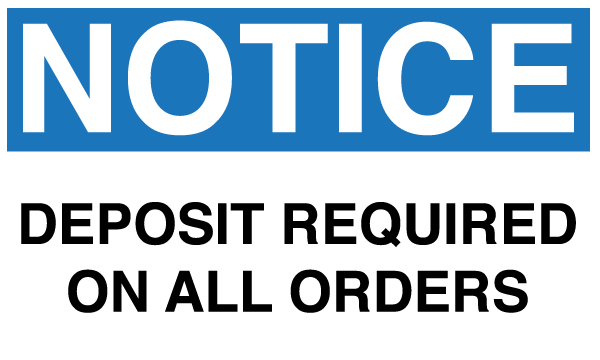
This is where the lesson should be learned folks: Always get paid a deposit worth at least your materials and labor; the other half or portion should be the profit, the fat you are storing for the winter, so that in the case you’re put into trouble you at least retain your investment…..

In this case, I contacted the designer and was given a run around for about a week, at the end of which she informed me that I had turned over “poor quality work” and that her customer was dissatisfied with the results. How would this customer have actually been given the opportunity to look at the results and be as excited as they were, and then turncoat in this way? I was not sure how it worked, and after a lengthy email chain back and forth during which the designer failed to take any responsibility, I realized that SHE had not been paid up front by the customer either, and that we were probably BOTH being taken for a walk – no matter how sweet and appreciative this person was at the time! What a PEST!

Moral of the story is, lay out your terms carefully in a contract looking official invoice format. Do not fudge this or leave wiggle room. Be clear about pricing and commitments/requirements, and ALWAY ALWAYS ALWAYS require a downpayment or a validated form of payment on file, because you never know how it will go at the end of the transaction – even with referrals and friends of friends. Never turn work over, especially hard work – rush work – unless you know you’ll be paid and have been paid a portion up front. It also really helps to know when you’re maybe out-gunned, or when too many red-flags actually do pop up – if you don’t recognize these things, it’ll maybe come back to bite you, referral or not!


We know you must have a disaster story or two that you can share, so tell yours in the comments section below!

Heidelberg Alert – Printing Press At Work On Screen

Though the popular USA Network series “White Collar” is now in it’s 4th season, a nostalgic look back at the series pilot shows a Heidelberg windmill going full tilt in the final minutes of action.  The press is supposedly printing counterfeit, multi-color Spanish Victory Bonds.

( image credit: USA Networks © 2009 )

The bad guys are trying to finish printing and box up the bonds before the FBI breaks down the doors.  It’s often a game of “Spot the Mistakes” when a printing press is used in a movie or television.  However,  it’s also a source of pride to see and say “hey, it’s a (fill in the blank) press” when you come across one.  You’ll probably admit that, when possible, you back up the action to take a second and even third look at the press (it’s okay, so do we). Just remember — this Heidelberg windmill was forced to do these illegal deeds.

Also spotted recently (with some very careful sleuthing) is a cameo appearance of another Heidelberg Windmill tucked away in the corner of print shop in the Academy Award-nominated 2002 film, “Catch Me If You Can”, starring Leonardo DiCaprio and Tom Hanks.


( image credit: Dreamworks Pictures © 2002 )

The scene in question opens up with Tom Hanks’ character, Carl Hanratty, doing some of his own detective work with a few ink-in-the-blood printers while trying to locate where the crafty con-man, Frank William Abignale, might be next. In the far right, a sneaky Heidelberg graces the scene for a few seconds, but steals our heart for the rest of the film.


Boxcar Talk With Eric Woods

A year-long celebration commemorating the 10 year anniversary at The Firecracker Press in St. Louis, Missouri is in full swing. The beginnings were humble in a dirty old warehouse with a questionable freight elevator, but two moves later, they are thriving & pushing the limits at their present space. Owner Eric Woods and Print Shop Manager Matty Kleinberg confess they eat, drink, and sleep letterpress, and it’s a diet that has served them well.


HOMETOWN ROOTS I’m originally from the small town of Piedmont, Missouri. My close family is from that region and I still have close ties to the area. One of my grandfathers owned a lumber and hardware business, the other was a retired Missouri State Park Superintendent. I grew up with one foot in town and the other deep in the country.

THINK INK I had known about letterpress since art school in the 1990s but didn’t get involved until well after. I’d worked in New York designing book covers, had come home to work at the local newspaper, and then got recruited to St. Louis by a large ad firm. The idea of starting a letterpress studio had been percolating for 5-6 years and after feeling unfulfilled with my design career I came home to tell my wife I was quitting my job. At the time we called it “going off the grid” but I had a feeling it was the right thing to do. Within days of quitting, I had signed up for a letterpress class through a local printer and rented a studio space with a few mates.

Letterpress quickly proved the perfect combination of graphic design and hands-on craftsmanship. It was everything I’d been searching for and offered complete control from concept to production. In an odd way I’d been practicing for a career in letterpress my whole life. I bought a C+P 10×15 in 2002 and The Firecracker Press was born!


SPLENDOR IN THE SHOW-ME STATE We own a 2500 sq. ft. building in the Cherokee neighborhood in St. Louis, Missouri. The front of the shop is a mix of retail and studio space. We sell posters, books, cards, and stationery… all of it made in the back of the studio. If you stop by you’ll see printmaking in action and we’re happy to show visitors around. We have two C+P platen presses, a Golding Pearl, two Vandercooks (#4, SP20), a large sign press, and a variety of smaller desktop platens. I guess I’d call our decorating style functional chaos but we try to run a clean shop.

A WEALTH OF KNOWLEDGE Dick Niehaus introduced me to the St. Louis Letterpress Society and helped me find our first press. We’ve learned a lot from Dick and others in the Society and they’ve been a great resource over the years. We’re lucky to have such a thriving group and a rich history of letterpress printing in St. Louis.

THE DAILY GRIND We work with a wide range of clients but most jobs start out the same way… with a conversation. We research the project, draw out ideas, and then build designs on the computer.

Once we’ve got a tight mockup we’ll go through a round of changes with the client and work toward final approval. We use the approved mockup as a road map to construct hand-carved woodblocks, lead or woodtype, and/or photopolymer on press. There is real magic that happens from the digital realm to the tangible, printed form and that’s what keeps us hooked. After 10 years I’m still surprised at the moment of creation.

FULL TIME FUN We’re open 6 days a week and print full time. From the beginning it was important that we jump in with both feet. We eat, drink, and sleep letterpress.

LOVE AT FIRST SIGHT Technically our first press was a Nolan Proof Press that my father helped me dig out of an old school. But the press that launched The Firecracker Press was a C+P 10×15 that we rescued from an old printshop. The owner was retiring and had sold off all his other equipment. The only thing left was the C+P . My friends and I moved it across the state and onto the second floor of our first studio. It fit through the front door and into the elevator but was larger than the door to my studio by about 6 inches (a rookie mistake). We tore the wall down and put up new drywall before morning. My landlord never suspected a thing.

INSPIRED BY THE PAST We love rescuing old equipment and giving it new life. We have studio tours for all ages that pass on the knowledge we’ve gained. We’ve got a robust internship program and have hired several interns as part-time and full-time employees. Our connection to history through the methods/techniques we use inspires us. It’s always a pleasure to meet people that have old stories or are somehow drawn to printing. We’re
proud and feel lucky that we’ve been able to do what we love for so long! Our clients have been generous and amazing.

BOXCAR’S ROLE You guys used to make photopolymer plates for us on a regular basis. We now make our own but do use your services for plates that are over-sized. We’re inspired by Boxcar’s size and reach.

SHOP TIPS The question we hear most from young artists and printers is: “How much do I charge for my work?”, and our answer is this: letterpress rarely comes easy and is often accompanied by hard work that our clients never see. As a result, we continually educate our clients and communicate with them throughout the making process. We set expectations early and work hard to deliver quality work. We developed a cost schedule in the early days after researching new and old methods of structuring prices. We’ve updated it over the years but it’s a system that’s served us well.

WHAT’S NEXT We hope to expand the studio and are working on plans to build onto our current location. If all goes well, we’ll more than double in size, with a venue for performances, a larger retail shop, a garden, and of course, more studio space.

Lots of thanks out to Eric for letting us get the full scoop on Firecracker Press!

Boxcar Talk With Katie Daniels of Concrete Lace

Armed with sharpies, inks, and a dazzling inspiration, Katie Daniels of Concrete Lace is a phenomenal front to shaping the way letterpress has been deftly handling those warm wishes and special greetings to friend and family alike, be it a an eye-popping invitation or a special run edition card. A Georgia native, Katie’s been imbibing the wonderfully sweet fruits of the creative process.

If you’re in the Asheville, North Carolina area between August 2nd-5th, you should pop in to the Ladies of Letterpress Conference and say a big hello to Katie, as she’ll be rousing up some fun at the printer’s fair!

IT’S ALL IN THE CARDS I am originally from Foley, Alabama, on the Gulf Coast of Alabama (a sleepy town that didn’t know what to do with a rebellious punk vegan in the early 90’s). My mother is very creative, always had art supplies around and is no doubt the reason why I am an artist today. As a four-year-old, she encouraged me to start selling my handmade cards annually at the Foley “Art In The Park”event. 30 years later, after moving to Atlanta, the card making tradition continues under the name my awesome sister, Carla Kaiser, came up with: Concrete Lace. I also love history, collecting, cooking, exploring, gardening, animals and being a nerd.

LETTERPRESS FOR LIFE I had dabbled in printmaking in the past, but when I got engaged in 2008, I really wanted to print my own invitations. A friend of mine told me about a local company, Praxium Press, who let you rent their press. The owner, Berwyn, was an awesome guy who introduced me to the Vandercook world. I loved it and immediately started designing & printing letterpress greeting cards and Atlanta neighborhood postcards, and was printing there so often that he convinced me it was time to get my own press. My awesome husband, Paul, then decided to set me up with a Vandercook studio in our home where Concrete Lace is thriving today.

GIFTED IN GEORGIA My studio is in my home, with the Vandercook & Kelsey upstairs in the small 7×10″ studio, and the Kluge, C&P and large format Challenge cutter down in the one-car garage. My upstairs studio is an inspirational eclectic mess, and the garage is more industrial feeling. I love to crank up local tunes super loud when I am printing, and I like to let the music set the tone for my productivity.

LIFE LESSONS + PRINTING MENTORS I had a fortunate job at one of the best health food stores, Brighter Day in Savannah, Georgia, while in college. I worked there for many years, and befriended a dear woman who also worked there, the late Joan Cobitz. Joan was among the first female MFA printmaking graduates of her time. She served as a major inspiration to me, as we traded house cleaning expeditions for printmaking classes in her home studio (printmaking was not offered at SCAD at the time). She was a great story teller and mentor for me and I think of her daily, not only in the press room, but also when I use her culinary advice or her prized Sabatier kitchen knife.

After graduating, I moved to Atlanta, and was fortunate enough to buy a house next door to a fourth generation letterpress printer, David Brough. He was a kind and generous man who loved his presses and loved to share information. Through David’s passing, I met another printer, Kevin O’Neil, who serves as my primary letterpress mentor today. Kevin very generously donated a beautiful C&P and Kluge to my pressroom, along with his invaluable information, which I will cherish forever.

DAILY GRIND For illustrations and hand lettering, I start out either with sharpies or pen and ink, then scan them in and convert them to vector graphics in Illustrator. Some illustrations are done directly on the computer in Illustrator (sometimes Photoshop then Illustrator), but I do all of my layouts, typesetting and separations in InDesign. My designing system is different for each line of cards as I like to switch things up so that I am always exploring new things. For example, I did a great deal of research on tapestries, pottery, wall paintings and other historic references when coming up with designs for my Greek and Hebrew lines, but did more hand lettering and illustration for my pet sitter cards, and illustration & typesetting for my French and German series.

THE DESIGNER IN THE PRINTER I am a professionally trained graphic designer, as well as a printer.

FULL TIME FUN I am a full time designer and a “part time” printer (but more like a 2nd full time job). I will never stop designing, so it is not my goal to give that up. I love it too much!

A LUCKY FIND I looked a year for a Vandercook SP15 or #4 (the only two sizes that would fit in my tiny upstairs studio), but no luck until I got Steve Robinson involved. He found me a #4 from an ink testing studio, and the press was in beautiful condition, with minimal miles logged and only one owner!

A VARIETY OF ACCOMPLISHMENTS I have won the Redbull Flugtag competition twice, thousands of dollars in numerous halloween costume contests, fostered and placed over 30 dogs, donated eggs twice, taught myself how to proficiently speak German in three years, forgot how to speak German in three months, taught myself how to play the accordion, started piano lessons at age 23, started tap lessons at age 31, won several design awards for work done for Emmy awards packaging and work created for television networks TNT, TBS and Turner Classic Movies, and most importantly, started Concrete Lace.

BOXCAR’S ROLE Boxcar sold me my base for my Vandercook and my Kelsey press, and I have been ordering my plates from Boxcar ever since. I really do find value in the relationships I have established with Boxcar, and feel that they have set a high industry standard, and high expectations, for customer service and plate making. They are fast and their site is user-friendly — key reasons for why I use them.

SHOP TIPS Don’t be discouraged. 1) This industry is all about exploring and learning, so I feel like even the biggest mistakes are the best teachers. 2) These machines were around WAY before any of us, and WAY before computers. We sometimes need to back off and not put pressure on ourselves to meet today’s standards of timing. These machines are much more powerful than we are, so it’s so important to think clearly and work at a pace that is comfortable for each of us individually.

WHAT’S NEXT I am working on an Italian line, and have two more lines in the works that will have to be a surprise… They probably won’t be ready until 2013, at this rate!

Big round of thanks out to Katie for letting us take a peek around the shop at Concrete Lace! Don’t forget to say “Hi!” to her at the Ladies of Letterpress Conference on August 2nd-5th, 2012!

Workspace Spotlight: Headcase Press

Letterpress printer Nicole Monforti of Headcase Press has a dual career.  When she isn’t finessing ink through her presses, she makes jewelry from recycled lead type in her New Bedford, Massachusetts studio.  This printer and designer is all for following wherever her art and presses take her.  Recently, she completed a custom order for cufflinks for some of the cast of the Disney Broadway musical “Newsies,” and she can often be found at local artfests in the eastern Massachusetts area. Nicole is a proud member of Ladies of Letterpress and will be displaying her stationery and jewelry for the second year at the 2012 conference in Asheville, North Carolina in August. Walk through the door of her workspace and take a look around.

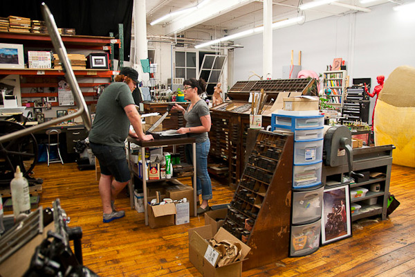
THE PRESSES: I have four – A 10 x 15 Heidelberg Windmill, a 8 x 12 New Style C&P, a Vandercook 14 proof press and a 3 x 5 Kelsey that I use for demos at shows.

SIZE OF PRINT SHOP: About 800 sq. ft in a shared space of 2,000 sq. ft.

TYPE OF SHOP: Commercial.

THE LOCATION: The space itself is great – it’s an old mill building so it has lots of old industrial elements and high ceilings.

FAVORITE THING ABOUT THE SHOP: I love the paint job in the shop, especially the red stripe (which was not easy to get straight!), and the history of the building itself. I love thinking about all of the things that have been made here over the past 100 years.

NUMBER OF PRINTERS IN SPACE:  The space is shared with a classical figure sculptor and one printing intern (Will is the red haired guy). He’s a recent Montserrat College of Art (my alma mater) graduate and he works for me as a part time pressman.

MOST VALUABLE SHOP TOOL: Probably my slug cutter, making the jewelry without one would be nearly impossible. After that, it’s a three way tie between tweezers, a pica ruler & locking quad guides.

FAVORITE INK: Holyoke Fine Papers (a local company) makes rubber & soy based inks that I really like. I’m partial to their “moss”.

SOLVENT OF CHOICE: Colorlok Glaze Off works miracles!

PLATE AND BASE OF CHOICE: I use the deep relief Boxcar base for the C&P and the standard for the Heidelberg. I’ve used them for the past year or so.

OIL OF CHOICE:  Mobil DTE oil extra heavy for the Heidelberg. WD40 for squeaky parts on the C & P.

WHAT TYPE OF RAG DO YOU CLEAN UP YOUR PRESSES WITH:  Old T-shirts. I think the jersey material works best.

FLOORING MATERIAL: Gorgeous wood floors!

FLOOR PLAN TIPS:  Keep your paper cutting/folding station far from the presses, because you just never know….

PIED TYPE: 300 lbs currently, waiting to be cut and turned into jewelry. (Hell box donations are always welcome!)

ORGANIZATION ADVICE: Post-it notes, I have them on everything.

PRINTING ADVICE: Make sure you have room to move around. I crammed things in at the beginning and I’ve since re-arranged about 4 times to make it more user friendly.

The Letterpress Roundtable, Part III: Shop Tool Star

Thomas Carlyle, a satirical Scottish writer, is quoted as saying that Man is a tool-using animal. And what self-respecting print shop or studio isn’t filled with many necessary and important tools? We asked a handful of talented letterpress printers to tell us about the most valuable tool in their print shop, and we got some great answers to share with you (including tips and secrets for geting the most out of these handy tools). As always, we hope to hear about the tool you can’t live without in your shop, so be sure to add your advice in the comments section below!


Mary Mashburn and Steve St. Angelo (Shop Boy) – Typecast Press 

There are so many terrific tools that we’ve been given or purchased while building our business — and letterpress knowledge — that we had to think pretty hard about which is the most useful. Then it hit us at the same instant: Alignmate! (If you don’t have one yet, it’s a thin, see-through, gridded, somewhat-expensive-for-what-it-is and easy-to-lose-in-stacks-of-paper piece of plastic that makes checking the straightness of image to paper so simple, aligning addresses on envelopes such a snap, that you won’t be able to function without it).

But we figured everybody would say that, right? Not that they or we would be wrong. But it got us to thinking about tools at our printshop that have made the almighty Alignmate even better. Mary and Steve — alias Shop Boy — have very different roles at Typecast Press (she the registration, he the repetition) so it should be no surprise that we have a strong difference of opinion here.

Mary went with the loupe. A photographer friend bequeathed to Typecast Press not just any loupe but an adjustable black metal Fuji 4x job that the company had once given away as a promo. It’s overkill. Any loupe will do for magnifying the precision of the Alignmate. By pressing the loupe directly against the Alignmate, Mary can see all the way to straightness heaven. Side to side, centered. Top to bottom, ditto. Stray dots cannot hide. Of course, even without the Alignmate, the loupe is a wonder for looking at ink density (“Get me 30ccs of mag carb, STAT!”) and consistency across the printing area, or for evidence that the rollers are too high or low. And checking those things again. And again. And again.

Steve’s running joke is that Mary looks for reasons to stop the presses; he looks for reasons to keep them going. She insists her tweakiness is the real time saver. Fair enough.

But as his most important tool, Steve votes for those little double-stick foam scrapbooker squares — Uhu is our brand. These dumb little things let you print funky-sized envelopes or pre-cut coasters on the C&P in a hurry, using a Boxcar base and a polymer plate, without the fear of a nicked base and smashed metal gauge pins. Say Mary’s letterpress class from the Maryland Institute College of Art has stopped by for a tutorial on the C&P. They work exclusively on Vandercooks at MICA. About 15 students. Each has a polymer plate the size of a 4-inch round coaster. And we’ve got 90 minutes or so in which to get each kid the experience of creating 25 samples of his or her printed design. No sweat. Pick a dependable spot on the platen. Peel one side of two little squares (it’d be three squares set like gauge pins for a rectangle) and stick them to the tympan, an inch or two apart and angled in just a hair. Tape the impression side of the polymer plate to the coaster and set the coaster between the squares. Press together. Bang. You should be pretty darn close to registered. (“Alignmate!”) The squares pull up and then re-stick for micro-adjustments if necessary. Done. And … next!


Ray Nichols – Lead Graffiti

I didn’t want to go with the obvious, such as one of our two micrometer composing sticks, but I wanted to get outside of the normal a bit. Hmmm. A roller height gauge is critical. Our electronic micrometer for measuring paper thicknesses and wood type height. Our killer old Boston pencil sharpener which puts a seriously long, tapering point to pencils. But overall I would pick Scotch tape. We use it to build up type (and once you get it right you can just leave it on) or woodcuts. We also use it a lot on the mylar on our Vandercooks to build up specific area a bit such as the names on a wedding invitation to give it a bit of extra punch. One small trick that is good if you have enough room around it is to double back one end (not under an area you are printing) so that you can easily grab it to pull it up after printing. We’ll often print right on the mylar, stick a piece of tape to the printed image we want to add impression and then pull it back up so we can see the exact printing area, and then cut the tape out in the right shape. This way you have a nice image to align against. Also we will often use an Xacto knife blade barely stuck to one or both sides to help us get it into position.


Mike Dacey – Repeat Press

After much thought I’d have to say the most valuable tool in my shop right now is my cutter, a Challenge 305 with power back and digital readout. It allows me to order and cut large parent sheets in bulk, which saves a huge amount of time and money. After printing, I can trim down orders with the precision and consistency that my clients demand. The cutter cost more than I paid for any of my presses but I’d buy it again in a heartbeat – I really can’t imagine running my shop without it. I don’t have many secrets for this one, it’s a pretty straightforward piece of equipment. Get some extra knives, keep them sharp, and you’re good to go!


Gerald Lange – Bieler Press

What I have to proffer is not the most valuable tool (in terms of expense) but it is one I rely upon and trust daily, and it has a personal history that I value. It is the lowly roller height setting gauge. I had always admired the long handled gauges used on production platen presses and when a friend of mine offered to make a dead on accurate gauge for me at Jet Propulsion Laboratories, what could I say but yes. They had made a bed plate for me a while before and it was dead on (I think they thought it was going to Mars or something).

Well, he tested the other gauges I had, historic and present, and said that they were not, um, in anyway .918 (he was a bit of a stickler) so off we went, hand-polished to .91800+/-. Somehow we ended up with about four or five dozen of these before he got sick and tired of the hand-polishing thing. I kept a couple and we sold the rest.

At any rate, I like to call it my magic gauge. Everything seems just so right when I use it. And that is just so, so reassuring on press.

Specifications on it are: Gauge is 15-3/8 inches long. Shaft is 5/16 of an inch in diameter. Mirror-polished head is precisely ground to .91800+/-. Head is beveled and measures 3/4 of an inch wide. Weight is 7-1/4 ounces. Knurled tail. Made of 303 high-grade stainless steel. Highly resistant to corrosion. Non magnetic.


Ben Levitz – Studio on Fire

Here are a couple things we use every project, every press:

Digital Thickness Gauge – Don’t guess at your packing. These are critical for knowing what you are placing in the press for packing to quickly and accurately achieve the desired impression. Ours cost about $70 from Amazon.

Depth Ruler – These little $2 rulers have a little sliding clip perfect for comparing the distance from crop to edge of sheet. Perfect for quick comparison side to side and head to tail of sheet to squaring things ups. Crooked printing sucks to correct later on the cutter.


Graham Moss – Incline Press

Back in the day there was a printing supply company in the UK called Cornerstone, and by the 1960s they were the bee’s knees when it came to ordering sundries for serious letterpress work.

They pretty much supplied all the goods you might need, excluding presses and type. They made sets of three narrow rollers with a uniform handle so you could pull two colour proofs with a single line of 10pt type in a second colour; type cabinets with cases that were made of ultra lightweight metal with plastic liners, that ran on nylon rollers and had a safety mechanism so it was impossible to pull the case too far out and drop it; their aluminium furniture was widely used, top quality page cord the like of which we won’t see again, and the make-up galley with a spring lever that told you how many points under or over your page was, another item still in use around here.

But of all their sundries the one I prize most is the type high measuring gauge. The 10 inch square steel base is engineered flat, and connected to one side is a five inch curving arm bringing a dial gauge to a spot over the centre. This has a spring loaded contact point so that a block, be it polymer, zinc, mag, or wood engraving, placed beneath it, gives the exact height, the dial showing .918 centred at zero, and one thou increments up to twenty five thou above or below type high each side of it.

I rely on it, and every block I prepare for printing passes under the gauge before going in the chase. Old blocks, purchased with all sorts of paper packing on the back, can be cleaned and rebuilt, checked and made ready for use with little trouble. Likewise wood type, notoriously various, saving a lot of effort by checking each letter for wear before setting and pulling a first proof. Eventually every piece in the shop will have been corrected through using the gauge, but that will take a while!

My biggest saving was with a book illustrated with ten original wood engravings – all were supposed to be machined to type high by a reputable supplier. One though was twelve thou over, and considering how much work goes into creating one wood engraving, I was delighted not to crush it!


Fred Hagstrom – Carleton College

I recently asked a student how large something was and the reply was “seven and three lines.” So my most essential tool is the ruler, and I am dismayed by the growing number of people–smart, well educated people–that don’t know how to read a ruler. When I do bookbinding with groups I ask them to measure 3/8 of an inch for the spine gap. I have to quickly look around the room. Some will have 3/16, some even 3/4 but they will have 3 somethings. It is not that they are dumb, it is just that they have never made anything before, so there is a huge gap in the physical and mental skills of how things are made. For instance, body mechanics. I can show someone how to cut something, or how to print something, but I can no longer assume a basic physical understanding of how to complete a task. I end up talking about how to stand, how to push down on something etc. That is something I did not have to do years ago. I have found my print tools spread around the building, mangled when used to do something inappropriate like opening a paint can. There is little reverence or appreciation for tools because they are not understood.

Learning these skills is not just a mundane thing. There is an intellectual dimension to knowing how to do things. Too many folks in education see this as devoid of intellectual content. Some highly intelligent people lack the basic ability to complete a task. They would be liberated in an intellectual sense if they had a better understanding of work. And the digital world has only increased this problem. I hope to increase people’s enjoyment of the process, and decrease their fascination with the results-only approach. I had a poor academic preparation, but I had a huge advantage in life experience from doing manual labor. I knew how to learn because I knew how to work.


So tell us – what’s the handiest tool in your print shop? Add your comments below!