Let the Show Begin: A Look at Sideshow Press

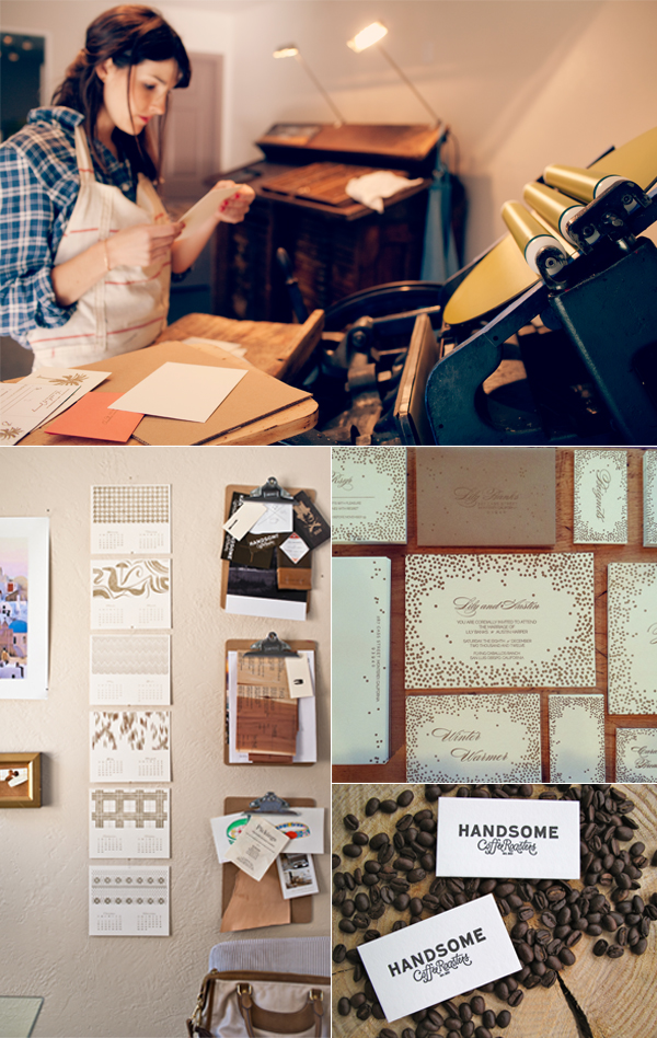
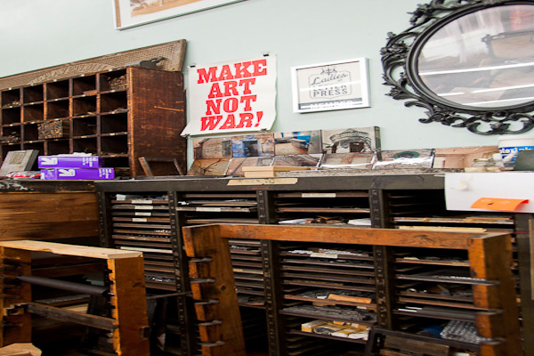
The warmth of the South Carolina sun follows us in as we enter Virginia Gregg’s brightly lit printing space, Sideshow Press, located just a stone’s throw away from historic Charleston. Virginia greets us with a smile that lasts from the moment we start the fabulous tour on through the curious conversation threading from her Great Dane, Lulu, organization advice, and of course her gorgeous letterpress work!

THE PRESSES We have 3 presses total:  a 12 x 18” C&P, Vandercook No. 4, and a 10 x 15” Heidelberg Windmill

SIZE OF PRINT SHOP 700 square feet

THE LOCATION Located in historic downtown Charleston, our small shop is just around the corner from King Street. You can find us nestled in a small alley off Cannon Street. You can’t miss our bright yellow doors. Our space is crisp and clean, with great natural light…and paper everywhere!

FAVORITE THING ABOUT THE SHOP The sound of presses running [is out favorite thing]. Besides the presses, we have lots of found objects we’ve gathered from our grandmother’s attics, antique stores and travels abroad.  They serve as inspiration for designs, techniques or texture. Our ceilings are about 14 ft. high so we never feel cramped or crowded. It’s nice to have that extra air around us filled with natural light. It’s pretty calming and inspiring!

NUMBER OF PRINTERS IN SPACE Just the three of us! And sometimes Lulu, a 130lb Great Dane that comes to hang out every now and then.

MOST VALUABLE SHOP TOOL The line board we use to measure straightness. Can’t live without it!

FAVORITE INK We use VanSon rubber-based inks mostly. Currently we are using a lot of grays since they go with everything. That way the little pops of color really stand out!

SOLVENT OF CHOICE We use odorless mineral spirits for wash ups. On the Vandercook, we’ll run make ready sheets between the roller system to extract as much ink as possible before wash up.  And we let the press do some of the work for us by adding wash while its still rolling.  When the rollers stop rolling, you can start to clean.

BASE AND PLATE OF CHOICE We switched to the Boxcar base format and photopolymer plating about 3 years ago and haven’t looked back. We found it to be much more accurate, provides better impression quality and the polymer plates are so easy to store, reuse and cut and rearrange as needed.  One time we had a funny typo, with the phrase “to the mooon and back”, we’ll that’s an easy fix with a little poly-type surgery and we were back in business.

OIL OF CHOICE  Durofilm R&O 150

WHAT TYPE OF RAGS DO YOU CLEAN UP YOUR PRESSES WITH We use the boxed Scott Shop Rags for press wash ups.

FLOORING MATERIAL Our floors are concrete, painted gray. Of course!

FLOOR PLAN TIPS Keep it organized!

PIED TYPE We don’t really have/use much in the way of pied type.  We have a little hanging around.

ORGANIZATION ADVICE We use lots of storage boxes and shelves to maximize our small space. Since our ceilings are so tall, we just keep going up instead of out.

PRINTING ADVICE When setting up, make one adjustment at a time.  When having a problem, mechanical or while printing, start by looking at the simplest thing first and move up from there.

Big round of thanks to Sideshow Press for giving us a tour of their space today!

An inside look at Woodside Press

Davin Kuntze of Woodside Press let us in to his Brooklyn Navy Yard shop, which is nestled safely between artisans shops and within World War I enemy fire resistant walls. More now a refuge for the creative thought than for protecting, Davin muses on the need for more letterpress in the world and bad typography (a crime against humanity) as he shows us through the space. THE PRESSES In general use we have seven presses. There is the C&P treadle press that came from the American Typefounders Company; two C&P Craftsman presses (one for printing and one for scoring and perfing); a Windmill for longer jobs; a Heidlberg KSB; and finally two Vandercooks, a Universal III for poster work, when we get it, and an SP20 that we use almost exclusively for proofing type. In addition to that we have a number of random presses in various states of repair, mostly small format platen presses that no one seems to want these days.

SIZE OF PRINT SHOP 5,000 square feet I think. It’s really too much space for one shop, but we’ve managed to fill it up with plenty of objects that inspire. But seriously, I think you should call “Hoarders.”

THE LOCATION We’re located in the Brooklyn Navy Yard, which is home to its own strange assemblage of artists, craftsmen, furniture makers, malcontents, mad scientists, old school Brooklyn hangers-on, young upstart urban farmers … the usual crowd that is attracted to affordable industrial space. We are in a high-floor corner of a massive 11-story building that was built for World War I, and actually carries a fire-rating of “able to withstand enemy attack,” although the enemy envisioned is most likely the Red Baron. Lomography has a distribution facility across the hall from us, and the Yard also has the largest manufacturer of military-grade body armor in the country.

FAVORITE THING ABOUT THE SHOP The view is one of a kind. We look out over the East River onto Manhattan from the southern tip of the island, up past the Williamsburg Bridge, to the United Nations. A lot of the time it feels miles away from the frantic pace of the city. That and the radio, be it NPR or some music at a volume that will drown out the phone if it starts to ring.

NUMBER OF PRINTERS IN SPACE It’s just us at the moment. We have a working relationship with a few other artists who occasionally come in to do collaborative projects. And we’re always happy to give a tour complete with our own (possibly skewed) history of printing and typecasting.

MOST VALUABLE SHOP TOOL I can’t think of any one machine we’d really suffer without, but the Linotype comes in really handy for book projects. There are a number of chapbooks we’ve done over the years that would easily have taken three or four times as long without this incredibly frightening contraption.

FAVORITE INK We use Van Son rubber-based for the most part. My favorite colors tend to be very rich. Far too many designers waste countless hours deliberating between four slightly different shades of light brown which all look like, well, baby crap. Type should be black (for the most part) and you should pick an accent color that makes a statement.

SOLVENT OF CHOICE We use Power Klene VC for the presses and Blanket Wash #4 for type, both from Prisco.

BASE AND PLATE OF CHOICE We’ve used KF152 for a number of years. People want “letterpress quality,” which means we have to smack the paper too hard.

OIL OF CHOICE You got me. We have a giant barrel of some sort of oil that I’ve been using for years, seems to be 30-weight motor oil.

WHAT TYPE OF RAG DO YOU CLEAN UP YOUR PRESSES WITH We get our rags from an industrial rag supplier. Every month or so they show up with a barrel of clean rags and take away our dirty ones. Not very exciting.

FLOORING MATERIAL Concrete. This is the Navy Yard and our building was built to warehouse aircraft-carrier components. It can stand up to a few tons of printing equipment.

FLOOR PLAN TIPS Smaller is actually better. It keeps things simple and all your tools are close at hand. A place for everything and everything in its place. Unfortunately we don’t follow our own advice. This place is a constant battle against entropy, and I love it. But losing all six pairs of scissors for a month at a time can be frustrating.

PIED TYPE We have a couple barrels of it. An associate of the press who cuts mats and makes brand new foundry type occasionally takes a big bucket away to cast a new face. In exchange we sometimes get brand new type for the shop. Works out for both of us.

ORGANIZATION ADVICE Did you read my answer about floor plan tips? [I recommend that.]

PRINTING ADVICE When I first got into printing, I was given a book by DB Updike called “In The Day’s Work” which I recommend to anyone in any creative field, although this book is more for the practical printer. Basically it says take pride in your work, keep your shop clean and organized, and don’t let your clients make decisions because you, as the printer, are the expert. I should have read that more closely and taken it to heart. I think the three books I’d recommend for a printer starting out are “In The Day’s Work” for self discipline and self confidence; “The Elements of Typographic Style” by Robert Bringhurst, because bad typography is a crime against humanity; and “The Elements of Color” by Johannes Itten, because there IS a science to why some colors work together and others don’t.

Workspace Spotlight: Alissa Bell

In the sunny spacious hills of California, Alissa Bell can be found enjoying her new printing space. She let us take a well-timed tour of the new digs, and offered up some great advice, heaps of laughter and curious answers as we meandered around her brightly lit space.

THE PRESSES I have a Chandler & Price 12×18 press from 1919.

SIZE OF PRINT SHOP 500 sq. ft.

THE LOCATION My workspace, located in the hills just outside of Salinas, California, is in a “casita” with views of old oak trees and Steinbeck country.

FAVORITE THING ABOUT THE SHOP I moved into this new space just 2 weeks ago and already I am feeling more inspired and refreshed.  I love the high ceilings and big windows…they bring in lots of natural light.  My dogs keep me company while I am printing. Barley likes relaxing by my feet, but Blue is scared of the press while its running so he sits outside. I also have a cow-skin rug… just in case I forget that I’m in the countryside.

NUMBER OF PRINTERS IN SPACE This is a one girl commercial print shop!

MOST VALUABLE SHOP TOOL My iPod. I nerd out to Ira Glass and other podcasts while printing. I love learning and printing at the same time.

FAVORITE INK Van Son rubber based inks. However, I’ve been playing around with the Van Son oil based metallics. I am enjoying gold 871… I printed 2013 calendars in gold on black paper stock. It looks and feels so glamorous.

SOLVENT OF CHOICE I use California Wash. Fellow printer, Robert from The Paper Crane in Half Moon Bay, recently shared a tip that has shaved a few minutes off my cleaning process. He suggested after the initial cleaning of the ink disk, reapply cal wash to the disk. Run the press and allow the rollers to run over the cal wash… removing extra ink and also breaking up the ink on the rollers further before taking a rag to them. I find this little tip very helpful!

PLATE AND BASE OF CHOICE I have a Boxcar deep relief base and use Boxcar KF152 plates.  My studio has only been in business for 1 year and I’ve been using this system since day one.

OIL OF CHOICE Motor Oil from the hardware store

WHAT TYPE OF RAG DO YOU CLEAN UP YOUR PRESSES WITH I am often making trips to ACE hardware to purchase this handy square box of old t-shirts.  They are perfect for clean-up.

FLOORING MATERIAL Stained concrete

FLOOR PLAN TIPS Since this space is 2 weeks new, I am still working out the equipment arrangement.  One new item being added to the floor plan is a platform/stool.  For this move, we (and by we I mean strong men and a forklift) got the press on a pallet and I think I will keep the press on it permanently just in case of a future move.  I’m going to build a platform for me to stand on so I am at a safe height to work.

PIED TYPE First born. Type A. I love to clean… I can’t help it!

ORGANIZATION ADVICE I have a filing system for my clients’ polymer plates.  I use the plastic sleeve from Boxcar to help separate different projects and clients so I don’t loose my marbles (or the plates) during a reorder.

PRINTING ADVICE The word “no”… I am so excited about what I do and want to share with each person who shows interest. Sometimes, though, being able to say “no” due to time constraints, comfort level, or the intangible bad feeling about a project would save me a few headaches.

Workspace Spotlight: Sargent Brothers Printers & Typographers

Before you enter Ben Sargent’s shop, you hear the bustling clamor of the Austin, Texas landscape. Cars, freight, and distant chatter of the Austin natives pound in your ears but once you step over the shop’s threshold, the roaring city sounds snap shut and a soft melodious metal clacking and clicking takes over. Ben was gracious enough to let us take a winding tour through the fine workshop of Sargent Brothers Printers & Typographers and gave us the details on how he orchestrates such a gifted letterpress print shop filled to the brim of of musing, stories, and great design.

A look inside the letterpress shop known as Sargent Brothers Printers & Typographers

THE PRESSES: We rely on our dear old Chandler & Price 10×15 Old Series, which was built in 1905, acquired by my father and his brother when they were teenagers in 1928, and in the family ever since. Still runs like a watch.

SIZE OF PRINT SHOP: 289 square feet.

THE LOCATION: Our shop is my one architectural accomplishment; I drew it and a carpenter friend built it, back in the late ‘80s. It’s a little 24-foot-square house on the back of our property in South Austin.

FAVORITE THING ABOUT THE SHOP: I like that my shop is out of the way of all our other activities and makes a cozy, quiet and compactly organized place to pursue printing. Much of our equipment — including our press and most of our 245 fonts of handset type — I inherited from my dad (who was a lifelong amateur printer) so it’s a shop with many sentimental associations.

NUMBER OF PRINTERS IN SPACE: While we enjoy in-house projects such as little books and ephemera, we have a steadily increasing amount of job work, mostly done in connection with a growing group of graphic designers in Austin who ship us their letterpress jobs. While my son, currently away at law school, has shown interest in learning the trade, right now we have one printer and that’s me.

MOST VALUABLE SHOP TOOL: We treasure and enjoy all our shop tools and machines, but I think our most valuable asset is what I’d call the zen of letterpress, by which I mean assuming an attitude that’s calm, creative and useful to the work. That would include an understanding that a letterpress project is almost always a series of problem-solving exercises, planning carefully, and having a big helping of patience.

FAVORITE INK: We have used Van Son’s excellent rubber-based inks for as long as I can remember, though the testimony of some of your other bloggers has me very interested in trying out soy-based ink. As to color, it seems like when we’re printing something we’re designing ourselves, we sure do rely a lot on Scarlet red and Wedgewood blue; they make a nice combination on a page.

SOLVENT OF CHOICE: When I first learned to print at the age of 12, my father told me, “Now here’s the drudgery part: cleaning the press.” I guess if I did have a technique that seems to lighten the drudgery, it’s wiping ink table and rollers with a dry rag as you go, right after loosening the ink with solvent. And as to that, we generally use off-the-shelf roller washes (currently using Varn’s V-120) for applications requiring a water-miscible solvent (rollers, poly plates), and a stronger type wash (Rogersolite) for things like metal type and the mixing glass. And while we’d never want to return to the days of 90 years ago when my dad and uncle used gasoline for cleaning everything, kerosene is still the sovereign remedy for dirty, oily machinery.

PLATE AND BASE OF CHOICE: For almost all of our job work these days, we are using the Boxcar Press KF 152 (deep-relief) adhesive-backed poly plates on a Boxcar base. We became enthusiastic converts to photopolymer about a year ago and have been faithful enough that our old photoengraving vendor has inquired as to what happened to us.

OIL OF CHOICE: To lubricate the press and paper cutter, we have had best results with “way oil,” the lubricant used in machine shops for drills, lathes, etc.

WHAT TYPE OF RAG DO YOU CLEAN UP YOUR PRESSES WITH: The paint store near us sells conveniently sized boxes of cotton rags, which is certainly worth not having to find and cut up rags on one’s own. (If you go that route, remember that colored rags, for whatever reason, are much cheaper than white.)

FLOORING MATERIAL: Good sturdy concrete. When we built the building, the concrete contractor asked why we had drawn several 18-inch-deep piers underneath the slab. “You putting something heavy in here?” he asked. “Trust me,” I replied.

FLOOR PLAN TIPS: I always thought the best-designed newspaper office I ever saw was the old Globe-News building in Amarillo where my dad worked, because it was designed by the paper’s general manager instead of an architect, and was arranged according to the work flow of putting out the daily paper. We tried to use that principle in laying out our shop, and placing the various elements where the work could easily flow from one point to the next.

PIED TYPE: Oh, yes, a little bit, which I suspect is not uncommon in a handset shop, but we try to avoid it by making a habit of distributing type forms right after we’re through printing from them. Nonetheless, I think we may have a few galleys still holding a little bit of type set back in the late ‘60s.

ORGANIZATION ADVICE: Other than the principle mentioned above of placing different work locations in a logical order, one of the most useful things is getting into the habit of putting tools back where they belong just as soon as one is through using them.

PRINTING ADVICE: Once again, when things get challenging, take a deep breath and have patience. Plan each job carefully, “measure twice and cut once,” and keep faith that your materials, tools and machinery will do what you’re trying to achieve, even if they are making you figure it out step by step. (Not that there aren’t things that letterpress is simply unsuited for. In those cases, says one of my trusted letterpress mentors, a wise printer learns the value of the word “no.”) As another of your bloggers sagely observed, take care of your tools and machinery, and they will take care of you.

A look at the Sargent Brothers Printers & Typographers workspace

Workspace Spotlight: That Sky Blue Press

In the neighboring north of Canada sits a letterpress shop with a self-proclaimed international flavor and big expectations. Litsa Babalis, of That Sky Blue, is the owner and main designer for the company and you can find her work across the North American continent. But it all starts here and she is happy to take a break from designing and printing her environmentally responsible cards to take us on a shop tour.


THE PRESSES We have four presses: three 10×15 windmills and one 12×18 Chandler and Price.

SIZE OF PRINT SHOP 1200 square foot studio.

TYPE OF SHOP We occupy the space completely for our own production, however we often offer classes to students and letterpress enthusiasts after work hours.

THE LOCATION We are based in Montreal, Canada. Our studio is located on the banks of the historic Lachine Canal and minutes away from great coffee shops, markets, and the most adorable & friendly boutiques.

FAVORITE THING ABOUT THE SHOP How can you not feel creative being surrounded by these beautiful machines? Seeing them in action everyday is sure to inspire anyone.

NUMBER OF PRINTERS IN SPACE two pressman, one presswoman (me, whenever I get a chance to get on press… I take it) and one intern.

MOST VALUABLE SHOP TOOL The great people that work here.

FAVORITE INK We use soy based inks. We love the coverage they can handle and the drying time is very quick. My current favorite color has to be 871 gold…I love the way it looks on dark paper as well as the standard white cotton papers we use.

SOLVENT OF CHOICE We use California Wash for our everyday clean ups. It’s great because it’s water miscible, it has a mild odor, and is not harmful for your rollers.

PLATE AND BASE OF CHOICE We use the standard base and the KF95 regular relief plates.

OIL OF CHOICE We prefer to use a heavy weight, non-detergent press oil for our presses.

WHAT TYPE OF RAG DO YOUR CLEAN UP YOUR PRESSES WITH  We use a linen service who comes and picks up our soiled rags once a month and replenishes our stock with clean 100% cotton industrial shop rags.

FLOORING MATERIAL Concrete.

FLOOR PLAN TIPS We have a very small space, so getting the right floor plan is quite important to our work flow. Adding new equipment to our space is always a challenge, so we end up moving everything around once or twice a year. We try to use every square inch as best as possible and that includes wall space. Hanging tools and chases and putting up shelving for inks and other press room supplies saves us on floor space so we can move around a little easier.

PIED TYPE As incredible as it is to have that little bit of printing history in the form of lead type scattered around in drawers and boxes, it just wasn’t getting any use from us so we gave it away a long time ago to a deserving letterpress & typography master.

ORGANIZATION ADVICE I am a neat freak. I like my press shop to be in order, otherwise I feel distracted. The best advice I can give on keeping an organized space is when you use something, put it back in it’s place and clean as you go.

PRINTING ADVICE Get to know your machines really well, take care of them, and most of all be patient with them as they get older and more stubborn…Be good to them and they’ll be good to you!


Workspace Spotlight: Headcase Press

Letterpress printer Nicole Monforti of Headcase Press has a dual career.  When she isn’t finessing ink through her presses, she makes jewelry from recycled lead type in her New Bedford, Massachusetts studio.  This printer and designer is all for following wherever her art and presses take her.  Recently, she completed a custom order for cufflinks for some of the cast of the Disney Broadway musical “Newsies,” and she can often be found at local artfests in the eastern Massachusetts area. Nicole is a proud member of Ladies of Letterpress and will be displaying her stationery and jewelry for the second year at the 2012 conference in Asheville, North Carolina in August. Walk through the door of her workspace and take a look around.

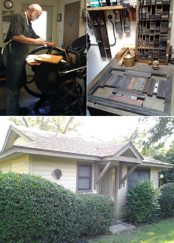
THE PRESSES: I have four – A 10 x 15 Heidelberg Windmill, a 8 x 12 New Style C&P, a Vandercook 14 proof press and a 3 x 5 Kelsey that I use for demos at shows.

SIZE OF PRINT SHOP: About 800 sq. ft in a shared space of 2,000 sq. ft.

TYPE OF SHOP: Commercial.

THE LOCATION: The space itself is great – it’s an old mill building so it has lots of old industrial elements and high ceilings.

FAVORITE THING ABOUT THE SHOP: I love the paint job in the shop, especially the red stripe (which was not easy to get straight!), and the history of the building itself. I love thinking about all of the things that have been made here over the past 100 years.

NUMBER OF PRINTERS IN SPACE:  The space is shared with a classical figure sculptor and one printing intern (Will is the red haired guy). He’s a recent Montserrat College of Art (my alma mater) graduate and he works for me as a part time pressman.

MOST VALUABLE SHOP TOOL: Probably my slug cutter, making the jewelry without one would be nearly impossible. After that, it’s a three way tie between tweezers, a pica ruler & locking quad guides.

FAVORITE INK: Holyoke Fine Papers (a local company) makes rubber & soy based inks that I really like. I’m partial to their “moss”.

SOLVENT OF CHOICE: Colorlok Glaze Off works miracles!

PLATE AND BASE OF CHOICE: I use the deep relief Boxcar base for the C&P and the standard for the Heidelberg. I’ve used them for the past year or so.

OIL OF CHOICE:  Mobil DTE oil extra heavy for the Heidelberg. WD40 for squeaky parts on the C & P.

WHAT TYPE OF RAG DO YOU CLEAN UP YOUR PRESSES WITH:  Old T-shirts. I think the jersey material works best.

FLOORING MATERIAL: Gorgeous wood floors!

FLOOR PLAN TIPS:  Keep your paper cutting/folding station far from the presses, because you just never know….

PIED TYPE: 300 lbs currently, waiting to be cut and turned into jewelry. (Hell box donations are always welcome!)

ORGANIZATION ADVICE: Post-it notes, I have them on everything.

PRINTING ADVICE: Make sure you have room to move around. I crammed things in at the beginning and I’ve since re-arranged about 4 times to make it more user friendly.

Workspace Spotlight: Slow Print

Nestled next to the hearty Mississippi River, Iowa’s own Slow Print hangs back in the thriving old Warehouse District in Dubuque and houses extraordinary letterpress work, a neatly arranged showcase of letterpresses spanning from a 1900s Chandler & Price to a 1960s 10×15 Heidelberg Windmill, and as many letterpress stories as there are ink cans. Peter Fraterdeus of Slow Print let’s us take a look at what’s inside.

Workspace Spotlight at the Slow Print letterpress shop in Dubuque

THE PRESSES: 1960s Original Heidelberg “Windmill” 10×15 – Red Ball, main workhorse production press; 1950s Original Heidelberg “Windmill” 10×15 – Black Ball, mostly die-cutting and fail-over; 1940s Vandercook 219 Proofer 19×26; 1930sMiehle Vertical V36 Cylinder 13×19.5, and a 1900s Chandler & Price Gordon Old-Style 10×15.

THE LOCATION: My shop is in Dubuque’s Historic Millwork district, a few blocks from the Mississippi River, and in fact, I’ve been one of the “flagship” tenants. In the past two years, a public-private partnership has upgraded the District, including all the streets & sidewalks and a full-block quadrangle building to the tune of well over $20 million. I just hope I don’t get gentrified out – but the arts are a primary core function of the newly active district.

I’m a block from the Voices Warehouse Gallery and a block from the new Dubuque Community Food Co-op, so it’s an exciting time to be in the area. The building is an early 20th century brick warehouse. The space I’m in was converted to offices many years ago, but it’s surrounded on the 1st floor by raw warehouse, currently inhabited by an ‘architectural salvage’ and antiques dealer.

FAVORITE THING ABOUT THE SHOP: My large blue oriental rug in the coffee/lounge area (about 100 years old, it’s nearly worn out) with the futon couch and 1960s LaPavoni espresso maker.

NUMBER OF PRINTERS IN THE SPACE: One, just me and my new apprentice for the summer, Rachel.

MOST VALUABLE SHOP TOOL: Other than the Heidelberg Red Ball, and my MacBook Pro (without which there would be no business!), the most valuable tool is my loupe.

PLATE AND BASE OF CHOICE: I use KF95 on a locally machined aluminum base. I bought a 24×48 slab of .875 aluminum and had it machined down and cut into numerous smaller sections from 18″x24″ (used on the Vandercook) down to 2″x3″. It’s been in use since about 2007.

FAVORITE INK:  Oil-based – either VanSon or others as needed.

SOLVENT OF CHOICE: WM Wash from LithCo. I use Putz Pomade on the rollers after wash-up, which keeps any remaining medium from drying into the surface. The slightly pumice gritty stuff also helps keep the rollers from glazing. I’ve been using rollers from Advance in Los Angeles with very, very good results.

OIL OF CHOICE: 30W non-detergent

FLOORING MATERIAL: Hardwood floors.

PIED TYPE: Plenty. Much of it is wood type, as I purchased a barrel full on ebay some years ago. Couldn’t stand to see it auctioned off a handful at a time. I have one galley full of 24 point Legend, the beautiful Ernst Schneidler calligraphic type, purchased from an eminent printer who was closing up his shop a few years ago.

He shipped the type in the cases, with nothing but a sheet of single-corrugated cardboard on top. When the shipment arrived, the UPS driver set it on its side (although it was marked “keep flat”) and all the type was pied in a mound under the wrapping. I was not at all happy. Took hours just to get it into the galley, and I still haven’t figured out how to read Legend backwards. Major headache.

ORGANIZATION ADVICE: High tables and work surfaces with plenty of storage underneath.

PRINTING ADVICE: These are hardly secrets, but for the auto-didacts who haven’t yet figured it out, these will help a lot.

  • Don’t add white to color. Add color to white.
  • There’s nothing worse than slimy long ink for sharp printing. But don’t add too much mag, or the ink won’t want to come off the roller!
  • There’s no point to adjusting the rollers if there’s too much ink on them.
  • How much is “Too Much” ink or “Too Long” ink is entirely dependent on the form being printed.

Deep impression only makes sense with deep paper, otherwise it’s just gauche. (Note to clients: you can’t have deep impression on both sides of the same sheet – unless there’s no overlap from back to front)

Slow Print Workspace spotlight

Workspace Spotlight: The Arm

As studios go, The Arm in New York might be one of the best hidden secrets.  If you go before it opens, you might wander up and down this Brooklyn street wondering if you are in the correct location.  There is no sign, just some apartments, empty-looking warehouses with metal rolling doors, and a small corner store. The street number is right but still nothing to say “here it is”.  But minutes before the 11 am hour, a couple of people wander up.  They carry paper and what could be a plastic printing plate.

This looks promising. And on the hour, a skateboarder arrives, unlocks the door, rolls up the metal rolling cover to show a big picture window and its welcome to The Arm.  Here there are the presses, the notices on the window. The activity begins as many more printers arrive in succession.

Daniel Morris of The Arm describes what’s inside.

THE PRESSES: I am a bit of a freak for late model Vandercooks. I have two SP-15s, two Universal Is and two Universal IIIs. For smaller work there are a couple of C&P Pilots and a Kwikprint 86 foil stamping press. Because I also recondition presses there are often one or two others in some state of restoration at any given time. The equipment has been chosen very carefully to be safe and suitable for a shared work environment.

SIZE OF PRINTSHOP: 1500 square feet

THE LOCATION:  The Arm is on the ground floor of a renovated nineteenth century stables building in Williamsburg, Brooklyn. The studio takes up the bulk of the ground floor. I built the glass shopfront so that it opens 8 feet wide — getting equipment in and out is a breeze.

FAVORITE THING ABOUT THE SHOP: The way I have laid out the space, the press room is visible from the street, but the type room is tucked away. This was to make sure that passers-by could see what was going on from the street, but also to make sure that people weren’t too distracted when composing type forms.

TYPE OF SHOP: Community + educational. I set it up specifically to be able to share it, my presses and my knowledge of printing. I teach classes from the space almost every week and make the presses available for people to use for their own projects. We’ve got quite a community of printers here in NYC. It is far more fun in the space when there are a few people in working.

MOST VALUABLE SHOP TOOL: The trusty .918 roller setting gauge.

FAVORITE INK: We use the Van Son Rubber Base Plus system and maintain an inventory of all the base colors for the Pantone mixing system. With these inks, a Pantone book and a scale you can’t go wrong.

SOLVENT OF CHOICE: I use Gamsol for washup. It is an artist’s grade mineral spirits. We keep it in Justrite plunger cans and make sure all waste rags end up in our sealed Justrite waste cans. I’m a bit militant about shop safety protocol, MSDS sheets, etc.

PLATES AND BASE OF CHOICE: I am very fond of the standard base and the KF95 plates. I don’t like the deep relief plates, but do have a couple of small deep relief bases for people that bring them in. There must be nearly a dozen Boxcar bases here at The Arm.

FLOOR PLAN TIPS: Make sure your press is situated where you feel comfortable and have good light. Get yourself a good anti-fatigue mat (I love the 2×6 Uline Cadillac mats for Vandercooks) and your feet, legs and back will thank you.

PIED TYPE:  I am proud to say my shop has no pied type. As one of the owners of The Dale Guild Type Foundry, I love to work with metal type, but my policy is to sort the good stuff and melt the bad. May as well turn it back into something useful- we can smelt old foundry type to make new type and Linotype metal, Monotype, etc. we give to our machinist to melt down to make fishing sinkers. You’ve got to keep your machinist happy.

ORGANIZATION ADVICE: Down time is critical. Sometimes you just need to take everything apart, clean like crazy, and put it all back together.

PRINTING ADVICE: Coffee and good records are key [to making the space feel creative and comfortable]. But it is important that the music isn’t too loud that you can’t hear when the press is trying to tell you something.

Big round of thanks to Dan Morris for letting us get the grand tour of The Arm!