Little Letterpress Cards from The Pink Orange

A while back we printed these cool little letterpress cards designed by Rebecca Ashby of The Pink Orange. They’re small, business card size, with crisp black ink on white. They are the perfect the little pick-me-up to give or to receive. They come paired with tiny envelopes in rainbow colors and we find them quite charming.
final-1

final-4

final-3

final-2

Letterpress Business Collateral for Revival

A while back we had the opportunity to print some letterpress business collateral pieces for Revival, including these letterpress hang tags. They are a cool combination of simple typography on recycled chip board, which we printed and then hole drilled for merchandising.

letterpress-business-collateral-revival-uncommon-goods

letterpress-chip-board-business-collateral-hang-tags

Cloudy Collection Prints Vol. I Ed. 3 Letterpressed by Boxcar Press

Dubbed The Scarlet Lettering, the third edition of the Cloudy Collection was amazingly cool to print. Appropriately enough, this series of illustrations was printed in a bright red ink and blind deboss with a hit of transparent white for a bold and graphic effect. For more information about the Cloudy Collection check out our interview with Cloudy Collection mastermind Dave Huyck. All of the prints in the Cloudy Collection series are available for sale on the Cloudy Collection website.

Letterpress Save the Dates for The Pink Orange

We printed these cool letterpress save the dates for Rebecca Ashby of The Pink Orange for a client of hers seeking a design with a distinct beachy feel, but a unique edge. We printed these with a letterpress flood in yellow and they are paired with a sweet 2-color letterpress #10 business envelope with a string and button closure. You can read more about the design on Rebecca’s blog.

Letterpress Holiday Cards for The London Hotels

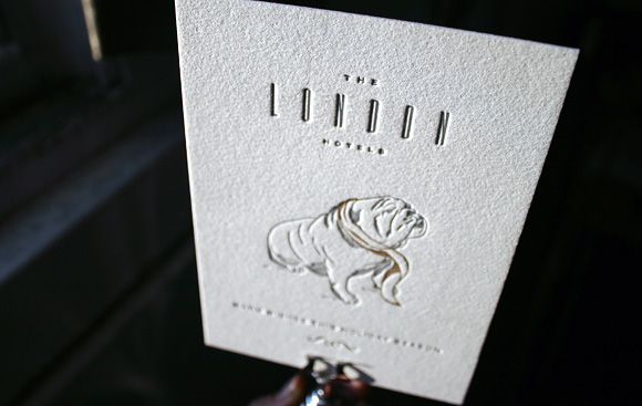
We recently printed these letterpress holiday cards, designed by Korn Design, for The London Hotels. They feature a very cool bulldog all dressed up in his winter finery for the holiday season, printed in 2-color gray and brown letterpress.

From Our Print Shop – Letterpress Marketing Materials for Corinna Raznikov Photography

Printing these super cool letterpress marketing pieces for Corinna Raznikov Photography, designed by Sharon Bartholomew, was a treat. It was also a big challenge, but a really fun challenge we couldn’t wait to tackle. The primary map card has a combination of large letterpress solids and hundreds of tiny dots, which required some crafty printing to get just right. The result is a collection of really bold letterpress pieces we consider pretty awesome.

photographer-3

photographer-1

photographer-7-closeup
The letterpress correspondence card, letterpress pricing card and letterpress promotional card feature calligraphy by Debi Zeinert of The Blooming Quill. All of the pieces were printed in a bright red ink and blind deboss with a hit of transparent white to make the colors pop. In combination with the striking illustrations dreamed up by Sharon Bartholomew and created by Pier Gustafson, and the old school script calligraphy, the pieces are a bit of a study in juxtaposition, something we think is especially sweet.

photographer-1

photographer-6-closeup

This set quickly became a crowd favorite around Boxcar and it’s pretty easy to see why. We love getting to letterpress pieces that are innovative and unique and this set definitely fits the bill.

From Our Print Shop: Cool Letterpress Business Cards for Salt & Syrup

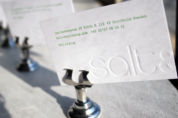
These letterpress business cards, printed for Salt & Syrup, are simple but really cool. We love the combination of blind deboss with a cool green ink. They have a clean Scandinavian feel, perfect for this fun Swedish stationery line.

Letterpress Wedding Invitations Designed by Ian Koenig

We loved printing these sweet letterpress wedding invitations designed by Ian Koenig because they are just plain cool. According to the bride, Lindsay, “We did not want to take the whole idea of wedding invitations too seriously…make them fun, non-traditional and have our personalities shine through…We live in the Pacific NW where beer rules all [plus the groom works for Deschutes Brewery] so we definitely wanted that to be showcased as well.” Printed with metallic ink on smooth chocolate brown paper from French Paper, these invitations definitely achieve the goal of being fun and a little offbeat. We love it when couples think outside the box and these invitations are one of our favorite examples of doing just that…


The couple is incorporating a lot of handmade details and a ton of mixed and matched textiles and cool old buttons, vintage salt and pepper shakers and whatever good finds they can score at the farmer’s market on the day of the wedding, which will be at The Gardens at Flying Diamond Ranch in Redmond, Oregon, so Ian took that into account when designing. “I just wanted to capture and compliment all of the eclectic odds and ends that will make up the guest’s wedding experience. We began with a mood board, and from there it was clear that the design opportunity was in the details. The best way to suggest this was through repetition and variation of little icons, the idea that the sum is greater than the parts.” We agree that the sum is definitely great!


Congratulations, Lindsay and Geof!

Fine Press Broadside: When Poetry and Letterpress Meet

One of the coolest collaborations Boxcar is proud to be a part of is our sweet partnership with the YMCA’s Downtown Writer’s Center here in Syracuse. In 2002, the Downtown Writer’s Center launched a broadside series as fundraiser for their reading series. Two poets are selected annually and Boxcar’s own Harold Kyle takes the lead on designing and printing the broadsides in support of the series.

This recent broadside is for Jane Hirshfield’s poem, “Critique of Pure Reason” and Phil Memmer of the Downtown Writer’s Center calls it one of his favorites from the series. As Phil notes, “The detail in both the border and background is marvelous, and serves to echo the subject of the poem…and the careful way in which the poem itself is presented is simply perfect.” Phil also shares that the best commentary on the broadside might be from Jane herself, who gasped aloud when she first saw it – we love that!

You can check out other broadsides in the series in our letterpress portfolio. The Jane Hirshfield broadside, $25, and others in the series are available through the Downtown Writer’s Center by emailing phil@ymcaarts.org