Boxcar Talk With Annika Buxman

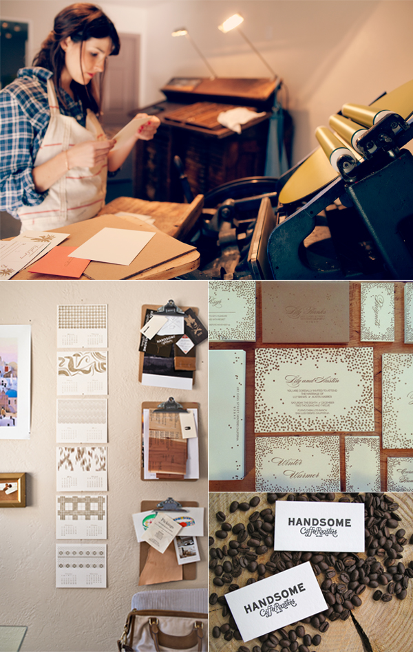
There’s a vibrancy when Annika Buxman of De Milo Design Studio & Letterpress speaks about braiding her foci of letterpress,  responsible printing, faraway homelands, and her support of Fair Trade paper. Deftly she passes from one story to another, entrancing us, while her C&P mirrors her movements. Paper to ink. Printed piece to hand. Annika paused the press so we could ease in a few curious questions into the extraordinary printing tapestry around us.

THE CREATIVE CASE OF ANNIKA BUXMAN Machinery is in my blood. I mostly grew up in Bakersfield, California in the 1970’s. At that time the landscape, even in town, was covered with functioning oil wells. The “head” on a long “neck” was constantly moving up and down like a gargantuan horse leaning down to drink. I named dozens of them and felt a special kinship with these “creatures”. The oil wells combined with the farm equipment in my grandparents’ barn made me feel at home with wrought iron and rust. I didn’t learn how to use a computer until college in 1988, so mechanical rather than digital functionality is imprinted in my brain.  A completely different childhood experience from Bakersfield was being born in Africa (Kinchasa, Zaire) and having those images and stories around the house. My family also lived in Manila, The Philippines, right after the revolution in 1987 and traveled around that part of the world for a year. Those experiences gave me a strong sense of poverty in developing countries. But it seemed like too big of a problem to solve. When I learned about how small businesses can make a difference through the practice of fair trade it was the perfect fit for De Milo Design.

Locally, I enjoy teaching the art of letterpress to people in my studio and working on custom invitations, business cards and personal stationery. Globally, I’m committed to promoting cross cultural business relationships with women in developing countries through the development and sale of their handmade paper via my fair trade and eco paper line “Sustain & Heal.”

LOVE AT FIRST SIGHT I first saw letterpress printing in the gallery at Art Center College of Design where I was a student in 1993 and was fascinated. I took their Archetype Press class. I thought it was just a fun elective. I never thought I would do it for a living so I didn’t pay very close attention. When I started up my shop I had to go back and take the class again.

STAYING COOL IN CALIFORNIA South Pasadena, California is a small town about 10 miles northeast of downtown LA. The entertainment industry does a lot of filming here when they need the “quaint-cute-midwestern-small-town” look. The front of my street level studio has huge windows that look out onto the main boutique shopping and gallery section of town. The Goldline light rail station and weekly farmers market is just down the street and the chamber of commerce organizes art walks 4 times a year so there’s a lot of foot traffic. I treadle my C&P in front of the windows every chance I get. Working the press with the backdrop of lovely marbled fair trade papers always attracts attention.

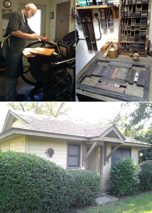
PRINTING MENTORS My first printing mentor was Regis Graden. I met him just in time because he died a few years later. But in those few years my skills improved by leaps and bounds largely due to his input. When I called him with a question often he would say “I could tell you but it would be easier to show you. I’ll be there in 20 minutes.” Here is a bit more about him on my blog. Today my mentors are other printers like me who are each doing their own thing with letterpress. Close to my studio there are at least a dozen printers — Maude Press, Lala Press, Anenome Press, Fugu Fugu Press, and Papermum Press, just to name a few. And we all rely on local printing legend Gerald Lange. The International Printing Museum puts on an annual printers fair and it’s fun getting together with other local printers to talk shop and exchange advice. The Ladies of Letterpress conference this past August provided me with a host of contacts and I love their discussion board.

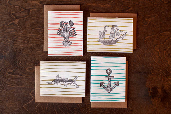
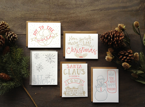
THE CREATIVE PROCESS The unexpected juxtaposition of materials is the most fun way for me to design. At Art Center I learned the basics of a good layout (first, second, third read, and dynamic “white” space) and picked up an appreciation for meticulous typography. Applying those skills to combining different materials is my favorite way to design. Most of my work ends up being a collage of some sort. I could get a PhD in adhesives!

FULL TIME FUN I am both a designer and printer, and I’ve been printing full time since 1998.

PRESS HISTORY I bought a 8×12 C&P Old Style Treadle Press from the International Printing Museum in Carson and drove it to Pasadena on Los Angeles freeways on a little trailer that was only rated to carry 500 pounds. Dumb.

PRINTING FEATS In 2007 I designed and launched a line of fair trade and eco friendly papers called “Sustain & Heal.” It primarily features handmade & handmarbled papers and a specially made for letterpress Jute sheet. Later I traveled to Bangladesh to meet with many of the artisans who make the paper and see what a huge difference it makes in people’s lives when we buy fair trade. Taking “Sustain & Heal” to the National Stationery Show and bringing the message of fair trade to people there for the last six years has been a huge undertaking. I’m terrible at marketing and showing my work. I dread public speaking and talking to strangers, especially when they stare at me blankly after my passionate little speech about fair trade. Doing this show has been an area of personal growth and I’m proud that I rise to the challenge year after year.

BOXCAR’S ROLE When I first launched my website in 1999 there were not many other letterpress websites out there. Boxcar made me feel like I wasn’t alone, or crazy, to be doing what I was doing. They also gave me a laugh with the “What is Harold wearing” section. They continue to be ahead of the curve and leaders in this industry. Their habit of eco-friendly practices inspire me to do the same.

PRINTING ADVICE Regis [Graden], my first letterpress mentor, used to say “You know the only sure way to not make a mistake? Don’t ever do anything!” He also once consoled me when I called him with my latest printing woe, “You made a mistake? I can’t believe it. The last time I made a mistake was…let me think…ten o’clock this morning.”

WHAT’S NEXT So many “high on talent, low on bank account” folks walk into my studio each week with their wonderful designs that they want printed. Often they leave disappointed because they had no idea letterpress requires so much effort and is on the higher end of the price scale. So I’ve set up a “letterpress lab” program for people to come into the studio and print their own designs for a small equipment rental fee. So far it’s worked well with the few people who have tried it. I’m looking forward to expanding this program next year.

Again, a big round of thanks out to Annika for letting us catch a glimpse of the spectacular work of De Milo Design Studio & Letterpress!

Workspace Spotlight: Alissa Bell

In the sunny spacious hills of California, Alissa Bell can be found enjoying her new printing space. She let us take a well-timed tour of the new digs, and offered up some great advice, heaps of laughter and curious answers as we meandered around her brightly lit space.

THE PRESSES I have a Chandler & Price 12×18 press from 1919.

SIZE OF PRINT SHOP 500 sq. ft.

THE LOCATION My workspace, located in the hills just outside of Salinas, California, is in a “casita” with views of old oak trees and Steinbeck country.

FAVORITE THING ABOUT THE SHOP I moved into this new space just 2 weeks ago and already I am feeling more inspired and refreshed.  I love the high ceilings and big windows…they bring in lots of natural light.  My dogs keep me company while I am printing. Barley likes relaxing by my feet, but Blue is scared of the press while its running so he sits outside. I also have a cow-skin rug… just in case I forget that I’m in the countryside.

NUMBER OF PRINTERS IN SPACE This is a one girl commercial print shop!

MOST VALUABLE SHOP TOOL My iPod. I nerd out to Ira Glass and other podcasts while printing. I love learning and printing at the same time.

FAVORITE INK Van Son rubber based inks. However, I’ve been playing around with the Van Son oil based metallics. I am enjoying gold 871… I printed 2013 calendars in gold on black paper stock. It looks and feels so glamorous.

SOLVENT OF CHOICE I use California Wash. Fellow printer, Robert from The Paper Crane in Half Moon Bay, recently shared a tip that has shaved a few minutes off my cleaning process. He suggested after the initial cleaning of the ink disk, reapply cal wash to the disk. Run the press and allow the rollers to run over the cal wash… removing extra ink and also breaking up the ink on the rollers further before taking a rag to them. I find this little tip very helpful!

PLATE AND BASE OF CHOICE I have a Boxcar deep relief base and use Boxcar KF152 plates.  My studio has only been in business for 1 year and I’ve been using this system since day one.

OIL OF CHOICE Motor Oil from the hardware store

WHAT TYPE OF RAG DO YOU CLEAN UP YOUR PRESSES WITH I am often making trips to ACE hardware to purchase this handy square box of old t-shirts.  They are perfect for clean-up.

FLOORING MATERIAL Stained concrete

FLOOR PLAN TIPS Since this space is 2 weeks new, I am still working out the equipment arrangement.  One new item being added to the floor plan is a platform/stool.  For this move, we (and by we I mean strong men and a forklift) got the press on a pallet and I think I will keep the press on it permanently just in case of a future move.  I’m going to build a platform for me to stand on so I am at a safe height to work.

PIED TYPE First born. Type A. I love to clean… I can’t help it!

ORGANIZATION ADVICE I have a filing system for my clients’ polymer plates.  I use the plastic sleeve from Boxcar to help separate different projects and clients so I don’t loose my marbles (or the plates) during a reorder.

PRINTING ADVICE The word “no”… I am so excited about what I do and want to share with each person who shows interest. Sometimes, though, being able to say “no” due to time constraints, comfort level, or the intangible bad feeling about a project would save me a few headaches.

Boxcar Talk With Bridget Elmer

In the pressroom, Bridget Elmer of Flatbed Splendor is creative heat, cool logic, a constant of undeterred printing desire. She is the definition of adroit; passing from typesetting, to teaching classes in both the academic & community settings, and comes back around as a deft, keen machine of printing prowess bent on devouring type, ink, paper, and bindery. Bridget peered in through the letterpress looking glass in the early 2000s and became immediately enamored with the letterpress community. She started up Flatbed Splendor in 2007, and stays on her toes at Black Mountain College Museum + Arts Center. Her style presses the printing frontiers (e.g. multiple colors on one run, dubbed the “Rainbow Roll”) while getting the job done and then some—drawing from a library of book art knowledge to specialized printing techniques. An American splendor, Bridget let us in on the wonderful workings of Flatbed and how the ink rolls these days.

SPREADING THE LETTERPRESS LOVE I am an artist, book maker and letterpress printer currently working in Asheville, North Carolina, and soon relocating to St. Petersburg, Florida. I am the proprietor of Flatbed Splendor, an independent press that I founded in 2007. Through Flatbed Splendor, I produce artists’ books, prints, broadsides, and ephemera. Flatbed Splendor is a member of the 7 Ton Letterpress, a collective devoted to letterpress printing, graphic design, calligraphy, paper goods, invitations and shenanigans.

My fellow 7 Ton members include Beth Schaible of Quill and Arrow Press, Kelly Kelbel of Tiny Story Factory, and Eleanor Annand of Two Step Press. I am also the co-operator of Impractical Labor in Service of the Speculative Arts (ILSSA), a membership organization for those who make experimental or conceptual work with obsolete technology, which I co-founded with Emily Larned in 2008. I am thrilled to report that I recently joined Jessica Peterson as co-owner of The Southern Letterpress, providing letterpress artwork, products and printing to the Southeastern United States. Jessica currently runs The Southern Letterpress print shop in Northport, Alabama. Upon my arrival in Florida this September, The Southern’s St. Petersburg location will soon be up and running!

I received my MFA in the Book Arts (2010) and Masters in Library and Information Studies (2011) from the University of Alabama. In addition, I teach book arts in a variety of educational settings. I have taught as an Adjunct Professor at Florida State University, a Visiting Art Professor at Colorado College, a Resident Artist at The Catherine Cook School, and an Instructor at Asheville Book Works and Ox-Bow. As a member of the College Art Association, College Book Arts Association, the Southeast Guild of Book Workers, and Ladies of Letterpress, I have also presented and published my work and my intersecting fields of interest.

BEAUTIFUL BEGINNINGS Ten years ago I arrived in New York City from Portland, Oregon, where I had been working in the non-profit sector for several years, advocating for affordable housing, transportation alternatives and police accountability. All of this advocacy work, as well as my interest in creative writing and poetry, led me to discover a continuing education class at Cooper Union entitled Self-Publication. The course was taught by Christopher Wilde, a book and collage artist who was a student of Walter Hamady’s and a co-founder of Booklyn, Inc., an artist-run, non-profit artist and bookmakers organization headquartered in Greenpoint, Brooklyn. Christopher introduced us to the history of the book and the artist’s book as a contemporary art form. One of our field trips for the class was a visit to MoMA to see the exhibition, The Russian Avant-Garde Book 1910-1934. I was hooked, and letterpress is what hooked me! Particularly the work of Olga Rosanova and Vasilii Kamenskii, which integrated collage, wallpaper, monoprints, and linocuts with letterpress printed, handset type and simple book forms.

Soon I was spending my every extra moment in Greenpoint, absorbing all that I could from the amazing alliance of artists that Booklyn convened. I started taking classes at the Center for Book Arts as well and bought my first press soon after.

OPULENCE IN THE OLD NORTH STATE It’s a crazy time for me, as I am smack dab in the middle of moving from Asheville to St. Pete. Currently, I print at 7 Ton Letterpress Collective in West Asheville. I’m going to be moving from this space on Labor Day weekend, which I must admit, totally breaks my heart. 7 Ton is an amazing, affordable studio in a mixed-use building, located in a primarily residential area of Asheville. We have a storefront with huge windows and a glass door, where we prominently display our logo, which my collaborators designed and I love so much! Behind the storefront is a large studio space, which houses two Vandercooks, one Chandler & Price motorized platen press, and two table top platen presses, as well as an extensive collection of handset type, a monster guillotine, a bunch of flat files and a collection of book binding equipment.

West Asheville is one of my favorite places, so I love our location. We’re just a few short blocks from Harvest Records, the best record store on the planet; Ship to Shore Shop, the studio of artist, designer, dressmaker, and one of my favorite collaborators R. Brooke Priddy; Asheville BookWorks, a community resource for book artists and printmakers; and The Dry Goods Shop, a studio, community center and store for locally made goods. We’re also a hop, skip and a jump away from the River Arts District, a hopping, ever-expanding neighborhood that is home to over 165 working artists, including Ladies of Letterpress founder Jessica White’s Heroes & Criminals Press, as well as Mark Olson’s Innerer Klang Letterpress. Asheville is located on the Blue Ridge Parkway, nestled in the Appalachian mountains, surrounded by natural beauty and grounded in a strong tradition of craft and creativity.

PRINTING MENTORS The Booklyn crew, including Christopher Wilde, Mark Wagner, Emily Larned and Sara Parkel. My Bama crew, professor Steve Miller and my fellow MFA graduates Jessica Peterson, Emily Tipps, Sarah Bryant, Frank Brannon and Ellen Knudson. The Asheville crew, Brandon Mise, Laurie Corral, Jessica White, Beth Schaible, Eleanor Annand and Kelly Kelbel.

THE CREATIVE PROCESS When I design, I try to start with the idea, intention or overall feel of the project. As such, I usually start from a draft text and any available source imagery. From here, I draw up a variety of possibilities in my sketchbook. I usually move from my sketchbook to my laptop, mapping out potential layouts, trying out different typefaces and color schemes, and making my way toward a rough draft of the project. At this point, I often make mock ups if the project requires complicated imposition and finishing. If I’m planning to print from photopolymer, I continue working digitally until the design is finalized. If I plan to work with handset type, then I work from a fairly rough digital draft. As I set type and proof, the finalized design emerges. If I’m working for a client, I arrange for a proof check, either at our shop or via a digital scan, before I commit 100% and start cranking!

PRINTER’S PARADISE After ten years of letterpress printing and over five years of owning my own press, I feel that I’ve evolved from a printer to a designer / printer. I’ve been trained primarily as a letterpress printer and book designer, but as my interests have expanded into experimental printmaking, custom letterpress work and the foundation of a full-fledge print shop and storefront, my design interests have also grown. I find myself doing a lot of research and self-educating with regard to the history of design and contemporary design practices. I strive to constantly be learning more in that realm.

Currently, I do not print full time. I work three days a week at the Black Mountain College Museum + Arts Center, and I will soon transition to a more flexible schedule as a consultant at the museum, working the equivalent of two days a week from home. In addition to my work at the museum, I also have a sporadic teaching schedule, which can range anywhere from a two-day workshop to a semester or year as an Adjunct Professor. I would say that I currently spend about two days a week in the print shop on average. Once my move to St. Petersburg is complete, I’m hoping to spend at least three days each week printing, with the eventual goal of The Southern Letterpress being my primary bread and butter. I want to continue teaching and making my own work, so I intend to always make time for those pursuits. In my dreams, the print shop becomes a community center where I can do it all (printing, teaching, making art) in a one-stop shop!

PRESS HISTORY I took Letterpress I with Richard Meneely at the Center for Book Arts, and learned how to print handset type on a small, table top platen press. When the class ended, I asked Richard if he had any suggestions for how I could find a similar press. He led me to a previous student of his, who was living in Brooklyn. She had purchased a Craftsman Superior years before after completing Richard’s class, but it was languishing on the floor in the corner of her apartment, collecting dust and cat hair. I made her an offer she couldn’t refuse and, thanks to a generous gift of type, ink and leading from Mark Wagner, I was able to set up the first incarnation of Flatbed Splendor in my apartment.

PRINTING FEATS I am most proud of the collaborations and communities that I have helped to found and build through letterpress, including ILSSA, 7 Ton and The Southern. I’m also very proud of the artists’ books that I have published, each of which gives me the opportunity to learn more about designing, printing and binding. I feel a sense of pride when the back-and-forth of custom letterpress work comes to fruition in ways that please both me and my clients. Finally, I’m super-proud of my students and always excited to watch them fall in love with letterpress.

BOXCAR’S ROLE Boxcar Press has been an invaluable ally in my both my letterpress printing business and my work as an artist. In addition to enthusiastic service and a consistent, reliable product, Boxcar offers a community of support that I am constantly tapping into, both with my own work and with my students. Boxcar also provides a successful, sustainable model for all of us hoping to move forward with a career in letterpress.

SHOP TIPS I think the best advice I’ve been given as a letterpress printer regards the importance of clear communication and the constant need to educate our clients and the public in general. Clear policies and accessible descriptions of the letterpress printing process translate to good business and ever-increasing interest in our field.

WHAT’S NEXT Funny that you’re asking right at this moment! I’m getting ready to make some big changes in the coming weeks–moving from Asheville, North Carolina to St. Petersburg, Florida, finding a new space for my shop, refurbishing a new-to-me Vandercook #4, giving my Chandler & Price motorized platen press some long-deserved attention, and hopefully, by the beginning of 2013, spending the majority of my time building clientele and making things happen at The Southern Letterpress! I’m also excited to report that I’ll be teaching a two-month concentration at Penland School of Crafts in the spring of 2013, entitled Book Structures: Innovative Forms. I’m super-psyched that Micah Currier from the Dale Guild Type Foundry will be teaching a class in Type Founding during the very same session. I can’t wait to check out their pivotal casters and get a rare peek into the type founding process!

Big round of applause and a tip of the hat out to Bridget for sharing the details on Flatbed Splendor!

Boxcar Talk With Amy Rau

Amy Rau, of Green Girl Press, has a candid smile and jingle of a laughter that steps in time with the rhythmic clicking of her presses and fantastically-detailed letterpress designs. She’s one of those printers that can be spreading ink on the rollers while gushing about her last memorable jaunt to the most recent Ladies of Letterpress Conference down in North Carolina (and, oh the stories she tells!). For Amy, printing weaves together a love of detail, history, and passion. This fellow Central New Yorker printing powerhouse talked with us about how she plays with her designs just as much as she does with her printing resume – read on for the full story.

Amy Rau of Green Girl Press - letterpress printer profile by Boxcar Press

WOMAN ON A MISSION I’m super detailed. I ascribe to the “more is more” philosophy, even though I admire clean minimal design. I have 2 dogs & 2 cats. Vacuuming is my favorite “chore” (I can’t resist the lines it makes on the floor!). Last year I endeavored on a quest to find the perfect vegetarian marshmallow recipe (haven’t found it yet).

LETTERPRESS LOVIN’ Totally by accident. I thought I wanted to take up calligraphy. By a stroke of luck, the calligraphy class I wanted to take at the GCAE wasn’t being offered for the next session so I signed up for “Type 1” now, “Lovin’ Letterpress 1” instead. I had no idea what Type 1 even was. But, within 5 minutes of my first class, I had fallen head over heels. By the second class, I knew that I was going to quit my day job and start my own press. I later took that calligraphy class and it turns out I don’t have even half the patience required to work with nibs anyway.

Letterpress printed calendar made by Amy Rau of Green Girl Press, as seen on the Boxcar Press blog

EXCELLENCE IN THE EMPIRE STATE I have 2 table top presses that reside in my garage and I also rent space from a community print shop in Rochester, New York. There is always something new coming into the community space.

A LETTERPRESS FAIRY GODMOTHER After listening to her keynote speech at the 2011 Ladies of Letterpress Conference, Judith Berliner of Full Circle Press became my unofficial “Letterpress Fairy Godmother”. Whenever I come across a sticky situation in the print shop, I conjure up a vision of her waving a magic wand and erasing my problems. It’s not really very helpful for problem solving but it does make me smile.

THE PROCESS The majority of my design process occurs in my head. I use sketchbooks to make endless lists. And I spend a lot of time procrastinating. That’s probably the biggest portion of my design process. Days and days of thinking. After that, I work in Illustrator playing with different typefaces and layouts. My designs usually come together pretty quickly once I move onto the computer. I’ll play around with 3 or 4 versions of the same project and those usually evolve into a dozen or so more complex but similar designs, one of which I find successful enough to print.

FULL TIME FUN I am both a designer and a printer, but I love to print other people’s designs as well. It allows me focus on printing everything perfectly without the distraction of wishing I could modify the design.  I do, I do, I do print full time! I’ve been printing full time for the past year and a half, and loving every minute of it!

LOVE AT FIRST SIGHT The story behind my first press is relatively unremarkable. The story behind my second press, a 3×5 craftsman, goes like this: A lovely woman by the name of Shirley began emailing me telling me that her husband, Milton, had seen a newspaper article about me and wanted to sell me his guillotine paper cutter. We exchanged a few emails and then, after a brief telephone conversation, they invited me to their home. Milton had set up a personalized garage sale in his basement for me! Everything I mentioned liking was displayed on folding tables. I didn’t end up buying the cutter (that day) but I did go home with some beautiful Cheltenham wood type and my little Craftsman. It was hard not to buy up everything!

PRINTING FEATS I’m pretty sure I died from excitement the first time I saw my work on Pinterest.

BOXCAR’S ROLE Without Boxcar, I wouldn’t exist! As much as I love typesetting, my real passion is in printing designs that I have created digitally. Boxcar’s platemaking is top-notch.

Cathy, Rebecca and Anthony in plate making have all been SUPER wonderful whenever I have dared to spread my design wings and not known how to manipulate the files in order to print well. I also find the video tutorials really helpful.

SHOP TIPS Raise your prices.

Big round of thanks out to Amy for letting us get a glimpse into the wonderful world of Green Girl Press!

Boxcar Talk With Isabel Ibanez

Boxcar Press sat down with Florida native and letterpress maven, Isabel Ibanez of 9th Letter Press, to talk about her first jobs, how it took one business card to change her life, and why she won’t back down from a good printing press find. 9th Letter Press plans to open up shop with a little shindig on October 27th, so if you’re in the Orlando area be sure to stop by!

THE NINE LEVELS OF ISABEL I’m a Floridian/Bolivian hybrid who graduated from the University of Central Florida with degrees in English + History. I like giant cups of pumpkin flavored coffee, tall stacks of books, and heading to the cinema on an all the time basis.

Many people have been asking the significance regarding the name of my company. Well, here it is: the 9th letter in the alphabet is the letter “i”. My first and last name both start with this letter and I was also born on April 9th. Nine has always been my number. Since I’m essentially starting a printing press business, I added “press” to the name as a play on what my company is and what my company uses to print. Voila!

BEAUTIFUL BEGINNINGS I was working for a magazine as an editorial assistant where I would often get to observe the design process. It seemed like modern day art to me. I left my writing gig in order to go back to school to study graphic design so I can learn a little more about “modern day art”. In my very first class, my teacher handed out business card samples and one of them happened to be letterpress.

The effect was instantaneous. I absolutely loved it. From there, I was very proactive with my education and got an internship and a mentor. Both helped me pave a way to starting my own printing shop.

SERENDIPITY IN THE SUNSHINE STATE Oh, man. I have something of a nostalgic personality and I knew I wanted my studio to reflect that. When it came down to searching for the perfect place, my heart was set on the Winter Park area. It’s quite charming and old school. Lots of brick roads, quaint houses built in the early 1900s and the like. Our studio is decorated in a turn of the century feel. I wanted to mix the aesthetics of old New York style + the industrial revolution, creating a space where Edith Wharton would feel like she could step in for tea. On top of that, I knew I wanted to make the printing process accessible to the public. Not many people get to see a letterpress in action. The layout in our studio has our press out in the open juxtaposing our retail section. A client could come in and see their project getting printed while drinking coffee and checking out our newest paper products.

PRINTING MENTORS I interned at Mama’s Sauce, and afterward was mentored by Gary Johanson. Both have been valuable experiences.

THE DREAM JOB I am the designer + printer. 9th Letter Press is my full time job, thank goodness.

PRESS HISTORY I first started out with a tabletop but quickly moved to getting a 10 x 15 Chandler & Price. I searched long and hard for the right press and finally found a C&P in Seattle. Of course, I wasn’t a huge fan of the zip code that press lived in. A C&P weighs 1800 pounds or some such, which made my stomach turn whenever I thought about how on earth I was going to move the C&P across the continental United States. But then by some miracle, Sheli (my partner in crime) and I found a C&P 15 minutes down the street from my house. The owner had been printing as a hobby and was looking to downsize from living on a paved street to living on a boat. The rest is something of a blur but within a week I was the owner of a C&P, the very press I had my heart set on!

PRINTING FEATS Honestly, I think my proudest moments have been recognizing that what I was doing wasn’t crazy. We all face a moment when we’re about to commit to something seemingly scary and we wonder for a minute if we’ve lost our minds. Was I really about to start a business in this economy? I never thought “working” could be so much fun. With each new thing that gets printed + designed and is well received by friends, blogs, retailers, etc., it further confirms that I’ve found my niche. I can’t believe I get to do what I do. I guess I wasn’t as crazy as I thought.

BOXCAR’S ROLE Boxcar is chock full of the nicest and most helpful people I’ve ever met. I can’t tell you how daunting it seemed to me to find a place where I could outsource my plates, buy ink, and receive excellent customer service. Boxcar has all that plus the added bonus of being super encouraging. Who doesn’t need a little pep talk here and there?

SHOP TIPS That timeless anecdote about no man being an island is completely true. Having a major role in so many areas in your business will take its toll, particularly if you’re wanting to go at it alone. There are resources everywhere, especially if you’re brave enough to ask for help. You’ll be surprised and moved by how much people are willing to give — whether it be proof reading an important email, hanging shelves, or packaging greeting cards, help looks like a lot of things and can come from anywhere. Just ask.

WHAT’S NEXT Growing up, I loved perusing the aisles of Barnes + Noble to see the newest journals, calendars, planners, and wrapping paper. 2013 will have me designing + printing some of my favorites things, and I couldn’t be happier to explore other paper products.

Extra heap of thanks to Isabel for letting us get a sneak peek over at the wonderful workings of 9th Letter Press!

Smudge Ink to host a holiday sale for the Boston Food Bank on November 1

Our friends at Smudge Ink are teaming up with Boston area vendors again this year for another Holiday Sip & Shop event! If you’re in the Boston area, visit Smudge on Thursday, November 1st from 4-8pm in their Charlestown shop for an evening of pre-holiday shopping, sipping and socializing. You’ll get the opportunity to purchase products from some great local companies, and a portion of the proceeds will be donated to the Greater Boston Food Bank. We donated the photopolymer plates for the letterpress posters used to promote the event, and were so impressed with the final outcome!

A portion of the proceeds from the 2012 Smudge Ink Sip & Shop will be donated to the Boston Food Bank

Check out the photos below from the 2011 Smudge Sip & Shop event and don’t miss out on the fun!

Smudge Ink held a holiday shopping event to benefit the Greater Boston Food Bank

Workspace Spotlight: Sargent Brothers Printers & Typographers

Before you enter Ben Sargent’s shop, you hear the bustling clamor of the Austin, Texas landscape. Cars, freight, and distant chatter of the Austin natives pound in your ears but once you step over the shop’s threshold, the roaring city sounds snap shut and a soft melodious metal clacking and clicking takes over. Ben was gracious enough to let us take a winding tour through the fine workshop of Sargent Brothers Printers & Typographers and gave us the details on how he orchestrates such a gifted letterpress print shop filled to the brim of of musing, stories, and great design.

A look inside the letterpress shop known as Sargent Brothers Printers & Typographers

THE PRESSES: We rely on our dear old Chandler & Price 10×15 Old Series, which was built in 1905, acquired by my father and his brother when they were teenagers in 1928, and in the family ever since. Still runs like a watch.

SIZE OF PRINT SHOP: 289 square feet.

THE LOCATION: Our shop is my one architectural accomplishment; I drew it and a carpenter friend built it, back in the late ‘80s. It’s a little 24-foot-square house on the back of our property in South Austin.

FAVORITE THING ABOUT THE SHOP: I like that my shop is out of the way of all our other activities and makes a cozy, quiet and compactly organized place to pursue printing. Much of our equipment — including our press and most of our 245 fonts of handset type — I inherited from my dad (who was a lifelong amateur printer) so it’s a shop with many sentimental associations.

NUMBER OF PRINTERS IN SPACE: While we enjoy in-house projects such as little books and ephemera, we have a steadily increasing amount of job work, mostly done in connection with a growing group of graphic designers in Austin who ship us their letterpress jobs. While my son, currently away at law school, has shown interest in learning the trade, right now we have one printer and that’s me.

MOST VALUABLE SHOP TOOL: We treasure and enjoy all our shop tools and machines, but I think our most valuable asset is what I’d call the zen of letterpress, by which I mean assuming an attitude that’s calm, creative and useful to the work. That would include an understanding that a letterpress project is almost always a series of problem-solving exercises, planning carefully, and having a big helping of patience.

FAVORITE INK: We have used Van Son’s excellent rubber-based inks for as long as I can remember, though the testimony of some of your other bloggers has me very interested in trying out soy-based ink. As to color, it seems like when we’re printing something we’re designing ourselves, we sure do rely a lot on Scarlet red and Wedgewood blue; they make a nice combination on a page.

SOLVENT OF CHOICE: When I first learned to print at the age of 12, my father told me, “Now here’s the drudgery part: cleaning the press.” I guess if I did have a technique that seems to lighten the drudgery, it’s wiping ink table and rollers with a dry rag as you go, right after loosening the ink with solvent. And as to that, we generally use off-the-shelf roller washes (currently using Varn’s V-120) for applications requiring a water-miscible solvent (rollers, poly plates), and a stronger type wash (Rogersolite) for things like metal type and the mixing glass. And while we’d never want to return to the days of 90 years ago when my dad and uncle used gasoline for cleaning everything, kerosene is still the sovereign remedy for dirty, oily machinery.

PLATE AND BASE OF CHOICE: For almost all of our job work these days, we are using the Boxcar Press KF 152 (deep-relief) adhesive-backed poly plates on a Boxcar base. We became enthusiastic converts to photopolymer about a year ago and have been faithful enough that our old photoengraving vendor has inquired as to what happened to us.

OIL OF CHOICE: To lubricate the press and paper cutter, we have had best results with “way oil,” the lubricant used in machine shops for drills, lathes, etc.

WHAT TYPE OF RAG DO YOU CLEAN UP YOUR PRESSES WITH: The paint store near us sells conveniently sized boxes of cotton rags, which is certainly worth not having to find and cut up rags on one’s own. (If you go that route, remember that colored rags, for whatever reason, are much cheaper than white.)

FLOORING MATERIAL: Good sturdy concrete. When we built the building, the concrete contractor asked why we had drawn several 18-inch-deep piers underneath the slab. “You putting something heavy in here?” he asked. “Trust me,” I replied.

FLOOR PLAN TIPS: I always thought the best-designed newspaper office I ever saw was the old Globe-News building in Amarillo where my dad worked, because it was designed by the paper’s general manager instead of an architect, and was arranged according to the work flow of putting out the daily paper. We tried to use that principle in laying out our shop, and placing the various elements where the work could easily flow from one point to the next.

PIED TYPE: Oh, yes, a little bit, which I suspect is not uncommon in a handset shop, but we try to avoid it by making a habit of distributing type forms right after we’re through printing from them. Nonetheless, I think we may have a few galleys still holding a little bit of type set back in the late ‘60s.

ORGANIZATION ADVICE: Other than the principle mentioned above of placing different work locations in a logical order, one of the most useful things is getting into the habit of putting tools back where they belong just as soon as one is through using them.

PRINTING ADVICE: Once again, when things get challenging, take a deep breath and have patience. Plan each job carefully, “measure twice and cut once,” and keep faith that your materials, tools and machinery will do what you’re trying to achieve, even if they are making you figure it out step by step. (Not that there aren’t things that letterpress is simply unsuited for. In those cases, says one of my trusted letterpress mentors, a wise printer learns the value of the word “no.”) As another of your bloggers sagely observed, take care of your tools and machinery, and they will take care of you.

A look at the Sargent Brothers Printers & Typographers workspace

Whacking is sometimes needed

When diecutting shapes, a metal jacket is used on the platen instead of oiled tympan paper. This protects the press from the sharp cutting edges of a die. To coax the jacket and its springy clips into place, sometimes we use a mighty “32 oz Rubber Mallet” to tap it into place. Tap, tap with the mallet’s wide surface area and the jacket is locked in and ready to start getting in position. Wielding this 32oz rubber mallet makes me feel like Thor.

die cutting equipment at boxcar pressdie cutting process at boxcar press