Smudge Ink to host a holiday sale for the Boston Food Bank on November 1

Our friends at Smudge Ink are teaming up with Boston area vendors again this year for another Holiday Sip & Shop event! If you’re in the Boston area, visit Smudge on Thursday, November 1st from 4-8pm in their Charlestown shop for an evening of pre-holiday shopping, sipping and socializing. You’ll get the opportunity to purchase products from some great local companies, and a portion of the proceeds will be donated to the Greater Boston Food Bank. We donated the photopolymer plates for the letterpress posters used to promote the event, and were so impressed with the final outcome!

A portion of the proceeds from the 2012 Smudge Ink Sip & Shop will be donated to the Boston Food Bank

Check out the photos below from the 2011 Smudge Sip & Shop event and don’t miss out on the fun!

Smudge Ink held a holiday shopping event to benefit the Greater Boston Food Bank

Workspace Spotlight: Sargent Brothers Printers & Typographers

Before you enter Ben Sargent’s shop, you hear the bustling clamor of the Austin, Texas landscape. Cars, freight, and distant chatter of the Austin natives pound in your ears but once you step over the shop’s threshold, the roaring city sounds snap shut and a soft melodious metal clacking and clicking takes over. Ben was gracious enough to let us take a winding tour through the fine workshop of Sargent Brothers Printers & Typographers and gave us the details on how he orchestrates such a gifted letterpress print shop filled to the brim of of musing, stories, and great design.

A look inside the letterpress shop known as Sargent Brothers Printers & Typographers

THE PRESSES: We rely on our dear old Chandler & Price 10×15 Old Series, which was built in 1905, acquired by my father and his brother when they were teenagers in 1928, and in the family ever since. Still runs like a watch.

SIZE OF PRINT SHOP: 289 square feet.

THE LOCATION: Our shop is my one architectural accomplishment; I drew it and a carpenter friend built it, back in the late ‘80s. It’s a little 24-foot-square house on the back of our property in South Austin.

FAVORITE THING ABOUT THE SHOP: I like that my shop is out of the way of all our other activities and makes a cozy, quiet and compactly organized place to pursue printing. Much of our equipment — including our press and most of our 245 fonts of handset type — I inherited from my dad (who was a lifelong amateur printer) so it’s a shop with many sentimental associations.

NUMBER OF PRINTERS IN SPACE: While we enjoy in-house projects such as little books and ephemera, we have a steadily increasing amount of job work, mostly done in connection with a growing group of graphic designers in Austin who ship us their letterpress jobs. While my son, currently away at law school, has shown interest in learning the trade, right now we have one printer and that’s me.

MOST VALUABLE SHOP TOOL: We treasure and enjoy all our shop tools and machines, but I think our most valuable asset is what I’d call the zen of letterpress, by which I mean assuming an attitude that’s calm, creative and useful to the work. That would include an understanding that a letterpress project is almost always a series of problem-solving exercises, planning carefully, and having a big helping of patience.

FAVORITE INK: We have used Van Son’s excellent rubber-based inks for as long as I can remember, though the testimony of some of your other bloggers has me very interested in trying out soy-based ink. As to color, it seems like when we’re printing something we’re designing ourselves, we sure do rely a lot on Scarlet red and Wedgewood blue; they make a nice combination on a page.

SOLVENT OF CHOICE: When I first learned to print at the age of 12, my father told me, “Now here’s the drudgery part: cleaning the press.” I guess if I did have a technique that seems to lighten the drudgery, it’s wiping ink table and rollers with a dry rag as you go, right after loosening the ink with solvent. And as to that, we generally use off-the-shelf roller washes (currently using Varn’s V-120) for applications requiring a water-miscible solvent (rollers, poly plates), and a stronger type wash (Rogersolite) for things like metal type and the mixing glass. And while we’d never want to return to the days of 90 years ago when my dad and uncle used gasoline for cleaning everything, kerosene is still the sovereign remedy for dirty, oily machinery.

PLATE AND BASE OF CHOICE: For almost all of our job work these days, we are using the Boxcar Press KF 152 (deep-relief) adhesive-backed poly plates on a Boxcar base. We became enthusiastic converts to photopolymer about a year ago and have been faithful enough that our old photoengraving vendor has inquired as to what happened to us.

OIL OF CHOICE: To lubricate the press and paper cutter, we have had best results with “way oil,” the lubricant used in machine shops for drills, lathes, etc.

WHAT TYPE OF RAG DO YOU CLEAN UP YOUR PRESSES WITH: The paint store near us sells conveniently sized boxes of cotton rags, which is certainly worth not having to find and cut up rags on one’s own. (If you go that route, remember that colored rags, for whatever reason, are much cheaper than white.)

FLOORING MATERIAL: Good sturdy concrete. When we built the building, the concrete contractor asked why we had drawn several 18-inch-deep piers underneath the slab. “You putting something heavy in here?” he asked. “Trust me,” I replied.

FLOOR PLAN TIPS: I always thought the best-designed newspaper office I ever saw was the old Globe-News building in Amarillo where my dad worked, because it was designed by the paper’s general manager instead of an architect, and was arranged according to the work flow of putting out the daily paper. We tried to use that principle in laying out our shop, and placing the various elements where the work could easily flow from one point to the next.

PIED TYPE: Oh, yes, a little bit, which I suspect is not uncommon in a handset shop, but we try to avoid it by making a habit of distributing type forms right after we’re through printing from them. Nonetheless, I think we may have a few galleys still holding a little bit of type set back in the late ‘60s.

ORGANIZATION ADVICE: Other than the principle mentioned above of placing different work locations in a logical order, one of the most useful things is getting into the habit of putting tools back where they belong just as soon as one is through using them.

PRINTING ADVICE: Once again, when things get challenging, take a deep breath and have patience. Plan each job carefully, “measure twice and cut once,” and keep faith that your materials, tools and machinery will do what you’re trying to achieve, even if they are making you figure it out step by step. (Not that there aren’t things that letterpress is simply unsuited for. In those cases, says one of my trusted letterpress mentors, a wise printer learns the value of the word “no.”) As another of your bloggers sagely observed, take care of your tools and machinery, and they will take care of you.

A look at the Sargent Brothers Printers & Typographers workspace

Whacking is sometimes needed

When diecutting shapes, a metal jacket is used on the platen instead of oiled tympan paper. This protects the press from the sharp cutting edges of a die. To coax the jacket and its springy clips into place, sometimes we use a mighty “32 oz Rubber Mallet” to tap it into place. Tap, tap with the mallet’s wide surface area and the jacket is locked in and ready to start getting in position. Wielding this 32oz rubber mallet makes me feel like Thor.

die cutting equipment at boxcar pressdie cutting process at boxcar press


Boxcar Talk With Jessica Peterson

We’ve all heard the old adage that you should never mix business with pleasure, but Jessica Peterson, founder of The Southern Letterpress & Paper Souvenir would delightfully debate that. She’s built a business creating fine quality letterpress posters, cards, and printed goodies from her unusually narrow studio and in just three years, she’s cultivated a rich print media history to match her passion. A former fellow Central New Yorker, she’s weaved her printing prowess through three different states, creating a body of print work that caters to the art of letterpress. Here, we got a chance to catch Jessica between runs and to find out why Art Night in Northpoint, Alabama is extraordinary.

Boxcar talk with Jessica Peterson from The Southern Letterpress
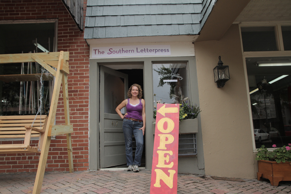
SOUTHERN CHARM
I run The Southern Letterpress in Northport, Alabama. It is the narrowest print shop in the country: 6 feet wide and a city block long. In it, there are 52 cases of type, a basic bookbindery, a photo polymer plate maker and a Vandercook SP-15 printing press. I’m a book artist and letterpress printer, originally from Rochester, New York. I’ve been making artists’ books and multiples since 1994, and letterpress printing since 2006. My collaborator Bridget Elmer and I are building The Southern Letterpress to provide letterpress artwork, products and printing to undeserved areas in the Southeast. I work in Northport, Alabama, and Bridget is setting up shop in St. Petersburg, Florida.

LETTERPRESS PASSION I took a weekend class at The Center for Book Arts in New York because I wanted to print a book with beautiful text. I had been making digitally printed artists’ books and multiples, but when I saw the level of craft involved in letterpress, and how great the type looked (especially compared to a digital print), I was hooked. I soon left my day job in commercial print production in New York City to move to Alabama where I studied letterpress as part of my MFA in Book Arts at the University of Alabama. Since then, letterpress printing has slowly dominated my life and has become the impetus for many major life decisions. Printing is what keeps me grounded, especially now that I own like 3000 pounds of letterpress stuff.

INKING UP IN THE HEART OF DIXIE My print shop in located in historic downtown Northport, Alabama. The space used to be an alley between buildings which someone put a roof over and made into a long, narrow building. Before I moved in, the space was used as an art gallery, a lunch counter and a newspaper office. I’m across the street from The City Cafe, which has one of the best meat and three lunches. The Southern is next to a locally owned and very well stocked hardware store, Anders. Kentuck, an amazing art museum, is one block away.

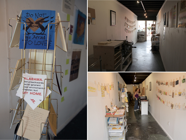
I am part of Northport’s monthly Art Night. I typeset a simple, one color, text-based broadside, and invite everyone in the community to come try out the Vandercook and print one copy for free. The idea is that if you visit the shop every Art Night, you slowly accumulate a portfolio of prints for free. I started the print shop in Columbus, Mississippi, one floor above a still-printing newspaper press. The name of The Southern came from the first newspaper printed in Columbus, in the 1850’s.

PRINTING MENTORS Glenn House Sr., Joan Lyons, Amos Paul Kennedy Jr., Sarah Bryant, Jessica White, Bridget Elmer, Emily Tipps, Walter Hamady (Hamady is a mythical mentor, because I am mentored by looking at his work… I’ve never actually met him) and Steve Miller.

Boxcar talk with Jessica Peterson from The Southern Letterpress

THE DAILY GRIND I like to collect narratives, and print them typographically. I can’t draw (even after years of art school) so I love letterpress because I can use printed words to create image. The narratives I collect range from a simple quote to a whole story. For example, I have a postcard that reads “short haul”. This is a phrase from Gordo, Alabama used to describe the process of moving a large and heavy object a short distance, as in “I’m going to short haul this Vandercook across the street right now.” I also collect longer narratives about a range of topics: race in the United States, hurricanes and forgotten places. I make these narratives into artists’ books. Cause and Effect, which I wrote, made the paper for, designed and printed, describes how I learned about my connection to the 1964 race riot in Rochester, New York while living in Alabama.

Boxcar talk with Jessica Peterson from The Southern Letterpress

FULL TIME FUN I am a designer and printer. My goal is for my day job to be printing, both commercially and as an art practice.

Part of the challenge of working in an area without much letterpress or art is that you have to introduce your potential clients to the medium, and teach them about why they should want letterpress printing. I sell my artist’s books to special collections, and my prints in area stores. Right now, I’m working on a line of souvenir postcards for Columbus, Mississippi and Northport, Alabama, two places that have tourists, but no postcards. I teach book arts, graphic design and letterpress to make ends meet.

Boxcar talk with Jessica Peterson from The Southern Letterpress

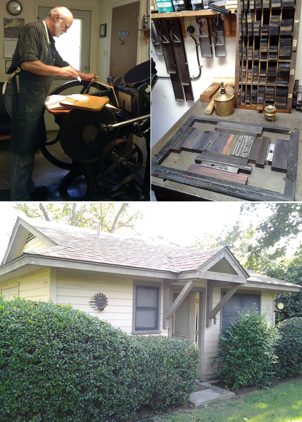
LOVE AT FIRST SIGHT I found my Vandercook SP-15 in 2009 in the basement of an old farmhouse in New Jersey, where it was sitting disassembled in about 10 different parts for the previous 20 years.

It was very dirty and rusty, and no one knew if it would even work. The only way to get it out of the basement was to lift each piece through a small 1 foot by 3 feet basement window. I had pieces shipped down to Gordo, Alabama where I was living. I spent a year and a half removing rust and cleaning the parts, and figuring out how to put the pieces back together. Through that process, I learned how Vandercooks work. I know my press very well.

SPREADING THE ART OF LETTERPRESS I am proudest of how I got my press and my work. I try to use my press and printing to serve my community in some way. The places where I live don’t have a great deal of access to art, graphic design, typography. Sometimes I miss living in a big liberal city like New York City, but I am proud of the work I do in Alabama and Mississippi to spread art and printing.

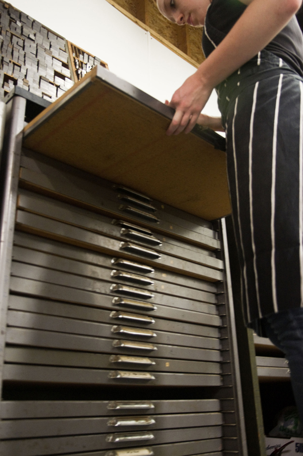
BOXCAR’S ROLE My Boxcar base! I like to print artists’ books on handmade paper, and photopolymer plates make that process feasible.

My last book, Ma’Cille’s Museum of Miscellanea, was 80 pages, and about 14,000 words. Without photopolymer plates to print the text with, I would still be typesetting today. Also, even though I’ve adopted the South, I will always have my upstate New York rust belt pride, and therefore I love supporting a company in Syracuse.

Boxcar talk with Jessica Peterson from The Southern Letterpress

SHOP TIPS I think no matter what, you have to keep printing and keep finding things that you are interested in printing.

COMING SOON The Southern Letterpress will grow, and succeed. I am really excited.  (I’m also excited about figuring out how to get around Alabama football merchandising licenses and copyright so that I can print a bunch of Crimson Tide items for the fall football session. Roll Tide!)

A huge rolling round of thanks out to Jessica of Paper Souvenir for letting us get a glimpse of her letterpress finesse!

Festive Fall Vector Set

With cooler weather in full swing, we thought a cheery vector set to warm the soul was in order! This (free!) festive set includes a haute shoe set pattern, an awesome autumn pumkpin, and a plethora of fun + festive graphics to ring in the fabulous fall season. All are free for use and in both EPS and PDF format . Cheers!

Get your goggles!

We put together a stack of eye-popping set-up sheets with layers and layers of our neon Day-glo ink that had been run through the press several times. The glowing result became a light source of its own! This is the Bella Figura design Polka Stripe designed by Erin Jang. It is a design meant for Great Fun!

neon letterpress at boxcar press

Boxcar Talk With Anna Tomlonson

Michigan is a swirling eddy of vibrant creativity and a full force of passionate people. From the endless cherry farms in Traverse City, the delightful scents of pasties cooking in the breathtaking U.P, and of course, the energetic letterpress work of Anna Tomlonson of Ginger Tree Press from Kalamazoo. Working with a keen know-how of typography and a fiery passion for detail & craftsmanship, Anna stops for a minute between runs to let us in on the loves and labors of letterpress.


1-2-3 TYPOGRAPHY
I have a BFA in Graphic Design from Western Michigan University. I thought I wanted to go into Interior Design, but a freshman foundation design class and a lecture on typography by visiting designer Wolfgang Weingart prompted me to apply for the Graphic Design program instead. It was the idea of typography that is what first drew me to graphic design and, later, to letterpress.

GIVING SOME LOVE TO LETTERPRESS A few weeks before picking up the press, I took a letterpress workshop at the Kalamazoo Book Arts Center, which is located just down the hall from my current studio space and has been a great resource. In the workshop we learned the basics of setting type, locking up a form, and proofing a design. My Chandler and Price was quite different than the presses we worked with in the workshop and when I started printing on my own, I only had a vague idea of how my press ran, which I gathered from taking the press apart to move it.


It was a combination of Elementary Platen Presswork by Ralph W. Polk, Boxcar Press’ videos, and a good deal of trial and error that helped me amass what printing knowledge I have.

As I became more comfortable with printing, it felt more and more natural. I have always been very detail oriented and I have fallen in love with the problem solving that printing on a hundred year old press requires. In my design work I have also always been most interested with the substrate, in fact, it was the basis of my bachelor’s thesis. Having such a close relationship to paper choice and printing technique is one of the things I find most exciting about letterpress.


MUCH ADO IN THE MITTEN
My studio is in a building called the Park Trades Center, it is an old warehouse that was converted to artist studios in the early 80’s. It is right downtown and participates in Kalamazoo’s Art Hops, a monthly event where downtown businesses host area art work and artists open their doors to the public. It has proven to be a great marketing tool.


INSPIRED BY CRAFTSMANSHIP
 While I don’t have any one particular printing mentor, I am always inspired by printers whose focus is craftsmanship.

CREATIVE GEARS IN MOTION I always start a design on paper, creating a word list before I even start sketching. If I am working for a client, I am trying to find a direction that is appropriate for their particular project. If I am working on a project for myself it helps to narrow down my focus and create guidelines for the project. I have found there is nothing more challenging than a project with no restrictions – it is hard to do anything when you can do anything.

DESIGN + PRINT Since my background is in design, I often think of myself as a designer first and printer second. My work falls into three categories: non-letterpress design work, letterpress for fellow designers, and most often, seeing the job from ideation and design through printing.


FULL TIME FUN?
I don’t print full time, yet. I also do the food ordering for a local gourmet food and wine shop. Half of the week is pure studio time, and the other half I like to print after work with a chunk of cheese and a glass of wine.

LADY LUCK I found my first press very much by chance. A friend of my dad’s was trying to sell his parents’ house, which had a complete print shop in the basement. They were struggling to find someone willing to buy everything and, preferring not to turn it into scrap, they were looking to give it away. At that point owning a press was more of a long-term fantasy than short-term goal, but it was an opportunity I couldn’t pass up. To say moving the press was a struggle is putting it lightly. Thankfully, I have some dedicated friends who spent a 17 hour day with me, in mid-August, hauling as much as we could out of that basement and back across the state.


SHOP TIPS
Find mentors and ask for help, both in business and in printing. While there is something to be said for figuring things out for yourself, building a network and learning from other people’s experience is an invaluable asset.

WHAT’S NEXT Next on the list of skill sets to teach myself is die cutting. An old blueberry box full of dies was one of the treasures that came with the press, and I’m excited to put them to use. I am also planning my first workshop for this fall and starting on designs for a full holiday collection.

Huge thanks to Anna for letting us getting a sneak peek at Ginger Tree Press!

The Letterpress Roundtable, Part V: Ink in the Blood

For the fifth installment of our letterpress roundtable discussions, we asked some of the printing and designing world’s die-hard denizens to show off their love of all things printing via their tattoo work as well as the stories behind the ink. And trust us, there’s always a good story to be told.  As always, we’d love to hear of your own stories embodied in tattoo-form in the comments section!

Mark Herschede – Haven Press Studio

I decided to get a Fuchs and Lang litho press tattooed on my back as a kind of homage to what is no longer made, and had plans to compliment it with an old style C&P 10X15 eventually; obviously not two at a time. These were by no means my first tattoos, and so I knew what I was getting into and knew what I wanted out of the artist. I found the appropriate engravings and took them to a few tattoo shops and talked to some folks/had consultations, and eventually settled on a fellow named Josh Egnew at 3 Kings who I had worked with before. Firstly, he did such a great job with the Fuchs and Lang that I was excited to bring him the drawing of this C&P; he kinda balked at it at first, as it was even more of a p.i.t.a. than the litho press, but after taking the time to trace it out for a transfer – he seemed happy enough, but a little bit reluctant. It took 2 sessions: one to outline and handle some of the shading, and the other to finish up the shading. By comparison, the litho press took him one session. I’m sure I squirmed a lot more for the C&P.

In the end I know he was very happy with the results, and the work is slightly out of character for him, but it was first rate work and the whip shading he used was top-notch. I can honestly say I will not be very likely to get anything as ornate or difficult to work with as this press, but I feel it is a commitment to what I love to do – and a fitting illustration as homage to this lovely breed of art that, if you are reading this blog, you undoubtably know and love yourself.

Stephanie Laursen – StephanieLaursen.com

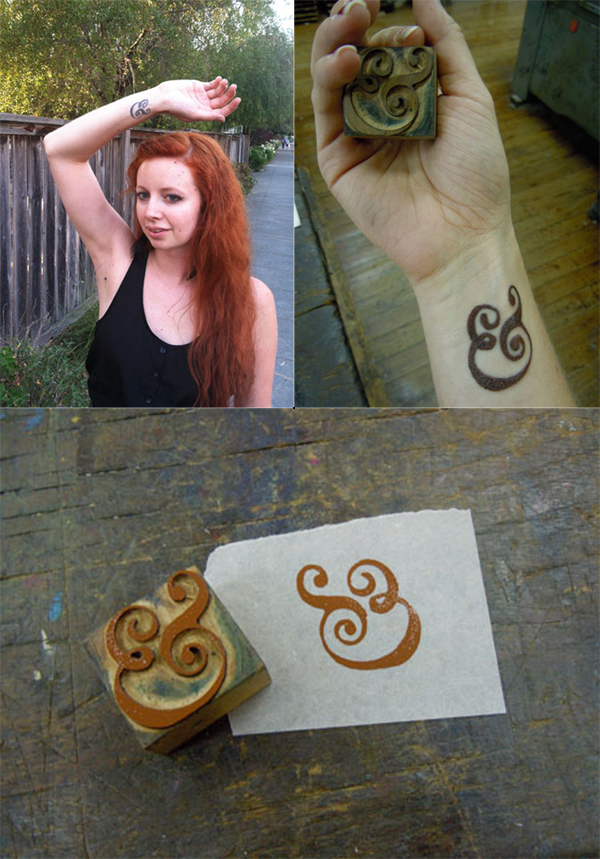
When I was about to graduate from CCA (California College of the Arts) with a degree in Graphic Design, I knew I wanted a bit more of a hands-on approach to design in my life than most of my classes had emphasized (I took a lot of letterpress and bookmaking on the side to make up for it). On a whim I applied to the Hatch Show Print internship program for the month after graduation, and I got accepted! Thus, my boyfriend and I relocated to Nashville, Tennessee for 6 weeks.

While at Hatch I got some AMAZING experience playing with type, designing and printing, and learning about the history of letterpress. I knew I had found my calling, and I felt that it was such a milestone experience that I wanted to get a tattoo to commemorate it. I have always loved the Caslon ampersand, and ampersands in general (my cat is even named Ampersand), so when I saw a Caslon ampersand woodblock at Hatch I knew it was the tattoo I wanted. My other tattoos are kind of hidden, so I also knew I wanted it in a place I would see (and others would see) all the time, which is why it’s on my wrist.

I pulled a print of the woodblock, and took that to the tattoo artist to copy. I specifically wanted it to have some woodgrain texture so it would look more like woodtype, and less like digital type. Overall, though getting the tattoo hurt a lot, I absolutely LOVE my tattoo. It is a constant reminder of my passion for history, letterpress, and things that are well crafted and handmade.

Nicole Monforti – Headcase Press

While I was at the Ladies of Letterpress conference this year, I decided to get a type related tattoo as a souvenir. It’s a less obvious version of mind your p’s and q’s. When I look at it, it is a p and q within curly brackets and from the perspective of someone else, it is a b & d.

My part time employee at the shop Bill also has a p’s and q’s themed tattoo. His is much more obvious with the actual moveable type forms tattooed with the wording of “mind your” I’m not entirely sure why he got his, beyond a love for letterpress.

Roberto Hidalgo – Unrob.com

I had the tattoo done just a few months after dropping out of college here in Mexico City. My job back then required me to do a whole lot of print work for the company I used to work. However, being so inexperienced and contact-less after dropping out, I had to try quite a lot of print shops, most of which produced less-than-stellar results.

One thing I never got to learn while in school was color matching and the whole printing process, since most of my education was focused around digital output. It took me a really long time to get the hang of these concepts, trying out an endless list of shops and ruining, I’m sorry to admit, quite a bit of paper in the process. At the time, I chose to have the tattoo done since it was very useful to have this comparison point readily available, almost at my finger tips. Now a days, it’s more of a welcome reminder that learning about anything is more akin to a practicing a craft than carrying out a job.

Mark Cooley – Graphic Designer

I’ve always been a fan of type. The obsession started early, practicing the “Metallica” lettering style over my folders in 5th grade. The natural gravitation from music and art eventually led me (narrowly dodging guitars altogether) to a career in graphic design.

It was only natural when planning for a tattoo to use a ligature as my trade symbol. After a bit of research and  exploration, I found this italic ampersand an allegory of my life: … always looking to what comes next...  Over the years I’ve see a few other ampersand tattoos, but something about the way this one’s shaded and the subtle wrap of the terminals around my forearm have kept it distinctive.

Keegan Meegan – Keegan Meegan and Co.

I have many tattoos large and small, some of them pertain to printing and the rest are Victorian Luddite sentiments. The first and second printing tattoos I got at the same time: an ink brayer and a copy of a “poison” skull from ludlow specimen book. The third is the now famous “apathetic ink knife” of which is a bit cathartic now since some how it proliferated the web a bit after I got it. A friend of a friend drew it (lithoshop) and one of my tattooing friends convinced me to get it. The next one will be a little guy of a windmill……

Do you or someone you know have ink in the blood? Let us know in the comments section below! We’d love to hear from you!