It’s 2002 and I’m in the final stretches of finishing my MFA thesis project. Typography is involved, and I have my heart dead set on using Satanick also called Tell Text or Troy, which was designed and cut by William Morris for his Kelmscott Press. There is just enough of the lead Satanick at Columbia College to set a headline for the broadside, a piece about pepper with Salman Rushdie’s text. I make desperate pleas to buy or borrow the type on various letterpress listservs and receive paternal-not-patronizing replies. If folks had this font, they probably wouldn’t lend it out. And the Smithsonian had the mats an abbreviation for “matrix”, a mould for casting type used in letterpress printing. Below is a photo (by Robert McCamant, taken at Jim Rimmer’s studio) of individual matrices or mats loaded into a matrix-case.

at one time but rumor has it they lent them out and somehow they were lost for good. A big dead end, but fate delivered P22.
P22 is a digital type foundry specializing in the creation of “computer typefaces inspired by Art, History, and sometimes Science.” For less than thirty dollars and ten minutes, I have downloaded and installed P22’s newest font, Morris Troy. I print the broadside using metal type and photopolymer, side by side. It takes two passes on press, but only the most discerning type nut would know.
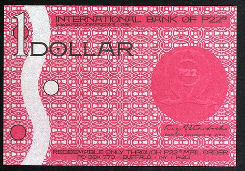
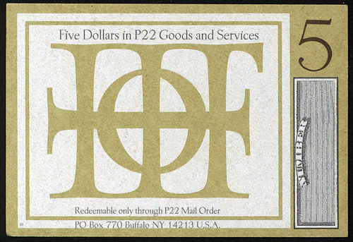
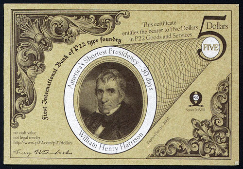
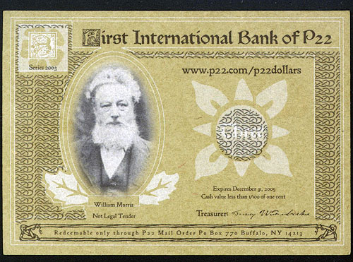
P22’s the origins of the company name can be traced back to an old rubber stamp discovered on the storeroom floor of Kegler’s father’s hunting and fishing shop. His best hunch: it refers to a fly-fishing fly. The random letter and numbers were embraced as a “mysterious fictional multi-national umbrella corporation.” head type nut Richard Kegler calls himself a “typographic archeologist” and, with wife Carima El-Behairy, leads a collective of type foundries under the P22 umbrella based in Buffalo, NY. For graphic designers in the 1990s, P22 was a typographic candy store with unusual “artsy” fonts packed with alternate characters and coordinating dingbats. Fonts arrived mail order in gorgeous packaging accompanied by P22 Dollars that could be used towards future purchases, but the faux currency was so lovely in design and print they became instantly collectible. Inspired by S&H Green stamps, store coupons, Bauhaus artists (such as Herbert Bayer 1900-1985, Austrian graphic designer and architect who directed the Bauhaus printing and advertising department in the 1920s), and German and Austrian currency, designers utilized P22 fonts and ornaments to turn what could have been mere coupons into dainty type specimens.
Not your typical type
Kegler created his first font in 1994 based on the handwriting of artists Marcel Duchamp and Joan Miro as part of his master’s thesis. “Not typefaces in a traditional sense, the Duchamp font was an attempt to use Duchamp’s own methods of random selection and appropriation in a self-referencing homage, and the Miro font was an attempt to extract a full alphabet from the forms found throughout Miro’s Constellation series of paintings,” says Kegler.
In order to create the fonts, Kegler autotraced Duchamp and Miro’s handwriting, then imported the scans to Fontographer Developed by Altsys for the Macintosh in 1986, Fontographer was the first Bézier curve editing software available commercially. Being “found objects” little alteration was required. The fonts were packaged on floppy disks and sold through a network of museum gift shops, which already carried Kegler’s handmade blank books. Sadly the fonts are no longer for sale—a lesson learned about copyright, trademark and public domain.
Collaborations with foundations and museums followed in the creation of more P22 fonts, which Kegler describes as “at times vaguely pastiche yet with a real reverence to the source materials.” The Guggenheim collaborated on a Josef Albers font, and the Whitney cooperated on a Daddy-O beatnik set, providing examples of lettering on 60s era paperback novels and jazz albums. The Daddy-O fonts have appeared on numerous CDs for bands like Esquivel and Xavier Cugat, all produced by P22 fan Rod McKuen. Once formally introduced, the foundry and the musician made beautiful music together: a CD version of McKuen’s Beatsville album including a new track plus the picture font Daddy-O Beatsville.
Fourteen years of P22 history include collaborations that—like working with Rod McKuen—seem to happen by chance, but evidence Kegler’s persistence and devotion to the history underlying his craft. In 1996, The London Transport Museum approached P22 about developing a transportation font for their Children’s Museum. While pursuing the design, Kegler took advantage of the opportunity to approach the Museum about digitizing Edward Johnston’s Underground, a sans serif designed in 1916 that inspired modern sans-serifs like Futura and Gill Sans. London Transport was infamously protective of the font, so Kegler figured no one else would even pursue the matter. “Our first inquiries were dismissed. The children’s font luckily never saw the light of day, but from the ashes of that project rose a new attitude at London Transport that our first proposal might just be agreeable,” says Kegler.
Letterpress prints of Johnston’s original woodblocks were provided as source material, and imperfections like “bumped corners” were intentionally added to keep the look authentic, not sanitized. Pictorial elements were added, inspired by train station tile, cabin upholstery and original maps. Font users can tie together elements to create winding, bending lines of train tracks complete with stations. The Underground set was a smash, a must-have for many designers’ toolboxes: “I think the history is more than 50% of its appeal,” says Kegler. “Designers know it the way musicians know Johnny Cash. Even if you aren’t a huge fan, you recognize the iconic stature and greatness.”
Because P22 fonts are so recognizable, the danger of overuse and abuse is a distinct possibility. Several global coffee companies used the script font Cezanne simultaneously, and now multiple chocolate makers have embraced the face, from artisans to Hershey’s. According to Kegler, “the Arts & Crafts font was used by just about every other person in the village of East Aurora, New York, where the Roycroft Campus is situated. Since this was the lettering by Dard Hunter that essentially made the Roycroft visual identity, people there wanted to use it. I tried posting a tip to help but there are still lots of stretch versions with random alternates on expensive signs all over the place.”
Many of our really nice fonts I have seen in awful settings and some of our awful fonts I have seen in great settings. A font is a tool. That is the risk of making a tool, it may cause people to do great things or hack away and make a mess.
P22’s umbrella grows
As P22 grew over the years, separate divisions were formed with distinct identities—basically font boutiques. International House of Fonts (IHOF) was formed to sell the work of freelance font designers, with online-only sales in contrast to the P22 boxed sets sent via mail-order. In 2003, the Sherwood Collection was added to feature Ted Staunton’s historical fonts, a good fit with the P22 family. Staunton began working as a graphic designer, wood engraver and letterpress printer in the 1960’s and–with a life-long interest in type–knews his way around its design and history.
In 2004 a tremendous opportunity to expand P22 arose with the acquisition of the Lanston Type Company, along with more than a century of history tracing back to the monotype caster. In the late 1800’s Tolbert Lanston patented a mechanical typesetting machine which became the Monotype caster. Using “hot metal,” the machine cast individual letters (in contrast to a Linotype, which casts slugs containing text for a whole line of type and is best suited to newspaper production’s quick set, melt and reset) which allowed for simple correction of mistakes as needed. By 1906, the machines were fitted with keyboards and improvements that allowed for automatic justification. Lanston manufactured these casters, supplying type to fulfill a growing need for quality printing, especially in the production of books. Frederic Goudy served as Lanston’s art director from 1920-47, creating over 100 classic typefaces.

Gerald Giampa, previous Lanston Type Collection owner & letterpress printer
(photo: Gerald Giampa’s web site)
P22’s Lanston Type Collection underworld rise of the lycans HD download features 272 fonts, including faces by Goudy and Sol Hess, who managed the Lanston library. Digitization was based on the metal patterns used to make the master punches from which type was cast, a process began by previous Lanston owner Gerald Giampa. These 3 x 4” patterns are used in combination with printed samples as references to work out spacing and kerning. One of the earliest developers of Postscript fonts Postscript is a language developed by Adobe Systems in 1984 that, along with the Macintosh computer, allowed computer typesetting to thrive, Giampa oversaw Lanston’s transition from hot metal to the digital era and continues to consult with P22. “The Lanston collection gives P22 an authentic typographic pedigree,” says Kegler.
The description of Kegler as an “typographic archeologist” is apt as he describes the process of digitizing the Lanston collection: “We search for the best possible specimens of each face and scan at high resolution. We also look for alternate sources. For LTC Metropolitan Italic (Frederic Warde’s Arrighi) we innocently asked during a visit to the Cary Collection at Rochester Institute of Technology what specimens they had in their collection. I was unaware they had the actual punches for Arrighi! That helps to get a true sense of the intention of the design. Arrighi also had an early version with the ascenders turning in the opposite direction of the final version, so we incorporated both versions so with OpenType you can choose from two style of ascenders within one font, so we look for alternates and proofs as well as the ‘official’ release versions of Lanston faces.”
Canadian type designer Jim Rimmer was brought on board to assist in the development of the Lanston collection since he had worked on many of the Lanston designs for Giampa. “When we acquired Lanston,” says Kegler, “there was some confusion over the ownership rights to some of Jim’s original designs that came with Lanston. We wanted to be sure that Jim had proper attribution and royalties. That led to the formation of “Rimmer Type Foundry” as a single entity which offered Jim’s digital designs at P22.”
Collaborations between Rimmer and Kegler continued. Kegler suggested developing one of Rimmer’s metal typefaces as a digital font. Rimmer had bigger ideas: for the first time, a simultaneous offering of a new font in both hand-set metal and digital form. Using the computer program Ikarus, Rimmer designs characters with a plotting pen and outputs to a laser printer. A paper master pattern and working lead pattern are then developed, scaled to a 16 point brass matrix to allow for casting of single pieces of type. Frederic Goudy followed a similar process—without the assistance of computer and printer—for hand casting at his Village Type Foundry.
Rimmer’s typeface is named Stern, in memory of Chris Stern, a talented Seattle artist and printer who died in 2007. Kegler has recorded the font’s development with a documentary filmed at Rimmer’s studio to premiere in 2009. A booklet filled with lush duotones taken throughout the process is in production at Coach House Press in Canada, and—along with the Stern font—will be available at TypeCon2008. Typographers attending the conference will also be the first to see a trailer for Kegler’s documentary.
TypeCon, presented by The Society of Typographic Aficionados, takes place in Buffalo this year under Kegler’s leadership. A mix of speakers, workshops, exhibits and tours are piled into five dream days for type nuts from all over the world. Kegler notes: “Some of the highlights are outside of the main conference track at partner facilities: Pecha Kucha at Hallwalls; Stefan Sagmeister at the Karpeles Manuscript Museum; NLXL at the University at Buffalo; and Erik Spiekermann German typographer and graphic designer, founder of the firm MetaDesign at the Albright Knox Art Gallery.”
Kegler also has big plans to unveil the new home of the Western New York Book Arts Collaborative during TypeCon. Using his supreme skills at collaboration, Kegler pulled together a rich collection of arts organizations, printers, and book artists to create WNYBAC, dedicated to the printed word and image. While the group has previously offered lectures, classes and exhibits in various venues, the new building will house binding and printing equipment (donations Kegler is hard at work gathering) plus offer permanent space—much like community-based book arts centers in New York or San Francisco.
Kegler keeps his own hands-on connection to type history by binding in his home studio or printing at Paradise Press, a local letterpress shop, when possible. “The minimum is a Christmas card each year. I learned bits here and there from Paradise proprietor Hal Leader (who was the apprentice to one of the last Roycroft printers, Emil Sahlin.)”
Though P22 utilizes letterpress printing with photopolymer plates in their marketing materials, Kegler hasn’t tried the process yet. Kegler took photopolymer into account with the digitization of the Lanston collection. “We actually made fonts available in two weights for photopolymer use and compensation for gain but have not had discernible feedback to say whether anyone really uses these as intended. I would think good presswork could do more to avoid gain than altering fonts.”
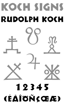
Kegler’s favorite font in metal? “I think Neuland, since every letter is different at every point size and the medium and technique by Rudolf Koch German type designer known for his craftsmanship as punchcutter at the Klingspor Foundry in Offenbach, Germany during the 1920s and 1930s <img class=”photoborder-thintwo” align=”right” src=”/wp-content/images/koch-photo.jpg” alt=”Ruldolf Koch” really defined the look.”
The original Neuland was designed without the aid of patterns or pantograph, each point size punched and filed like one-of-a-kind sculptures. If you can’t get it in metal, there is P22 Koch Nueland, which is intentionally spelled differently than the metal font and subsequent digitizations that preceded P22’s. Yet another fine collaboration, it features alternate characters designed by Koch, lost in previous digital fonts, then rediscovered by Kegler through researching original sources like a Dutch sample book and sign painter instruction manuals. In keeping with the typographic archaeologist’s other work, the task was approached with reverence.




Great site. Thanks.