The L Letterpress can produce nice printing. No, really, it’s possible. Note: I didn’t say “easy.”

When I first saw the QuickKutz L Letterpress earlier this year I was troubled (as were many of the other professional letterpress printers I knew). It seemed like it would cheapen and denigrate our 550 year old craft and confuse people who are used to high quality letterpress printing. If you comb the internet, you might still be able to find some of my irate comments on blogs denouncing the machine.
But rather than writing the machine off, I’ve recently tried to come to terms with the machine. Whether I like it or not lots of people will be buying this press and hoping to have fun printing. (They’ll probably have a lot more fun than many of us professionals making a living by printing!) Some of the new printers will hope to sell quality printing made from it. It’s really in everyone’s best interest to make sure these new additions to our tiny letterpress community have the best materials and techniques at hand…so that they make letterpress look as good as possible. I don’t want letterpress to have a bad name!
My hope is that by sharing some time-tested letterpress techniques (that aren’t in the manual), I can help L Letterpress printers from getting discouraged. And without help, I think the press can be very discouraging. Eventually, my hope is that these new printers will use the L Letterpress as a stepping stone to a more substantial press, say a 13×18 Heidelberg Windmill, and that they will help preserve the craft and equipment for future generations to cherish.
After spending a few days tinkering with my own L Letterpress, I’m convinced that quality printing is possible on this machine, but it’s not going to happen “out of the box.” It’s not going to be very easy, either, but with enough patience and effort it can be done. Anyone who wants to make nice prints on this press is going to need to make five changes right off the bat. These often reflect techniques that letterpress printers have used for over 500 years, but somehow didn’t seem important to the L Letterpress manufacturer. The press itself is fine. Don’t tell anyone with a Kelsey that I said this, but for single-color printing it’s probably going to give you better results than an old cast iron Kelsey press, if you use it right! You just have to learn how to “mod” it to print well:
1) Throw away the supplied ink roller and buy yourself one that will work.
Why? This is the most important thing you can do to improve your printing on the L Letterpress. As with a big cast iron press, you will never get quality printing without quality rollers…and the manufacturer has not shipped a quality roller. The manufacturer’s ink roller was too hard for letterpress printing. It wasn’t even round, and had “dry spots” when I rolled out ink on an ink slab.

I didn’t even try to pull a print with the supplied roller because it was so obviously problematic. Fortunately I had a big printmaking brayer that’s used in hand printing woodblocks laying around the shop. (You don’t need one that’s nearly so big, this roller is definitely overkill. My point is that you need a soft roller that’s round and wide. )
How to do this? Purchase a printmaking brayer. You can get these for under $10 from your local art store, but I’ll recommend a few that are a little more “up-market” so that you can be assured your roller will work.
Here’s my top choice, if you have the money:
B4802 6.5” x 1.75” Japanese Soft Rubber Brayer $59.75
And then there’s this (along with a lot of similar rollers) which will get the job done:
54129 Speedball 6”x1.25” Soft Rubber Brayer #66 $11.70
(This second brayer is also available at many art stores around the world. The key is the word soft.)
You’ll see why I’m suggesting such a wide (6 inch) roller in my third tip. Also, you’ll probably want an ink knife (shown in the background of the photo above) from a hardware store—check the paint section. This should only cost you a couple bucks. I’ll post shortly with some more specifics on how to ink more consistently. Start here, though!
2) Throw away the supplied plates and make yourselves custom KF152 photopolymer plates.
Why? With just two impressions on the L Letterpress, we had shattered the plastic plates the manufacturer had supplied. A quick Google search showed that we were not alone. Clearly, the plates that ship with the press are made from a material that is not suited to the pressure involved in letterpress printing. Thankfully, we have been making custom photopolymer plates for years that do withstand the pressure of letterpress printing. Our plates are resilient and bounce back after each impression. They won’t shatter if you handle them correctly (keep them out of light when unused and sealed in the ziplock bag provided).
How to do this? Order letterpress plates from us! Our plates are designed to handle the stresses of letterpress printing. Just request the KF152 plate material from our online order form. Our plates come with adhesive backing already on the plate and with a letterpress-printed proof to show what the plate will print like when you start—and when you finish—your printing! You’ll receive them sealed in a bag, so all you have to do is remove them, peel, and stick.
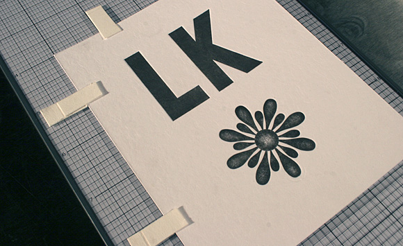
Please note that every plate we made is custom, and we don’t have a catalog of stock plates. We just ask that you send us a PDF or a file suitable for graphic design (AI, EPS, etc.) and we’ll ship you back a plate of what you see on the screen. Also, read over our tips for file submission, which has detailed instructions on preparing custom artwork for letterpress. Real quickly: make sure everything is 100% black, line art, crisp. Feel free to contact us with any questions or concerns you might have about sending us custom artwork for your L Letterpress!

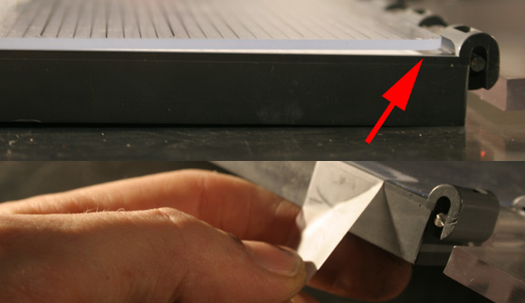
The KF152 is the same thickness as the plates supplied with the L Letterpress:
3) Use roller bearers to ink your plate consistently.
Why? You’re hand inking on an L Letterpress. Inking in letterpress is very touchy, so slight deviations in the pressure or the angle of the roller are going to be visible on the printing. This problem dates back to the handpresss era of letterpress, when rollers were first invented in the 19th century. The solution always has been to put roller bearers to support the roller alongside the part that you want to ink. This will be easier to show with a photograph (again, ignore the massive roller, which is overkill):

You can see that two thin strips of plate material—which are the exact same thickness as the plate—are supporting the ink roller on either side of the plate. This keeps the roller parallel thereby keeping it from exerting too much pressure on the plate. You’ll know you need to do this if your printing appears splotchy, bloated, or isn’t crisp; it will probably never be crisp without roller bearers unless you are superhuman!
How to do this? There’s no additional cost—how about that? Prior to shipping your plate, we have a border around the plate material that would make perfect roller bearers. We usually cut this off prior to shipping the plate out because most people don’t ink by hand. You can simply request that the plate is not trimmed down when you place an order, which will give you strips of material which you can cut down to place alongside your printing plate.
This is our KF152 plate material, available for order via our Platemaking service
Ink up with the roller bearers perpendicular to the direction you’re rolling the roller. When you’re done inking for each print, remove the bearers and set them aside to use on the next print. It’ll add a few seconds to each print but it will improve your printing considerably!

Make sure to peel off the inked-up bearers when you go to pull your print (you don’t actually want these to go through the press). You can put them back down when you’re ready to ink up your next print.
4) Throw away the sponge foam for positioning the paper and use paper “gauge pins” instead.
Why? There are several things keeping you from printing in good “register” on the L Letterpress. The biggest problem is easily solved with a few pieces of paper and double stick tape. The manufacturer instructs you to position your paper with pieces of adhesive foam that stick down to the press bed. One look at that idea and I said, “no way!”
First of all, the foam pieces are not very re-positionable if I want to move them to align the printing. And secondly, the foam is very squishy so I can never be sure where the paper will rest. No letterpress printer in their right mind would use foam to hold their paper in position! We (printers) are accustomed to much more accurate placement of the paper because we have to print multiple colors in register on top of each other. If you’re planning on multiple colors printed on your piece, listen up! While it’s not a traditional solution, people have been making paper “gauge pins” (this is the name of the pins that hold the paper) for ages as a way to hold the paper in a tight squeeze.
How to do this? I used a few pieces of the paper supplied by the manufacturer to make my gauge pins. First I cut six ¼ inch by ½ inch strips.

Then I used double-stick tape to adhere three of the tabs down the press bed where I wanted the paper to be. Finally, I adhered a thin strip on top of these tabs to hold the paper down and in place. The paper we print on will slip under these top strips and bump (securely) up against the bottom tabs. Since the paper is much thinner than the printing plate, you won’t see any indentation where the top strips overlap your piece of paper after squeezing them in the press. If you need to re-position the gauge pins, they peel up nicely and you can move them around to square up your plate to the sheet you’re printing on.
Note: I used our Boxcar film adhesive for the double stick tape, which we sell as a way to mount printing plates. Since this is a re-positionable double stick tape, it fit the bill for this application as well.
In this photo, you can see a comparison of our KF152 plate (top) with the cupped plastic plate that ships with the machine (bottom). You can also see how the paper gauge pins are holding the paper in position.
5) Tape the press bed down to keep it from moving around.
Why? After a few impressions I noticed that the press bed itself was getting warped. At this point, I also realized that the press bed doesn’t fit perfectly into the machine, it actually has some slop in it. This means that the paper will not be registered to the plate every time you pull a print. To keep this from happening, tape down the press bed at the corners to keep it from moving around.
How to do this? Scotch tape! Letterpress printers are very fond of this supply. Make sure you always have some on hand in your L Letterpress print shop.
Note: I still noticed slop in the registration of the machine, because the hinge that the plate sits on also is pretty sloppy. I can’t figure out a quick or cheap way to improve this, so you’ll just want to be mindful of this looseness if you’re planning on printing multiple colors on top of each other in tight register. Always try to position the panel that flaps down over the plate in the same spot relative to the press bed.
Printing on this machine is still going to take a lot of practice. How much ink do you put on the plate? How do you get multiple plates positioned correctly? I’ll post some more ideas to help you out with your printing in some upcoming blog posts. But for now, I just wanted to point out quick, simple ways to make good printing possible. It’s my opinion that the L Letterpress printing press can actually print well—if start by following these five tips when you start using it, and keep at it long enough. There is going to be a bit of a learning curve, but I hope these tips will at least get you started in the right direction.
I hope this is helpful! If you’ve just bought an L Letterpress, welcome to the wonderful letterpress community! I think you’ll find you’re in good company. It’s a very fun craft to pursue and I hope that these techniques will help you get off to the right start. Let us know if you have any questions or concerns via the comments here and we’ll try to help you out as best as possible!
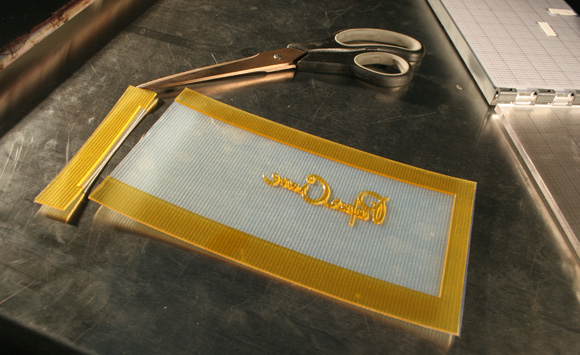
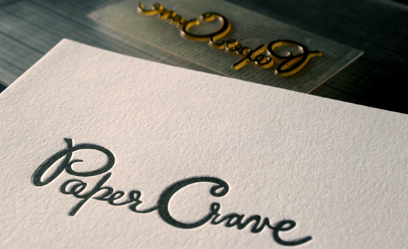 Here’s a nice print we made for Paper Crave. Her blog post got me started on this project. Thanks Kristen!
