Jim Rimmer’s shop is nestled in a yard behind his Victorian house on a quiet street in a suburb of Vancouver, BC. A quaint letterpress placard on the door instructs visitors to walk around. The entrance is graced by a type specimen of Duensing Titling, carved in stone by Rimmer. A tour of this hard working shop, along with work samples and stories shared by Rimmer, makes it clear why he is considered a living national treasure in Canada. There just aren’t many people who can cast type any more, and even fewer who can take the mere idea of a font then bring that idea to form in lead, tin and antimony, ready to print once it cools off. When Fred Goudy was doing such a thing for his Village Press, he had a lot of equipment and craftsmen ready to lend well-trained, experienced hands.
Rimmer has a network of typecasters through the American Typecasting Fellowship (despite the name, an international group) that share ideas and technical knowledge in keeping this craft alive, and member Rich Hopkins sums up Rimmer’s very special skill set: “Jim is truly unique in that he has such an “instant” design flair and has a mastery of all those neat devices he uses in cutting his types.”
In 2006, after 50 years of printing, designing, typecasting and teaching Rimmer was joined by friends and colleagues to celebrate, complete with an introduction by Robert Bringhurst. Dubbed “Rimmerfest”, the event marked Jim Rimmer’s contributions to a craft he continues to keep vital.
Following is a Q&A interview. Also check out Bob McCamant’s article on Jim Rimmer as well as excerpts from Rimmer’s autobiographical book “Leaves from the Pie Tree.”
(Jessica Spring) Your first press was an 8 x 12 Columbian purchased for $30 and “a thing of near perfect beauty.” What were the challenges in using this press?
(Jim Rimmer) The Columbian platen press: the difficulty was in pulling the handle to get an impression. The press was very heavy for its size, but under-engineered. As a result it was very hard work to pull the handle with enough force to get a good impression on any type forme over about 5×7 inches.
Any love affairs with other presses in the past?
My favorite press is definitely the Colts Armory. Its immense strength has made it possible to print two books with large type area with no difficulty. In spite of its age of 105 years and its marked wear, it still prints well with a little care. It’s a good ‘n!
I had a small Reliance handpress a few years ago. It had been in an engraving studio that I worked at as a designer back in 1970. It was used for nothing more than scrunching the metal engravings down onto the wood blocks. I tried to buy it, but no luck. I chased it around town for the next 25 years, until the owner finally sold it to me. I got really broke a number of years back and had to sell it. It was a beautiful thing, and printed well, but printing that way is more idealistic that I wanted to be. Printing on a powered press is work enough.
You’ve been a printer since learning how to set type in 10th grade. What are you most proud of?
I am most proud of being able to stay at the craft more or less without a break for nearly 60 years. Or quite simply, I am proud to have been associated with the craft.
Most of your books include a typeface designed and cut for the project, such as Hannibal Oldstyle for Tom Sawyer. Are the fonts intended for one-time use only, or do you envision other uses?
My fonts will more than likely be used for just the one book. Hannibal may be used again if I have the years left to print Huck Finn. In the past I have preferred to experiment and move on to new type designs.
When you design a typeface do you work differently depending on its final form as metal or pixels? Was Stern a new challenge knowing it would be both?
When I design a typeface in either digital or metal, I think of it being printed letterpress, and envision each letter’s bite into the paper. Though some would argue with this opinion, I think that almost any typeface can be used for either litho or letterpress printing. After all, in the end, they are merely images that are to be laid on paper, and if printed by a good press operator will come out clean and crisp.
Stern was no challenge at all in so far as the two technologies are concerned. The challenge was to make a type that I think Chris Stern would have liked to see printed, or to print with.
You learned your craft after six years as an apprentice only to see the trade give way to offset printing. For folks who missed this transition, what was it like?
At first the decline of letterpress was slow, but soon sped up. Within about 15 years from my first awareness of the decline of the craft there was hardly a Linotype or Monotype machine in town, and presses were relegated to numbering and diecutting. Let me say, it was sad, and I thought (foolishly) that it was fickle and capricious that the shop owners should dump such an honorable craft with its history and grace without a backward glance. What saddened me even more was the indifference of the printers themselves to the loss of letterpress. Some loved to say: “No more dirty type. Now we can wear white shirts to work.”
Any comments on the revival of letterpress and photopolymer?
I am delighted to see so many young and not so young people getting involved in letterpress. Although I have no personal interest in printing from polymer plates, I am aware that they print every bit as well as does metal type. That said, if I had no choice but to print from polymer plates, my interest in continuing on would be reduced by about 99.5%. There is just too much fascination for me in designing, casting and setting metal type.
What has been your biggest challenge as a printer?
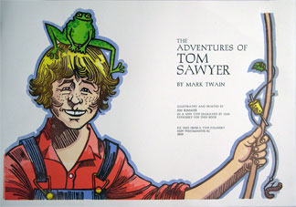
There have been many challenges. My biggest challenge as a printer has been the book I am completing at present: The Adventures of Tom Sawyer. Tom Sawyer has been the greatest challenge from the standpoint of its size. The text is lengthier than anything I’ve done before, and I designed and made the typeface (Hannibal Oldstyle) to run on the Monotype composition caster. This in itself has never been done outside of the Monotype company, I was told by Harry Wearn who worked at British Monotype for many years.
So I suppose the making of the type matrices was the most time consuming and daunting part. Also there are a lot of linocut illustrations which I had to draw and cut.
Your favorite typeface?
That’s a tough one to answer. I love so many of them and I hate none of them, but I have to say that I think Cartier (Carl Dair’s original design, not the handful of re-creations that are out there) is my favorite typeface.
Most of your illustrations are linoleum cuts. What’s the appeal of the medium?

Linoleum cuts from A Christmas Carol , published by Pie Tree Press, 1998. (image: Type Club of Toronto
Linoleum cuts just pluck the strings of my inner harp. I like the rugged gutsiness of them, and I like that each one is a complete surprise once the first proof is pulled. I admire the look of wood engraving, but it’s not for me. I think I lack the skill and the patience to work in that medium. Linocuts suit my impatient nature.
Any typographers/printers throughout history you admire?
Gutenberg; Nicholas Jenson Born in France in 1420, Nicolas Jensen was trained as a goldsmith but became a letter cutter, printer and publisher. While working in Venice, Jenson produced a roman type based on the humanistic scripts of his time. He produced over 150 books, including Eusebius printed in 1470.; FW Goudy Prolific type designer who was a true celebrity in mid-twentieth century America. No, it’s true: a type designer was a celebrity at one point in American history! Goudy’s designs were sold primarily by Lanston Monotype and by his own Village Foundry in upstate New York; Bruce Rogers American typographer and book designer born 1870-1957, known for the design of Centaur, which was a project for the Metropolitan Museum of Art. A special version of the font was used to produce the Oxford Lecturn Bible. Completed in 1935, the Bible was set with a Monotype caster to showcase the machine’s abilities.; Paul Hayden Duensing Jim Rimmer’s good friend and mentor, Duensing was involved in every aspect of the typographic arts. He designed and cut matrices for Quadrata, Chancery Italic, Unciala and Zapf Civilté; co-founded the American Typecasting Fellowship; and wrote numerous scholarly articles on the history of typography. Penland School of Arts and Crafts in North Carolina has named a gorgeous new letterpress and printmaking studio in his honor including a scholarship endowment.; Chris Stern; and my grandfather, Arthur Boutilier.


What an inspiring story! He will certainly be missed by everyone in the craft. He will be missed not only as a designer and craftsman but as an important teacher, commentator and human being in the field of printing. His name deserves to be added to the list of typographers/ printers that he himself gave: Gutenberg, Jenson, Goudy, Rogers, Hayden, Duensing and Boutilier. Many other have made great contributions but the ones on Jim Rimmer’s list did it all and did it so so well.
Perhaps the best testament to Jim will the way we keep his legacy by seeing that his skills get passed down to young folks studying typography and printing, that his beloved equipment, and others like it, are kept and used, that his typefaces are used and his love of the fine printed book is continued.
Many schools are starting or continuing to teach letterpress and related topics. There is now even an association of college and university letterpress teachers. Rich Kegler is probably going to save the typefaces for us. While not type designer or a caster, not a typographer of merit, or even a full-time printer, I am doing something that may help with Jim’s legacy. I am trying to recreate the Roycroft Printing Shop in East Aurora, NY with, you guessed it, five Colt’s Armory presses (These were Jim’s favorites.) Perhaps the circle will be completed some day.
Joe Weber
Pingback: Jim Rimmer Passes Away January 8, 2010 | The FontFeed
Jim and I were old friends. We met in 1978, his shop, called “The Stable” was located at 411 West Cordova, on the second floor of a heritage three storey brick building in Vancouver’s Gastown. I opened Colophon Books next door at 407 West Cordova, a sister building, also on the second floor. We soon met, and naturally his love for printing and my interest in fine books we had a mutual interest. Jim designed, did the linocut illustrations, line drawings, printed letterpress “Allison’s Fishing Birds by the naturalist Roderick Haig-Brown. It was Jim’s first book and also Colophon’s first . In the early 1980’s we did several poetry broadsides and chapbooks. Thinking back all these years I now remember as I gather tears in my eyes, it was all done on a handshake. That was Jim Rimmer.