In the neighboring north of Canada sits a letterpress shop with a self-proclaimed international flavor and big expectations. Litsa Babalis, of That Sky Blue, is the owner and main designer for the company and you can find her work across the North American continent. But it all starts here and she is happy to take a break from designing and printing her environmentally responsible cards to take us on a shop tour.


THE PRESSES We have four presses: three 10×15 windmills and one 12×18 Chandler and Price.
SIZE OF PRINT SHOP 1200 square foot studio.
TYPE OF SHOP We occupy the space completely for our own production, however we often offer classes to students and letterpress enthusiasts after work hours.
THE LOCATION We are based in Montreal, Canada. Our studio is located on the banks of the historic Lachine Canal and minutes away from great coffee shops, markets, and the most adorable & friendly boutiques.
FAVORITE THING ABOUT THE SHOP How can you not feel creative being surrounded by these beautiful machines? Seeing them in action everyday is sure to inspire anyone.
NUMBER OF PRINTERS IN SPACE two pressman, one presswoman (me, whenever I get a chance to get on press… I take it) and one intern.
MOST VALUABLE SHOP TOOL The great people that work here.
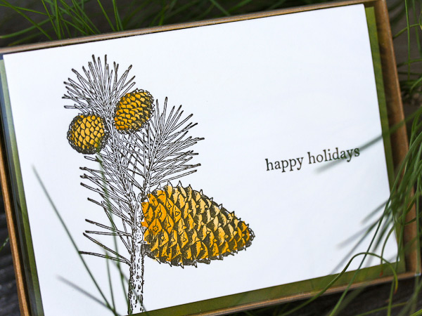
FAVORITE INK We use soy based inks. We love the coverage they can handle and the drying time is very quick. My current favorite color has to be 871 gold…I love the way it looks on dark paper as well as the standard white cotton papers we use.
SOLVENT OF CHOICE We use California Wash for our everyday clean ups. It’s great because it’s water miscible, it has a mild odor, and is not harmful for your rollers.
PLATE AND BASE OF CHOICE We use the standard base and the KF95 regular relief plates.
OIL OF CHOICE We prefer to use a heavy weight, non-detergent press oil for our presses.
WHAT TYPE OF RAG DO YOUR CLEAN UP YOUR PRESSES WITH We use a linen service who comes and picks up our soiled rags once a month and replenishes our stock with clean 100% cotton industrial shop rags.
FLOORING MATERIAL Concrete.
FLOOR PLAN TIPS We have a very small space, so getting the right floor plan is quite important to our work flow. Adding new equipment to our space is always a challenge, so we end up moving everything around once or twice a year. We try to use every square inch as best as possible and that includes wall space. Hanging tools and chases and putting up shelving for inks and other press room supplies saves us on floor space so we can move around a little easier.
PIED TYPE As incredible as it is to have that little bit of printing history in the form of lead type scattered around in drawers and boxes, it just wasn’t getting any use from us so we gave it away a long time ago to a deserving letterpress & typography master.
ORGANIZATION ADVICE I am a neat freak. I like my press shop to be in order, otherwise I feel distracted. The best advice I can give on keeping an organized space is when you use something, put it back in it’s place and clean as you go.
PRINTING ADVICE Get to know your machines really well, take care of them, and most of all be patient with them as they get older and more stubborn…Be good to them and they’ll be good to you!