Let’s see that printed: Dia de los Muertos letterpress cards from Pablo Delgado

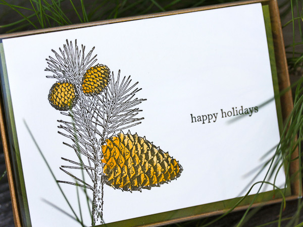
From start to finish, watching the production of a custom photopolymer plate is fascinating. From the genesis of a digital design file to hand-inspection of a pulled proof, the transformation of light-sensitive photopolymer to a vehicle for endless hours of printing fun is curiously intriguing. We followed one of Pablo Delgado’s recent plate orders as he had fun using the plate on the at-home Fiskars Fuse system to create letterpress cards.

Delgado-img5-1 Delgado-img6-1

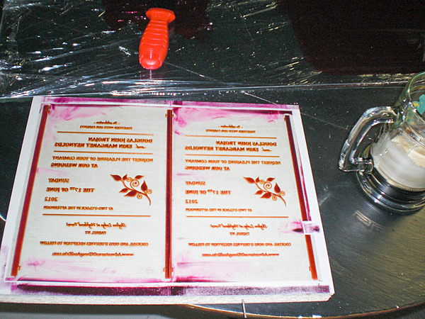
Starting out, I went with the Fiskars Fuse because of the maximum size for the platform. At 12 inches it is double the max width on the Quickutz Epic Six. The first problem was that there wasn’t a platform available at the 12 inches that would allow me the registration necessary to print on the precut A-6 size cards. So I ordered two 12″x12″ clear cast acrylic sheets from Tap Plastics. The bottom piece was .472″ thick and would work as my base for the cardstock, and the top piece was .236″ thick and would act as the chase for the photopolymer plate. I cut a heavy white plastic in two strips to work as hinges and put it all together. It looked a bit crude, but it worked great and I am able to take advantage of the wider roller length. I adhered a sheet of hard heavy white plastic to help achieve the thickness necessary, and a couple of thinner sheets with grids on them to help with placement. The ink I am using for the particular card I am showing are both Great Western Ink oil based Pantone 185 and Reflex Blue.

Delgado-img1

I began with a one color card to figure out the process, and this went fairly smooth. I played around with packing to get the depth I wanted and when I accomplished this I took the leap into a two color card. This was a challenge. Keeping an even consistency of the two inks on the brayer was difficult to figure out at first. I had to try different ways of getting enough but not too much ink on the rubber roller without causing ghosting or plugging up the detail. In the end a couple of thin coats seemed to work best as the perfect balance. One trick I learned to keep the messiness down was to put some transparent tape on the plate strips so when I rolled out the ink on the plate, I could lift off the inked  tape and the strip remained clean. I had a lot of fun figuring out this process. It definitely requires a good bit of patience, the ability to look at things analytically, and organization to keep the ink only where it belongs. The rewards of seeing your art reproduced in vibrant colors and beautiful stock outweighs any of the downsides you experience.

Delgado-img2

The art I am using is original. It is inspired directly by the traditional “Dia de los Muertos” style of images that depict “calacas” (skeletons) and “diablitos” (little devils) in humorous and satirical poses. “Amor Eterno Artesanias” is the name that I am creating under.

Delgado-img3-1

It has been a journey that has taken several years to come together, and the work is only just beginning. I had not been able to find the right medium to share this art through before, so I am very thankful to Boxcar Press for not only putting out information on how to create these letterpress images, but also the personal assistance they offer. Whatever this venture may turn in to, it’s reassuring to know that Boxcar Press is there to help out in any way they can.

Huge round of thanks out to Pablo for letting us get a closer look at his beautifully printed pieces!

Cutting Edge With Keeganmeegan & Co.

Katy Meegan and Keegan Wenkman of Keeganmeegan & Co. have grown a small idea into a large community-empowered printshop over the past six years. The power printing duo houses a love for the yesteryear production model, the smooth whirl of Vandercook, and the inspiring Portland, Oregon resident support . To find out how the vibrant printshop ticks, we rode shotgun with Keegan and it’s been one amazing adventure.

Keegan Wenkman and Katy Meegan of Keeganmeegan and Co. in their letterpress shop.

LETTERPRESS BEGINNINGS Keeganmeegan & Co. was founded in 2007. Known for hand-illustrated relief printing, Keeganmeegan has also been recognized for award-winning design and print & packaging solutions for local and global clients.

We live and work in Portland after moving out west from Minneapolis in 2005. Both of us have been printing since our teens — Katy doing Book Arts at MCBA and I did silkscreen most notably at Burlesque Of North America.

Art brought us to print, in order to duplicate our art and be an assistance in our artistic community. We’ve had the shop for 8 years now, and focus on commercial and artistic editions modeled from the job printing shop of yesteryear. We unite illustration and design with printing and die-cutting services all in house.

Keegan Wenkman washes down his Heidelberg Windmill with Katy packing up luscious letterpress goodies.

FOR THE LOVE OF LETTERPRESS Katy worked at MCBA and one day she casually showed me their shop. That was it for me.

The colorful print wall of Keeganmeegan and Co.

BUSY IN THE BEAVER STATE We have a 2,500 square foot shop in SE Portland next to the iconic Burnside Bridge. It’s on the ground floor near the Towne Building and was formerly the warehouse for Blake, Moffitt & Towne Paper Company based out of San Francisco.

We still have the original payroll safe in the shop and we’re coveting seven Vandercook cylinder presses primarily used for art editioning services and experimental projects.  The rare 232p, in particular, has one largest print areas of any Vandercook, an absolutely massive 32½ -inch by 30-inch. We also employ 2 Heidelberg windmills and 4 Chandler & Price printing presses for job printing.

Type drawers, Heidelberg Windmills and the press shop, oh my!Keegan Wenkman and Katy Meegan set-up plates and letterpress posters.

PRINTING MENTORS Stumptown Printers mentored us early on, giving us business advice and direction. Midnight Paper Sales was a big inspiration. Also the crew of CC Stern Type Foundry helped with our shop up-keep.

Gorgeous, colorful examples of letterpress printed treats from Keeganmeegan & Co.

DESIGN + PRINT We are illustrators, designers, print makers, commercial and artistic printers, we are fun loving idiots for art, problem solving, and perfection.

THE CREATIVE PROCESS Old books, pen and paper.  If I go online for inspiration I just spin my wheels. I do what people did before computers: think for themselves.

FULL TIME FUN We have supported ourselves for 8 years, each receiving a salary as 50/50 ownership.

PRINTING FEATS We’ve grown a small idea into a large success thus far, through hard work and being kind to people. Hence, our clients are absolutely lovely being that they are makers and thinkers alike. They make us laugh, bring us gifts, and have allowed us to keep this going strong and grow more each year.

Additionally, we’ve been able to work with a lot of artists, touring bands, comedians, and people on the forefront of our current culture.Hand-carved printing plates and a shop view at Keeganmeegan and Co.

Extraordinary attention to detail is not spared while viewing the letterpress posters of Keeganmeegan & Co.
Keegan-Meegan-_IMG7

BOXCAR’S ROLE Boxcar Press makes the biggest poly plates available that I know of. You’ve allowed us to completely max out our Uni III / with 2 13×18 Boxcar based butted up together (take a look).

PRINTING TIPS Ask the right questions to the right people and you can get yourself far in life.  It helps to fail a lot too. Otherwise, people always ask me how I cut my linoleum blocks, my answer is black magic and podcasts. Podcasts are a lone printer’s best friend.

Letterpress ink color prints for a poster printed at Keeganmeegan & Co.

WHAT’S NEXT We will just keep going, every day is a new day with new problems to solve and chances to learn. We will also go on vacation, gotta love vacation. We didn’t take one for the first 3 years.

Huge round of thanks out to Keegan over at Keeganmeegan & Co.!

Reverse Type File Prep Techniques

An increasingly common question we are asked, here in the Platemaking Department at Boxcar Press, is “will my reverse type/text/design be readable or look good when I letterpress print it?” Reaching the desired results means exploring what exactly “reverse type/design” is and what to check for to guarantee a great printed piece.

When it comes to printing, reverse type or design refers to white or light text or objects positioned against a solid colored (usually dark) background. This is sometimes also referred to as “knocked out” text.

This is an example of reverse type: white text on black background.

There are some important aspects to remember when designing for reverse type, especially with regards to using photopolymer plates:

  • Always take the time to check that your designs meet or exceed the minimum guaranteed line or dot thicknesses. Check out these recommended line and dot thicknesses for your preferred plate type. (We also have a nifty tutorial that offers step-by-step instructions on how to check your dots and line thicknesses – go check it out!). 
  • Next, it’s critical to know the eye will observe your white text as “smaller or thinner” on your printed piece as your eyes are tricked by the optical illusion created by the juxtaposition of a large dark area next to a smaller thinner white area. So, we cheerfully recommend that you add AT LEAST a 0.75pt extra stroke around designs to balance out this optical illusion. This extra stroke is added on top your minimum line/dot thickness.  It’s misleading to judge an onscreen or laser printout against what a final printed piece will look like so we usually suggest erring on the side of slightly larger reverse type.
  • If you are printing in a light ink background, your white text or objects may need to be even larger and thicker because the the contrast between the white text against a light colored background on a white paper can be easily lost. Small text may not have a place in this color situation and needs to be avoided.

Illustration of reversed type on lighter background.

  • Lastly, make note of the dark areas in between your white object. (The highlighted area in cyan shown in the image below illustrates the “dark areas” in between the white objects that should also be checked for line and dot minimums). Are they narrow and thin? Will they meet the line and dot minimums so the plate polymer can support and hold between your white space?

Illustration of the negative space around text and objects that also need to be checked for minimums.

Designs with reverse type can be pretty dramatic, and we hope you’ll consider printing a project like this.  With a little planning and forethought about how the design will translate with a larger solid inked area and  the detail you want, you can have some very satisfying results.  So keep those rollers inked, letterpress lovers, and go reverse!

Boxcar Talk With Laura Bentley

After dipping her toes into the world of letterpress at the School of Visual Concepts in Seattle, all it took was a few choice experiences to get Laura Bentley of Pinwheel Press hooked on printing—a Vandercook here, a jaunt with typesetting there, plus one unforgettable brush with Gordon Franklin press that made her passion a full-frontal phenomenon. But as Boxcar Press sat down to discover, Laura is more than the sum of her letterpress loving parts.

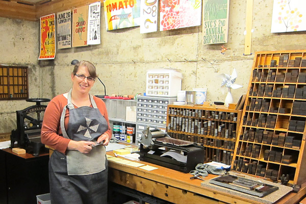
UP CLOSE WITH LAURA BENTLEY When I was young I enjoyed doing artsy things, but in college I went a different direction and got a Computer Science and Accounting degree.  By day I’m a computer consultant mostly for a dance studio that teaches social dance—ballroom, salsa, and swing.  I run their website, set up their sales system, and do their bookkeeping. So, I’m a hobby letterpress printer, and try to squeeze in time to print when I can.  I also volunteer as a teaching assistant for the letterpress classes at SVC (School of Visual Concepts) in Seattle.

INK IN THE BLOOD I first took a class at SVC in Seattle.  I was hooked right away.  Exploring the school shop felt like a treasure hunt.  With my first printing projects I tried to include as wide a variety of type and ornaments as possible, and enjoyed the challenge of typesetting them in crazy but-still-safe-to-print ways. I love typesetting and using the vintage equipment.  I was thrilled to find an art form where I could use my attention to detail and logistics to produce results.

EXCEPTIONAL IN THE EVERGREEN STATE My print shop is in the basement of my house.  The walls are unfinished, but colorful with printed work.  I have an 1863 Gordon platen press, a tabletop No. 0 Vandercook proofing press, and a very cute sign press that I use for proofing type.  I have two cabinets of type, and I’m always trying to be creative with how to fit in more.  I also have a 16” Challenge paper cutter that I fixed up real pretty.  My favorite thing about it is the old vintage equipment— I like to think about all the work they printed over their lifetimes.

PRINTING LEGACIES I feel blessed to be part of a printing community that is filled with talented printers who are very generous with their knowledge and time.  Two of my favorite mentors are Jenny Wilkson and David Black.  Jenny is the manager of the SVC shop and has a talent for developing students to do their best work no matter what style of printing—dainty and detailed invitations to raw and chunky posters with wood type.  She always has suggestions for projects that take them to the next level.

David Black is a fellow teaching assistant and a print artist.  I personally consider him a mechanical genius as he can fix almost anything, and has a real gift for explaining how things work.  But what inspires me most is that he makes time to print most every day.  He once printed a little card that had a tiny ornament of a car and the text said “Tiny car”; only black ink on white paper.  It was a great reminder to me that you don’t always have to be printing big extravagant projects, but can print quick fun things, and you’ll learn something with each new thing you print.

PRINTER’S PARADISE I design what I print. But that’s probably expected for a hobby printer; I don’t do job work.

PRINTING FEATS Our printing community just finished up a project where we partnered with a non-profit group of writers that works with patients in Children’s Hospital to help them write poetry.  Sixteen printers each printed a broadside of a poem, to create an edition of poems that are bound in a portfolio.

It’s always a challenge to design something to catch the spirit of someone else’s words and imagery. Also the edition size was 100, which with five print passes was a huge printing project for me.  I had never printed an edition of that size before.

BOXCAR’S ROLE Boxcar Press has helped me with the above broadside project, and others, by producing quality photopolymer plates.  I love handset type for hobby work, but for more flexibility and efficiency, it’s hard to beat photopolymer.

PRESS HISTORY A gentleman named Carl Montford, the self-nicknamed “press matchmaker,” matched me up with an 1863 Gordon Franklin press.  It was in the basement of a local artist that wasn’t using it anymore.  It’s a great match for me, because it’s a smaller platen press (chase about 7 x 11) and we needed to get it down into my basement.  The press would be a little wonky for production work, but it suits a hobby printer like me just fine.

SHOP TIPS Listen to your press.  Listen to it when it’s printing well—learn the pattern of sounds it makes.  Then someday when it makes a noise that’s new and unfamiliar you’ll notice it and be able to tend to it before things go awry.

WHAT’S NEXT Need to fix some inking issues with my platen press, and print more!

Big thanks out to Laura for letting us take a look at the wonderful whirl at Pinwheel Press!

Letterpress Art Sales to Benefit Baby’s Medical Procedures

Today we’ve got details about a worthy event that will help a young boy’s medical expenses and provide you with a chance to obtain some limited edition fine art prints for your walls! Prints for Platelets is helping raise funds for Nico Bond, the 17-month-old son of Arizona Master Printer Brent Bond of Santo Press and artist Veronica Villanueva.

Since November of 2011, Nico has undergone 2 bone marrow biopsies, over a dozen transfusions and is still undiagnosed with a blood disorder that leaves him with very low platelet counts.  Prints for Platelets will give you a 20% discount off all Santo Press Prints with 100% of the proceeds going to Nico’s medical expenses through the month of May.

Santo Press Prints offers high quality relief prints, monoprints and monotypes from 16 regionally and nationally recognized artists. Shown above is a photopolymer and reduction linocut from Veronica called Nicolas’ Odyssey.  Veronica tells us this about the creation of this print.

Getting pregnant wasn’t easy and the pregnancy was a high risk one.  I made this print when I was pregnant with Nicolás.  It seemed that even before birth Nico has gone through a whole odyssey.  And it seems that his odyssey continues… The key image was created digitally and relief printed from a Boxcar polymer plate, colors were developed via a reduction linocut.  The print was from an edition of 50 which was donated to Mesa Contemporary Arts at Mesa Arts Center for their annual fine art print calender fund raiser.

Click here to go to the Santo Press website and choose one or more signed, numbered, and titled prints from the artists and receive the 20% discount through the month of May.   The prices are very competitive and with an additional 20% off, it’s an easy but meaningful way to help this little boy and his parents while supporting fine art printmaking.

Boxcar Talk With Nancy Hill

Boxcar Press goes one-on-one with colorful Nancy Hill, one-half of the dynamic letterpress duo of Hazel & Violet Press, (the other printing power is Beverly Wolfe) to talk shop, slip in a few amazing printing stories, and show how letterpress has shaped quite an adventure the two will never forget. Read on to get the full interview.

PERFECT PRINTING PARTNERS We are two long time friends who share a love of typography, paper, and letterpress printing. Although we both have full time jobs, we love printing every chance we get.

LETTERPRESS LUCK We had been watching, looking, hoping… for just a table top hobby press – when an opportunity came along to buy a complete letterpress shop. We learned to print by taking classes, personal instruction, and good old fashioned trial and error.

AWESOME ARIZONA Our shop is in a completely renovated garage – complete with cabinets, sink, insulation and flooring. Not sure if you can call it ‘decor’ – but, we definitely have a turn of the century industrial feel. Since there are no curtains on the windows,  we would have to call it a shop, not a studio. We have a new style Chandler & Price 10×15 named Beauty and a Windmill named Baby. We also have a Potter #2 named Beatrix at our gallery in downtown Phoenix. Our favorite thing about our shop is that we get to print there.

PRINTING LEGACIES Ladies of Letterpress has been a great mentor for us. The team at our first NSS was just great and has led to many new friends. Many of our mentors we haven’t even met. They are the guys on Letpress.

PRINTER’S PARADISE We do not print full time – but that is really our goal!

PRINTING FEATS That our first job was a 3 color wedding invitation and we didn’t kill each other. Also being selected Best Letterpress of Phoenix 2011 by New Times.

BOXCAR’S ROLE Great patience and so much help from Cathy when we first started ordering plates. Even now Boxcar is so helpful when we call with stupid questions.

PRESS HISTORY Well…we saw an ad on Craig’s List for an entire shop for sale and we just jumped in. It took every friend we have and a horse trailer to get it to our shop.

SHOP TIPS  Our favorite business advice – don’t break out the wine until you finished cutting the job.

WHAT’S NEXT While we are still printing our retail stationery, we are well on our way to growing our commercial letterpress business. We are really enjoying working with designers on their projects, and we are starting letterpress classes later this summer.

Big round of thanks to Nancy Hill for letting us get the full story on Hazel & Violet Press!

Central New York Couple’s Letterpress Excursion

Letterpress love is in the air! Or at least that’s the case of this soon-to-be-hitched Central New York couple, Douglas Trojan and Erin Reynolds. The pair printed custom letterpress invitations for their upcoming Big Day, and the experience has brought them closer by means of laughs, inks, and whole lot of printing fun!

The couple caught up with us first with a nifty visit last month to get the full tour of Boxcar Press (as well as to get a few pointers on their project). Armed with good advice, Douglas and Erin purchased their custom made plates and the rest is history.

Check out their printing adventure from start to finish here and get a sneak peak at the finished invitation!

Boxcar Talk With Lenor Mirochna of Paprika Letterpress + Design

Take a large helping of letterpress love, add a smidgen of luck when finding the perfect press, pour in slowly more than a few cups of excellent design experience, add an enchanting creative streak, and you’ve got the divine recipe behind Paprika letterpress + design. Lenor Mirochna lets us in on the flavorful story behind the letterpress and design studio powerhouse. Read on to get the full scoop.

SPICING UP LETTERPRESS Paprika letterpress + design has been an adventure since day one with a serendipitous beginning. Short story about my background: I studied design at a number of different colleges and universities from Detroit to NYC. I began my design career in the mid 70’s; the beginning of computer typesetting where artwork was prepared using rapidograph pens, Xactos, photostats and hand done mechanicals.  There is a LOT to be said for the fabulous resources and possibilities of today’s graphic design. My experience has included ad agency design and art direction, owner of several graphic design firms, freelance design, commercial printing sales and print services buyer.

INK IN THE BLOOD I was interested in the process of letterpress and looking for a creative venture where I could use my design skills and love of color. I began to think about a local printer I met about 10 years ago who had a print shop in my town. On a whim, I stopped in one day and asked Dan Dewechter, the owner of Constitution Press, a 120 year old, continuously operating print shop, whether he had any letterpress equipment he was interested in selling. As luck would have it, he did. In fact he was consolidating and liquidating much of his shop having decided to explore other career options.

That is where I first met my circa 1916 Chandler and Price 8 x 12 press, all 1250 lbs of iron.  Along the way I also contacted Alan Runfeldt of Excelsior Press in Frenchtown, New Jersey. Interested in more hands-on-printing experience, I signed up for a day-long class with Alan and had a blast printing on a variety of presses.

FLOURISHING IN THE GARDEN STATE I am currently set up in a small garage studio. I hired some renovation help and we painted, insulated, refreshed and reorganized the space 6 months ago and now it is much more aesthetically pleasing as well as energy efficient. I am looking to expand my capabilities by purchasing another press by the end of the year.

PRINTING LEGACIES As a printer for over 30 years, Dan Dewechter has a wealth of knowledge and experience that you can’t find in a textbook. He not only worked with me, but also gave me pointers and patiently explained the idiosyncrasies of the process. He was generous with his time, talent and skills and is the person to credit or blame for what I ‘m doing now — right, Dan?

DESIGNED FOR PRINT I design and print. Currently, I am continuing to add to a line of greeting cards, notecards, and soon-to-come calendars. It’s been an adventure exploring the techniques and mechanics of letterpress printing. I have just scratched the surface of custom work and have collaborated with clients on custom pieces which has been extremely rewarding and a ton of fun.

PRINTING FEATS Letterpress printing is a beautifully complex yet simple process.  I love the colors, the feeling and the fun exploration of papers and technique. I’m not really sure I’d call it “my life’s work”.  I really like it and I’ll see where it takes me.

BOXCAR’S ROLE It was Alan who suggested I check out Boxcar Press to purchase plates as well as acquire more knowledge of the letterpress industry. Frequently posted videos and industry information on the Boxcar website has deepened my letterpress education. All of my plates are ordered through Boxcar Press and they have been an excellent, reliable resource for me.

GETTING STARTED When it was time to get my press, I contacted Dan, rented a trailer, asked my engineer husband to check out the situation and set the moving date.

When I arrived to pick up the press (haha- that’s a good story there) the fun began. (see the pictures) Dan was invaluable and incredibly generous in helping me get my shop set up.  Along with the press he gave me just about every possible piece of equipment needed to get started and in fact things I didn’t even know I needed.

Seriously. He included  quoins, 3 C &P chases, furniture, sets of guides, large roll of tympen paper, packing sheets, extra set of BRAND NEW rollers still in their box, cans of pre-mixed pantone ink colors, press wash, large “stone” on which to lock up the base, roller puller tool, sticky finger goo and stacks of  different types of paper to get me started. And more. And he helped move the press. Dan was amazingly helpful and I like to think he was happy to see the press go to someone who would work it and not sold as scrap.

WHAT’S NEXT My plans for 2012 include adding a new press to my shop, working with more custom clients and continuing to create new pieces for the Paprika letterpress + design line. My retail outlets include stores in Charleston, South Carolina, New Jersey, Philadelphia, and other areas of Pennsylvania. My cards have been featured in Culture Cheese Magazine and soon to be in USEF’s Equestrian magazine. In the future I’d like to grow the Paprika Letterpress brand specifically within the specialty retail and hand-made-art market nationwide.

Many thanks to Lenor for letting us take a look into the wonderful world of Paprika Letterpress + Design!

How to Easily Outline Fonts into Vector Shapes

One of easiest ways to ensure smooth sailing from file to plate is to outline your fonts into vector shapes if you are using either Adobe Illustrator or InDesign. Outlining text into shapes frees you of the troublesome worry of whether you need to send along your fonts or embed them with your file. It also lets you add strokes to thinner fonts with ease – since the text becomes a vector shape, you’ll have more control over how each character looks.

Here’s the scoop in three simple steps:

•    Select the text with your black arrow tool in either Illustrator or InDesign. The black arrow tool is your default selection tool.
•    Select TYPE>Create Outlines.
•    Click anywhere that is blank on your art board and voila! Your text is now converted into fully editable vector shapes!

If the text looks a little thicker than usual, don’t panic! Simply deselect your text or click anywhere on your art board to deselect it and you’ll find that your text looks completely normal.