Letterpress QSL Cards Around The World

I’ve had a fifty-year obsession with QSL cards. And a newfound interest in letterpress. This is the tale of how they cross paths.

Dad had a cigar box full of these nifty “ham radio postcards” (aka QSL cards) from when he first got his license in the 1930’s back in Nova Scotia. Amateur radio operators, or “hams,” send QSL’s to one another to commemorate a contact they’ve made over the air.

Going after distant signals has always fascinated me. As a kid in 1960s Prescott, Ontario, I’d love to tune the TV dial, seeking out stations that were only there on certain days. Why did that happen?

As a young teen, I got bitten by the shortwave listening bug, especially after learning that shortwave broadcast stations sent their own QSL cards! Back in the 70’s, the Cold War was in full swing and the international broadcasters both East and West loved to hear from their listeners.

Shortwave broadcast stations (you’ve heard of the Voice of America, the BBC World Service, Radio Moscow, etc.) made for an effective way to hear varying points of view. They also were a wonderful source of exotic targets for a teen to go after. I wrote to every single station that I could hear and requested their QSL card. I would send them a reception report, telling them exactly when I heard them, on what frequency, and what was heard in their programming.

Many—even most—of these powerful international broadcasters have since left the air. Amateur radio is a little different from shortwave broadcasting. While both types of radio are found on shortwave, ham operators are not broadcast stations trying to reach a wide audience. Rather, they are individuals contacting other individuals.

In 1980, I got my Canadian amateur radio license and drew-up my very own QSL card. It featured one of my boyhood hang-outs, the lighthouse just two miles down the St. Lawrence River. (Look up the Battle of the Windmill near Prescott, Ontario if you like history.) I had the cards printed at a local print shop in Brockville.

Well, my love of shortwave listening and ham radio eventually turned into a 27-year career in radio broadcasting. At one point, that included six wonderful years as an international broadcaster at my favorite shortwave station, the “Voice of the Andes-HCJB,” in Quito, Ecuador. In fact, my wife, Lisa, and I were hosts of a program especially targeted towards shortwave hobbyists. We started raising our family in that beautiful Andean capital. Back in Ontario, Dad and Mom tuned in and listened to us each week, along with listeners around the globe.

Our family returned home in the mid 90’s and I continued broadcasting from Syracuse, NY. Eventually, I left radio to get into elementary teaching and audiobook narration. The teaching never got beyond subbing, while the narrating is something I still do on occasion. Two years ago, a steady position as a platemaker at Boxcar opened up. Letterpress was a different world to me—life on Jupiter might have been more familiar—but they were willing to teach and steady work was very attractive!
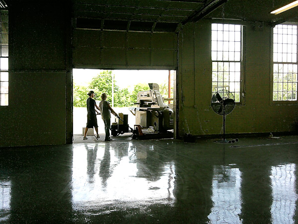
At Boxcar, Cathy Smith encourages all of us to use our department’s Vandercook Universal 1 for projects of our own. It’s an excellent way to learn and appreciate the printing side of letterpress. I’d done a few of these projects. However, I could never draw and ideas relating to visual artwork didn’t come easily to this audio-entrenched mind.

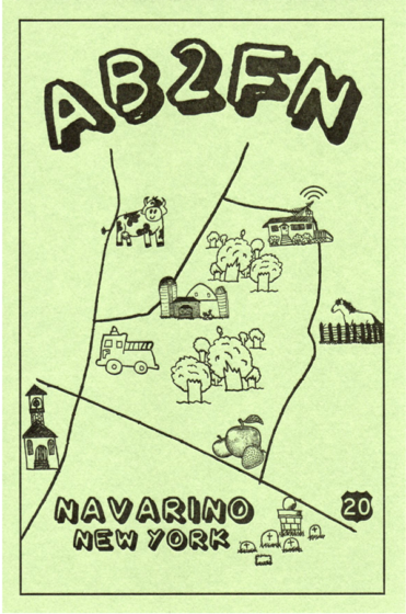
In the fall of 2022, I found myself re-bitten by the ham radio bug. However, if I wanted to receive QSL cards, I’d have to send QSL cards. By this time, though, I had an idea for a QSL, thanks to the hundreds of wedding invitation plates I had made over the past year. A map! I loved maps!

First, I sketched out a map of the roads around the hamlet of Navarino, our New York home since 1999. Next, I asked my daughter, Rachel (who also works at Boxcar) if she’d be willing to make some of her cute drawings for me for the map. Rachel was only too happy to give it a go and I was delighted with what she came up with.

At Boxcar, Rebecca put Rachel’s drawings onto my map and formatted the finished work for the negative. A second negative was made with the technical information on the QSL’s backside. I used a KF95 plate to make the first run of AB2FN QSL’s on green paper stock.

By the spring of 2023, I had sent all of these QSL’s to other hams and needed a new batch. This time, I wanted to try two colors on a lighter-color stock. Cathy had some 80 lb weight ivory stock with a felt surface. I went with an earthy brown and hunter green for the rural theme. We made a few small changes to the artwork (that’s Rebecca’s portrait of my head floating over the house). This batch went quickly and, with Cathy’s help, I found some more of the same paper on clearance and made a second run. This time, I used a KF95 plate for most of the card, but a KF152 for the”AB2FN” to give my call letters more of an impression. Our Universal 1 has an adjustable bed.

By August, it was time for yet a new supply. As southern Onondaga County is known for its apple orchards, I thought that an apple-themed border would work well. Rebecca brought this together and we went with red.

In the year since I began making QSL’s, I’ve sent out about 150 cards to hams in over 100 countries, including Australia, Andorra, Thailand, China, Scotland and Oman. While many hams use computer programs and printers to fill these out today, I really enjoy doing it by hand. It’s the feel of the pen contacting the paper, each time trying to improve my penmanship. For much the same tactile reason, I enjoy using an old-fashioned Morse code key to make most of my contacts, although I’ll use the microphone if there’s an exotic station I really want to contact.

And, to be honest, as a broadcaster at heart, I do like the feel of using my voice. A surprise was discovering that QSL cards and letterpress are a link shared by a number of hams! Ham radio and letterpress—especially the printing stage—have a similarity in that both arts require plenty of fussiness and fine-tuning. Besides a bond with past traditions, there is also the bond between an operator and his or her equipment, and the care in repairing and maintaining what is often older technology. Here’s a link to another blog by a fellow ham operator, QSL collector and letterpress printer. He designs his cards to match the early style used in the 1920’s and 30’s.

Not long ago, I was corresponding with a fellow whose ham-related small business dried up, partially on account of many hams today preferring “electronic QSL’s”  over paper. The “QSL” is a jpeg sent over the internet.

Bleah!

As we lamented the loss of the old ways, I mentioned that I was so “old school” that I made my own paper QSLs on a letterpress. “OMG!” He replied, and then went on to tell me how his father had a printing business and taught him to handset type at age five. He eventually used his dad’s 10 X 15 C&P and a 9X12 Little Giant for his own at-home letterpress business, which included QSL’s!

Making my own QSL cards has given me a much deeper appreciation for the talented and dedicated artists at every stage in every department at Boxcar.

I still have Dad’s QSL’s—even the cigar box!

Hidden Treasures at Type High Letterpress

Right down the highway from Syracuse, New York, is Rochester’s very own Type High Letterpress. At the helm of this cozy, treasure-packed print shop is Tony Zanni. From wood & metal type goodies to presses that shine, Tony gives us a tour of this hidden gem tucked away in upstate New York.

Tony Zanni Type High Letterpress IMG 1
Tony Zanni Type High Letterpress IMG 4

PRESSES AND WOODCUTS AND TYPE, OH MY!

Our shop is located on the second floor of an old candy factory in downtown Rochester, NY called the Hungerford Building. It houses around 40 other artisans of varying crafts. We occupy a 1,200 sq. ft. space that is long and narrow.

At the front of the shop is a small retail area. The rest of the shop is packed to the gills with over 700 cases of wood and metal type, and over 150 galleys of dingbats and cuts. At the back we have our 4 large presses:  a Damon & Peets 8×12, Heidelberg Windmill (with factory foil stamping attachment), a Vandercook No. 3 Proof press and a giant Wesel Iron Handpress. We also have a fun collection of small table top presses hiding around the shop as well.

The space in and of itself isn’t really interesting, however, what it’s filled with captures imaginations and inspires creativity. There are all sorts of letterpress goodies to look at. We have originals of Adobe’s Wood Type Ornaments typeface, old wood cuts from various shops around the western NY area, slug cutters, miterers… The Hell Bucket. There’s a lot of stuff to look at if you ever visit.

MOST PRIZED POSSESSIONS

This is going to sound funny but my favorite thing about the shop is that it’s heat included. Our original location was a bit better but boy was it cold in the Upstate winters. The new space… Toasty!

As for fun things / prized possessions, there’s a couple. First would have to be my Vandercook, Izzy. Yeah, I named her Isabelle or Izzy for short. I found her thanks to Shelly at French Press. I asked Shelly to visit this estate sale (because I couldn’t attend) and had her look for Vandy’s. She called and said there was a Vandy in the garage, mostly complete.  I said great, put me on the phone with the seller, offered $500 sight unseen. They said yes and I picked it up two days later. I honestly think this was the last $500 Vandercook to be had and this was back in 2009.

This past summer I acquired another nifty item: a Lufkin 6 ft. tape measure with inches and Pica rules on it. Maybe not super practical, but pretty cool.

One more super cool thing I have is an original plate of the very first Photographic image printed in a magazine. It is “A Scene in Shantytown, New York”  that appeared in the March 4, 1880 issue of New York Daily Graphic – the first halftone photograph ever printed by a newspaper. Yes, we have a pretty cool collection.

SHOP SIZE

I jokingly refer to my shop as the “train car”. It’s about 15′ wide by 65′ long and has 3 windows in the back and a double door up front. With any luck we’ll be moving down the hall later this year a space that is 1500 square feet. I’m not looking forward to moving all this again.

PRINTING IN THE EMPIRE STATE

We are in the Hungerford Building. surrounded by many other creative artists.  On the first Friday and second Saturday of every month we host events. We are the northern border of an area called the Neighborhood of the Arts.  About 3 blocks away are the Memorial Art Gallery, Anderson Alley Arts building, plus a host of other galleries & public art pieces.

TYPE OF SHOP

Type High is a commercial letterpress print shop specializing in hand set typography and design for letterpress printing. Obviously, I use Boxcar Press for our plates when the need arises. We teach letterpress workshops in our space, how to set type properly and print an edition. In addition, I also teach a semester long letterpress design class for the Rochester Institute of Technology.

PRESS FAMILY

The long list of things currently in the shop from largest to smallest…

  • Wesel Iron Handpress
  • Sheet 18×24 printable 16×22
  • Vandercook No. 3 Proof press
  • Sheet 14×20 Printable 13.5ish x 18.5ish
  • Heidelberg Windmill 10 x 13 with Foil
  • Damon & Peets 8 x12
  • Nolan Proof press 12 x 18 galley proof press
  • Showcard Press 14 x 20ish
  • Old style Pilot Press 7 x10
  • Craftsman 5×8
  • Golding 4×6
  • Kelsey 3×5
  • Sigwalt 2×3 toy press
  • Challenge 26.5″ cutter

MOST VALUABLE TOOL

The most valuable tool in my shop is my line gauge, Pica Stick, ruler… whatever you want to call it. My favorite one is a Gaebel 612H-12 with inches, Picas, Points and millimeters. Not only is it great for measuring and drawing straight lines, but it’s also great for opening ink cans, cutting open packages, getting things out from under the press. Not to mention, slicing pizza, and cutting cookie cake on those special occasions.

GETTING INKY

My favorite inks are from the old cans we pull out of shops that we buy out. The older the ink, the better the coverage. Plus it’s usually free and we’re saving it from going to the landfill. When we have to buy new stuff, it’s usually Van Son due to ease of ordering with our local supplier.

SOLVENT OF CHOICE

Don’t tell anyone, I order California Type Wash. It’s an older solvent, that’s probably not as good for the environment as some of the newer stuff but it’s by far the best i’ve ever used. It cleans quick, dries fast, and will take 100 years of ink off in only a few wipes. I like to challenge myself when cleaning up the Vandercook to do it only using one or 2 rags at the most.

BASE SYSTEM

For most jobs I need plates for, I use the Boxcar Base and polymer plates. My base is beat up, but it still does the trick. To be honest, I hate printing with polymer plates. It’s been my experience that the ink does not carry well, and they can be finicky at times with the amount of ink on the roller and the roller height. Since we go in between hand-set type and plates, it is challenging at times for make-ready.

OIL OF CHOICE  

You’re supposed to oil these things? Honestly, I just use the same oil I use for my race car. If it’s good enough to run at 6000 RPM for an hour in a race car it’s good enough for a press.

PREFERRED CLEAN-UP RAG

I’m cheap… I use Scotts Rags in a box… but only the ones from small mom and pops hardware stores, because they are different from the ones at Home Depot.

PIED TYPE

I just recycled a 91 lb. bucket of pied worn out old metal type. However, there’s still standing forms from shops we cleaned out years ago. Some of the type from those shops may have been sold or dumped at this point but the standing forms are still in our galley storage. There are also 5 drawers of miscellaneous wood type hiding in the shop. I need a few more hours in the day to handle pied type.

ORGANIZATION SECRET

I guess the only secret I have is a Sharpie. I have a pretty photographic memory for where my type is, what it is, and to where that random Cap L needs to go.  When I take something out to use, I write in Sharpie the cabinet and drawer number on the back of it. Other than that, as long as I put it away I know right where it is. When I don’t,  well let’s just say I swear a lot until I find it.

SHOP TIPS

Things I wish I knew from day one: How to price my work for lines of type setting, vs pricing a computer-aided design. And pricing for press time vs make-ready time vs finishing time. That probably needs to evolve for each person. As a one man shop, it’s tough to figure all that out. If anyone has a magic button for that, let me know.

Tony Zanni Type High Letterpress IMG 4
Tony Zanni Type High Letterpress IMG 1


Rob LoMascolo: The Call of Letterpress

We enjoy hearing from wonderful members of the letterpress community on how the printing tradition has inspired them to their true calling. Aurora, NY-based Rob LoMascolo of The Press of Rob LoMascolo shares with us on why he is smitten with the printing tradition.

Why do I love letterpress? Letterpress appeals to me on many levels, but I think it is the tactility of it that appeals foremost to many of us. You can feel and see the difference. When looking at crisply printed type with just a slight bite into the paper one gets the sense that each and every letter is a physical thing, not a digital recreation of a thing, but every letter is a real actual thing that is very much part of that printed sheet.

My mom likes to tell people that in first grade we kiddos were all asked what we wanted to do when we grew up. Most of my classmates wanted to be athletes, firefighters or follow in their parent’s footsteps, but I wanted to own my own museum!

Yup, visitors always say my shop is like a working museum. Letterpress combines my loves of history, art, design, books, old machines, and above all, it has a realness about it that is lacking from so much of our digital world.

As much as I love letterpress for all those reasons, the reason I do it is simply because I have not found any better way.

School Art Budgets Get a Boost from Boxcar Press’ Annual Paper Giveaway for Teachers.

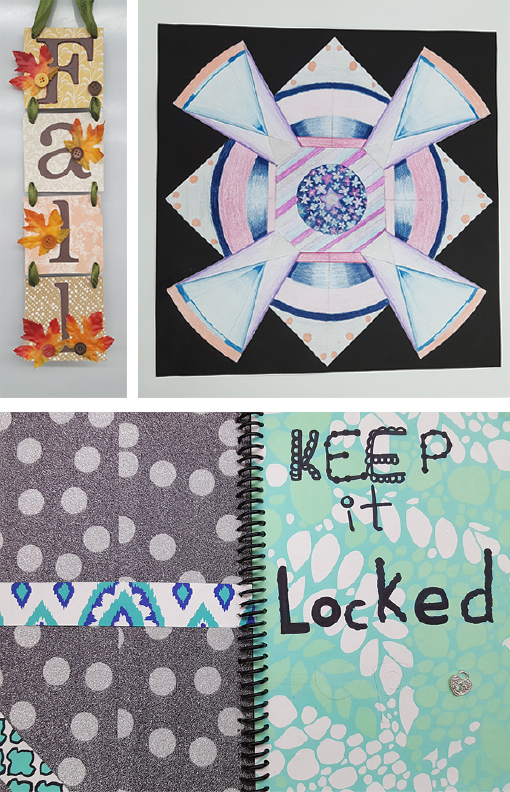
Pulaski Academy Art Department teacher Stacey Walton reached out with photos and praise for our Boxcar Press paper giveaway for art teachers.  “If not for your generosity my budget would not allow for my students to have so many more opportunities and variation in art supplies as they do now,” writes Stacey.

The Pulaski, New York art instructor is referring to our annual giveaway of printing papers and more to art teachers at local schools.  Boxcar Press gathers a wide variety of items no longer needed for printing projects and it’s not just limited to papers.  It varies from year to year but can include papers of all types, patterns, and sizes, envelopes, surplus cards, packaging, transparencies and colored foils.

2017 OctoberTeacher Giveaway

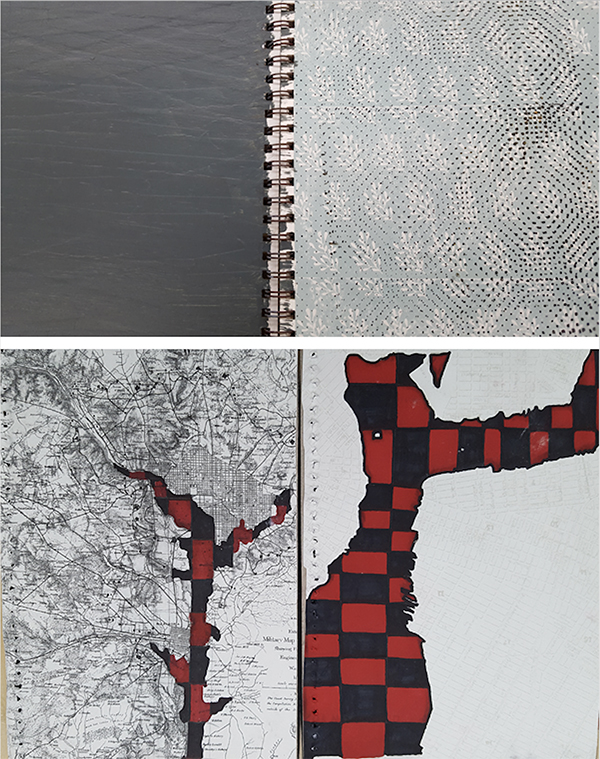
Stacey included photos of just a few examples of how creative her classroom students were.  Some of the paper is perfect for oil pastel and acrylic painting. They use the patterned papers in their art journals a lot. They also use them for after school craft projects, including Fall signs, wreaths, and ornaments (by curling the paper and putting it inside glass ornaments – they come out beautifully!)  The solid colored papers (especially black) are great for mounting backs.  

2017 OctoberTeacher Giveaway

Some of the items offered are not papers or materials but plastic boxes formerly used for card sets and the cards themselves.  The students use the boxes of plastic covers as palettes for painting, printmaking, etc.  They are perfect because students can close them up and save them from day to day rather than washing the paint off every class.  Stacey writes, “This is a huge saver on paint for us, and super convenient for the students as they do not have to re-mix colors from class to class.”

2017 OctoberTeacher Giveaway -art journals

2017 OctoberTeacher Giveaway - art

“I have had students paint little boxes to use as stands for ceramics and sculptures for displays.  We used the foil rolls we got last year as decorations for our school dances. I also use the “Thank You” cards any time an organization or business donates something to our program.  Our secretaries use the Thank You cards as well (I found a set with our school colors, so they were perfect).  We even give them to students who need thank you’s to send out when they get things like awards and scholarships.”

Thank you Stacey for the feedback and artwork.  We enjoy providing what we can to enrich school art programs and are astounded by the creativity and breadth of how the supplies are used. We encourage other art teachers to let us know in photos and words how you have used our give-away items.

This year’s annual paper giveaway for teachers is Wednesday, October 25th, 2017 from 2:30-4:30 PM and questions can be directed to Boxcar Press at 315-473-0930.

Whacking is sometimes needed

When diecutting shapes, a metal jacket is used on the platen instead of oiled tympan paper. This protects the press from the sharp cutting edges of a die. To coax the jacket and its springy clips into place, sometimes we use a mighty “32 oz Rubber Mallet” to tap it into place. Tap, tap with the mallet’s wide surface area and the jacket is locked in and ready to start getting in position. Wielding this 32oz rubber mallet makes me feel like Thor.

die cutting equipment at boxcar pressdie cutting process at boxcar press


Get your goggles!

We put together a stack of eye-popping set-up sheets with layers and layers of our neon Day-glo ink that had been run through the press several times. The glowing result became a light source of its own! This is the Bella Figura design Polka Stripe designed by Erin Jang. It is a design meant for Great Fun!

neon letterpress at boxcar press