Printer’s Fairs, Wayzgoose, Conferences, and Chapter Meetings, Oh My!

I think we can all agree letterpress fits the dictionary definition of niche (a specialized segment of the market for a particular kind of product or service), but when we gather as a community as we love to do, we feel dynamic, vibrant, and that we are at the peak of the printing heap.

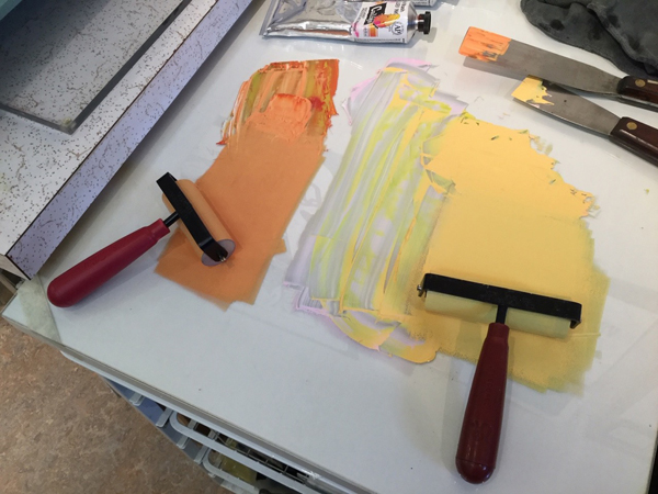
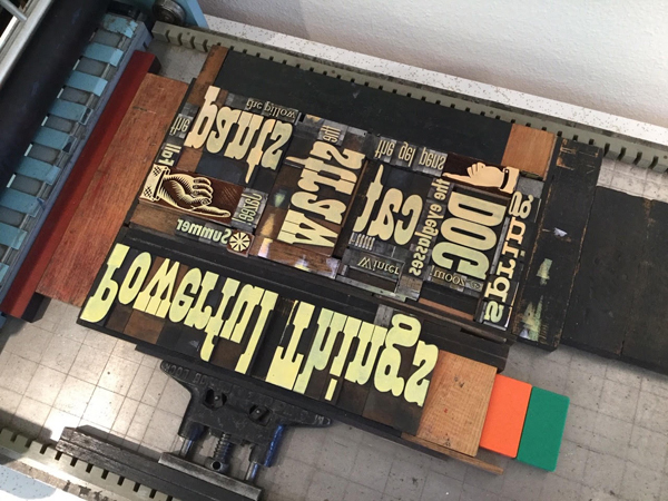
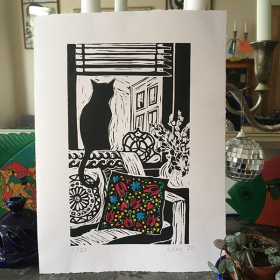
To start, our presses are beautiful and have stood the test of time, our printing papers are luxurious and rainbow gorgeous, and our type options number in the thousands.  We can carve a lino block or make a polymer plate or handset some letters and in relatively little time, make a beautiful print or a thought-provoking broadside.  Is it any wonder we feel a little heady when we can print?

Now, put one or more of us together in the same place and we can get giddy.  Boxcar Press was a vendor at the Lancaster .918 Club Printer’s Fair in Lancaster, Pennsylvania this past weekend.  We brought our wares to showcase and sell, however, we really love the conversations, the demonstrations, and finding a tool and printed piece we need in our own collection.  We joke as we leave that we may be going home with more than we brought. And we are happy about it.

This is the way of “our kind” at our Conferences, our Wayzgoose’s, print demonstrations and field trips.  I personally enjoy the people interactions and hearing their stories. Just a sampling form this weekend:

KenKulakowsky-center2
  • The Amish printer who works for a group that prints Russian books that go to the Ukraine. There are 11 million ethnic Russians who live in the Ukraine.  His group is still shipping books despite the war and, as you can imagine, those books are moving about the country as the people are moving around.
  • A long time customer from North Carolina, Brian closed his shop and moved up to Philly in 2019.  Cue the pandemic and he laid low.  Now he is helping a community print shop with letterpress and press instruction.
  • Some beginner printers looking for the supplies for their new love of letterpress. They pick up a few items and tips and leave us with their enthusiasm.  Always get revved up for the new printers.
LancasterPrintersFair-vendors
  • Putting a face to customers who were names and voices for over a decade. It is so good to really meet them and connect.
  • Visiting with other vendors with their new wares and new projects – yes, we will buy that calendar and that print and those cards, thank you very much.   
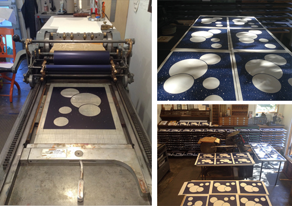
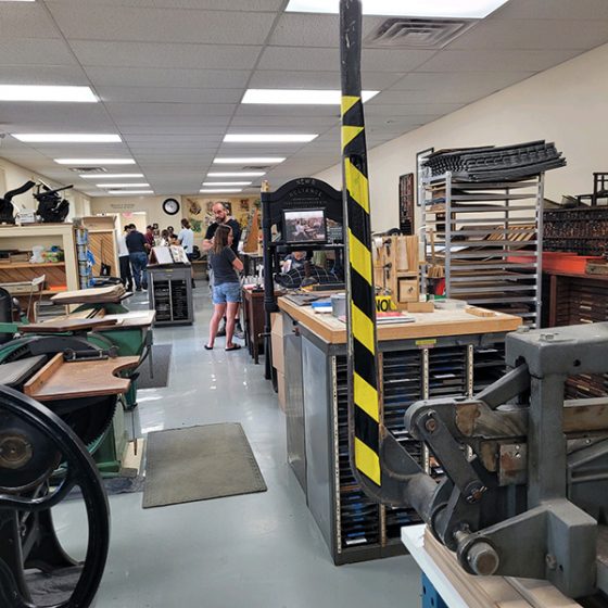
  • Marveling over the long rows of printing presses like soldiers and the type drawers and impressive equipment at the Ken Kulakowsky Center for Letterpress and Book Arts. And talking with Ken himself. 
  • Being pleasantly surprised by visitors who aren’t printers and may have a vague connection to print (publishing, marketing, artists) but thought this Fair sounded intriguing.  We hope we passed on some of our passion and introduced them to a new artisan craft. Thanks for letting us talk on and on. 
LancasterPrintersFair-vendors-BXCR
  • Welcoming fellow Boxcar employees who drove the 8 hour round trip to surprise and support us and get their own firsthand taste of the letterpress printing fair experience. What a blast!
JohnBarrett-LetterpressThings
  • Chatting with everyone’s favorite supplier, John Barrett of Letterpress Things . What an impressive array of table top presses.  If you are looking, check with John.
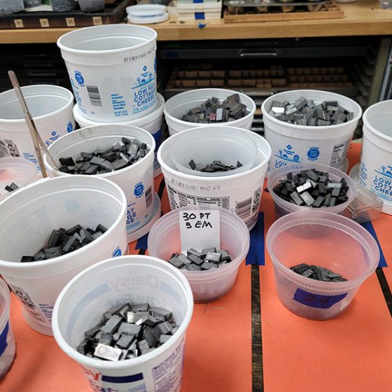
loosetype
Ornaments-vendor

We can’t encourage you enough to attend a printers fair or a Letterpress Conference (shout out to the Ladies of Letterpress this week for their conference).  There is so much to catch your eye and to marvel over if your heart is in letterpress printing.  Look for a chapter of the American Printing History Association near you and join and go to their events. Visit the various printing museums around the country and the world or a Book Arts Center.  Take or teach a workshop so the teaching and learning go on. And thanks for bringing Boxcar Press along on your letterpress journey.

Cerveza With Ben Sargent

Installment 4 ]

Next up in our Letterpress Friend chat is Ben Sargent. A Texas native and avid Chandler & Price printer, Ben is an inspiration for the pursuit of printing knowledge, and offers some good chuckles, and stories. As the conductor of Sargent Brothers Printers & Typographers, he adds a bit of charismatic style that comes only with letterpress.

Boxcar Press: So wonderful to catch up with you and delightful to have you. Speaking of delights… is there one defining moment or point that you just fell hard for printing?

Ben: It was last Christmas. I realized that was the date 60 years prior that my brother and I received our first press and type–a 5×8 Kelsey Excelsior, seven fonts of type, and the whole outfit. While we knew our Dad had been a printer in boyhood and we had grown up around the hot-type composing room of the Amarillo Globe-News, it was the first experience as “real printers” ourselves, and I never looked back. 

Boxcar Press: Tell us about a press you remember fondly (or not so fondly) or one you have now that you prefer to use?

Ben: Three years after I began on the Excelsior mentioned above, Dad brought home the C&P 10×15 Old Series he and his brother had bought as teenagers in 1928. That is the press I use to this day. She is a graceful and hardy specimen from the long-ago era of well-built iron-and-steel machinery. “I love her well and she must love me….”

Boxcar Press: What is something people might not know about you that would surprise them?

Ben: Maybe they don’t know that when I’m not printing, I can often be found swinging on and off moving equipment as a fully licensed but volunteer brakeman and conductor on our local excursion railroad. Can’t keep me away from ancient technology.

Boxcar Press: What is your printing superpower? You definitely have one!

Ben: I usually think there are always people who can do better than I in just about every facet of this trade, but if I had to choose a superpower, maybe it would be the delight I have in continuing to learn things about every aspect of the work, even 60 years into it. Sometimes new techniques, skills, and understandings come from my dear colleagues both young and old. Sometimes there are things I just figure out on my own, but it is always a pleasure to learn one more of the apparently infinite things there are to learn about this craft. 

Boxcar Press: Anything you want to reveal about a current project you are working on – even a hint or clue?

Ben: Recently, I had one of the most curious and interesting wedding invitations in the course of printing many, many such projects. The invitation itself is a thin 5 x 4 box. It was a challenge finding people who could do the tasks beyond my capacity such as the necessary die-cutting, duplexing, scoring, and laser-cutting of some tiny holes. Really the only part I had left was doing some letterpress on the inside of the box. But the finished box contains a computer chip the recipient plugs in and then touches the laser-cut openings to play various sound recordings from the happy couple. (The wedding involved a graphic designer and a computer engineer, so there you go.) 

Boxcar Press: Given these current “strange” times, what is that one project that you are always going to get to but it just never seems to get done?

Ben: If I had to pick one, might be the 3rd edition of our handset-type specimen book, last published in 2010, and in need of an update. But the deck seems to stay crowded with job work even in strange times, so it does keep getting put off.

Boxcar Press: One last question before you finish your drink, an IPA from Texas-local Pinthouse Brewing called “Electric Jellyfish”, – Do you listen to podcasts or music in your shop while you create?

Ben: I always have my Pandora channels on, which beggar the word “eclectic.” I’ve seen a young typesetter friend’s eyebrows rise when hearing Brubeck–Mercedes Sosa–Gregorian chant–Booker T and the MGs–Tommy Dorsey–Handel–Brazilian bossa nova etc. all in a row.

That was an immensely fun time, Ben. Heartfelt thanks out to you for the cheery chat!  Want to know more? Visit his website: http://sargentbrothersprinters.com/

West Coast Printing: Thom Caraway of Spokane Print & Publishing Center

Printing on press is as much a personal creative time as it is an experience you just can’t wait to share with others. This is an observation from Thom Caraway of the Spokane Print & Publishing Center. The full-time teacher and Center organizer has enjoyed creating a space where all interested in the craft could roll-up their sleeves and get inky. We spent time with Thom to talk shop, and to see how the printing world in Spokane is being discovered by others at their printing paradise.

GEARING UP FOR PRINTING ADVENTURES I’m a university English professor in Spokane, Washington via Whitworth University. I write poetry and teach classes in editing, book design, and print culture.

In 2015, I inherited a C&P from a printmaking professor who didn’t want it in the school art studio anymore. I was excited about it but had no idea what to do with it (or even how it worked). Shortly after, I met Bethany Taylor, who was getting her shop off the ground, and we decided to make a place where neophytes could come learn. She’d been to the Independent Publishers Resource Center (IPRC) in Portland, and we modeled ourselves off of their space and got going.

Spokane-Print-Publishing-Center-

PRINTING CENTER COMMUNITY We closed Iteration one in 2018 when our lease ran out, and moved into the new space as Spokane Print & Publishing Center in 2019. With the bigger space, we were able to add more presses and expand from letterpress and screenprint into relief and etching as well. Later, we added book arts and digital design and printing. My favorite thing is when there are members spread out across the shop all working on different awesome things, especially if several presses are going at once.

ALL IN THE NEIGHBORHOOD We’re a 5-minute drive from the Kendall Yards neighborhood and the Spokane River. Downtown is just across the river, so we are close to food and shopping.

Spokane-Print-Publishing-Center-2-1

PRINTING MENTORS Letterpress Instagram kind of kept me sane during lockdowns, and with no formal art or print shop training, I’m a big fan of the School of Bad Printing. Amos Kennedy, Mizdruk, Fresh Lemon Press, Bright Press, Marcos Mello. Also Rick Griffith, Amy Redmond, Ben Blount, Chris Fritton, Base Press, Stephanie Carpenter…so many great printers out there!

PART-TIME PRINTER, FULL-TIME FUN This is a side hustle from my day job teaching. I would love to get to a point where I could print full time though.

Spokane-Print-Publishing-Center-2-1

THE CREATIVE PROCESS I’m becoming more of a planner, but mostly I’m a seat-of-my-pants designer. I like seeing what happens with different applications of color, and big messy press beds full of wood type. From there, I might layer in a quote or phrase, or play around with the letterforms of larger wood type to see what happens.

Spokane-Print-Publishing-Center-2-1

PRINTING FEATS Making a more formal turn from writing to printing in the last four years has been a lot of fun, if a little nerve-wracking at times. But mostly I’m proud of our little shop. We’ve weathered COVID well, and offer classes pretty much every week now. I feel like we’re really developing Spokane’s appetite for the print and book arts, and training up a bunch of new printers!

PRESS HISTORY I have that first press – a C&P Old Style with a broken flywheel axle. Have still never gotten that thing fully functional.

Spokane-Print-Publishing-Center-2-1

BOXCAR’S ROLE We’ve gotten a bunch of ink from Boxcar, and had some plates made. And we’ve been meaning to order some logo plates, too!

PRINTING TIPS & TECHNIQUES I print mostly now on a Vandercook 14, which is really basic, so no ink rollers. Everything is applied by hand. My advice for letterpress printers is don’t be afraid to mess it up a bit. I love a nice clean print as much as anyone, but I’m also really interested in the accidents and goofs. Those are usually my favorites.

Trogdor

WHAT’S COMING NEXT I’ve got a full slate of letterpress classes spread through the year. I am hoping to grow our membership base once things open back up, and continue developing our Print Town USA events, which get the public into the shop for sales and demos, and are just a lot of (socially-distanced) fun.

A double round of applause & thanks out to Thom of Spokane Print & Publishing Center for letting us take a sneak peak at the wonderful community-driven printing center!

Part 2: 2020 Seattle Children’s Hospital Broadsides

In our second installment on the 2020 Seattle Children’s Hospital Broadside / Words of Courage, we shine a spotlight on another trio of printers who breathed life into a family story, brought to life great word pictures, and more.

Their inspiration is the poetry written by children who are patients at the hospital and with the team of Sierra Nelson and Ann Teplick of Seattle’s Writers in the Schools program (WITS).

Heidi Hespelt

I illustrated and printed “The Rat” by Lucy Watters, Age 7, for the Children’s Hospital Broadside poetry project. I think the poem is so fun and I found out after I designed the artwork that it was a family story that was told often in their household. 

Lucy, like me, loves animals and has written other poems featuring a variety of species. I wanted this broadside to be something that the family would want to hang on a wall, so the rat became part of the rose bush rather than a grotesque figure. Lucy was in my thoughts the entire time I worked on this piece. I hope that she felt that her poem came to life.

This year was special to me for printing because I set up my own printing shop in January 2020 and the broadside was my first big letterpress project in my own space, using my own machines and newly acquired type. Then Covid hit and put things on hold for so many printers. I felt lucky. I could do the entire project except for cutting the paper. And then, serendipitously, in mid-May a beautiful old paper cutter showed up for sale in Aurora, Oregon. Road trip and the cutter was mine! A couple of days after that, I was able to complete “The Rat” and send early copies to Lucy and her family. 

Here is a description of my process:

Here is the mock-up, including hand-set type proof.

Linocut, reduction-style, for the background. I also used pressure printing for the first time ever, to make the rat’s features and roses pink. It felt like an arts and crafts project and I needed  some long-distance coaching from my letterpress mentors, Jenny Wilkson and Amy Redmond.

Here I cut away the white parts of the rat and roses, and printed the green background.

More arts and crafts pressure printing to add dimension to the rose bush.

Last pass before printing the type! More of the lino block was cut away so that

the features of the rat and the outlines of the leaves and roses would pop with a darker green.

Here is the final product, before cutting to size.

And one last photo of my new shop, my printer’s helper Sheraton, and of the paper cutter that finished the job so Lucy and her family could receive the prints early. 

Annabelle Larner

I was immediately drawn to Peyton Bartz’s poem titled Something New because of the beautiful words about a mermaid tree. I loved Peyton’s descriptions – lumpy, flowing, green, honey-dew melon, rough, scratchy, hard as glass, soft. These words made me think of coral and its magical properties. Everything was hand done but the type was a polymer plate from Boxcar. I found a lovely font, Josefin Slab, to create the poem, which felt contemporary and clean. I knew I wanted to do layers and textures to match the poet’s descriptions, so I forged ahead. 

The broadside was created with five separate printing steps on the press: 

First pass: I used a piece of wood to create a subtle textured background, and printed it in a warm yellow. Second pass: I drew and cut out the coral-like tree on chipboard, glued it to wood, sealed it with acrylic medium, then printed it in a mossy green. Third pass: I created a mermaid with coral-like qualities to blend in with the tree (and used the same cutout/glued process as the tree), then printed her in blue.

I wanted to give the mermaid more features, so I carved linoleum for her face and tail, and did this fourth pass in light green to match Peyton’s descriptions. 

And finally, the fifth and final pass was the poem itself, laying on top of the entire picture so it would stand out. I felt the colors and layers of the elements looked nice and hopefully reflected Peyton’s words! 

Sarah Kulfan

This is my seventh year participating in the Seattle Children’s broadside project. I was so happy to join in on its 10th year anniversary! This year, I printed a poem that was written by 16 year old Darren Lagbao, titled ‘My Mom And I’. This poem is a loving tribute to his mom and his words honor her strength, patience and attentiveness, whether she is making adobo with pork sauce and boiled eggs or reading him to sleep.

From an imagery stand point, there is so much in Darren’s poem to inspire. I chose to illustrate the lines where he talks about his mom’s patience in teaching him to care for the family’s 5 dogs. This is something that I have in common as my extended family includes 5 dogs as well.

The image is printed from a reduction cut, or a lino-block that is carved away in between each color layer. I started with a thick paintbrush to paint directly onto the lino-block and then carved around all the little detailed edges to get the dynamic brush strokes in the blue background layer. Then I carved and printed two more layers of brown ink for the mom and the group of dogs.

There is so much in this project to be grateful for, especially this year which was fraught with challenges. I’m grateful to have been able to print Darrens’ words; to work alongside a group of amazingly talented printers; to have so much support in this project from WITS,  the School of Visual Concepts (now Partners in Print) and Seattle Children’s Hospital.

Our leadership team is 100% behind this project every year as they guide our team of printers and our sponsor partners encourage us.  For more behind-the-scenes, check out Sarah’s blog article about the project here.

Did you miss Part 1 of the 2020 Children’s Broadsides project?  Read more and visit Partners in Print to see previous years efforts and news on the 2021 Project. A thousand heartfelt thanks go out to all the printers, young poets & their families, and organizers who continue to make this Broadside collection special every year.

2020 Seattle Children’s Hospital Broadside: Part 1

It is always a treat to share the joy and delight of the Seattle Children’s Hospital Broadside collection.  The colorful stories and broadside prints are a testament to the hearty spirits of the participants. They include:  the folks at the Writers in the Schools program working with the children at the Seattle Children’s Hospital, and the letterpress printers of Partners in Print (formerly part of the letterpress family at Seattle’s School of Visual Concepts – SVC).  Together, this collaboration crafts memorable letterpress broadsides of poetry. 

At Boxcar Press, we are honored every year to be a part of this project.  This first installment of a two-part blog covers the 2020 edition of the Portfolio, titled I Know What It Means to Be Brave. Read on about three printers who share the love through wood and metal type, aligning the stars (literally) while on press, and more.

Bonnie Thompson Norman

We usually know very little about the poets whose poems we have chosen to print. We go by the feeling or inspiration we take from reading and re-reading the poems. I was drawn to Darian Parker’s poem because it felt like a benediction. The young man was 16 when he wrote his poem. I wanted to create something that felt a little more ‘grown-up’ by using a palette that seemed rather more sophisticated than child-like. 

In the poem, he thanks someone for giving him a second chance. One infers from the text that Darian is the recipient of a transplant. I placed circular shapes at the top and bottom of the broadside, one in a grey, the other in a golden color to give the feeling that he had gone from a dark place to one that was much lighter. Darian’s poem recites how he is thankful for the gift he has received.  I tried to convey the feeling of that second chance by having a large golden shape seem to be rising from the bottom of the broadside as in a sunrise. I find his poem to be a beautiful expression of gratitude and it moves me each time I read it.

The type for this broadside is all handset using both metal and wood types. The metal types are 18 point Albertus and 8 point Bernhard Gothic Light. The wood type is 8 line. I used both linoleum and ⅛” plastic for the circular shapes and printed the broadside on both a Vandercook SP 15 and a 10 x 15 Chandler & Price. The text for the poem went on the Vandercook as well as the title because these were large forms. The shapes, poet’s name and age, and the colophon were printed on the C&P. Using two presses makes it easier to move along in the production of the piece. While printing, I slip-sheeted each broadside so that the ink would not offset from the front of one sheet to the back of the next because there was so much ink coverage. I left the slip sheets in until after I had done the final trim.

Due to COVID-19, we were not able to gather together as a group to create the portfolios. I bound all of them in my home studio on my own. Gathering to bind the portfolios is a wonderful process for all of the printers. It is an enjoyable chance to visit with one another, talk about our work on our broadsides,and catch up on everything else as well. It wasn’t difficult for me to bind the portfolios by myself as I have been a commercial hand binder for a number of years but I did miss our camaraderie.

My co-leader in the binding of the Children’s Hospital broadside project over the years has been Jules Remedios Faye. Jules chose the color scheme for this year’s portfolio and created the beautiful letterpress printed label for the front cover. After all of the portfolio covers were completed, I used the entire table surface of my studio to collate the broadsides. It is always a wonderful opportunity to see all of them together and marvel at the originality and creativity that each designer/printer brings to the text of their poet. Instead of our usual wrap-up for this project when we have gotten together to read the poems out loud and talk about our design process, I was able to hand off each printer’s portfolio individually as they came to my house (safely!) to collect their copy. It was both a celebration to deliver a complete portfolio and an affirmation that we can continue to do good and meaningful work despite the challenges we faced.

Robin Kessler

My poem is “Powerful Things” by Jazee Holloway (her first name is pronounced JUH-zay and rhymes with sauté).

This poem has many images, and as usual for me, I really dithered over how to illustrate them. In the end, I went with my love of wood type and decided to highlight the words as image. 

Because of the pandemic, our options for printing on a Vandercook at SVC or other printers’ studios became very limited. So I decided to print this broadside at home, hand-inking the edition of 110 on my 14” x 24” sign press. I’m retired, and all my usual activities had been cancelled, so what the heck – I had plenty of time!

 (I use Caligo Safe Wash ink, which I thicken with magnesium carbonate)

I used my limited but beloved collection of wood and metal type for the background, and inked it in two colors. Some of the prints have a graduated or ombre look, but I abandoned that after a while. I printed the backgrounds over the course of 3 days – this is a VERY variable edition!

The text, title, and colophon are photopolymer from Boxcar. I was afraid I wouldn’t get a crisp print for the black text, but it worked out fine. I think I also spent 3 days printing the black run. 

This was a satisfying experience in “making do” with what is at hand. I’m lucky to have a couple small presses and a bit of type at home. As always, it’s an honor to participate in the Children’s Hospital Broadside project. We had our final celebration via Zoom in September – it was wonderful to see all the prints and share our printing trials and triumphs. 

Carol Clifford

I have worked with constellation imagery in two previous broadsides for Children Hospital poems. I enjoy the challenge and the depth of color you can get when creating a nighttime sky. Plus, I am a fan of using gold metallic ink and it works nicely when printed on top of a dark color. In “Constellations” I appreciated the imagery Dylan was conjuring up with the many constellations.

I thought about how best to present the poem to this young poet. I had the good fortune this summer to camp under the stars for 6 nights and I thought of how I could convey this experience to Dylan. When I go camping I love the fact that the sky doesn’t have the light pollution we have in the city. I wanted to capture that awesomeness we rarely get to experience. I wanted Dylan to feel the expanse of a clear, pollution-free starry night. I added the dark silhouette of a figure with binoculars at the bottom to not only provide a sense of perspective but to also show a curiosity to see more than what you can see with the naked eye.

I began working on the ideas for this piece shortly after picking the poem in March. However, when the pandemic began, I found myself constantly distracted and struggling to find the headspace to focus. I was relieved when a new deadline was set for August because it allowed me to get my head back in the game and provided a pleasant diversion from the big picture.

I had budgeted just the minimum amount of time to order plates (3), have them arrive in 2 days (I still find that turnaround time a miracle), print, wait for the broadsides to dry, trim, and deliver. Every day counted. I did not allow any time for mishaps and so when there was a shipping glitch, just like that I was behind schedule. A hearty thank you shout out to Boxcar who helped me in my 12th hour. They offered to resend at least the first plate (they sent the first two!) to help me stay on schedule and I was able to because of their thoughtfulness! It takes a village.

Once I was on course to print, the process, thankfully, went smoothly. This wasn’t so much a happy accident as it was just a huge relief. It doesn’t always go as smoothly. The stars must have aligned for me this year (pun intended).

Stay tuned for Part 2 of the 2020 Children’s Broadsides project!  We would like to thank all of the young writers & their families, printers, and organizers who help make the 2020 Broadsides project one of enchantment and spirit.  You can view all of the prints from all the years at the Partners In Print website here.

London-based Linocut Artist Kate Guy

Kate Guy is a London, UK-based linocut and fine printmaking artist. She incorporates bold use of flora, fauna, colors and her cat into her works. From early beginnings at the press in her family’s workshops to enjoying where the creative process takes her, Kate shares how she is carving out her own printing path.

Kate Guy is a London, UK, based linocut and fine printmaking artist.

BOLD LINOCUTS, GRACEFUL ART I live and work in London UK, I trained as a graphic designer but now I am doing what I love most. I am a printmaker working with traditional techniques on paper and fabric. My main subject area is illustrated recipe linocuts. My unique system uses individual ingredients prints which I combine to make recipes, which I then turn into quality homewares. My designs are boldly graphic and colorful giving them a modern feel whilst also celebrating a strong tradition of print and quality in British manufacturing. My products are all designed by me and made in the UK, everything is printed on organic cotton using eco-friendly inks to be as kind to the planet as possible.

Kate Guy is a London, UK, based linocut and fine printmaking artist.

EARLY BEGINNINGS My father was a graphic designer and he bought a Victorian printing press in the 1960s which fascinated me as I was growing up. I first used it when I was 7 – see comments below.

I have built up a collection of wooden type which I use to create signs and posters and also combine with my linocuts. I guess my first proper project was at Art School in the 1980s where I really began my obsession with typography.

Kate Guy is a London, UK, based linocut and fine printmaking artist.

PRINTING IN THE UK I print in my studio in Camden, my favorite thing has to be the vibrant area and the light. The studio has windows all down one side and looks out over the rooftops of North London. When I’m printing on a larger scale I go to my mother’s studio in Putney, South London. My mother is an artist and has our lovely old cast iron Victorian Albion printing press from 1857 at her studio as well as an etching and a lithography press.

Kate Guy is a London, UK, based linocut and fine printmaking artist.

LONDON LIVING My studio is in Camden, North London – famous for its trendy market and boutique shops. Once a mecca for punks and goths – you can still see a few around these days and the market still retains much of its original independent charm having (so far) resisted the chain stores and high street homogenization.

Kate Guy is a London, UK, based linocut and fine printmaking artist.

I also have the whole of London on my doorstep to use as inspiration, with its wonderful galleries and museums – most of which are free.

PRINTING MENTORS I love the work of the English linocut artists from the early 20th century – people like Edward Bawden, Eric Ravilious, and Cyril Power from the Grosvenor School. My father, although he died when I was only 9, is still a source of inspiration. It is thanks to him that we have our Albion press and I believe he instilled a love of the traditional techniques in me.

PRINTING FULL-TIME FUN Yes! Well… I do in theory, but I seem to spend most of my time these days doing marketing – I have just ‘finished’ my website. I was an Art teacher in secondary (high) school until 5 years ago when I quit following my dream of being a full-time printmaker and designer.

Kate Guy is a London, UK, based linocut and fine printmaking artist.

THE DESIGN PROCESS All my designs start with drawings, usually from life but sometimes I work from a photo. I have made a film about my process – from initial idea to the final edition of prints created during the recent lockdown (seen here: ‘Lockdown Cat with Mexican Cushion’).

PRINTING FEATS Too many to list here! (ha ha, no not really).

I have done lots of different things in my life; I’ve been a graphic designer, animator, illustrator, glass artist, teacher, and mother to name a few. Now I have the time to be the printmaker and designer which I think I was always meant to be.

Kate Guy is a London, UK, based linocut and fine printmaking artist.

PRESS HISTORY I grew up in a house with two studios – one for my mother and one for my father and a beautiful old Albion press. On this press, I made my first linocut and letterpress print aged 7, ‘Ereh si a tac‘. Basically, as a know-it-all 7-year-old, I wouldn’t be told how to lay out the letters to go with my little linocut of a Cat…

You can read all about it on my blog.

The first press I bought myself was a Victorian book press which I found in a ‘Marche au Puce’ (Flea market) in the South of France.

Kate Guy is a London, UK, based linocut and fine printmaking artist.

BOXCAR’S ROLE I find your work and ethos inspirational and was delighted to be asked to complete an interview for you. Sadly I am a bit far away (London UK) to visit in person at this time. I also share your obsession with heavy antique printing equipment.

Kate Guy is a London, UK, based linocut and fine printmaking artist.

PRINTING TIPS Always keep your dirty area and your clean area separate and use folded paper ‘tongs’ to pick up your paper for printing. I always get very messy printing (one of the fun parts) usually with ink on my face and everywhere else, but there is nothing more annoying than a perfect print with a big old thumbprint on it!

Kate Guy is a London, UK, based linocut and fine printmaking artist.

WHAT’S COMING NEXT My plans have been very much affected by the pandemic. I had lots of live events planned, I had taken a stall with a demonstration area at shows across the South of England, a couple of these are still holding out but most have been canceled. I am hoping we will be able to be back to normal for this upcoming Christmas season.

I was also planning lots of printmaking teaching and workshops in my studio but…[unusual times have happened].

2021 Mother’s Day Letterpress Gift Guide

We scouted out for your gifting pleasure some of the most delightful & heartfelt Mother’s Day gifts & cards. Peruse the many items here that show your affection for the #1 Mom in your life. Catch something we missed?  Let us know in the comments below!

1. 6” Soft Rubber Brayer from Takach  |  2. Loving Me Through My Messes letterpress card from Thimblepress  |  3. Mother’s Day Dogwood letterpress card by LetterpressPDX  |  4. Letterpress Boxcar Press t -shirts from Boxcar Press  |  5. Southern Sayings letterpress coasters from Ancesserie (For the mom whose kids never seem to remember to put their drinks on a coaster)

 6. Grandma letterpress card  from Kiss and Punch (don’t forget the Grandma in your life!)  |  7. Masy Chighizola – Dahlia and Rose art print from Blackbird Letterpress (A bouquet print that never fades or drops its petals)  |  8. Book earrings from PurgatoryPiePressINK |  9. PANTONE Notebook Set by PANTONE  |  10. Font Hoarder enamel pin by itsgeoffrey

Top 10 Valentine’s Day Letterpress Picks for 2021

Looking for inspiration for that special printer in your life? Come check out our quick list of ten favorite gifts for this upcoming Valentine’s Day 2021—featuring fresh, hilarious, sweet, and extra special gifts for that certain someone.

Inspired by our Valentine’s list?  Let us know in the comments below!

Valentine's Day 2021 Gift Guide

1. Field Notes T-shirt and Field Notes from Field Notes Brand  | 2. Love Song from Fickle Hill Press | 3. Chandler & Price Platen Press enamel pin from the paper carnival | 4. Johannes Guttenberg sticker by WritersSpot | 5. Trump valentine letterpress card from DeLuce Design

Valentine's Day 2021 Gift Guide

6. Seahorse Lovers print from Anomal Press  | 7. 12″ or 18″ Line Gauge from Boxcar Press | 8.  Hedge Hug letterpress card from Dogwood Letterpress | 9.  Giant Mighty Love letterpress card from Benchpressed | 10. Wine glass stem tags from Laughing Owl Press

Bourbon With Paul Moxon

[ Installment 3 ]

Our Letterpress Friend chat today is with Paul Moxon. He is synonymous with Vandercook presses.  He is the resource behind the website vandercookpress.info, author of Vandercook Presses: Maintenance, History and Resources, and a printer of letterpress books and broadsides under his press name Fameorshame Press.

There is always much to learn from a conversation with Paul, who lives in Mobile, Alabama. 

Boxcar Press: Why Vandercooks and proofing presses?  What is the appeal and draw for you?

Paul: A forlorn SP15 in the corner of a printmaking studio was the first press to which I had access. The ratio of its footprint to the printing area was appealing. Experiment and production were satisfying and different than paste-up. In time, I found joy in teaching maintenance and making repairs. Sharing this knowledge with other printers has surprisingly become my life’s work.

Boxcar Press: Is there one defining moment that you can recall or point to that was the start of your printing career or business

Paul:  Learning phototypesetting and paste-up as work-study in college.

Boxcar Press: Tell us about mentors or printers that you admire or set you on a particular path? 

Paul:  There have been so many. During college, Jocelyn Dohm (founder of the Sherwood Press) always welcomed me at her charming little job shop and endured my novice enthusiasm. Librarians Jim Holly and Elspeth Pope introduced me to fine press books. At Alabama, Glenn House, then retired, piqued an interest in maintenance. Fritz Klinke let me explore the Vandercook archives. Ian Leonard Robertson (Slow Loris Press) and I shared similar work experiences. His old school presswork and design was crisp and effortless. Most of his equipment is now in my shop, and I feel his jovial presence every day.

Boxcar Press:  If you weren’t a printer or in the printing industry, what else might have been your career path?

Paul : A machinist

Boxcar Press:  That is not surprising. You have referred to yourself as an independent educator.  

What would you tell a brand new letterpress printer today?

Paul:  Visit many shops, libraries, and museums. Attend wayzgooses, talk with everyone. Print on every kind of press you can big and small. Print every kind of form; lead, wood, copper, magnesium, and polymer. Strive for best practice. Read everything, especially old technical manuals and catalogs. Don’t be discouraged by the high prices of presses. Save-up, be patient, you become discerning over time. or grumpy old naysayers. Mistakes will make you an expert.

Boxcar Press:  Tell us about a press you remember fondly (or not so fondly) or one you have now that you prefer to use?

Paul:  I’ve printed on other makes of proof presses, jobbers, tabletops, hand presses, and even a windmill. Each had something to teach me. (Someday I want to print on a Heidelberg cylinder and a Little Giant.) I love my Vandercook No. 4. It’s great for production and teaching maintenance. I’ve printed on, tuned up, or inspected thirty Vandercook models, including some rare ones—nearly a thousand in all. But there are still a few I haven’t worked with, such as the 30-26 four-color press. Hopefully, post-COVID.

Boxcar Press:  You have mentioned that you are fascinated by the vintage equipment and tools.  Tell us about one of the best or most used or most admired printing tools you can think of?

Paul:  Hard to choose: my loupe, paper thickness measure, and Align-mate are essential. But I love the elk-bone folder/plate lifter I made at Penland twenty years ago when I met Jim Croft.

Boxcar Press:  What is something people might not know about you that would surprise them?

Paul:  I can’t type, just hunt-and-peck. But I can handset type like a motherfucker.

Boxcar Press: What is your printing superpower?

Paul:  Being able to diagnose presswork and mechanical issues.

Boxcar Press:  Anything you want to reveal about a current project you are working on – even a hint or clue?

Paul:   Right now I’m into printing postcards. My last one is about the USPS and Trump enabler Louis DeJoy.

Boxcar Press:  What is that one project that you are always going to get to but it just never seems to get done?

Paul:  A book of three poems by a deceased, local author. I commissioned lino-cuts from Lauren Faulkenberry (Firebrand Press) a few years ago, but I fear that they may be drying out.

Boxcar Press:  Last question – Do you listen to podcasts or music in your shop while you create? 

Paul:  Music is essential. Big Joanie, Dinner Party, the Hu, and Idles and are in heavy rotation. The rest of the time I’m streaming KEXP.

That was an enjoyable time, Paul.  Thank you for the friendly chat and we’ll plan another.  Paul is also involved with the American Printing History Association, that encourages the study of the history of printing and related arts and crafts.  Visit his links to vandercookpress and fameorshamepress.

Coffee with Don Black of Don Black Linecasting

[ Installment 2 ]

We are “pulling up a chair” with Don Black, a Northern neighbor from Scarborough, Ontario.

Don is winding down his business after 50 years and the dismay and sadness of that is still a jolt to our letterpress community.  

A warehouse of heavy metal and wood is not an exaggeration describing Don’s business.  He and his family, particularly his son, Craig, have helped and talked with thousands of printers and artisans over those decades.  Sadly, Craig passed away last year and Don is eyeing a quieter life.

Boxcar Press:  It’s a delight to hear your stories.  Let me first say, thank you for your kindness to me and all the others who were at one time new to letterpress printing.  It must be a screwy time right now with the business..

Don: We are super busy with the closing of our business.  Our General Manager Albert Kwon is invaluable in this endeavour. 

Boxcar Press:  Let’s go back to the beginning.  Is there one defining moment that you can recall or point to that was the start of your printing career?  

Don:  The defining moment that I knew I wanted to make Printing a career occurred when I went for a tour of the Globe & Mail (newspaper based in Toronto, Canada) with my uncle who worked there.  When I saw all the equipment in the Composing Room I decided this was for me.

I started to work at the Globe & Mail before I was 17 doing all the delivery jobs etc.  Then I served a 6 year apprenticeship as a Linotype Machinist.

Boxcar Press:  Tell us about mentors or printers that set you on a particular path?

Don: While working there was a machinist, Ed Hull, who helped me immensely by guiding me and tried to keep me on the right track.  I think about him often and am super thankful for all he did to help me.

While working as an apprentice at the Globe & Mail, the Credit Union ran a contest for the best designed Printing job.  This was open to seven Printer apprentices, but no mention about Machinist apprentices.  I questioned them and received permission to submit an entry.  Believe it or not, I won the prize of $25.00  I still tease my friend today,  who was a printer’s apprentice, that a machinist apprentice beat a Printer apprentice at the Printer’s trade.

Boxcar Press:  Where was the next stage in your career?

Don: I left the Globe & Mail in 1964 when the three Toronto newspapers went on strike.  I started to do freelance service on letterpress equipment.

Then I received the  Canadian dealership for Letterpress Equipment for Canada from Canadian Linotype Company.  This was a big help as it opened doors coast to coast and helped me to meet many great people.

After I started my business in the 1980’s I became acquainted with an equipment dealer in Cleveland, Jack Boggs.  He bought and sold all kinds of printing equipment.  Over the next 30-40 years, we did a super amount of business.  He liquidated printing shops that were closing or upgrading equipment.  I purchased many truckloads of equipment from him.  It was great as it gave me access to things I could not find in Canada.  We still do business today and without a doubt, he is a big reason we have been successful.

In the early 1970s, something strange happened when the Globe & Mail decided to update a lot of equipment.  I purchased most of the Composing Room which had some great equipment but also included were eleven machines which were now outdated.  They had originally cost approximately $25,000.00 each, less than 10 years before.  The value in scrap was less than $500.00.  We made a large copy of the cheque and mounted it with the eleven nameplates from the machines.  It has become quite a conversation piece that we still have at the office today.

Boxcar Press:  What does the legacy of Don Black Linecasting mean to you as you slowly wind it down.

Don:  I would say it’s the fact that we have been in business more than 50 years, conducted and did business with wonderful people all over the world and helped to keep Letterpress alive.

Boxcar Press:  You handled so many of pieces of equipment, they can’t even be counted.  Can you tell us about a press you remember fondly?

Don:  We have a Baby Reliance Iron Press which we purchased from a customer in Winnipeg.  It is a beautiful press and I could have sold it many times, but Craig, my son, always said don’t sell this press.  Now that he is gone and we are closing down, I am going to let it go to a collector that had talked to Craig.  I know Craig would be happy that it is going to someone who will treasure it.

Boxcar Press:  Thank you Don for those great memories.  We’ll talk more soon.  Can you leave us with your favorite printing saying?

Don:  Go with the Best!  Go Intertype.

Time is ticking down on getting equipment from Don, give him a call or email to ask what he has and chances are, you’ll get a nice deal. www.donblack.ca