It has been over forty years since Ke Francis of Hoopsnake Press and Flying Horse Press set up shop in the creative haven of Tupelo, Mississippi. But recently, Ke has been bitten by the revitalizing bug and it shows—from spirited gatherings (with spirits) at the academic mecca of the Bellagio Center, revamping his dear and true Hoopsnake Press, and having his work shine in a multitude of galleries and collections, including The Polaroid Collection. Here, young-at-heart Ke reveals the awe-inspiring interstices found in the lush canopy of design and message.
 AN ARTIST WITH MANY TALENTS I am a narrative artist with 40 years of experience. I came to be involved in book arts because I had written stories that I wished to publish and I am a trained printmaker. I set up a studio in Tupelo, Mississippi in 1970 and worked there as an independent professional artist / book artist from 1970 until 1996. I am presently in the process (a two year project) of moving my studio back to Tupelo. In 1996 I moved Hoopsnake Press to Orlando, Florida and became the Director of Flying Horse Editions at the University of Central Florida. Over the past 15 years FHE has had two other directors (Ryan Burkhart and Theo Lotz) and the press has become a world-class facility with their help. I have served as a tenured professor in a number of administrative capacities during that time period, but have always maintained Hoopsnake Press and an active studio career.
I am represented by Lowe Gallery in Atlanta and regularly exhibit there. My book works, paintings, prints, photographs and sculptures are in numerous public and private collections including The Getty Museum, National Gallery, National Museum of American Art, High Museum, New Orleans Museum of Fine Art, San Francisco Museum of Contemporary Art, Yale / Sterling Memorial Library, Van-Pelt Dietrich Collection, and The Polaroid Collection, among many others.
THE ADVENTURE BEGINS I went to Italy on a Rockefeller Grant to the Bellagio Study Center where I was lucky to spend time with some very interesting professionals, including Carl Djerassi (Djerassi Foundation in California), Rollo May (psychologist), Paula Fox and Martin Greenberg (authors) and many other interesting characters. We drank bourbon and read each other stories in the evenings for entertainment. I was encouraged to find a publisher. Following up on their suggestions, I went to see Andy Hoyem in San Francisco. He shut down Arion Press for the afternoon and I read them short stories and showed them my woodcuts. Andy was interested and liked the work but he realized I wasn’t as well known as the artists and writers he has chosen to publish (Dine, Motherwell, James Joyce, etc.) and he would have a hard time selling my work. He’s a good person and a smart businessman.
 I returned to Mississippi, entered a national print competition with a woodcut and won first prize (Warrington Collescott was the juror) and met a person at the exhibit reception that wanted to sell a 14.5 x 22 C&P. I bought the press then and there and hauled it back to Tupelo. With no formal instruction I printed my first book, Jugline, using woodcuts and lead type. This strikes me as silly to have started on this letterpress venture with no formal training but I did have friends who were commercial printers and they were helpful. I sold over 150 copies of Jugline and it is in some terrific collections.
Letterpress printing would represent about 15% of the concept development and production of one of my projects so it probably makes sense that my mentors cover a wide range of disciplines. Jim Trissel was an early letterpress influence. I went to Colorado College as a visiting artist, at his invitation, and got interested in his early work with photopolymer.
THE CREATIVE PROCESS My creative process is highly intuitive. I tell my students that if they successfully complete their envisioned project with no mistakes then they have probably plagiarized someone. Unless a person is a true”visionary” they are copying ideas they have seen and appreciated. Every time they make a mistake and find a creative solution that solves a problem (a fanfold to correct an imposition mistake, etc) then the creative project moves one step closer to being their own idea and not a plagiarized idea. Mistakes are your friend…maybe even your savior…

I have been working so long I can actively steal from myself. My process is a crossover of the creative writing process, the visual imaging process and the processes involved in multiple production. Each of these processes benefit from the mistakes made in their sister processes. Each mistake provides opportunities for innovation and creative problem solving. Every time a problem is solved creatively the whole body of work takes a giant step forward. Even the frustration becomes bearable when this principle is understood. Almost…
CRAFTSMANSHIP SHOULD BE NEARLY INVISIBLE The history of printing has produced an amazing group of specialists who have traditionally worked on the collaborative efforts involved in the writing, designing, illustrating, printing, and binding of a book. Each of these processes have their own heritage and history.

These craftsmen and artists have devoted their whole lives to their portion of these collaborations and it is not unusual at fine press sites to find projects involving writers with fifty years of experience, designers with fifty years of experience, illustrators with fifty years of experience, printers with fifty years of experience and binders with fifty years of experience. The sum total of their experience is often 250 years (or more). I respect these collaborative craftsmen and artists and often am amazed by their facility and their faultless production.
I really have tried, throughout my career, to stay focused on the communication of concepts and ideas and in order to do that I have maintained the position that I am neither an artist nor a craftsman. If the first response to one of my works was, “it is beautifully printed – beautifully crafted” then I would certainly feel that I had failed in my effort. If the first response was an intuitive strong emotion based on the content of the work then I would feel pretty good. I am of the opinion that the assessment of craftsmanship should be (at least) a secondary response to a communicative object.
Craftsmanship, in my estimation, should be nearly invisible.
SOURCES OF PRIDE I am proud to be a contributing member of an artistic community whose primary purpose is to encourage and support the highest cultural ideals. I am proud to have been directly associated with so many brilliant and talented people, and I am proud of my family (immediate and extended) and their ongoing contributions to make this a better society.
BOXCAR’S ROLE Boxcar Press has played a supportive role in my efforts since Boxcar began. Early conversations about my work, advice on plate making, technical support for the photopolymer processing, printing advice and sometimes just swapping funny stories and the moral support given by Harold and all of the employees has helped me through relocations, equipment moves and the many ongoing frustrations associated with trying to achieve the experience necessary to produce the work at hand.
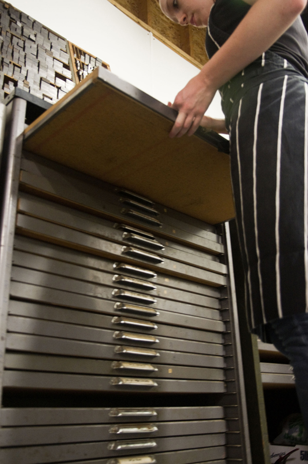
 THE PRESSES It’s a long story [laughs] involving a bunch of great folks and many presses. C&P’s, Challenge Proofers, large and small Vandercooks, Pocos, Etching presses I built and purchased, and the old Reliance – I still own them all.
SHOP TIPS The best piece of applicable advice came early in American history…Ben Franklin said, “He who teaches himself has a fool for a master.” Hard to argue with or improve on that statement. I have flown in the face of that advice and paid a heavy price.
I have also learned some really innovative and interesting stuff from my mistakes. All of which would have not occurred if I followed some master’s advice. The important part of the quote is that it informs you, early on, that the creative and innovative path isn’t a pleasant experience….maybe rewarding, but not pleasant or easy.

WHAT’S NEXT I am currently on Sabbatical from the University of Central Florida where I maintain a research space as part of Flying Horse Press. I intend to finish some book projects that are long overdue and work on a series of paintings and engravings based on the theme of “Rafters” (people and animals isolated on rafts in dire circumstances)…stories will follow the graphic work and the books next. I have several one person exhibits (Florida Mining Gallery in Jacksonville in the Fall and Piedmont College in Georgia this winter). I am in the process of upgrading my studios in Mississippi and expect to be in production there again by the Fall of 2014.
Big round of thanks to Ke for letting us get the double-scoop on both Flying Horse and Hoopsnake Press!


 I decided to get a Fuchs and Lang litho press tattooed on my back as a kind of homage to what is no longer made, and had plans to compliment it with an old style C&P 10X15 eventually; obviously not two at a time. These were by no means my first tattoos, and so I knew what I was getting into and knew what I wanted out of the artist. I found the appropriate engravings and took them to a few tattoo shops and talked to some folks/had consultations, and eventually settled on a fellow named Josh Egnew at 3 Kings who I had worked with before. Firstly, he did such a great job with the Fuchs and Lang that I was excited to bring him the drawing of this C&P; he kinda balked at it at first, as it was even more of a p.i.t.a. than the litho press, but after taking the time to trace it out for a transfer – he seemed happy enough, but a little bit reluctant. It took 2 sessions: one to outline and handle some of the shading, and the other to finish up the shading. By comparison, the litho press took him one session. I’m sure I squirmed a lot more for the C&P.
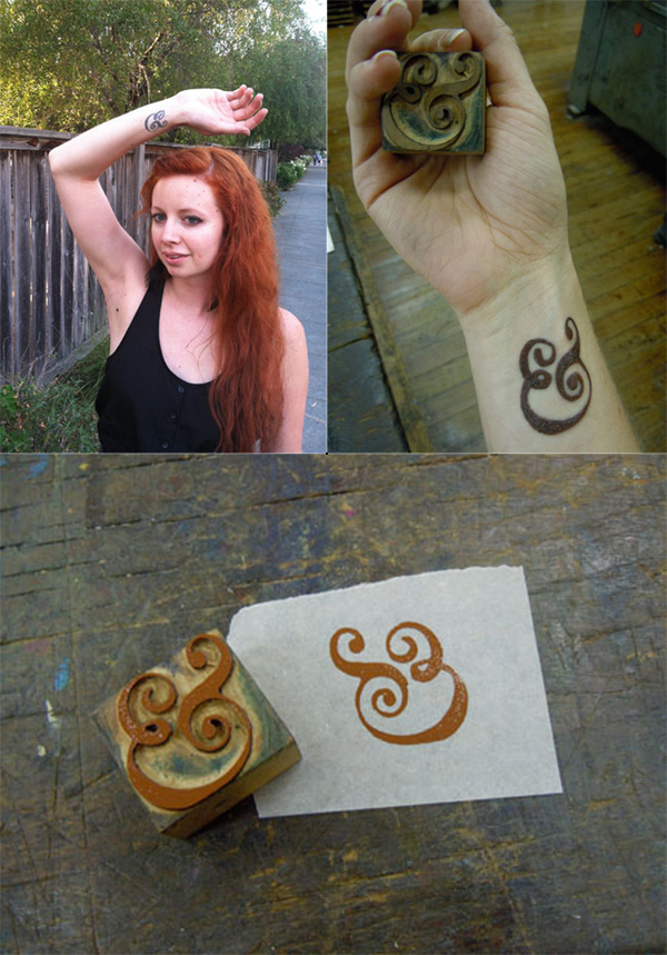 When I was about to graduate from CCA (California College of the Arts) with a degree in Graphic Design, I knew I wanted a bit more of a hands-on approach to design in my life than most of my classes had emphasized (I took a lot of letterpress and bookmaking on the side to make up for it). On a whim I applied to the Hatch Show Print internship program for the month after graduation, and I got accepted! Thus, my boyfriend and I relocated to Nashville, Tennessee for 6 weeks.
 While I was at the Ladies of Letterpress conference this year, I decided to get a type related tattoo as a souvenir. It’s a less obvious version of mind your p’s and q’s. When I look at it, it is a p and q within curly brackets and from the perspective of someone else, it is a b & d.
 I had the tattoo done just a few months after dropping out of college here in Mexico City. My job back then required me to do a whole lot of print work for the company I used to work. However, being so inexperienced and contact-less after dropping out, I had to try quite a lot of print shops, most of which produced less-than-stellar results.


