The Second Annual Letterpress Broadsides Project

For the second year in a row, we are thrilled to share with you photographs of an incredible collaboration between the folks at the Writers in the Schools program (WITS) and the School of Visual Concepts in Seattle, Washington. For the last two years, WITS has worked with terminally ill patients at Seattle Children’s Hospital to write poetry, out of which artists create beautiful letterpress broadsides. At Boxcar Press, we were privileged to be included yet again, and gladly offered up free photopolymer plates for the project. Below are photos of the process, as well as few shots of the incredibly inspiring poetry written by these kids and young adults.


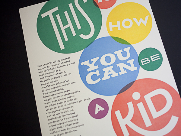
The second annual portfolio includes 16 hand-set artist-made letterpress broadsides. WITS Writers-in-residence  Sierra Nelson and Ann Teplich worked with patients at the Seattle Children’s Hospital to write the poems, then 16 artists from the Seattle area took the poems and translated them into works of art. The poems were printed as letterpress broadsides and included in a striking red portfolio.

At the end of the project, each patient received a portfolio, as well as ten copies of their poem to give to their family and friends. Some patients were given the opportunity to read their poem in front of a live audience.

So many people worked to make this project a success, including letterpress printers volunteering their time, and Mohawk Papers donating paper. It is truly inspiring to see letterpress used in such a positive way!

Do you have any “Doing Good” projects you’ve worked on that you want to share? Let us know! We’d love to hear about them!

Boxcar Talk With Julie Nash of Duet Letterpress

The soft staccato clicking of a Pearl Press. The fluid transfer of the ink to paper. The deft movements of feeding the press. All sync together in a performance that results in one of the many print runs at Duet Letterpress. We caught up with Julie Nash to find out just what it takes to keep this letterpress dance moving.

THE DUET DUO Duet Letterpress is a graphic design and letterpress studio owned and operated by a husband and wife duo. We specialize in custom projects including (but not limited to) stationery, invitations, announcements and business cards. Everything is designed in-house and individually handprinted on our turn of the century, pedal-operated Golding Pearl press.

I’m Julie, half of the Duet duo. I’m a Cajun girl who loves traveling, dark chocolate, really good music and pretty things. My husband, Kacey, is the other half. He was born in Texas and raised in Tulsa. He loves movies, video games and has a crazy knack for trivia. He’s an avid sailor. We also happen to be passionate about letterpress printing.

IN LOVE WITH LETTERPRESS My obsession with letterpress printing began when we were looking for invitations for our wedding. Once I held a thick, cotton letterpress printed invitation in my hand, I was in love. It felt so luxurious and special. I wanted to know more about how it was made. I started doing extensive research into the art of letterpress printing and was positively hooked.

TWIN TALENTS IN TEXAS We print in a small 12′ x 12′ studio in the Austin, Texas area. With a lot of organization and a flood of natural light, the space works out quite well for us. And, I love being in such a creative hub.

PRINTING ROLE MODELS When we were first starting out, smaller letterpress businesses like Simplesong Design [who has since really taken off!] to larger, print heavy companies like Studio On Fire really inspired us and still do!

THE DAILY GRIND Many concepts start with a brainstorming session and a pencil and paper. From there, I’ll either take the designs into the computer and convert them to vector artwork or start fresh using Illustrator to recreate the designs. The vector graphics are then sent off to Boxcar to make photopolymer plates to use for our letterpress printing.

DESIGN MEETS PRINT Thanks to my strong graphic design background, we are able to provide both print and design services. For me, I see letterpress printing as an extension of what I already knew and loved – designing. By doing our own printing, I’m able to have a hand in everything from start to finish. From brainstorming on pencil and paper to mixing ink to holding the freshly printed piece in my hand. I crave what I do and truly love it.

FOCUSED ON THE BUSINESS I design and print full time. Although we established the business in 2008, it wasn’t until 2009 that I was able to focus my attention solely on Duet Letterpress. Prior to that, I was working full time as an in-house graphic designer.

PRESS HISTORY We spent many months researching the type of press that would best fit our needs. We needed it to be on the smaller side yet pedal-operated. Once we decided on a Pearl Press, we then spent many more months locating one.

Since then, we’ve acquired another Pearl Press as well as an Old Style Chandler & Price that we are currently restoring and hoping to get it printing again.


We searched from Texas to Florida and then started making our way north through the states until we located a Golding Improved Pearl No. 11 Press in Missouri. One weekend, Kacey and I rented an SUV, drove up to Missouri, disassembled the press and drove it home. Then, it took more months for him to clean it, prime it, paint it, reassemble the press and get it working again.

PRINTING FEATS I’m really proud of how far we’ve come with our printing knowledge and techniques. On our little Pearl Press, we’ve been able to print some very laborious pieces with tight registration like the invites we printed for our daughter’s first birthday party.


BOXCAR’S ROLE
The printing information and videos on Boxcar were very valuable when we were first starting out. We’ve also gotten several tools and inks as well as the photopolymer plates that we use each time we print.

SHOP TIPS A while back on a letterpress printing forum, I remember reading about how there is a reason other forms of printing took over letterpress printing in the mainstream world of printing. Letterpress printing is hard work and very time-consuming. However, the finished piece is beautiful and something to be admired and respected. When it’s done right, it is truly a piece of art. It’s one of the reasons we continue to do what we do and love it so much!

WHAT’S NEXT I just feel so happy that I’m able to do what I love each day. I plan to continue to design and print and see where 2013 takes us!

Big round of thanks to Julie for letting us get the full story on the many sides of Duet Letterpress!

Important Numbers to Remember in Boxcar Platemaking 101

Everyday at Boxcar Press we throw around these numbers on the phone, in emails and to each other.  Some of us have even been known to mumble them in our sleep at night.  What makes them so special above all others?  See if you can guess what each one stands for.

94, 95, 145, 148, 152, 175: all of the plate types sold by Boxcar Press. The higher the number, the thicker the plate. 94 and 152 are available as both plastic backed and metal backed plates. If the number is followed by “SB”, it is a steel backed plate, not the number of stolen bases.

1:00: the time designated as the cut off or deadline for ordering same day rush service – 1:00pm EST to be exact.

6:00: the cut off time in the evening (again, Eastern standard time!) for creating a job ticket and submitting files for one day turnaround.

17 and 22: the largest plate size we can make in our platemakers that will fit on our Vandercook proofing press.  If your files measure greater than 17″ x 22″, break them up and submit 2 files.  You can always put them back together on your press to make letterpress love.

62 and 67: pricing per square inch for platemaking – $0.62/sq. inch for plates with the number 94 or 95 in their plate name; $0.67/sq. inch for plates with the number 145, 148, 152 and 175 in their plate name. And for some of you, ’67 may have meant the summer of love in San Francisco.

30: minimum charge for platemaking – $30 per job ticket.  Also the cost of overnight air shipping via UPS in the US.

.35 and .25: the minimum guaranteed line thickness for our plates measured in points (pt).  Lines should be .25pt for 94/95 plates and .35pt for anything larger.  Remember, dotted lines are considered dots and not lines.   Dots have their own special numbers and shouldn’t feel slighted at all.

1 and 1.25: preferred dot thickness for our plates, also measured in points.  Proper dot thickness helps those individual, stand-alone-by-themselves dots to stand firm and tall and press boldly into your paper.

0.5: the number in inches we add to your platemaking dimensions for the height and width.  This half inch is needed for the platemaking process.

.875 and .853: the thicknesses for the standard Boxcar base and the deep relief Boxcar base.  And some really good bowling scores after 3 games.

.918: this is an easy one. This refers to type high, or the standard height of type.  However, it also could refer to the Porsche 918 Spyder or the name of a letterpress club at the Lancaster Heritage Center Museum Print Shop in Lancaster, Pennsylvania (the 918 Club).

Now these numbers will have special significance for you too!

Workspace Spotlight: That Sky Blue Press

In the neighboring north of Canada sits a letterpress shop with a self-proclaimed international flavor and big expectations. Litsa Babalis, of That Sky Blue, is the owner and main designer for the company and you can find her work across the North American continent. But it all starts here and she is happy to take a break from designing and printing her environmentally responsible cards to take us on a shop tour.


THE PRESSES We have four presses: three 10×15 windmills and one 12×18 Chandler and Price.

SIZE OF PRINT SHOP 1200 square foot studio.

TYPE OF SHOP We occupy the space completely for our own production, however we often offer classes to students and letterpress enthusiasts after work hours.

THE LOCATION We are based in Montreal, Canada. Our studio is located on the banks of the historic Lachine Canal and minutes away from great coffee shops, markets, and the most adorable & friendly boutiques.

FAVORITE THING ABOUT THE SHOP How can you not feel creative being surrounded by these beautiful machines? Seeing them in action everyday is sure to inspire anyone.

NUMBER OF PRINTERS IN SPACE two pressman, one presswoman (me, whenever I get a chance to get on press… I take it) and one intern.

MOST VALUABLE SHOP TOOL The great people that work here.

FAVORITE INK We use soy based inks. We love the coverage they can handle and the drying time is very quick. My current favorite color has to be 871 gold…I love the way it looks on dark paper as well as the standard white cotton papers we use.

SOLVENT OF CHOICE We use California Wash for our everyday clean ups. It’s great because it’s water miscible, it has a mild odor, and is not harmful for your rollers.

PLATE AND BASE OF CHOICE We use the standard base and the KF95 regular relief plates.

OIL OF CHOICE We prefer to use a heavy weight, non-detergent press oil for our presses.

WHAT TYPE OF RAG DO YOUR CLEAN UP YOUR PRESSES WITH  We use a linen service who comes and picks up our soiled rags once a month and replenishes our stock with clean 100% cotton industrial shop rags.

FLOORING MATERIAL Concrete.

FLOOR PLAN TIPS We have a very small space, so getting the right floor plan is quite important to our work flow. Adding new equipment to our space is always a challenge, so we end up moving everything around once or twice a year. We try to use every square inch as best as possible and that includes wall space. Hanging tools and chases and putting up shelving for inks and other press room supplies saves us on floor space so we can move around a little easier.

PIED TYPE As incredible as it is to have that little bit of printing history in the form of lead type scattered around in drawers and boxes, it just wasn’t getting any use from us so we gave it away a long time ago to a deserving letterpress & typography master.

ORGANIZATION ADVICE I am a neat freak. I like my press shop to be in order, otherwise I feel distracted. The best advice I can give on keeping an organized space is when you use something, put it back in it’s place and clean as you go.

PRINTING ADVICE Get to know your machines really well, take care of them, and most of all be patient with them as they get older and more stubborn…Be good to them and they’ll be good to you!


Boxcar Talk With Johnny Brewton

From mind-boggling multiple color runs to must-have limited editions, from vinyl to Hunter S. Thompson, the elusive (and quite captivating) Johnny Brewton of X-Ray Book and Novelty Co. has a great story — read on to find out how he got started in letterpress printing and where his business is heading.


LETTERPRESSED FOR DETAILS I’m a letterpress printer, graphic designer & small press publisher with a focus on limited edition projects. I publish the assemblage magazines X-Ray & Bagazine plus assorted chapbooks, broadsides, artist books and miscellaneous odd print projects.

PRINTING AS A NECESSITY I was living in the San Francisco Mission district in early 1993 and began work on the first issue of X-Ray. It was to be a limited edition assemblage journal of sorts, non-disposable with original art and hand printing similar to a copy of Wallace Berman’s Semina.

Letterpress was the perfect tactile medium. So I began designing the inserts for letterpress, and paid printers like Artnoose and The Toxic Coyote to run them for me. Eventually – and out of necessity – I acquired my own press and began doing the printing myself.

WEST COAST WONDERS We go back and forth between our house in Grass Valley California and our apartment in San Francisco (lower Haight). My studio is located in the basement of the house my Dad built (in Grass Valley). We’re on 5 acres surrounded by Cedar, Black Oak and Sugar Pine trees. It’s a nice place to work & call home.

PRINTING MENTORS Jon and Louise Webb who published Outsider (Loujon Press), Wallace Berman (Semina), Graham Mackintosh (White Rabbit Press) and of course H.N. Werkman.


THE DAILY GRIND Step 1. Wrap my head around the obvious big idea and make a rough first draft – just to get it out of the way and grasp the concept.

Step 2. Take an abstract sideways approach, which is usually too wacky and avant-garde for a client. It’s always good to try something that’s the opposite of whatever seems obvious.
Step 3. I combine steps 1 and 2 and make a mutant third version. That process can change depending on who I’m working with. I’ll usually go with the one that’s the most appropriate for the integrity of the project.

DESIGNS THAT STAY TRUE TO THE CRAFT Sometimes I’m asked to design to look like letterpress when the piece is to be mass produced and offset printed. I avoid the exaggerated and over distressed look. It’s become overused and cheapens the craft. Once you see this used in a T.G.I. Friday’s commercial the jig is up!

FULL TIME FUN Not running the press full time yet but I print as much as possible and hope to be running it full time by the end of the year. Working out some details, website and getting ready to launch X-Ray Letterpress Service.

PRESS HISTORY Around 1994 while visiting my Dad I came a cross a little Kelsey 5 x 8 at a junk shop. I didn’t buy it but I told my Dad about it. He went down, purchased it and gave it to me for my birthday. I still have it.

Press List: Vandercook Universal No.1, Poco Proof Press, C&P 8×10, Kelsey 5×8.

PRINTING FEATS
Seeds on Hard Ground – Tom Waits
The Sudden Fart of Billy Childish – Billy Childish
Mistah Leary, He Dead by Hunter S. Thompson
Hunter S. Thompson – X-mas in Woody Creek
Richard Brautigan chapbook: Desire in a Bowl of Potatoes
POOP! – Charles Bukowski/Michael Montfort Box of Photos & Broadside
Bern Porter FOUNDS 1- 9
True Confessions – Tom Waits
The assemblage magazines X-Ray and Bagazine
Broadside of the Month Club. B.O.T.M.C.
Tom Waits Orphans LP and CD set
Neil Hamburger Heckle Cards 1 & 3
Neil Hamburger & Pleaseeasaur Souvenir Record
Instructions for Redemption – Mark Faigenbaum
Tanka-Toys – August Kleinzahler
The American Scene – F.N. Wright
Outrun the Blast – John Brewton Sr.
City Lights Bookstore 1969 – Michael Horowitz
In Search of Yage A William S. Burroughs Pictorial
13 Jazz Poems – A.D. Winans
The Ferlinghetti Arcane – Jack Hirschman
(to name a few)

BOXCAR’S ROLE I still use wood and lead type, but the Boxcar base and polymer plates have expanded the possibilities. It allows me to liberate the type and experiment in ways that I thought weren’t possible with multi color projects.

SHOP TIPS I’m probably not the best guy to be giving anyone business advice so here goes nothing: Don’t print anything you don’t want to look at for more than 15 impressions. Always be sure the project (at least) pays for itself.

If you’re not getting the desired result (no matter what you try and everything seems to be correct), clean off the ink, redo the tympan (packing) and start over. Always keep a keep roller gauge handy. Share your knowledge. Make the world a more interesting place with what you produce. Take your time. Have fun!

WHAT’S NEXT In addition to X-Ray Letterpress Service, we also have a few interesting projects in the works: Bagazine 5 which includes work by Mark Mothersbaugh of Devo, Richard Hell, Tom Waits and more. We have a few chapbooks and artists books lined up and are discussing additional projects with Richard Hell, Dan Melchior, Billy Childish, and maybe even a booklet + vinyl record of the Tim Leary, John Lennon, Yoko Ono conversation from the 1969 Bed-In. We’ll see…

Big round of thanks to Johnny for letting us get a sneak peek on X-Ray Book & Novelty Co.!