Introducing the Letterpress Roundtable: Essential Books about Letterpress

Welcome to the first Letterpress Roundtable Discussion – a new “venue” where we’ll ask a group of letterpress experts for their experienced opinions on a whole range of topics, one question at a time. We’ll ask the question and gather some answers to start things off, but we want all of you to chime in to keep the discussion going. This will be a fun learning exchange as more and more of the extended letterpress community participates, so please feel free to add your thoughts in the comments section below!

Let’s launch with our first question – What is the one book on printing that everyone should read?


The Elements of Typographic Style by Robert Bringhurst

Recommended by: Jenny Wilkson of Wilkson

Why: Not a letterpress manual per se, but it’s still a book that every printer should absorb early on in their career, as most of the information therein applies to hand composition as much as computer typesetting. In one compact paperback, we have a well curated history of type, principles of typographic rhythm, proportion, and hierarchy, and Jenny’s favorite: a fascinating chapter on the geometry of page proportion. The book is beautifully written, but perhaps what makes it most unique and compelling is that Bringhurst draws parallels between typography and music, literature, and the natural world throughout. This book is readily available on line.


Letterpress Printing, A Manual for Modern Fine Press Printers by Paul Maravelas

Recommended by: Casey McGarr of Inky Lips Press

Why: This book speaks to printing on a Vandercook and platen presses, and references printing, makeready, typography, vocabulary, ink, presses, platen, proof presses, and much more. This was the text Casey used in Texas when teaching a letterpress class, and a printer would enjoy this book since it talks about current letterpress practices. Available at Oak Knoll and other online outlets.


Printing Digital Type on the Hand-Operated Flatbed Cylinder Press by Gerald Lange

Recommended by: Casey McGarr of Inky Lips Press

Why: For the practicing graphic designer that wants to print without having typecases full of metal and wood type, this is a must have in the print shop and by the computer (currently out of print- Ebook available soon).


Printing Types: Their History, Forms and Use by Daniel Berkeley Updike

Recommended by: Michael Bixler of The Press and Letterfoundry of Michael & Winifred Bixler 

Why: Bixler calls the two volume set a terrific history of type. He admits it’s a little dry and not everyone will find it interesting, but it’s a #1 must read for anyone interested in type. It was printed in 1922, is very scholarly and worth it for the reproductions of 14th to 18th century type.


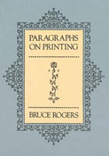
Paragraphs on Printing by Bruce Rogers

Recommended by: Scott Vile of the Ascensius Press

Why: Scott’s opinion is both poetic and practical:

To be somewhat glib, the one book on printing that everyone should read is all the books on printing. But if I had to choose one, it would be. Though focused primarily on book design, the amateur with ink in their blood would benefit greatly from the snippets of information on what makes a beautifully printed page. We all have access to an overwhelming number of typefaces, borders, decorations, and patterns. We can, in a day or two, receive a Boxcar plate with our own mental signature of what we believe good design to be, and then print from the plate with bottomless impression. What we desire, as letterpress printers and designers, is a beautifully printed page; this requires much more than a deep impression. It requires study, patience, character, and a careful examination of how design problems were solved in the past. Does the design look as though it were inevitable? That is success in printing.

I cannot state it any better than Rogers:

“Finally, it may be said that the decorative value of a simple page of beautiful type, beautifully printed, is a value quite apart from the esthetic pleasure given us by any other of the graphic arts. So elusive it is that it becomes difficult to analyze or describe; printing in its essential simplicity occupies a compartment all its own amongst the graphic arts. . . . You may be assured, however, that there is no golden road to fine printing. One must continually give his best effort, and only his best, to every piece of work he undertakes. The result will be a lasting thing of beauty—or not—according to his capacity as a workman and his taste as an artist.”


Daniel Keleher of Wild Carrot Letterpress

Recommendation: I cannot name just one book – my printing education came from many different sources. My advice? Seek out basic instructional texts and look for that one little hint that you have not read before.


General Printing: An Illustrated Guide to Letterpress Printing by Cleeton, Pitkin & Cornwell

Recommended by: Peter Kruty of Peter Kruty Editions

Why: Well, here is the book that everyone used at one time or another in their ‘apprenticeship’ to be letterpresser. It was used to teach highshoolers a trade in printing when all was hot metal. I was tickled to see that it is back in print and available from Amazon for $24.95 in a smart new yellow hardcover. No other book is going to show you the right way to tie a form for galley storage using kite string. My only concern is that every other contributor to this blog will recommend this book too, but hey, maybe in the end we are all just big highschoolers slaving away at the machines like it was still the 50’s.


Printing on the Iron Handpress by Gabriel Rummond

Recommended by: Peter Kruty of Peter Kruty Editions

Why: Everything, and I mean everything, about handpress printing, paper dampening, metal type handling, the works. Since nearly all of what we do at the studio is polymer, text and image, it’s interesting that the two books I’m recommending are for hot metal. Ah well, I guess plastic printing is a mast we all tie ourselves to at our own education and peril.


Finer Points in the Spacing & Arrangement of Type by Geoffrey Dowding

Recommended by: Carol Blinn of Warwick Press

Why: It is a classic. One can still get the best education by looking at books designed by the best – W. A. Dwiggins, Bruce Rogers, Giovanni Marderstieg and his son, Martino, and don’t forget all of the private press people who have gone before – plus new(ish) designers – all of these people were considered great for many reasons – use of classic typefaces, clean use of white space, delicate arrangements of type on a page just the right size for a project – open your eyes and look. And another thing, read your heart out to become educated in how words are put together to make sense. Read books by authors whose work and words you love. Immerse yourself with language. A good printer/designer should be educated in all things dealing with printed pieces – so don’t just become a worker bee, become a well-rounded professional printer/designer/editor/artist.

Having a good teacher is still the best way to learn how to do most things. Books with instructions are fine up to a point, but particularly in this world of ours – if you can’t get to the teacher, at least study their books. If they are still alive, contact them, pester them, and ask your questions. Bring them cookies and ask to stay for a day or two to learn how to make decisions in type and space and materials. Be grateful and thank them. And then go on to make your own mistakes and learn from them.


Do you agree, disagree, or have your own must-read book for printers? Tell us in the comments section below. We all hope to take away some great suggestions to add to your printing bookshelves!

Special guests

We had the honor of receiving some special guests recently. Bill Goldston, director of the renowned Universal Limited Art Editions (ULAE) and Andrew Saluti, curator of Pressing Print, a wonderful show of ULAE pieces at SUArt Galleries/ Shaffer Art Bldg. For decades, Bill has been inviting artists to come to his shop to explore the medium of printmaking using etching, silkscreen, letterpress, digital, anything to make the artists’ vision come true. He has worked with artists such as Jasper Johns, Jane Hammond, Carroll Dunham and Kiki Smith performing technical feats that my eyes have seen the amazing results of at the show currently in town. Highly recommend seeing it in person if you can! For show info. For info on ULAE.
From left in photo: Cathy, Bill, Andrew, Harold
visitors at boxcar press

How to Easily Outline Fonts into Vector Shapes

One of easiest ways to ensure smooth sailing from file to plate is to outline your fonts into vector shapes if you are using either Adobe Illustrator or InDesign. Outlining text into shapes frees you of the troublesome worry of whether you need to send along your fonts or embed them with your file. It also lets you add strokes to thinner fonts with ease – since the text becomes a vector shape, you’ll have more control over how each character looks.

Here’s the scoop in three simple steps:

•    Select the text with your black arrow tool in either Illustrator or InDesign. The black arrow tool is your default selection tool.
•    Select TYPE>Create Outlines.
•    Click anywhere that is blank on your art board and voila! Your text is now converted into fully editable vector shapes!

If the text looks a little thicker than usual, don’t panic! Simply deselect your text or click anywhere on your art board to deselect it and you’ll find that your text looks completely normal.

Boxcar Talk With Elizabeth Rittmeyer & Kelsie ZImmerman

Is there anything Elizabeth Rittmeyer and Kelsie Zimmerman can’t do? The energetic Elizabeth finally sat down with us to spill the details on just how ambrosial letterpress life at Sugarcube Press can be.

SUGAR, SPICE & EVERYTHING PRECISE I’m a 95%-self-taught letterpress printer, been doing it for 16 years. I’m a Portland, Maine transplant to SoCal via Seattle (I gloat profusely about living in the coolest places). The entire family is back in Maine so my husband and daughter go for 2 months and I get one before the printshop needs me back. I’m over 21, vegetarian 19 years, have a rational and hyper-creative husband who independently designs bags and i-gear for other companies like NAU and Apolis and he does production in Vietnam 4 months of the year (thus I become uber-super-mom). Our 11 year-old daughter is also so creative that she gets up at 6:30 a.m. to write stories before school. I love squirrels, pre-1900 books, tiny cut glass s&p shakers, ‘50’s odds-n-ends for my 1951 house with round livingroom, thrift stores and side-of-the-road finds, my proudest being a fire-orange Danish chair with swooped teak arms.

Sugarcube Press in action

INK IN THE BLOOD In 1995 I moved from Portland, Maine with my husband to a little rural island off of Seattle; he got a sweet job in K2 Snowboards. Well, after one trip on the ferry (after I missed the first two), through Seattle traffic, I decided there was just no way I could commute to Microsoft every day. What’s a girl to do on a wooded island with one blinking red light? Be the coffee-girl at a café. Lucky for me Jennifer and Ron Rich of Oblation remembered me from a book fair and asked if I wanted to be their paper-maker, which I did until I learned to print (enough) to be their printer for 2 years. With their success they left for Stumptown and I stayed on my island and did online weddings only. Looks like I was hooked.

CALIFORNIA DREAMING We recently moved to a new space in our sweet little Ojai downtown, a 6-minute walk from my house. We have 800 square feet with softly glowing buttercream walls, two all-windowed garage doors facing directly East with view of the mountains and with the doors fully-open we’re virtually “outside”.
An outside view of Sugarcube Press
Kelsie has a design-center, we have a processing + shipping area, and a near-half is the print shop. I am the second owner of my 1956 8×10 C&P named Dwight (she’s a girl), and 10X15 Heidelberg named The Butterfly that was bought from Frank Boross of Toxic Coyote Press (he had her for 25 years). Jack, my leggy Chihuahua mutt pound-dog, guards it all.

PRINTING LEGACIES I love Bonnie Thompson Norman of The Windowpane Press in Seattle. Her books are letterpress and lino-cuts; I adore Madeleine Zygarewicz of Panorama Press, she’s a doll; and I get really happy looking at 9SpotMonk, I gravitate to overlays and splash. Though I am amazed at people who achieve tight-registration and I totally bow to them, I prefer “movement” with overlays and juxtapositions that create new colors.

Sugarcube Press's print shop
DAILY GRIND “Design” happens every day; it’s inspiration and whimsy from a thrift-store goody or a conversation with a pal. My humor tends towards sarcasm and irony, so our cards are pretty funny. I like the one-offs and tongue-in-cheek play with words we English grads live for. These days I do quick pencil sketches and collaborate with my partner and designer-guru extraordinaire Kelsie Zimmerman; she uses our sketches and ideas and gets them plate-makin’ ready to send to Boxcar.

DESIGNED FOR PRINT I’ve always been a “designer” in the sense I draw, collage, carve, arrange and conceive. Up until I met Kelsie in 2007, I was the solo-business owner and designer. Our collaboration allows me to concentrate on Sugarcube’s printing; I print every single thing that comes out of the shop to supply over 400 stores.

Another look at the Sugarcube Press print shop
FULL TIME FUN I work full-time for Sugarcube Press and thankfully, finally, for no one else! Every-other year I’d panic and go get a desk job. But this past year was sweet to permanently be at my cast-iron “desk” all day; now I stand at the C&P for a solid 5 hours before it gets too tiring, then it’s off to other necessities: packaging, shipping, calling on invoices, and brainstorming.

PRINTER’S PARADISE In general, being a printer of good caliber; I print every single card and ephemera from Sugarcube Press on the C&P. Sugarcube has grown exponentially thanks to my go-getter-never-say-I-can’t partner, Kelsie. She rocks! We are both really proud of our growth over the years.

BOXCAR’S ROLE Our first NSS in 2008 found us paying thousands of dollars for wood-mounted metal that due to a changed formula (later discovered) was crumbling away as I printed. I was freaking out! We met with Boxcar at that show and decided to make the change to polymer plates: lightness in shipping, less cost in ganging–up images, less hazardous waste in it’s making, and polymer doesn’t smash (whoops) like magnesium.

Another look at the Sugarcube Press print shop
PRESS HISTORY I found my first press, named Big ol’ Pearl, a 10×15 1890’s C&P, in the Printer’s newspaper, in 1997-ish, in PDX. Drove down from the island in a huge Ford truck and extra-long Uhaul. Really spendy ferry ticket. My driver, backing it up in a rain-sodden field, became mired in the mud 500 feet from my studio door. One guy suggested we dump the press in the muck and drag it! The other guy (hello, Einstein) pointed out the press, being in a trailer, was already on wheels, we just needed a come-along, and a few hours of cranking got her inside with nary a drop of rain on her.

SHOP TIPS If you want to grow, get a partner! Kelsie and I both do different jobs and our expertise is necessary for our success. She designs and does all of the layout and haggling to get our catalogs done, online pop-up sales, keeps reps happy and trade shows looking sweet. I’ve mostly got the printing and stock under control; ya gotta make it to sell it!

WHAT’S NEXT Making more of everything and tripling growth.

Big thanks to Elizabeth and Kelsie for showing the sweeter side of letterpress with Sugarcube Press! Check out their nifty videos here!

Fresh Letterpress Fun: A Springtime Vector Set!

Spring seems to be coming a bit early here at Boxcar Press and we thought you’d enjoy a free spring themed vector set to kick the season off right! This vector set includes a festive pair o’lucky St. Patrick’s Day graphics, a typographic spring greeting, and to top it off… a trio of finely crafted Ukrainian Easter Eggs! All are free for use and in both EPS and PDF format. Enjoy!

A free springtime vector set from Boxcar Press

The Art of Currency – The Imagery of Presses

As a coin collector, it’s very easy to appreciate the art, colors, and designs of all the national currencies in our world. And when a beautiful currency note reveals a printing press? It doesn’t get much better than that.  We have two examples of small but oh so detailed works of art depicting presses and pressmen.

On the Colombian Cien Pesos Oro – circa 1990 – is a little jewel in the corner of a common press.  There is an interesting story behind this currency and explains why a press image.  On the front is General Antonio Nariño, who was a political activist and founded a political newspaper in the 1800’s.  He was a great admirer of Benjamin Franklin and translated the Declaration of the Rights of Man, which he printed and distributed from his own private press, much to the ire of his government.

On the 50 Kronur from Iceland, circa 1981, is a wonderful illustration of two pressmen on a Gutenberg Press. On the front is Bishop Gudbrandur Thorlaksson, who lived from 1570 to 1627.  He edited and published over 80 books including the first complete Icelandic translation of the Bible.  He set up a press in his home and was also the engraver of the woodcuts in this Bible.  A rare first edition of this Bible is in the National Library of Scotland.

Not only can we appreciate the art but the stories remind us that people today are still printing books and broadsides from similar presses.

Letterpress Graces Special Edition Book of Georgia O’Keeffe

The Vandercook takes the spotlight once again, as its printing powers are drawn upon by letterpress printer, Tom Leech, for the newest memoir regarding Georiga O’Keeffe. Read on to get the scoop and enjoy the wonderful video in the Santa Fe New Mexican.com article here!

Letterpress pieces printed by Tom Leech were used for a new Georgia O'Keefe memoir.

Local AIGA Branch Tours Boxcar Press

Boxcar Press started off February with a tour group from the local branch of the AIGA. These tours are a great opportunity for us to not only show what our company has to offer, but also helps us encourage and inspire people to pursue designing for letterpress projects. The group size consisted of about seven graphic designers. They showed great interest in the process from design to platemaking all the way to finishing.  Everyone enjoyed watching the printers at their windmills and rubbing their fingertips over the impression in the paper.  As letterpress continues to grow in popularity, we find graphic designers who visit are more knowledgeable about the craft than just a couple of years ago. A big thanks to these designers for stopping in!